Try it on your room

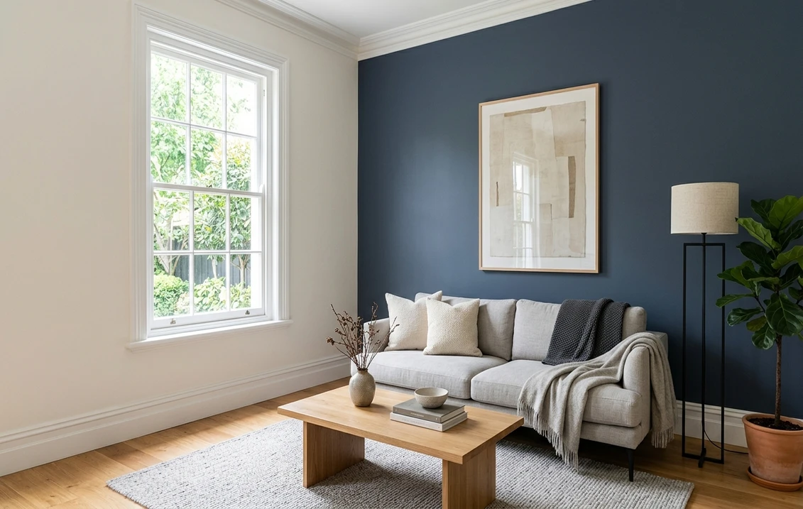
Benjamin Moore Newburyport Blue (HC-155) is the navy I reach for when a homeowner loves the drama of a deep blue wall but keeps hesitating because Hale Navy feels almost black. Newburyport lives one number over on the fan deck, and that small shift matters: it is a shade lighter and holds onto its blue a little more clearly, so the room reads as a rich, softened navy rather than a near-black one. It stays legible as blue where its famous neighbor grays down toward near-black.
The specifics: Newburyport Blue HC-155 is part of Benjamin Moore's Historical Color collection, with a hex of #465566 (RGB 70, 85, 102) and a very low LRV that puts it squarely in deep-navy territory. Its blue channel sits well above the red, which is why it keeps a true blue lean instead of tipping to charcoal. On the strip it sits just above Hale Navy HC-154 and below Van Deusen Blue HC-156. This profile is one stop in our wider Benjamin Moore interior paint colors guide. Here is how Newburyport actually behaves on interior walls.
Upload a photo of your actual room and preview BM Newburyport Blue under your own light in about 30 seconds, free.
Newburyport Blue at a glance: the numbers that matter
Before opinions, the verifiable specs. These are the values you can take to a paint counter:
| Spec | Newburyport Blue HC-155 |
|---|---|
| Color number | HC-155 (Historical Color collection) |
| Hex | #465566 |
| RGB | 70, 85, 102 |
| LRV (Light Reflectance Value) | Very low: a deep navy that reflects little light and reads dark and enveloping |
| Hue family | Deep blue navy (a true blue-leaning navy, not a blue-black) |
| Best base / finish | Matte or eggshell on walls, satin or semi-gloss on doors and built-ins |
Try it on your house
No photo? Try a sample
Sources: Benjamin Moore HC-155 color data 2026 (RGB 70, 85, 102); designer field reports compiled by FacadeColorizer.
The takeaway: Newburyport Blue is a commitment color, not a soft backdrop. A very low LRV means the wall absorbs most of the light that hits it, so it will always look darker on a full wall than it does on a chip, and darker still at night. But the RGB is encouraging too: with the blue channel a clear step above the red, Newburyport keeps a genuine blue identity instead of collapsing into gray-black like inkier navies.
Is Newburyport Blue blue or gray? The undertone, decoded
Blue, and it stays blue more reliably than most deep navies. Newburyport is a true blue-leaning navy with only a soft gray quieting it down, which keeps it from ever looking harsh or electric. It is not a blue-black and not a slate-gray blue; it is a rich, slightly muted navy where the blue is always the lead.
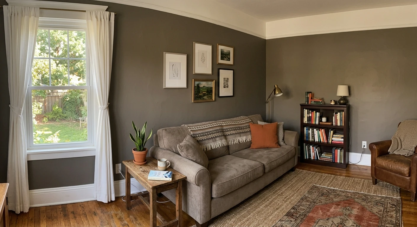
In bright daylight Newburyport reads as a clean, confident blue-navy with real depth. As the light drops (a north room, an overcast afternoon, warm lamps at night) it quiets and can approach charcoal, but the blue never fully leaves. That is the practical difference from Hale Navy: Newburyport holds its blue a beat longer into low light, while Hale Navy grays toward near-black sooner.
| Indoor light | How Newburyport Blue reads |
|---|---|
| South-facing (bright, warm) | Its cleanest, most saturated blue-navy read; depth without going black |
| West-facing (warm afternoon) | Rich and slightly warmed at golden hour, deepening after sunset |
| East-facing (cool after noon) | Crisp blue in the morning, settling into a moodier navy by afternoon |
| North-facing (cool, indirect) | At its deepest and coolest; treat the dark, enveloping navy as the design |
| Artificial light at night | Warm 2700K bulbs keep the blue alive; dim, cool light pushes it toward charcoal |
Sources: Benjamin Moore HC-155 color data 2026; designer field reports compiled by FacadeColorizer.
Best rooms for Newburyport Blue
A deep, softened navy is a mood-setter, and it earns its keep anywhere you want depth and a little drama:
Bedrooms and cozy living rooms
This is Newburyport's sweet spot. On four walls it wraps a bedroom or den in a calm, enveloping color that feels tailored rather than cold, because the blue stays warm-adjacent instead of tipping to blue-black. White bedding and pale oak keep it fresh; brass sconces and walnut make it feel like a library.
Dining rooms, studies, and powder rooms
Small, evening-use rooms are where a deep navy shines with the least risk. A dining room or study in Newburyport reads rich under lamplight, and a powder room in a glossier finish becomes a jewel-box moment. The low LRV that scares people off big bright rooms is what makes these spaces feel special.
Kitchen islands, cabinetry, and doors
Newburyport is a superb cabinet and island navy: deep enough to anchor a white or wood kitchen, blue enough to feel like a color choice rather than a default black. It also makes a striking front door when you want navy that still photographs as blue.
Where to think twice
A small, dim, north-facing room painted out entirely in Newburyport can tip from cozy to cave. There, either lean into the moody look on purpose, keep the navy to a feature wall, or add warm 2700K lighting so the blue does not go flat and near-black.
Free AI visualizer. Test Newburyport Blue on your real walls before buying a single sample pot.
Trim, ceiling, and decor pairings
Deep navies live or die on contrast. What works with Newburyport Blue:
- Soft warm trim (most classic): BM White Dove (OC-17) is the default answer: its gentle warmth stops the navy from feeling cold, and the huge value gap between deep navy and soft white keeps trim lines crisp.
- Crisp cool trim (more modern): BM Chantilly Lace (OC-65) is the cleaner, sharper option, pushing Newburyport toward a contemporary, high-contrast look with black window frames.
- Metals: brass and aged gold warm the navy; polished nickel and matte black keep it crisp and modern.
- Avoid: heavy yellow-cream trim. Against a clean blue navy, an antique white can look dingy and muddy the crisp contrast a deep color needs.
- Ceilings: keep them a clean white to protect the room's light budget, unless you are deliberately painting a small room out for full drama.
- Floors and decor: white oak, natural jute and linen, warm woods, and brass flatter Newburyport; cognac leather and cream upholstery balance the depth so the room feels layered rather than heavy.
Newburyport Blue vs the colors people cross-shop
Almost every Newburyport Blue shortlist has one other name on it, and usually a second:
- vs BM Hale Navy (HC-154): the big one, and its next-door neighbor on the strip. Hale Navy (RGB 67, 75, 86) is a shade darker and grays toward an almost-black, muted navy; Newburyport Blue (RGB 70, 85, 102) is a touch lighter and keeps a cleaner, more visible blue. Pick Hale Navy for the near-black look; pick Newburyport when you want the wall to still read blue in low light. Our Hale Navy HC-154 profile covers the rival in depth, and Hale Navy vs Newburyport Blue, settled room by room puts the two side by side under every light.
- vs BM Van Courtland Blue (HC-145): when Newburyport feels too dark for a big, bright room, this lighter, grayer heritage blue delivers the mood at a higher LRV. See the Van Courtland Blue HC-145 profile for the softer alternative.
- vs lighter blues generally: expect Newburyport to feel like a real leap in depth. Judge it after the second coat, in daylight, before deciding it is too much.
Spelling note: newburyport blue benjamin moore, BM Newburyport Blue, and newburyport blue HC-155 all point to this same color.
How to test Newburyport Blue before you commit
Deep navies are the hardest colors to judge from a 2-inch chip, because a small swatch cannot show how much a full wall darkens a very low LRV paint. Two better methods:
- Paint a large swatch: roll at least a 12-by-12-inch sample on two walls, one by the window and one in your darkest corner. Check it mid-morning, late afternoon, and at night under your normal bulbs. The dark-corner swatch is the honest one: it decides whether Newburyport reads blue or black in your room.
- Preview it digitally first: upload a photo of your room and run Newburyport against Hale Navy and a lighter blue before you buy a single sample. Our guide on how to compare paint colors side by side walks through the shortlist-then-sample method that avoids the five-sample-pot spiral.
Preview the two navies side by side on your real walls, free.
Frequently asked questions
Is Benjamin Moore Newburyport Blue blue or gray?
Newburyport Blue (HC-155) is a true blue-leaning navy, RGB 70, 85, 102 (hex #465566), not a gray. In daylight it reads as a clean, slightly softened blue-navy. In low or warm light it quiets down and can approach charcoal, but the blue is always the lead. It sits a shade lighter and a touch bluer than the grayer Hale Navy.
What is the LRV of Newburyport Blue HC-155?
Newburyport Blue has a very low Light Reflectance Value, deep in navy territory, so it reflects very little light and reads as a dark, enveloping wall. Treat it like any deep navy: it needs good natural light or warm lamps to keep from going flat and near-black at night, and it will always look lighter on a 2-inch chip than it does on a full wall.
Newburyport Blue vs Hale Navy: what is the difference?
Both are deep Benjamin Moore navies on adjacent Historical Color numbers (HC-155 and HC-154). Newburyport Blue (RGB 70, 85, 102) is slightly lighter and reads as a cleaner, more true blue. Hale Navy (RGB 67, 75, 86) is a shade darker and grays down toward an almost-black, muted navy. Choose Newburyport when you want the blue to stay visible, and Hale Navy when you want the near-black, grayed look.
What trim color goes with Newburyport Blue?
A soft warm white like BM White Dove (OC-17) is the classic pairing: its gentle warmth keeps a deep navy from feeling cold, and the wide value gap makes trim lines crisp. For a cooler, more modern contrast, BM Chantilly Lace (OC-65) sharpens the edges. Avoid heavy yellow creams, which can look dingy against a clean blue navy.
Preview BM Newburyport Blue on your actual walls under your own light before buying a single sample.
Disclaimer: Benjamin Moore, Newburyport Blue (HC-155), Hale Navy (HC-154), Van Courtland Blue (HC-145), Van Deusen Blue (HC-156), White Dove (OC-17), and Chantilly Lace (OC-65) are trademarks of Benjamin Moore & Co. FacadeColorizer is an independent paint visualization service and is not affiliated with, endorsed by, or sponsored by Benjamin Moore. Color reproduction on screens approximates the manufacturer's chip; always confirm with a manufacturer sample under your own light before purchase. Sources: Benjamin Moore HC-155 and HC-154 color data 2026, designer field reports compiled by FacadeColorizer.
Trademarks mentioned (Sherwin-Williams, Benjamin Moore, Behr, Caparol, Brillux, Sto, Alpina, Valspar, PPG, Glidden, Dulux, Crown Trade, Sandtex, Farrow & Ball, Johnstone's, Leyland) are property of their respective owners. FacadeColorizer is independent and not affiliated with any of them. Nominative fair use under Lanham Act §1125.