
The first time I cut in a corner of Benjamin Moore Boothbay Gray (HC-165) for a client, she stood in the doorway and asked, "Wait, is that blue or is that gray?" That hesitation is the whole story of this color. On a chip it looks like a quiet gray. Rolled across a wall in real light it slides toward soft slate blue depending on the hour. It is one of the most-requested colors out of Benjamin Moore's Historical Collection for exactly that reason: a coastal blue-gray that behaves like a neutral most of the day, then reveals its blue when the light is right. So which rooms does it flatter, and how do you keep it from going flat or icy? Here is how Boothbay Gray actually behaves indoors.
Quick orientation before the deep dive. Boothbay Gray paint has a published LRV of approximately 42 and a hex approximation of #A6AEAC (RGB 166, 174, 172). That makes it a mid-tone, soft blue-gray: light enough to keep a room open, deep enough to give walls real presence rather than fading into the trim. This profile is one stop in our wider Benjamin Moore interior paint colors guide, and it is the indoor companion to our Boothbay Gray HC-165 exterior guide: that one covers the color on siding, shutters, and facades, while this one stays on interior walls, rooms, undertones, and pairings. They are complementary, not duplicates.
Upload a photo of your actual room and preview BM Boothbay Gray under your own light in about 30 seconds, free.
Boothbay Gray at a glance: the numbers that matter
Before opinions, here are the approximate published specs from the Benjamin Moore color library. These are the values you can take to a paint counter:
| Specification | Boothbay Gray HC-165 |
|---|---|
| Color number | HC-165 (Historical Collection) |
| LRV (Light Reflectance Value) | Approximately 42 (mid-tone) |
| Hex / RGB (approx.) | #A6AEAC / 166, 174, 172 |
| Color family | Soft blue-gray (cool neutral) |
| Primary undertone | Slate blue, with a quiet green softening it |
| Best tint base | A light or medium base; avoid a deep base that muddies the value |
The takeaway from those numbers: Boothbay Gray is a true mid-tone, not a pale wash and not a dark statement color. At an LRV around 42 it reads as a confident wall hue without darkening a room. Its blue is real but restrained, kept honest by a green note that stops it from ever turning baby-blue or navy. That balance is why it travels so well from a study to a bathroom to a bedroom.
Is Boothbay Gray blue or gray? The undertone, decoded
Boothbay Gray is a blue-gray, and which word wins depends entirely on your light. People who swear it is "just gray" usually saw it in a north room or under cool LEDs that flatten the blue. People who call it "definitely blue" caught it in afternoon sun. Here is what is happening underneath.
The dominant Boothbay Gray undertones are a soft slate blue with a faint green sitting behind it. That green is the quiet hero: it is what keeps the blue grounded and slightly muted instead of clear and cold. In bright, warm light the blue steps forward and the wall reads as a gentle coastal slate. In cool, indirect light the blue can recede and the gray takes over, sometimes pulling the faintest green-gray cast. It almost never tips lavender or purple, which is the failure mode of many cheaper blue-grays, and that stability is a big part of why designers trust it.
Watch out for one quirk. Boothbay Gray photographs grayer and flatter than it lives, so its blue rarely survives a phone camera. If you are choosing from Pinterest images alone, assume the real wall will carry noticeably more blue and more depth than the picture suggests.
| Indoor light | How Boothbay Gray reads |
|---|---|
| South-facing (bright, warm) | Soft slate blue, its most flattering and characterful read |
| West-facing (warm afternoon) | Blue warms slightly and softens; the green note becomes more visible |
| East-facing (cool after noon) | Bright blue-gray in the morning, settling to a balanced gray by afternoon |
| North-facing (cool, indirect) | Cooler and grayer; the blue recedes and a faint green-gray can surface |
| Artificial light at night | Warm 2700K bulbs calm the blue and read cozy; cool 4000K bulbs sharpen the blue and read crisper |
Sources: Benjamin Moore HC-165 color data 2026; The Spruce blue-gray undertone coverage; designer field reports compiled by FacadeColorizer.
Free AI visualizer. Test Boothbay Gray on your real walls before buying a single sample pot.
Best rooms for Boothbay Gray
A mid-tone blue-gray with a calm, coastal personality, Boothbay Gray is at its best where its blue has light to play with and where you want walls that feel restful but not bland. Here are the spaces where it consistently earns its keep:
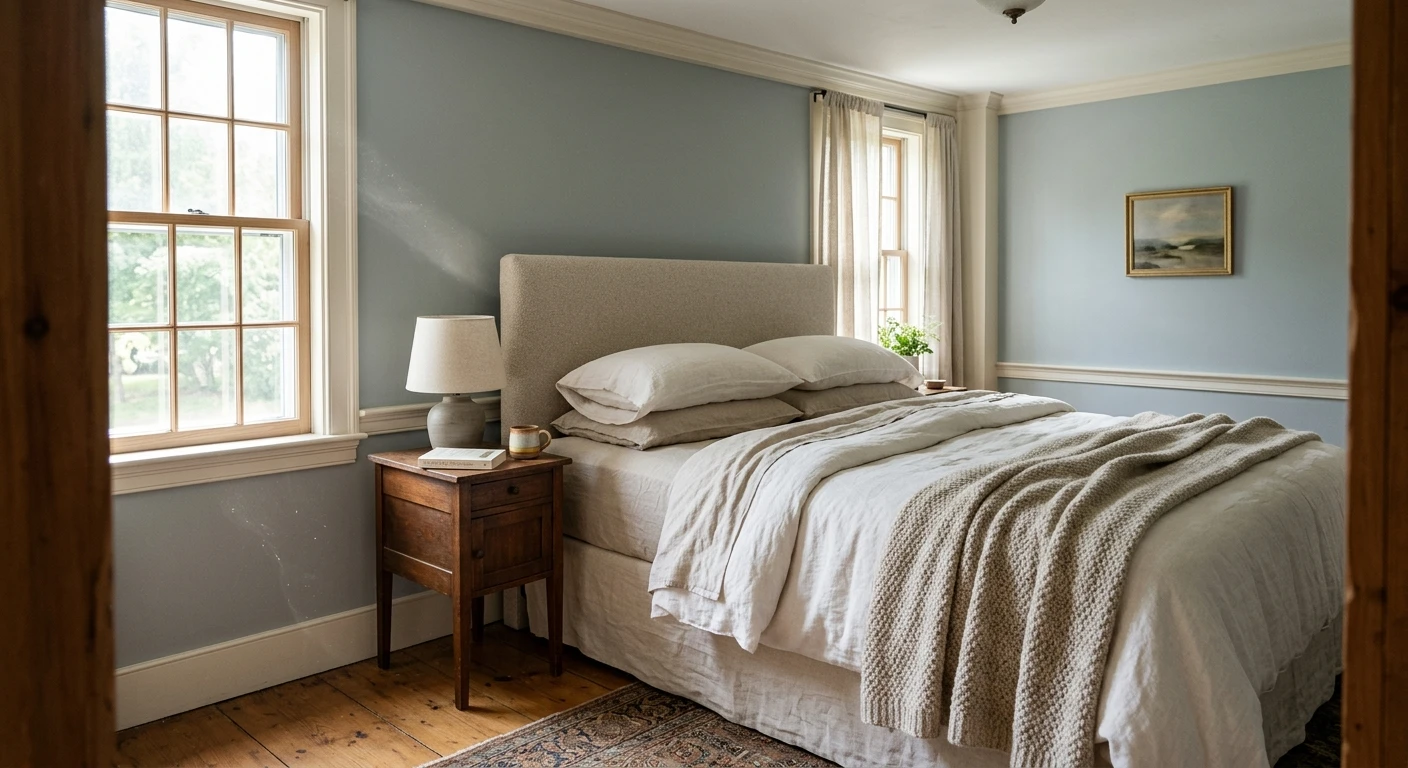
Bedrooms and primary suites
This is Boothbay Gray's strongest room. Blue is the most reliably calming hue for sleep, and at LRV 42 the color is soft enough to soothe without darkening the space. Under lamp light at night the green note keeps it warm rather than cold, so it reads serene instead of chilly. Pair it with crisp white trim and natural-wood furniture for a coastal-cottage feel that does not read like a theme room. For more restful schemes, see our calming master bedroom paint colors.
Bathrooms and powder rooms
Boothbay Gray and white subway tile are a classic for a reason. The slate blue reads clean and spa-like against white fixtures, and the mid-tone depth gives a small bathroom a sense of enclosure that pale colors miss. Just give it some light, because a windowless powder room under cool LEDs can mute the blue and tip it gray. A warmer 2700K bulb brings the character back.
Studies, offices, and dining rooms
In a study or home office the mid-tone depth makes Boothbay Gray feel focused and grounded, an easy color to think in. In a dining room it brings a quiet, dressed-up calm, especially with brass or warm-metal lighting to counter the cool. If you want to see how blue-grays as a family behave across rooms before committing, our guide to blue-gray paint colors and their undertones maps the full range.
Where to think twice
Small, dim, north-facing rooms with only cool light are where Boothbay Gray can fall flat and read as a sad institutional gray with the blue drained out. A windowless hallway or a basement under cold LEDs is the worst case. There, a lighter, greener blue-gray (Gray Owl is the obvious step) or a warmer bulb rescues it. For more room-by-room context, our room paint color ideas by room roundup is a useful map.
Trim, ceiling, and decor pairings
A blue-gray body color lives or dies on what sits next to it. Get the trim right and Boothbay Gray looks intentional and coastal; get it wrong and the blue can either disappear or turn cold.
- Crisp white trim (most versatile): BM Chantilly Lace (OC-65) gives the cleanest, most current contrast and lets the slate blue read sharp and coastal. This is the safe modern pick.
- Soft white trim (gentler, warmer): BM White Dove (OC-17) softens the contrast and warms the whole scheme, ideal for traditional and cottage rooms where you do not want a hard edge.
- Avoid: a heavy beige or cream trim that fights the blue. The warm-cool clash can make Boothbay Gray look muddy rather than clean.
- Ceilings: a clean white ceiling keeps the room bright and lets the wall color do the work. A cool blue-white ceiling over Boothbay Gray can amplify any north-light flatness.
- Floors and decor: warm oak, white oak, rattan, brass, and natural linen counter the cool and keep the room from feeling chilly. Cool gray-washed floors push it the other way and can leave the space feeling flat and one-note.
For a deeper, anchoring partner, a charcoal or near-black such as Wrought Iron on a vanity, door, or built-in reads handsome against the soft blue. And if you are weighing a lighter, greener alternative to soften the look, our Benjamin Moore Gray Owl OC-52 review covers the most common step-down from Boothbay Gray.
See walls, trim, and floor together in one preview, free.
Boothbay Gray vs the colors people confuse it with
Almost every Boothbay Gray search ends in a comparison. The three that matter most indoors:
- vs BM Gray Owl (OC-52): Gray Owl is much lighter (LRV in the high 60s) and leans green-gray rather than blue-gray. Choose Boothbay Gray when you want a confident mid-tone blue with presence, choose Gray Owl when you want a barely-there light neutral that stays soft.
- vs BM Coventry Gray (HC-169): Coventry Gray is a close blue-gray sibling that runs a touch lighter and cleaner, with the blue reading a hair more obvious. Boothbay Gray is slightly deeper and more muted thanks to its green note; pick it when you want more grounding and less brightness.
- vs SW Mineral Deposit and similar blue-grays: Boothbay Gray's signature is that green-softened slate. Many competing blue-grays read cleaner and cooler, which can tip lavender in north light. Boothbay Gray's muting is exactly what keeps it stable.
Spelling note: boothbay grey and boothbay gray benjamin moore both point to this same HC-165.
How to test Boothbay Gray before you commit
A small fan-deck chip is the number-one reason people pick a blue-gray that disappoints: it reads grayer and flatter than a rolled wall and cannot show how much the blue shifts across a day. Two better methods:
- Paint a large swatch: roll a 12-by-12-inch sample (or a peel-and-stick sample) on two different walls and check it mid-morning, mid-afternoon, and at night under your normal bulbs. Watch specifically for how much blue you keep in your dimmest corner, since that is where Boothbay Gray can go gray on you.
- Preview it digitally first: upload a real photo of your room and apply Boothbay Gray (plus a lighter and a cleaner blue-gray alternative) before you buy any samples, narrowing three contenders to one worth painting. Pricing context for the full repaint is in our interior house painting cost guide for 2026.
Preview Boothbay Gray against a lighter and a cleaner blue-gray, side by side, free.
Frequently asked questions
Is Boothbay Gray blue or gray?
Boothbay Gray (HC-165) is a soft blue-gray, and which side shows depends on your light. Its primary undertone is a slate blue with a quiet green behind it that keeps the blue muted. In bright, warm light the blue steps forward and reads as a gentle coastal slate; in cool, north light the blue recedes and the gray takes over. It almost never tips lavender, which is what makes it a stable, trustworthy blue-gray.
What is the LRV of Boothbay Gray?
Boothbay Gray has a Light Reflectance Value of approximately 42 on the Benjamin Moore color data, with a hex approximation of #A6AEAC (RGB 166, 174, 172). That makes it a true mid-tone blue-gray: deep enough to give walls real presence and a sense of enclosure, but still light enough to keep a room open rather than dark.
What are the best rooms for Boothbay Gray?
Bedrooms, bathrooms, studies, and dining rooms are where Boothbay Gray shines, because its calming blue and mid-tone depth flatter both white trim and natural wood. It is least reliable in small, windowless, or north-facing rooms with only cool light, where the blue can drain out and leave a flat gray; a lighter blue-gray or a 2700K bulb helps there.
What trim color goes with Boothbay Gray?
A crisp white like BM Chantilly Lace (OC-65) gives the cleanest, most coastal contrast, while a soft white like BM White Dove (OC-17) warms and gentles the scheme for traditional rooms. Avoid a heavy beige or cream trim, which fights the blue and can make Boothbay Gray look muddy by comparison.
Is Boothbay Gray the same as boothbay grey?
Yes. "Boothbay grey," "color boothbay gray," and "boothbay gray benjamin moore" all refer to the same color, Benjamin Moore HC-165. There is no separate British-spelling formula. The same color also has a published exterior profile for siding, shutters, and facades.
Preview BM Boothbay Gray on your actual walls under your own light before buying a single sample.
Disclaimer: Benjamin Moore, Boothbay Gray (HC-165), Gray Owl (OC-52), Coventry Gray (HC-169), Chantilly Lace (OC-65), White Dove (OC-17), and Wrought Iron are trademarks of Benjamin Moore & Co. Sherwin-Williams and Mineral Deposit are trademarks of The Sherwin-Williams Company. FacadeColorizer is an independent paint visualization service and is not affiliated with, endorsed by, or sponsored by Benjamin Moore or Sherwin-Williams. LRV and hex values are approximate and provided for guidance; color reproduction on screens approximates the manufacturer's chip, so always confirm with a manufacturer sample under your own light before purchase. Sources: Benjamin Moore HC-165 Boothbay Gray color data 2026, Benjamin Moore OC-52 Gray Owl and HC-169 Coventry Gray color data 2026, The Spruce blue-gray undertone coverage, designer field reports compiled by FacadeColorizer.
Trademarks mentioned (Sherwin-Williams, Benjamin Moore, Behr, Caparol, Brillux, Sto, Alpina, Valspar, PPG, Glidden, Dulux, Crown Trade, Sandtex, Farrow & Ball, Johnstone's, Leyland) are property of their respective owners. FacadeColorizer is independent and not affiliated with any of them. Nominative fair use under Lanham Act §1125.


