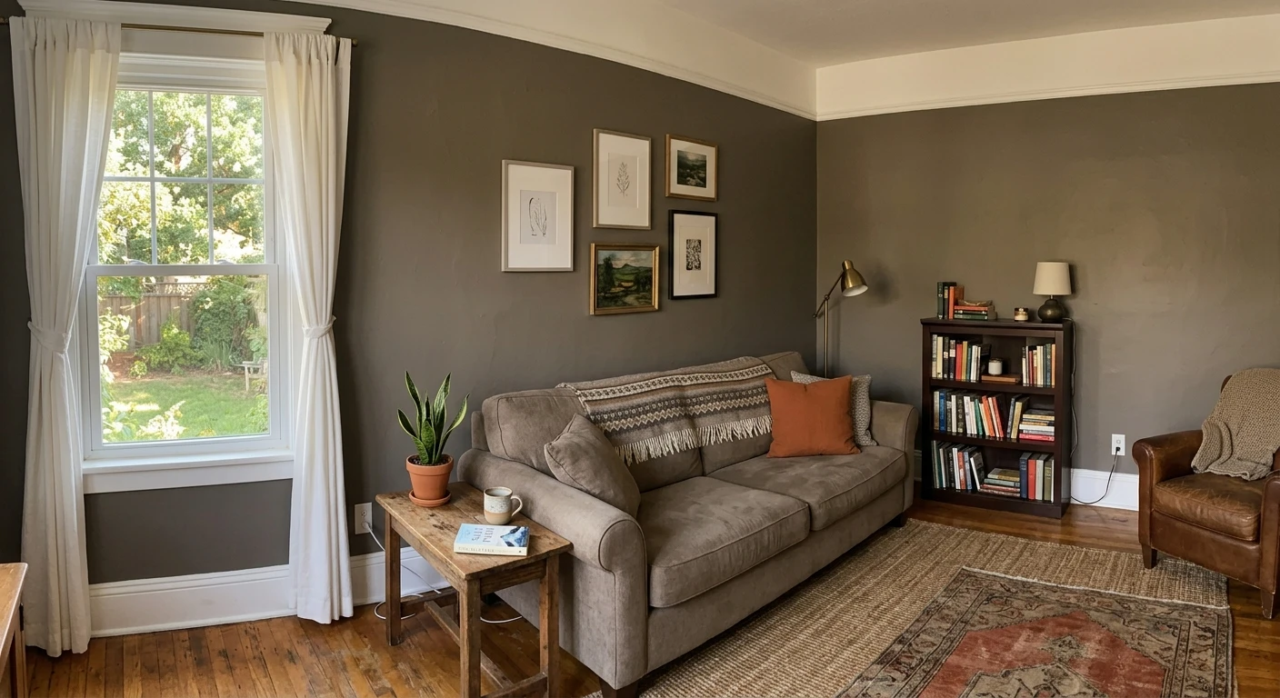

If you love the pewter family but Light Pewter washes out on your walls and Revere Pewter reads too pale to feel intentional, Benjamin Moore Antique Pewter 1560 is the one you have been circling. It is the deeper, more grounded greige in the pewter lineup: a soft gray with a warm taupe base and a quiet pewter cast, sitting at a lower LRV than its lighter cousins. That extra depth is the whole point. It gives a room a cocooning, settled feel without tipping into a true charcoal, which is exactly why it shows up on accent walls, studies, and bedrooms where a paler greige would just look like dirty white.
This is a full profile of Antique Pewter indoors: its real undertones, how room orientation pushes it warmer or cooler, the rooms it was built for, the trim and decor pairings that keep it from going muddy, and an honest side-by-side against Light Pewter 1464 and Revere Pewter so you can pick the right depth the first time. If LRV is a new concept, our guide to light reflectance value explains why a single number predicts how dark a color will actually feel on your wall.
Upload one photo of your room and preview Antique Pewter under your actual light in 30 seconds, free.
Benjamin Moore Antique Pewter at a glance
Antique Pewter belongs to Benjamin Moore's Color Preview collection, a deeper companion to the lighter pewters in the deck. The published technical data:
- BM code: 1560, Color Preview collection.
- Approximate hex: roughly #A7A296, a mid-deep warm gray; treat any on-screen hex as an approximation of the physical chip, never a match.
- LRV (Light Reflectance Value): about 36 on the Benjamin Moore technical data sheet, noticeably lower than Light Pewter and Revere Pewter, which puts it in mid-deep territory rather than light neutral.
- Color family: warm greige (gray plus taupe) with a soft pewter cast that gives the color its name.
- Primary undertone: warm taupe; secondary undertone: a faint green-gray that surfaces in cool or low light.
- Closest lighter neighbor: Light Pewter 1464, for the same character at a much higher reflectance.
That LRV near 36 is the headline. It is low enough to give walls real presence and depth, but high enough that the color still reads as a sophisticated gray-taupe rather than a moody charcoal. Because it sits in the mid-deep band, Antique Pewter darkens a room more than a light greige would, so window count and bulb temperature matter more here than with a high-LRV neutral. For the full mechanics of how that number translates to perceived darkness, see the LRV paint guide.
The undertones, honestly
Antique Pewter is a warm greige built on taupe, with a soft pewter-gray surface that keeps it from ever reading beige. Underneath the taupe sits a low-level green-gray, the usual byproduct of a warm gray mix, and at this depth that secondary note is a little easier to see than it is in a pale greige. In warm, well-lit rooms the taupe stays in charge and the color reads rich and cozy. In flat or cool light the warmth gets muted and the green-gray can step forward, which is when people describe it as "a touch sage" or "cooler than the chip."
This is the same light-subtraction effect we documented for warm whites in our SW Alabaster north-facing undertone guide: cool, indirect light strips out the warm wavelengths and exposes whatever pigment is left in the base. With a deeper color like Antique Pewter, that shift is just more visible because there is more pigment doing the work.
How room orientation changes Antique Pewter
Because Antique Pewter sits in the mid-deep range, light direction changes its mood more than it changes a near-white. Here is how the same can behaves by orientation in the Northern Hemisphere:
| Room orientation | Light character | How Antique Pewter reads |
|---|---|---|
| South-facing | Warm, bright, sun most of the day | Rich warm greige, taupe forward, the chip at its best |
| West-facing | Cool morning, warm golden evening | Deeper and cozier as the light warms toward sunset |
| East-facing | Bright warm morning, flatter afternoon | Balanced early, leans cooler and grayer past noon |
| North-facing | Cool, indirect, no direct sun | Coolest and darkest read; the green-gray can surface |
Sources: Benjamin Moore 1560 technical data sheet 2026; Benjamin Moore Color Lab undertone references; The Spruce paint color guidance.
In practice: a sunny south or west room shows Antique Pewter at its warmest and most flattering. A north-facing or low-window room will read it darker and cooler, so test carefully there and keep a lighter pewter on standby if the space starts to feel heavy.
Best rooms for Antique Pewter
The lower LRV makes Antique Pewter a depth color rather than a whole-home wash. It rewards spaces where you want walls to feel intentional and enveloping:
- Studies, offices, and libraries: the grounded depth makes a focused, settled room without the commitment of a true charcoal. See more in our Benjamin Moore interior colors hub.
- Bedrooms with good daylight: a cocooning, restful envelope in a south or east room. In a dim north bedroom, step up to Light Pewter so the space does not feel cave-like.
- Accent walls: deep enough to read clearly as an accent against a lighter greige or white on the remaining walls, without the harsh edge of black.
- Dining rooms: the depth flatters warm woods and candlelight in the evening, giving the room a quieter, more formal mood.
Where to think twice: small, windowless powder rooms and dim basements, where a mid-deep LRV can close the space in. There, the lighter members of the pewter family hold up better. If you want the pewter character but more light, the lighter sibling is the safer call, which is why most people compare the two directly.
Free AI room visualizer. Upload your room photo to see 1560 under your own light before buying a sample.
Trim, ceiling, and decor pairings
A deeper greige needs contrast handled with care. The right white makes Antique Pewter look rich; the wrong one makes it look murky.
- Best trim white: Benjamin Moore White Dove (OC-17, LRV 85). Its soft warm cream gives strong, clean contrast against the deeper walls while sharing the same warm temperature. We break the white down in our White Dove OC-17 review.
- Crisper alternative trim: Chantilly Lace (OC-65) for a brighter, more modern edge if you want maximum pop against the deep walls. Skip cool blue-whites, which make the warm greige look dingy.
- Ceiling: a warm white such as White Dove keeps the overhead plane light and prevents the room from feeling top-heavy under a deeper wall color.
- Wood floors: warm white oak, honey, or walnut bounce warmth back up and reinforce the taupe. Cool gray-washed floors pull Antique Pewter toward its green-gray side.
- Metals and decor: aged brass, oil-rubbed bronze, and warm leather flatter it; natural fibers like jute and linen soften the depth and amplify the cozy read.
Antique Pewter vs Light Pewter vs Revere Pewter
Almost nobody shops Antique Pewter alone. The real decision is depth: which pewter is right for your light and your room size. Here is the side-by-side:
| Color | Approx LRV | Character | Best for |
|---|---|---|---|
| Antique Pewter 1560 | ~36 | Deep warm greige, grounded pewter cast | Studies, accent walls, cozy daylit bedrooms |
| Light Pewter 1464 | ~68 | Airy light greige, same family, far brighter | Small, dim, or north-facing rooms; whole-home |
| Revere Pewter HC-172 | ~55 | Warm mid-tone greige, the popular default | Open living areas, hallways, kitchens |
- vs Light Pewter 1464 (LRV ~68): same pewter character, opposite job. Light Pewter is the airy, brightening version for small or dim rooms; Antique Pewter is the deep, enveloping version for depth and accent. Read the full breakdown in our Light Pewter 1464 review.
- vs Revere Pewter HC-172 (LRV ~55): Revere Pewter is the lighter, warmer, more universally safe greige that carries through a whole home; Antique Pewter is deeper and moodier, better as a feature than a wall-to-wall neutral. Compare in our Revere Pewter HC-172 review.
- Rule of thumb: pick Antique Pewter when you want walls with weight and a sunny room to carry it, Revere Pewter when you want one safe greige everywhere, and Light Pewter when the room is short on light.
For the rest of the lineup, the Benjamin Moore interior paint colors hub covers the full range of BM neutrals and where each one fits.
How to test Antique Pewter before you commit
With a mid-deep color, never judge it off a fan-deck chip. A small chip reads far lighter and warmer than a whole rolled wall, and at this depth that gap is bigger, not smaller. A test that actually works:
- Paint a large swatch, at least 2 feet by 2 feet, on two different walls (one near the window, one across the room), ideally on a poster board you can move around.
- Look at it three times: morning around 9 a.m., mid-afternoon around 2 p.m., and after dark under your normal bulbs. The green-gray, if it appears, shows up in the flattest light.
- Hold a true white card (or your chosen trim white) against the swatch to read the undertone honestly; the eye calibrates to whatever surrounds it.
The fastest no-paint option is digital: upload a photo of your actual room into our free room visualizer to see this color on your own room and apply Antique Pewter alongside Light Pewter and Revere Pewter before you buy anything. It will not replace a physical swatch for the final call, but it eliminates the obviously wrong picks in minutes against your real furniture and floors.
Upload your room and preview 1560, Light Pewter, and Revere Pewter side by side, free.
Frequently asked questions
Is Benjamin Moore Antique Pewter warm or cool?
Antique Pewter (1560) is a warm greige. Its dominant undertone is taupe, which is why it reads rich and cozy in good light, with a soft pewter-gray surface that keeps it from looking beige. It carries a low-level green-gray undertone that can surface in cool, flat, or low light. In a sunny south or west room it reads its warmest; in a dim north room it reads its coolest and darkest.
What is the LRV of Antique Pewter 1560?
Antique Pewter has a Light Reflectance Value of about 36 on the Benjamin Moore technical data sheet. That puts it in the mid-deep range, noticeably lower than Light Pewter 1464 (around 68) and Revere Pewter HC-172 (around 55). The lower LRV gives walls real depth and presence, but it also means the color darkens a room more, so window count and bulb temperature matter.
What is the difference between Antique Pewter and Light Pewter?
They share the same warm pewter character but sit at opposite ends of the depth scale. Light Pewter 1464 is an airy, high-LRV greige built for small, dim, or north-facing rooms where you want brightness; Antique Pewter 1560 is the deep, enveloping version built for studies, accent walls, and cozy daylit rooms. Choose Light Pewter to open a space up and Antique Pewter to ground it.
What trim color goes with Antique Pewter?
Benjamin Moore White Dove (OC-17, LRV 85) is the classic partner: a soft warm cream that gives strong, clean contrast against the deeper walls while sharing the same warm temperature. For a brighter, more modern edge, Chantilly Lace (OC-65) works too. Avoid cool blue-white trim, which makes the warm greige walls look dingy by comparison.
See 1560 and a lighter pewter backup on your actual walls before buying a single sample pot.
Disclaimer: Benjamin Moore, Antique Pewter 1560, Light Pewter 1464, and Revere Pewter HC-172 are trademarks of Benjamin Moore & Co. Sherwin-Williams is a trademark of its respective owner. FacadeColorizer is an independent paint visualization service and is not affiliated with, endorsed by, or sponsored by Benjamin Moore or Sherwin-Williams. LRV and hex values are published approximations; color reproduction on screens approximates the manufacturer's chip, so always confirm with a physical manufacturer sample before purchase. Sources: Benjamin Moore 1560 Antique Pewter technical data sheet 2026, Benjamin Moore 1464 Light Pewter technical data sheet 2026, Benjamin Moore HC-172 Revere Pewter technical data sheet 2026, Benjamin Moore Color Lab undertone references, The Spruce paint color guidance.
Trademarks mentioned (Sherwin-Williams, Benjamin Moore, Behr, Caparol, Brillux, Sto, Alpina, Valspar, PPG, Glidden, Dulux, Crown Trade, Sandtex, Farrow & Ball, Johnstone's, Leyland) are property of their respective owners. FacadeColorizer is independent and not affiliated with any of them. Nominative fair use under Lanham Act §1125.


