Stand in front of a wall painted in this color at 9 a.m. and you will call it a soft gray. Walk back through at sunset and you would swear it was beige. That gray-or-beige flip-flop is exactly why Benjamin Moore Revere Pewter HC-172 has stayed the brand's most-specified color for more than a decade, and it is also why it disappoints the homeowners who pick it off a chip and never test it. It is a greige, a warm gray and beige hybrid sitting at an LRV of 55.51, and that mid-range reflectance is what lets it slide between "soft warm gray" and "light taupe" as your light changes through the day. Get the light right and it is the most flattering neutral in the fan deck. Get it wrong and it can flash flat or, in a few rooms, faintly green.
This is a deep profile of HC-172 indoors: its true undertones, how north, south, east, and west light pull it in different directions, the rooms it was made for, the trim and decor pairings that hold it steady, and how to test it in a weekend rather than gambling on a $7 sample pot. This page is the indoor companion to our Revere Pewter exterior guide, which owns the same color on siding, brick, and facades. Same chip, very different behavior on a wall under a roof versus a wall under open sky, so we keep the two separate.
Upload one photo of your room and preview HC-172 under your actual light in 30 seconds, free.
Revere Pewter HC-172 at a glance
Revere Pewter belongs to Benjamin Moore's Historical Color (HC) Collection and has not been retired or repositioned since its release, a rarity in a catalog that rotates constantly. The published technical data:
- BM code: HC-172, Historical Color Collection.
- LRV (Light Reflectance Value): 55.51 on the Benjamin Moore technical data sheet, squarely mid-range, neither a light nor a dark neutral.
- Color family: warm greige (gray plus beige), with a soft pewter cast that gives the color its name.
- Primary undertone: warm taupe; secondary undertone: a faint green that surfaces only in cool or low light.
- Closest BM neighbor: Edgecomb Gray (HC-173), one step lighter and a touch warmer, for spaces where HC-172 reads too heavy.
That LRV 55.51 is the whole story. Below about 50, a greige starts to feel like a true gray and can darken a room; above 60, it drifts toward beige and loses the "gray" backbone that makes Revere Pewter feel current. At 55.51 it holds the line, which is why designers reach for it when a client says "warm but not beige, gray but not cold." If you are unsure how that number translates to a real wall, our guide on what LRV (light reflectance value) means for this color explains how reflectance shapes the way Revere Pewter reads in your room.
The undertones, honestly
Balance three pigments and you get a greige. Tip that balance warm, and you get Revere Pewter. The dominant note is a soft taupe that keeps it grounded and cozy. Underneath sits a low-level green, the byproduct of mixing a warm gray, and it is this green that homeowners either never notice or cannot unsee. Which way it goes comes down, almost every time, to the light and the surfaces around it.
In warm, well-lit rooms the taupe dominates and HC-172 reads as a creamy, sophisticated greige. In flat or cool light, the warm taupe gets muted and the residual green can step forward, which is when people describe it as "a little sad" or "slightly olive." This is identical to the mechanism we documented for warm whites in our SW Alabaster north-facing undertone guide: cool light subtracts the warm wavelengths and exposes whatever pigment is left underneath.
How room orientation changes HC-172
Because Revere Pewter sits right in the middle of the LRV scale, light direction moves it more than it moves a near-white or a deep charcoal. Here is how the same can of paint behaves by orientation in the Northern Hemisphere:
| Room orientation | Light character | How Revere Pewter reads |
|---|---|---|
| South-facing | Warm, bright, sun most of the day | Creamy warm greige, the chip at its best |
| West-facing | Cool morning, warm golden evening | Shifts noticeably warmer and softer at sunset |
| East-facing | Bright warm morning, flatter afternoon | Balanced greige early, slightly cooler past noon |
| North-facing | Cool, indirect, no direct sun | Coolest reading; the green can surface, leans gray |
Try it on your house
No photo? Try a sample
Sources: Benjamin Moore HC-172 technical data sheet 2026; Benjamin Moore Color Lab undertone references; The Spruce paint color guidance.
So in practice: give it a sun-filled south or west room and Revere Pewter is close to foolproof. Hand it a north-facing room, or one starved of windows, and you want to test carefully with a warmer backup on standby, because that is exactly where the green undertone tends to read.
Best rooms for Revere Pewter
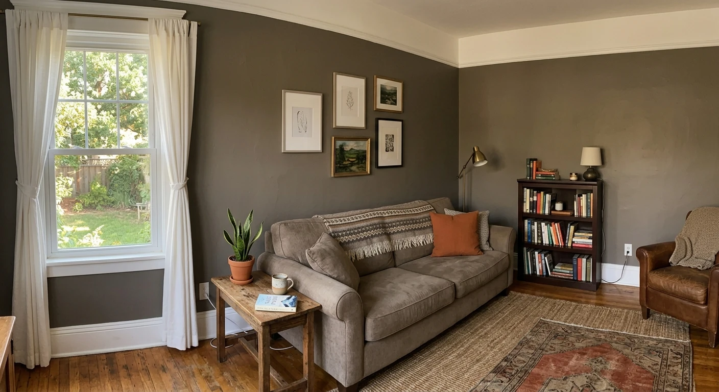
Part of the appeal is that HC-172 works as a true whole-home neutral. Carry it from the entry straight through the main living spaces and the color never fights itself room to room. The rooms where it really earns its keep:
- Open-plan living and dining: the mid LRV gives walls presence without darkening a large space, and it flatters both warm woods and cool grays in the furniture. See more options in our 2026 living room paint colors roundup.
- Main hallways and stairwells: connector spaces that catch borrowed light from several rooms benefit from a neutral that reads consistently. Revere Pewter is a classic hallway choice for this reason.
- Kitchens with white or wood cabinets: as a wall color behind white uppers it adds warmth without competing. On the cabinets themselves it reads as a soft greige door; for the full cabinet conversation see our kitchen cabinet colors guide.
- Bedrooms with good daylight: calming and warm in a south or east room. In a dim north bedroom, size up to lighter Edgecomb Gray.
Where to think twice: windowless powder rooms, basements, and north-facing rooms that stay dim, because low light is precisely where the green steps forward and the warmth that makes HC-172 special falls away.
Free AI paint visualizer. Upload your room photo to see Revere Pewter under your own light before buying a sample.
Trim, ceiling, and decor pairings
A greige lives or dies by what you put next to it. Pair Revere Pewter with the wrong white and it can look muddy; pair it well and the warmth sings.
- Best trim white: Benjamin Moore White Dove (OC-17, LRV 85). Its soft warm cream is the classic partner; it gives crisp contrast without going stark. We break the white down in our White Dove OC-17 review.
- Crisper alternative trim: Chantilly Lace (OC-65) for a cleaner, brighter edge if you want the walls to read more clearly gray. Avoid a cool blue-white, which makes the greige look muddy by comparison.
- Ceiling: White Dove or the trim white at 50 percent strength keeps the warmth flowing overhead. A stark builder white can make HC-172 look heavier than it is.
- Wood floors: warm white oak, honey, or walnut bounce warm light back onto the walls and reinforce the taupe. Cool gray-washed floors pull HC-172 toward its green-gray side.
- Metals and decor: oil-rubbed bronze, aged brass, and warm leather flatter it; chrome and cool nickel are fine but lean it cooler. Natural fibers (jute, linen, rattan) amplify the cozy read.
For the wider logic of building a neutral scheme, our interior paint color families guide explains how warm and cool neutrals stack within one home.
Revere Pewter vs other popular greiges and grays
Shoppers almost never look at Revere Pewter alone. It gets cross-shopped against the most-painted Sherwin-Williams neutrals, so here is how it stacks up:
- vs SW Agreeable Gray (SW 7029, LRV 60): Agreeable Gray is lighter and more neutral-balanced, the safer "no surprises" greige; Revere Pewter is deeper and warmer with more taupe character. Compare in our Agreeable Gray undertone guide, or go straight to our Agreeable Gray vs Revere Pewter side-by-side verdict.
- vs SW Repose Gray (SW 7015, LRV 58): Repose is a cool-leaning greige with a subtle purple-gray base; Revere Pewter is distinctly warmer. If your room runs warm, Revere wins; if it runs cool, Repose may suit better. See our Repose Gray guide.
- vs SW Accessible Beige (SW 7036, LRV 58): Accessible Beige is the beige-forward cousin with more warmth and less gray. Choose it for cozy over contemporary, and Revere for the gray backbone. Details in our Accessible Beige guide, and see the two matched up in our Revere Pewter vs Accessible Beige duel.
- vs BM Edgecomb Gray (HC-173, LRV 63): the in-house lighter sibling. Pick Edgecomb for small or dim rooms where HC-172 feels too dark, and Revere when you want depth.
For the full menu of this year's most-painted interiors across brands, our best interior paint colors of 2026 roundup puts Revere Pewter in context, and the Benjamin Moore interior colors hub covers the rest of the BM lineup.
How to test Revere Pewter before you commit
Whatever you do, do not judge a mid-LRV greige off a fan-deck chip. A small chip reads lighter and warmer than a whole rolled wall, and it cannot show you the green shift at all. Here is a test that actually works:
- Paint a large swatch, at least 2 feet by 2 feet, on two different walls (one near the window, one across the room), ideally on a poster board you can move around.
- Look at it three times: morning around 9 a.m., mid-afternoon around 2 p.m., and after dark under your normal light bulbs. The green, if it is going to appear, shows up in the flattest light.
- Hold a true white card (or your chosen trim white) against the swatch to read the undertone honestly; the eye calibrates to whatever surrounds it.
The fastest no-paint option is digital: upload a photo of your actual room into our free interior visualizer and apply Revere Pewter (plus a lighter or warmer backup) before you buy anything. It will not replace a physical swatch for a final decision, but it eliminates the obviously wrong picks in minutes against your real furniture and floors.
Upload your room and preview HC-172, Edgecomb Gray, and White Dove trim side by side, free.
Frequently asked questions
Is Benjamin Moore Revere Pewter warm or cool?
Revere Pewter (HC-172) is a warm greige. Its dominant undertone is a soft taupe, which is why it reads creamy and cozy in good light. It carries a low-level green undertone underneath that can surface only in cool, flat, or low light, but the color itself is never a cool gray. In a sun-filled south or west room it reads its warmest; in a dim north room it reads its coolest.
What is the LRV of Revere Pewter HC-172?
Revere Pewter has a Light Reflectance Value of 55.51 on the Benjamin Moore technical data sheet. That is squarely mid-range, neither a light nor a dark neutral. The mid LRV is what lets it shift between "warm gray" and "light taupe" depending on the room, and why light direction affects it more than it affects a near-white or a deep charcoal.
Why does Revere Pewter sometimes look green?
HC-172 is mixed from a warm gray, which leaves a faint green pigment in its base. In bright warm light the taupe dominates and you never see it. In cool north light, dim rooms, or under certain LED bulbs, the warm wavelengths are muted and that residual green can step forward. Testing a large swatch in the actual room and lighting, especially after dark, tells you whether your space will trigger it.
What trim color goes with Revere Pewter?
Benjamin Moore White Dove (OC-17, LRV 85) is the classic partner: a soft warm cream that gives crisp contrast without looking stark, and it shares Revere Pewter's warm temperature so nothing clashes. For a cleaner, brighter edge, Chantilly Lace (OC-65) works too. Avoid a cool blue-white trim, which makes the greige walls look muddy by comparison.
See HC-172 and a warmer backup on your actual walls before buying a single sample pot.
Disclaimer: Benjamin Moore and HC-172 Revere Pewter are trademarks of Benjamin Moore & Co. Sherwin-Williams and Behr are trademarks of their respective owners. FacadeColorizer is an independent paint visualization service and is not affiliated with, endorsed by, or sponsored by Benjamin Moore, Sherwin-Williams, or Behr. Color reproduction on screens approximates the manufacturer's chip; always confirm with a physical manufacturer sample before purchase. Sources: Benjamin Moore HC-172 Revere Pewter technical data sheet 2026, Benjamin Moore OC-17 White Dove technical data sheet 2026, Benjamin Moore Color Lab undertone references, The Spruce paint color guidance.
Trademarks mentioned (Sherwin-Williams, Benjamin Moore, Behr, Caparol, Brillux, Sto, Alpina, Valspar, PPG, Glidden, Dulux, Crown Trade, Sandtex, Farrow & Ball, Johnstone's, Leyland) are property of their respective owners. FacadeColorizer is independent and not affiliated with any of them. Nominative fair use under Lanham Act §1125.