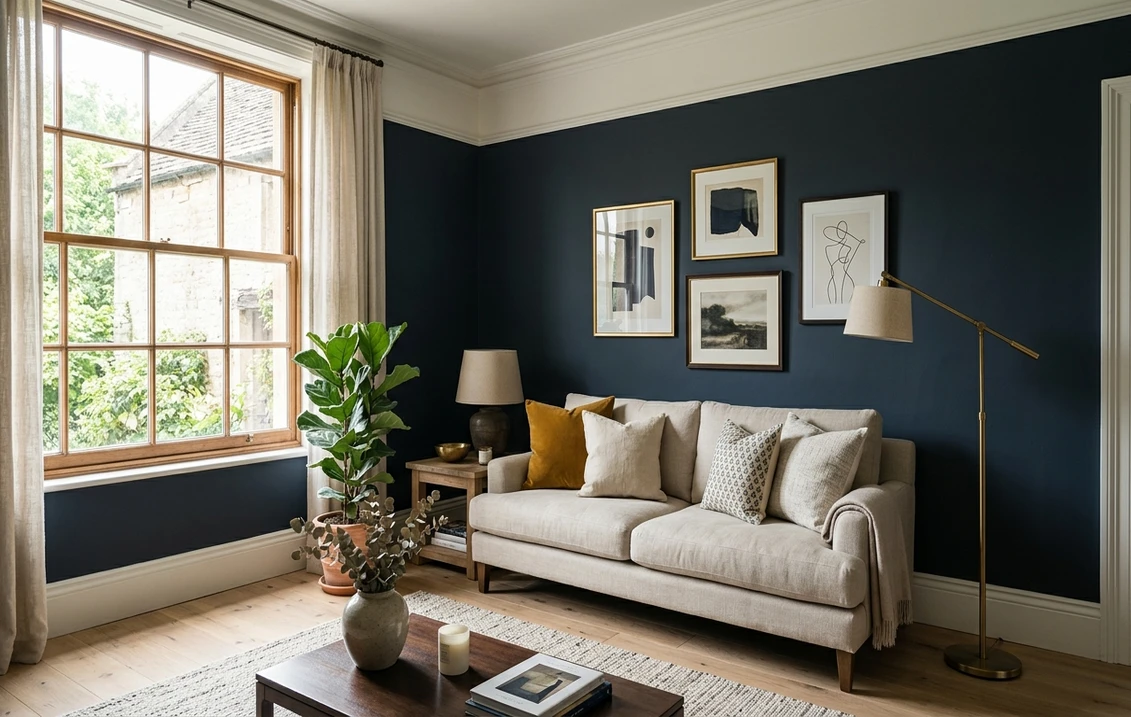
Just 6 percent of the light that lands on a wall of Benjamin Moore Hale Navy HC-154 bounces back to your eye; the rest is swallowed whole. That single figure, the color's Light Reflectance Value, is why this is the navy decorators reach for when a room needs to feel grounded without going black. The reason is its temperature. Hale Navy is not a pure spectral blue; it is a navy slightly grayed and softened, which is exactly why it behaves like a deep neutral indoors rather than a loud accent.
With a Light Reflectance Value of 6, this is a genuinely dark color, and dark colors are unforgiving when you guess. This profile covers HC-154 strictly indoors: its real undertones, the rooms it was made for, how much light it needs before navy turns to flat blue-black, and the trim and metals that make it sing. For the same chip on siding and brick, our Hale Navy HC-154 exterior guide owns the facade side. A wall under a roof and a wall under open sky reflect light very differently, so we keep indoor and outdoor advice separate on purpose.
Upload one photo of your room and preview HC-154 under your actual light in 30 seconds, free.
Hale Navy HC-154 at a glance
Hale Navy belongs to Benjamin Moore's Historical Color (HC) Collection, the same heritage line as Revere Pewter and Edgecomb Gray, and is the brand's best-known navy. The data that matters:
- BM code: HC-154, Historical Color Collection.
- LRV (Light Reflectance Value): 6 on the Benjamin Moore technical data sheet. For scale, anything under roughly 10 reads as deep and dramatic; Hale Navy is dark, but not the near-zero of true black.
- Color family: deep traditional navy with a warm gray undertone, which keeps it from going bright or cold.
- HEX approximation: #475866, a navy with visible gray rather than a saturated royal blue.
- Closest relatives: Newburyport Blue (HC-155), a touch brighter and cleaner, and Sherwin-Williams Naval (SW 6244), the most cross-shopped rival, a bit more purple.
That low LRV is the headline. Hale Navy reads as a rich, full-bodied navy in a bright room and slides toward blue-black in a dim one. Unlike a mid-tone greige, which shifts undertone, a dark navy mostly shifts depth: the less light it gets, the more it eats the room. Plan the lighting first, the color second.
The undertones, read honestly
Most navies fail in one of two directions. Push the blue and they turn juvenile, the color of a kid's bedroom or a sports logo; gray them too far and they go cold and corporate. Hale Navy threads the needle because it carries a soft warm gray in its base, and that is what lets it act as a navy "neutral" you can build a whole scheme around.
In strong daylight the blue is unmistakable and reads as a classic, slightly weathered navy. As light drops, the gray takes over, so by evening under warm bulbs Hale Navy can look almost charcoal. It rarely throws a purple or green flash the way some navies do, part of why it is so trusted. The physics is the same one we walked through in the White Dove OC-17 review, just amplified. Light keeps adding or subtracting wavelengths all day, and with so little reflected light to dilute the shift, a color this dark wears every change on its sleeve.
How room light changes HC-154
With a near-white you worry about which undertone surfaces; with a navy this deep you mostly worry about how much of the room it swallows. How it behaves by exposure in the Northern Hemisphere:
| Room exposure | Light character | How Hale Navy reads |
|---|---|---|
| South-facing | Bright, warm, sun much of the day | Rich, lively navy; the blue stays clearly visible |
| West-facing | Cool morning, warm golden evening | Navy by day, deepening to soft charcoal at sunset |
| East-facing | Crisp morning light, flatter afternoon | True navy early, quieter and grayer past noon |
| North-facing | Cool, indirect, no direct sun | Deepest, moodiest read; can verge on blue-black |
Try it on your house
No photo? Try a sample
Sources: Benjamin Moore HC-154 technical data sheet 2026; Benjamin Moore Color Lab references; The Spruce paint color guidance.
The rule of thumb: in a bright south or west room, Hale Navy on four walls feels enveloping and luxe. In a north-facing or low-window room, four walls can feel like a cave, so either lean into the drama (a library, a powder room) or use it as an accent. Artificial light matters too: warm 2700K bulbs lean it charcoal, cooler 3500K-4000K bulbs keep the blue alive after dark.
Best rooms for Hale Navy indoors
Most dark colors are one-room wonders. Hale Navy is not. That warm gray keeps it sophisticated instead of heavy, so it earns a spot in more rooms than you would expect:
- Home offices and studies: the classic application. A navy room reads as focused and quiet, and Hale Navy photographs beautifully behind bookshelves and brass picture lights.
- Powder rooms: the best low-risk way to use a dark navy. A small windowless bathroom is the one place "cave-like" becomes a feature: jewel-box and dramatic with a brass mirror and warm sconces.
- Dining rooms: navy flatters candlelight and warm metals, and a dining room is used mostly in the evening, when Hale Navy's deep charcoal read is most welcome.
- Accent walls and built-ins: a single navy wall behind a bed, or navy cabinetry and an island, gives depth without committing a whole bright living room. Our interior paint color families guide explains how to balance one deep tone against your neutrals.
- Bedrooms with good daylight: enveloping and restful in a south or east room; in a dim bedroom keep it to the headboard wall.
Where to pause: a north-facing main living room used all day in winter, or any room you want to feel airy. There, a soft greige does the heavy lifting better; see our Revere Pewter HC-172 review for the lighter alternative, and save Hale Navy for the moody room.
Free AI paint visualizer. See Hale Navy on your own walls before you commit to a dark color.
Trim, ceiling, metals, and decor
A dark navy stands or falls on its contrast: get the trim white and metals right and Hale Navy looks tailored, get them wrong and it looks dated.
- Best trim white: a soft warm white, not a cold stark one. Benjamin Moore White Dove (OC-17, LRV 85) is the go-to; its creamy warmth echoes Hale Navy's warm gray base and the contrast reads crisp without feeling clinical, as covered in the White Dove OC-17 review. Avoid a blue-white, which makes the navy look cold.
- Ceiling: in a powder room or study, the same Hale Navy overhead makes a small space feel like a deliberate jewel box. In a larger room, keep the ceiling in the trim white to lift the eye.
- Metals: warm metals are the magic ingredient. Aged or unlacquered brass and antique gold flatter Hale Navy most; oil-rubbed bronze works, while chrome and polished nickel read cooler and modern.
- Wood and decor: warm white oak, walnut, and natural leather make navy feel rich. Caramel, mustard, rust, and terracotta pop against it, while crisp white and linen keep it from going dark.
Hale Navy vs other popular navies
Hale Navy is constantly cross-shopped against a handful of rivals:
- vs Sherwin-Williams Naval (SW 6244, LRV 4): Naval is a hair darker and more blue-purple; Hale Navy is grayer and more traditional. Choose Naval to read clearly blue, Hale Navy for a deep navy that behaves like a neutral. The brand gap runs deeper than one color, as our Sherwin-Williams vs Benjamin Moore interior comparison covers. For the grayer Sherwin-Williams contender, see how Hale Navy stacks up against SW Cyberspace in a head-to-head.
- vs BM Newburyport Blue (HC-155): the in-house sibling, slightly brighter and cleaner. Pick Newburyport for a livelier navy, Hale Navy for the grounded look. Our Hale Navy versus Newburyport Blue face-off puts the two side by side, and if the sibling wins you over the Newburyport Blue HC-155 profile walks through its undertones and rooms.
- vs a true black: Hale Navy gives almost all the drama of a black room with a fraction of the heaviness, and in a small room it stays inviting where black feels airless.
Our best interior paint colors of 2026 roundup puts Hale Navy in context, and the Benjamin Moore interior colors hub covers the rest of the BM lineup.
Finish, coverage, and the cost reality of a dark color
Dark colors carry practical quirks a near-white never does. On walls, eggshell or matte hides flaws and keeps a navy velvety, while higher gloss reflects every imperfection, so reserve satin and semi-gloss for trim, doors, and cabinetry. Coverage is the other catch: a deep base like Hale Navy needs a tinted gray primer plus two coats for an even wall, and that extra coat is where dark rooms go over budget. Labor and prep, not the paint, is the bigger line item; our interior house painting cost guide breaks down what a repaint runs.
How to test Hale Navy before you commit
A fan-deck chip is the worst way to judge a dark navy: it looks lighter and bluer than a rolled wall and cannot show how much the color will deepen the room. Test it properly:
- Paint a large swatch, at least 2 feet by 2 feet, on two walls, one near the window and one in the darkest corner.
- Check it across the day: bright morning, mid-afternoon, and after dark under your normal bulbs. A dark navy changes more between noon and night than almost any other color.
- Test it against your trim white and metals, not bare drywall, because the trim contrast and brass-versus-chrome warmth change the read.
The fastest no-paint first pass is digital: drop a photo of your room into our free interior visualizer and apply Hale Navy, then try it as a single accent wall versus the full room. It will not replace a physical swatch for the final call, but in minutes it tells you whether your room has the light to carry navy at all.
Upload your room and preview HC-154 full-room and as a single wall, with White Dove trim, free.
Frequently asked questions
What is the LRV of Hale Navy HC-154?
Hale Navy has a Light Reflectance Value of 6 on the Benjamin Moore technical data sheet, a genuinely dark color, deep enough to read as a dramatic navy but not the near-zero of a true black. Because it reflects so little light, it deepens noticeably in a dim or north-facing room and reads richer in a bright south or west room, so the light a space gets matters more than for any mid-tone color.
Is Hale Navy too dark for a small room?
Often the opposite is true: small rooms are where it shines. Think powder room, study, or an evening dining room, where all that depth becomes a jewel-box asset instead of a problem. The risk is a small room you want bright and airy, or a low-light room used all day. There, use Hale Navy on a single accent wall or on cabinetry instead of all four walls, and keep trim and ceiling in a warm white.
What trim and metals go with Hale Navy?
Reach for a soft warm white. Benjamin Moore White Dove (OC-17, LRV 85) is the classic call here. Its creamy warmth answers Hale Navy's warm gray base, so the contrast lands crisp without tipping cold. For metals, warm tones flatter it most: aged or unlacquered brass and antique gold are ideal, oil-rubbed bronze a close second. Chrome and polished nickel work but read more modern. Avoid a blue-white trim.
Hale Navy vs SW Naval, which should I pick?
You cannot go wrong with either one. The split comes down to mood. Push toward saturated navy and Sherwin-Williams Naval (SW 6244, LRV 4) wins, a touch darker with that blue-purple lean. Hale Navy (HC-154, LRV 6) is grayer and more traditional, behaving like a deep neutral you can build a whole scheme around. Choose Naval for a bolder blue statement and Hale Navy for a grounded, classic navy that plays well with warm woods and brass.
See HC-154 and a warm white trim on your actual walls before buying a single sample pot.
Disclaimer: Benjamin Moore and HC-154 Hale Navy are trademarks of Benjamin Moore & Co.; Sherwin-Williams and Behr are trademarks of their respective owners. FacadeColorizer is an independent paint visualization service, not affiliated with, endorsed by, or sponsored by Benjamin Moore, Sherwin-Williams, or Behr. Color reproduction on screens approximates the manufacturer's chip; always confirm with a physical sample before purchase. Sources: Benjamin Moore HC-154 Hale Navy and OC-17 White Dove technical data sheets 2026, Benjamin Moore Color Lab references, and The Spruce paint color guidance.
Trademarks mentioned (Sherwin-Williams, Benjamin Moore, Behr, Caparol, Brillux, Sto, Alpina, Valspar, PPG, Glidden, Dulux, Crown Trade, Sandtex, Farrow & Ball, Johnstone's, Leyland) are property of their respective owners. FacadeColorizer is independent and not affiliated with any of them. Nominative fair use under Lanham Act §1125.