Try it on your house

The verdict in three lines. Hale Navy HC-154 (RGB 67, 75, 86, LRV 6) is the grayer, near-black navy: a deep neutral that pairs effortlessly with warm woods, brass, and cream.
Newburyport Blue HC-155 (RGB 70, 85, 102) sits one chip lighter and keeps a cleaner, truer blue, because its blue channel steps further ahead of the red.
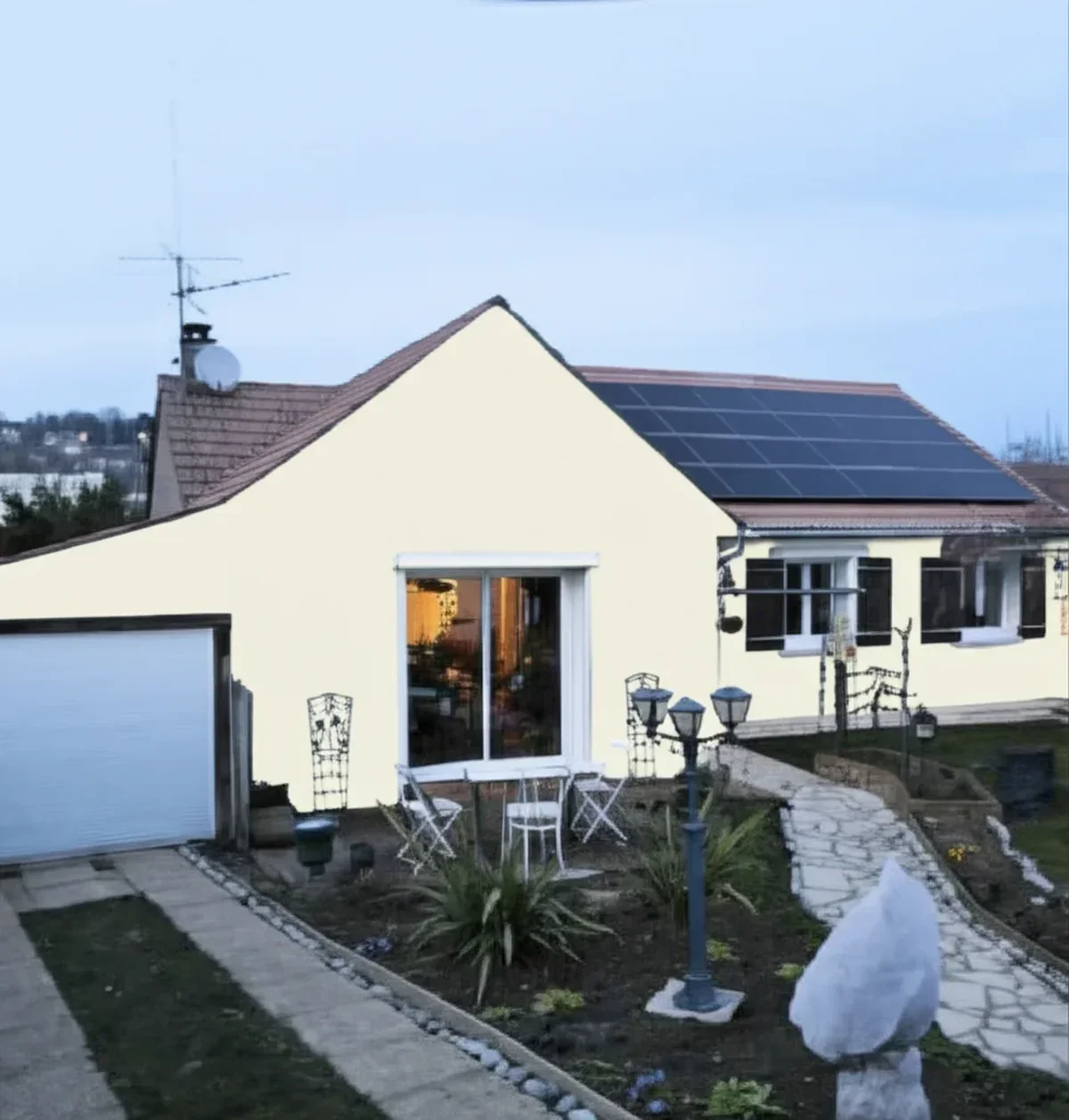
Depth is nearly a tie. Blue-versus-gray character decides this duel, so the only honest tiebreaker is seeing both on a photo of your own room.
Benjamin Moore Hale Navy (HC-154) and Newburyport Blue (HC-155) are next-door neighbors on the Historical Color strip, both deep, sophisticated navies that turn up on the same short lists. On a chip they look like the same color twice; on a full wall they do not, and that gap is what trips people up. This head-to-head puts their real RGB and behavior side by side and tells you when each one wins. For the method behind any two-color decision, start with our side-by-side method for comparing paint colors.
The numbers side by side
| Attribute | Hale Navy HC-154 | Newburyport Blue HC-155 |
|---|---|---|
| Family | Grayed, near-black navy | Cleaner, true-blue navy |
| LRV | 6 (Benjamin Moore data sheet) | Very low, deep-navy range; a touch higher than Hale Navy |
| Hex | #434B56 | #465566 |
| RGB | 67, 75, 86 | 70, 85, 102 |
| Undertone | Warm gray base; grays down toward blue-black in dim light | Blue channel clearly ahead of red; stays recognizably blue |
| Loves | Oak and walnut, brass, cream trim, warm woods | Crisp white trim, cool metals, rooms that want visible blue |
| Watch out for | Can read almost black in a low-light room | Still a very dark navy; needs decent light to stay blue |
| Overall vibe | Grounded, traditional, behaves like a deep neutral | A touch fresher and more clearly blue |
Try it on your house
No photo? Try a sample
Hale Navy's LRV 6 is the published Benjamin Moore figure; we do not quote an exact LRV for Newburyport with confidence, so it stays qualitative. Hex and RGB are approximate, not a substitute for a physical chip.
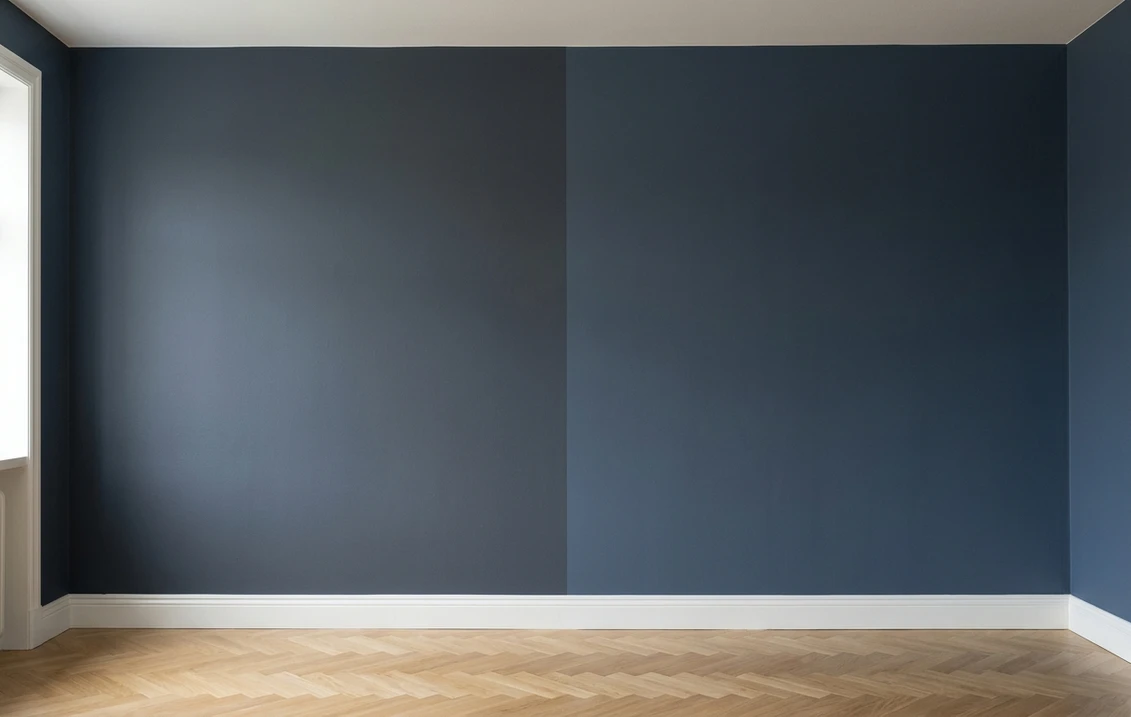
Read that table once and the duel is clear. Depth is close to a tie: both are genuinely dark navies, and nobody will call one of them "the light one." Everything else is undertone. Hale Navy carries a warm gray base and grays toward blue-black as the light drops; Newburyport keeps its blue channel a step above the red, so it stays recognizably blue where Hale Navy turns almost neutral. Held against white paper, Hale Navy reads grayer and heavier, Newburyport lighter and more openly blue.
Upload a photo, get a photorealistic render, then swap to Newburyport in one click. Free, no signup.
Room by room, exposure by exposure
Because both colors are so deep, the deciding factor is usually how much light a room gets and the mood you want.
| Situation | Usual winner | Why |
|---|---|---|
| North-facing or low-light room | Newburyport Blue | Its extra blue and lightness keep it from flattening to near-black; Hale Navy can read blue-black |
| Small evening room (study, dining, powder) | Either, both shine | Deep navies turn small lamp-lit rooms into jewel boxes; decide on undertone |
| Cabinetry or a single accent wall | Hale Navy | Its grayed, neutral behavior anchors millwork without shouting blue |
| Room with warm woods and brass | Hale Navy | The warm gray base joins the warm family instead of fighting it |
| Room with white trim and cool metals | Newburyport Blue | A truer blue sits cleanly next to bright white and chrome or black |
| Exterior body or accent | Either, sample outside | Daylight shifts both; Hale Navy has a dedicated exterior guide linked below |
Outdoors the same logic applies under harsher light. For siding, shutters, or a front door, the Hale Navy exterior guide covers orientation and trim pairings, and our roundup of colors that pair with navy blue works for either shade.
When to choose Hale Navy
- You want the grayer, near-black navy. It behaves like a deep neutral rather than a bright color, which is why it anchors so many whole-room schemes without feeling loud.
- Your fixed finishes are warm. Oak or walnut, cream trim, aged brass, warm stone: Hale Navy's warm gray base joins that family instead of fighting it.
- You want quiet drama in a well-lit room. Bright, it reads rich and full-bodied; dim, it slides to blue-black, which can be exactly the mood you want.
- You are building around one anchor navy. Its grayed, traditional behavior makes it the easier of the two to layer on.
For its full undertone breakdown, best rooms, and metals, see the dedicated Hale Navy HC-154 profile. If your cross-shop is Sherwin-Williams, the Hale Navy vs Naval duel settles that one.
When to choose Newburyport Blue
- You want the blue to stay visible. Newburyport keeps a cleaner, truer blue instead of graying toward black, so the wall still reads as color.
- The room is a little short on light. Its extra lightness and blue clarity help it dodge the flat near-black that catches the deepest navies in dim rooms.
- Your finishes are cool. Bright white trim, chrome or matte-black hardware, marble or quartz all sit cleanly on a truer blue.
- Hale Navy felt too gray or too close to black. Newburyport is the one shade over that fixes that while keeping the same deep-navy weight.
The full room-by-room treatment and the trim that suits it live in the Newburyport Blue HC-155 profile. Both also sit inside the wider Benjamin Moore interior paint colors guide, which ranks them against the deck.
Same wall, both navies, your actual light. Free render in about 30 seconds.
Frequently asked questions
What is the real difference between Hale Navy and Newburyport Blue?
They are neighbors on Benjamin Moore's Historical Color strip (HC-154 and HC-155) and both are deep navies, so the difference is subtle. Hale Navy HC-154 (RGB 67, 75, 86, LRV 6) is the grayer, more muted navy that grays toward near-black in low light. Newburyport Blue HC-155 (RGB 70, 85, 102) sits a shade lighter and keeps a cleaner, truer blue. Depth is nearly a tie; the blue-versus-gray character is what separates them.
Is Newburyport Blue lighter than Hale Navy?
Yes, slightly. Newburyport's RGB (70, 85, 102) is higher across all three channels than Hale Navy's (67, 75, 86), so it reflects a little more light and reads marginally lighter and bluer on a wall. The gap is small: on a 2-inch chip most people cannot separate them, but on a full wall in daylight Newburyport holds its blue while Hale Navy leans grayer and darker.
Which navy is better for a dark or north-facing room?
Newburyport Blue, usually. Both are very low LRV navies that deepen in dim light, but Newburyport's extra blue and lightness help it stay recognizably blue where Hale Navy can slide toward blue-black. If you want that near-black, grounded look, Hale Navy is the better pick. Either way, add warm lamplight and a soft white trim so the wall does not go flat at night.
Can I use Hale Navy and Newburyport Blue together in the same house?
Not side by side. They are close enough that on connected walls they look like two batches of the same color, not a deliberate contrast. Pick one as your navy; for a second blue nearby, step to a clearly lighter shade. Both pair beautifully with a soft warm white like White Dove for trim.
Settle it on your photo
Chips lie, screens lie, and even honest sample patches sit on someone else's wall in someone else's light. Deep navies are the hardest colors of all to judge from a 2-inch square, because a small chip cannot show how much a full wall darkens a very low LRV paint. The fastest honest answer to Hale Navy vs Newburyport Blue is to test both on a photo of your own room and let your trim, floor, and windows decide.
1 HD render plus 3 free color variations. Start with Hale Navy, swap to Newburyport Blue in one click.
Trademark notice. Benjamin Moore®, Hale Navy®, Newburyport Blue® and White Dove® are trademarks of Benjamin Moore & Co. Naval® is a trademark of The Sherwin-Williams Company. FacadeColorizer is not affiliated with, endorsed by, or sponsored by either company. Brand and color names are used for descriptive and editorial purposes only, consistent with nominative fair use.
Trademarks mentioned (Sherwin-Williams, Benjamin Moore, Behr, Caparol, Brillux, Sto, Alpina, Valspar, PPG, Glidden, Dulux, Crown Trade, Sandtex, Farrow & Ball, Johnstone's, Leyland) are property of their respective owners. FacadeColorizer is independent and not affiliated with any of them. Nominative fair use under Lanham Act §1125.