Try it on your house

The verdict in three lines. Naval SW 6244 (LRV about 4) is the slightly softer navy: a hair lighter, a touch grayer, and the Sherwin-Williams best-seller that is hard to get wrong.
In the Navy SW 9178 sits a step deeper, with a very low LRV and more saturation: a cleaner, moodier navy that still reads as blue where Naval goes near-black.
If the room is dim or you want the safe pick, choose Naval. Good light and a taste for maximum depth point to In the Navy. The only real tiebreaker is seeing both on a photo of your own wall.
Sherwin-Williams Naval (SW 6244) and In the Navy (SW 9178) are the two deep navies shoppers most often put head to head inside the same brand. Both are saturated, near-black blues that anchor a study, a powder room, or a navy-and-white kitchen. On a paint chip they look like twins, and even on a wall the difference is quiet. But it is real, and it decides which one belongs in your room. This head-to-head puts the numbers side by side, walks it room by room, and says when each color wins. For the method behind any two-color decision, start with our side-by-side method for comparing paint colors.
The numbers side by side
| Attribute | Naval SW 6244 | In the Navy SW 9178 |
|---|---|---|
| LRV | About 4 (published) | Very low, a step below Naval |
| Approximate hex | #2F3D4C | #283849 |
| Approximate RGB | 47, 61, 76 | 40, 56, 73 |
| Undertone | Slightly muted navy with a faint gray softness; clean, no purple | Cleaner and more saturated; a more pure, deliberate blue that also stays out of purple |
| Behavior at night | Deep, inky near-black; the blue returns in direct light | Even deeper; needs good light to keep reading as navy rather than black |
| Character | Familiar, a hair softer, forgiving | Richer, moodier, higher drama |
| Typical trim partner | Clean bright white such as Pure White or Extra White | Same crisp white; the deeper base makes high contrast matter even more |
Try it on your house
No photo? Try a sample
Naval's LRV is the published Sherwin-Williams figure; In the Navy sits a step lower on the same scale. Hex and RGB are approximate; the authoritative reference is a physical Sherwin-Williams chip.
Read that table once and the shape of the duel is clear. This is not a warm-versus-cool fight: both are clean, cool navies that avoid purple and teal. What separates them is depth and saturation. Naval is a hair lighter, with a faint gray softness that made it the default Sherwin-Williams navy in thousands of homes. In the Navy pushes deeper and more saturated, a richer, more deliberate blue where Naval slides toward near-black. If your shortlist is cross-brand, the Hale Navy vs Naval duel pits Sherwin-Williams' best-seller against Benjamin Moore's benchmark.
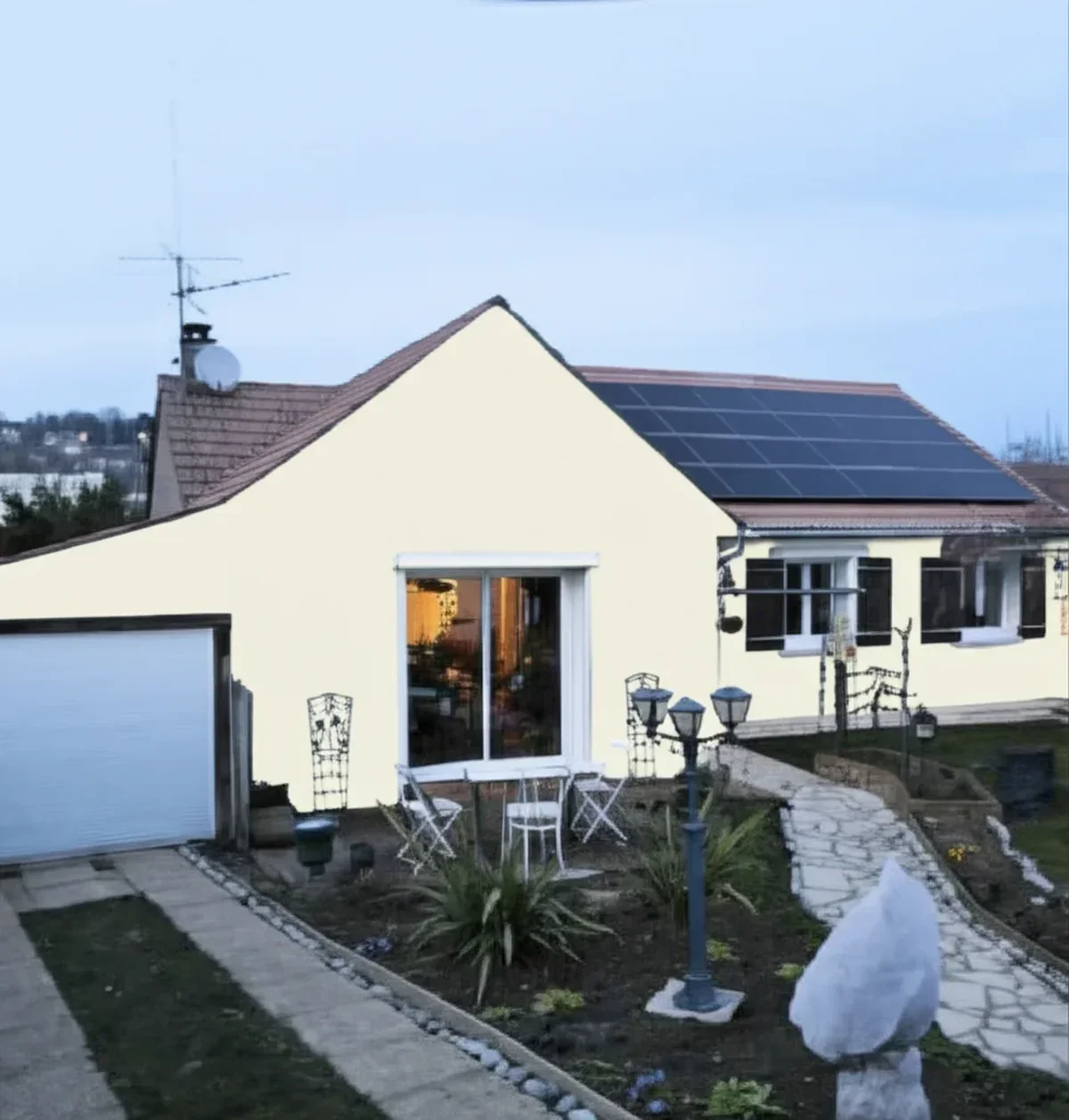
Upload one photo, get a photorealistic render, then swap to In the Navy in one click. Free, no signup.
Room by room, exposure by exposure
Because both navies drink up light and sit so close on the strip, the same room can crown either color depending on its light and finishes. Here is how the duel plays out.
| Situation | Usual winner | Why |
|---|---|---|
| North-facing or low-light room | Naval | A hair lighter and softer; In the Navy can flatten toward murky black without added light |
| Bright south-facing room | In the Navy | Strong sun rewards its saturation; the extra depth reads rich, not heavy |
| Home office, study, or library | In the Navy | Its deeper, moodier body is the signature study navy |
| Small color-drenched powder or dining room | In the Navy | The near-black jewel-box move; maximum depth is the point |
| Large open living-room wall | Naval | The slightly more forgiving navy holds up over big, well-seen areas |
| Cabinets or island under white uppers | Either, pick by light | Both nail the navy-and-white kitchen; brighter kitchens can carry In the Navy's depth |
In the Navy wants light and rewards it with saturated drama, while Naval keeps a safety margin where light is scarce. Both love crisp white trim, warm brass, and natural wood, so finishes rarely break the tie. Light does.
When to choose Naval
- You want the safer, more familiar navy. Naval is the Sherwin-Williams best-seller for a reason: a hair softer, a touch grayer, and hard to make look wrong.
- The room is dim or north-facing. Naval's marginally lighter body keeps it from collapsing into flat black where In the Navy would.
- You are covering big, well-seen walls. A fraction more lightness stops a large navy expanse from reading heavy.
- You want the navy to sit quietly. Behind wood, brass, and warm textiles, Naval grounds a room without being the loudest thing in it.
For its full undertone breakdown, best rooms, and trim pairings, see the dedicated Naval undertones and best rooms profile.
When to choose In the Navy
- You have good light. South or east exposure, or plenty of lamps, lets its saturation show as a rich blue instead of a black slab.
- You want maximum depth and drama. Study, library, moody powder room, jewel-box dining room: In the Navy was built for rooms where depth beats brightness.
- You want a cleaner, more pure navy. If "navy, but make it richer" is the brief, In the Navy is that exact chip.
- Cabinets or an island should read custom. Its deeper body looks built and deliberate under white uppers.
The full room-by-room treatment, its lighting behavior, and companion whites live in the In the Navy room-by-room profile.
Same wall, both navies, your actual light. Free render in about 30 seconds.
Frequently asked questions
What is the difference between Naval and In the Navy?
Both are deep Sherwin-Williams navies from the same cool-navy family, and on a chip they look like twins. Naval SW 6244 (LRV about 4) is the slightly softer, marginally lighter one, a touch more forgiving. In the Navy SW 9178 sits a step deeper and reads cleaner and more saturated. Depth and saturation separate them, not hue: neither drifts toward purple or teal.
Is In the Navy darker than Naval?
Yes, slightly. In the Navy (RGB 40, 56, 73) is a shade deeper and more saturated than Naval (RGB 47, 61, 76), so it reads inkier and closer to black in low light. The gap is small on a chip but clearer on a full wall after dark, where In the Navy leans harder into near-black.
Which is better for a north-facing or dark room, Naval or In the Navy?
Naval, in most homes. Both navies have a very low LRV, but Naval's marginally lighter, slightly grayer body gives it an edge in dim, north-facing rooms where In the Navy can flatten toward murky black. If you love In the Navy for a dark room, plan on good lamplight so its saturation still shows.
Can I use Naval and In the Navy together in the same house?
You can, but not side by side on connected walls: they are close enough that the pair reads like a mismatched batch rather than a deliberate contrast. The cleaner move is one navy as your signature color and the other in a separate, closed-off room.
Settle it on your photo
Chips lie, screens lie, and a navy this deep is the hardest color to judge from a fan deck: its character depends on how much light your room gives back. The fastest honest answer to Naval vs In the Navy is to test both on a photo of your actual room and let your own light, trim, and floor pick the winner. If the shortlist grows, our roundup of the best deep navy interior shades maps the wider field, and the 2026 Sherwin-Williams interior color guide covers the rest of the deck.
1 HD render plus 3 free color variations. Start with Naval, swap to In the Navy in one click.
Trademark notice. Sherwin-Williams®, Naval®, In the Navy® and Salty Dog® are trademarks of The Sherwin-Williams Company. Benjamin Moore® and Hale Navy® are trademarks of Benjamin Moore & Co. FacadeColorizer is not affiliated with, endorsed by, or sponsored by either company. Brand and color names are used for descriptive and editorial purposes only, consistent with nominative fair use. Hex and RGB values are approximate digital renderings; the only authoritative reference is a physical manufacturer color sample.
Trademarks mentioned (Sherwin-Williams, Benjamin Moore, Behr, Caparol, Brillux, Sto, Alpina, Valspar, PPG, Glidden, Dulux, Crown Trade, Sandtex, Farrow & Ball, Johnstone's, Leyland) are property of their respective owners. FacadeColorizer is independent and not affiliated with any of them. Nominative fair use under Lanham Act §1125.