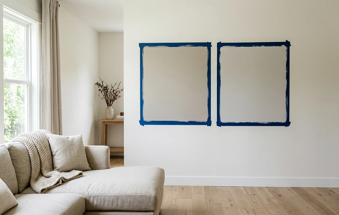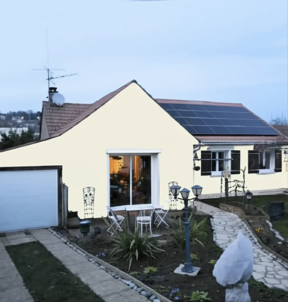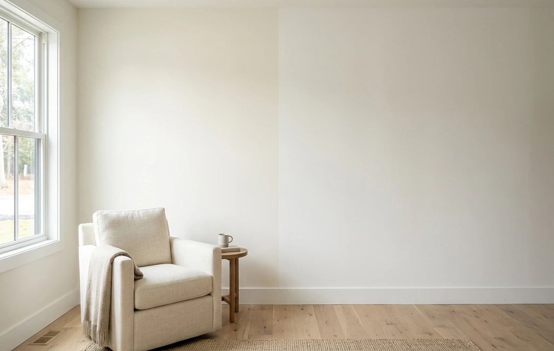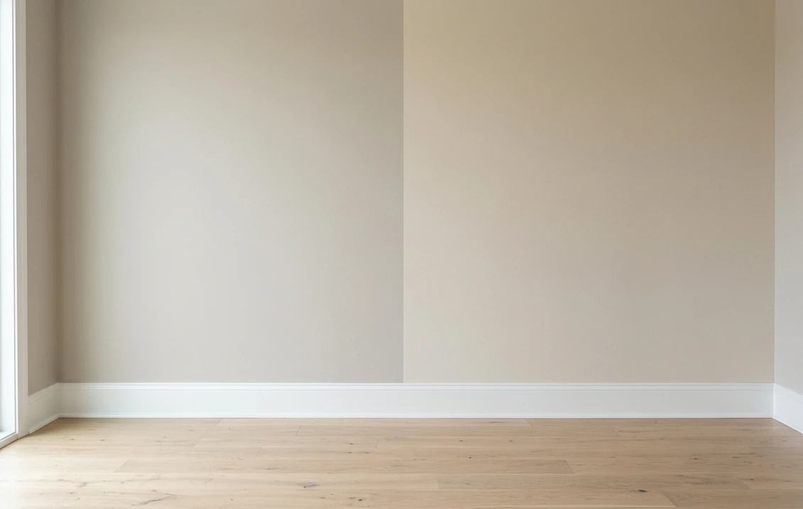
Try it on your house

The verdict in three lines. Agreeable Gray SW 7029 (LRV 60) is the gray-first pick: a greige that reads gray next to anything truly beige and keeps whites crisp.
Accessible Beige SW 7036 (LRV 58) is the beige-first pick: a beige tamed by gray, warmer and cozier, without the yellow flash of older builder beiges.
Depth is a wash at LRV 60 versus 58. This duel is decided by one question: does your home want to lean gray or lean beige? Your own photo answers it fastest.
Sherwin-Williams Agreeable Gray (SW 7029) and Accessible Beige (SW 7036) sit on opposite banks of the same river. Both are light, warm, wildly popular neutrals; both photograph beautifully; both get specified for entire main floors. But one is a gray that borrowed warmth from beige, and the other is a beige that borrowed restraint from gray. On a chip the gap looks tiny. Across four walls it sets the whole temperature of a room. This head-to-head lines up the numbers, walks the duel room by room, and calls a winner for each situation. For the general method behind any two-color decision, start with our side-by-side method for comparing paint colors.
The numbers side by side
| Attribute | Agreeable Gray SW 7029 | Accessible Beige SW 7036 |
|---|---|---|
| Family | Warm greige (gray first) | Grayed beige (beige first) |
| LRV | 60 | 58 |
| Approximate hex | #D1CBC1 | #D1C7B8 |
| Approximate RGB | 209, 203, 193 | 209, 199, 184 |
| Undertone | Gray base with soft beige warmth | Beige-tan base steadied by gray |
| Loves | Crisp white trim, mixed metals, gray sofas, marble | Warm wood, travertine, cream trim, rattan, linen |
| Watch out for | Can drift beige in warm evening light | Can lean tan in strong sun, faintly khaki in dim light |
| Overall vibe | Balanced, transitional, slightly crisper | Cozy, earthy, warmer and more enveloping |
Try it on your house
No photo? Try a sample
LRV values are the published Sherwin-Williams figures. Hex and RGB are approximate digital renderings; the authoritative reference is a physical Sherwin-Williams chip or peel-and-stick sample.
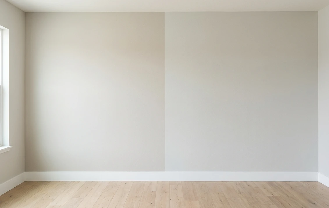
Look at the RGB rows and the story tells itself. Both colors start from the exact same red value, then Accessible Beige drops further on green and blue. Less green and blue means more visible warmth: that is the entire duel in one line of arithmetic. At LRV 60 versus 58 nobody will ever call one of these "the dark one," so depth is off the table. What is on the table is temperature. Put both chips against a plain sheet of white printer paper: Agreeable Gray keeps a composed gray face, Accessible Beige immediately shows tan. That white-paper trick, plus the two-coat sample rule, comes straight from the comparison method in the pillar guide linked above.
Upload one photo, get a photorealistic render, then swap to Accessible Beige in one click. Free, no signup.
Room by room, exposure by exposure
Because the depth gap is negligible, light and fixed finishes decide every round. Here is how the duel typically plays out across the most common situations.
| Situation | Usual winner | Why |
|---|---|---|
| North-facing living room | Accessible Beige | Extra warmth counters flat, cool light; Agreeable Gray can read flatter here |
| Bright south-facing room | Agreeable Gray | Strong sun pushes Accessible Beige toward tan; the grayer base stays composed |
| Open-plan whole-main-floor color | Either, pick by finishes | Both are proven whole-house neutrals; match the undertone to floors and trim |
| Kitchen with bright white cabinets | Agreeable Gray | The grayer base sits cleanly next to bright white and cool stone |
| Bedroom with wood furniture and linen | Accessible Beige | Its tan warmth wraps around wood tones and warm textiles |
| Exterior body color | Either, sample outside | Daylight shifts both; each has a dedicated exterior guide linked below |
Outdoors the same logic applies with harsher light. If the shortlist is for siding rather than walls, the Agreeable Gray exterior guide and the Accessible Beige exterior guide cover orientation, trim pairings, and siding materials for each color in full.
When to choose Agreeable Gray
- Your finishes mix gray and warm elements. A gray sofa on an oak floor, marble counters with brass pulls: Agreeable Gray is the diplomatic middle that flatters both camps.
- You want bright white trim to stay crisp. Against a grayer wall, white trim reads clean and intentional; against a true beige it can look slightly yellowed by comparison.
- You plan cooler accents. Blues, charcoals, and cool greens layer more comfortably on a gray-leaning base than on tan walls.
- You are moving away from a beige-heavy past. If the last owner painted everything golden beige, Agreeable Gray modernizes without swinging to a cold gray.
For its full undertone breakdown, best rooms, and trim pairings, see the dedicated Agreeable Gray undertones and best rooms profile. And if your shortlist is really gray versus gray, the Agreeable Gray vs Repose Gray head-to-head settles the all-greige bracket.
When to choose Accessible Beige
- Your fixed finishes are firmly warm. Honey oak, travertine, tan tile, cream or off-white trim: Accessible Beige joins that family natively instead of standing politely beside it.
- The room gets little direct sun. In north light or shaded rooms, its extra warmth keeps walls from going dull where a greige can flatten out.
- You want beige without the builder-beige flashback. The gray in its base holds back the yellow and orange notes that dated older beiges.
- Your palette is earthy. Terracotta, olive, rattan, camel leather: an earth-toned scheme reads richer on a beige-first wall.
The full room-by-room treatment, including lighting behavior and companion shades, lives in the Accessible Beige room-by-room profile. Torn between Accessible Beige and its deeper strip-mate instead? That bracket has its own referee: the Accessible Beige vs Balanced Beige duel.
Same wall, gray-first and beige-first, your actual light. Free render in about 30 seconds.
Frequently asked questions
What is the difference between Agreeable Gray and Accessible Beige?
Undertone family, not depth. Agreeable Gray SW 7029 (LRV 60) is a greige: a gray base warmed with beige. Accessible Beige SW 7036 (LRV 58) is the mirror image: a beige-tan base steadied with gray. The 2-point LRV gap is barely visible on a wall, but the gray-first versus beige-first character changes the whole temperature of a room.
Is Accessible Beige warmer than Agreeable Gray?
Yes, clearly. Both share a similar depth, but Accessible Beige carries more tan and reads warmer on every wall. Hold the two chips against white paper and Agreeable Gray keeps a gray face while Accessible Beige immediately shows beige. That extra warmth is why it pairs so naturally with wood, travertine, and cream trim.
Which is better for a north-facing room, Agreeable Gray or Accessible Beige?
Accessible Beige, in most homes. North light is cool and flat, and it can leave a greige looking dull or slightly gloomy. Accessible Beige has more warmth in reserve and stays cozy in the same light. If the room's finishes are strongly cool (bright white trim, black metal, marble), Agreeable Gray can still win, but sample both on that specific wall first.
Can I use Agreeable Gray and Accessible Beige together in the same house?
Yes, but zone them. They are close enough in depth that on adjoining walls the pair can read as a mismatched batch rather than a deliberate contrast. A cleaner plan is one color for the connected main areas and the other in a closed-off room, or one of them downstairs and the other on the bedroom level.
Settle it on your photo
Chips lie, screens lie, and the same two neutrals can swap winners from one room of your house to the next. The fastest honest answer to Agreeable Gray vs Accessible Beige is to test both on a photo of your actual room and let your own floor, trim, and windows cast the deciding vote.
1 HD render plus 3 free color variations. Start with Agreeable Gray, swap to Accessible Beige in one click.
Trademark notice. Sherwin-Williams®, Agreeable Gray®, Accessible Beige®, Balanced Beige® and Kilim Beige® are trademarks of The Sherwin-Williams Company. FacadeColorizer is not affiliated with, endorsed by, or sponsored by The Sherwin-Williams Company. Brand and color names are used for descriptive and editorial purposes only, consistent with nominative fair use. Hex and RGB values are approximate digital renderings; the only authoritative reference is a physical Sherwin-Williams color sample.
Trademarks mentioned (Sherwin-Williams, Benjamin Moore, Behr, Caparol, Brillux, Sto, Alpina, Valspar, PPG, Glidden, Dulux, Crown Trade, Sandtex, Farrow & Ball, Johnstone's, Leyland) are property of their respective owners. FacadeColorizer is independent and not affiliated with any of them. Nominative fair use under Lanham Act §1125.