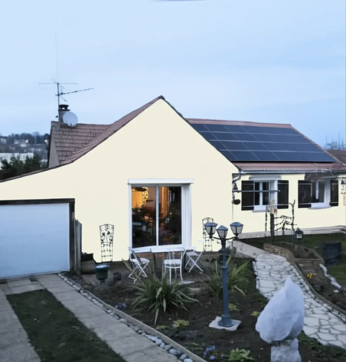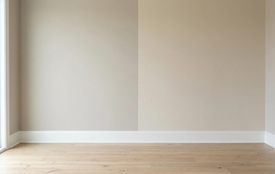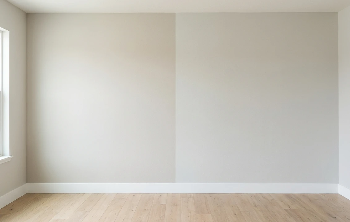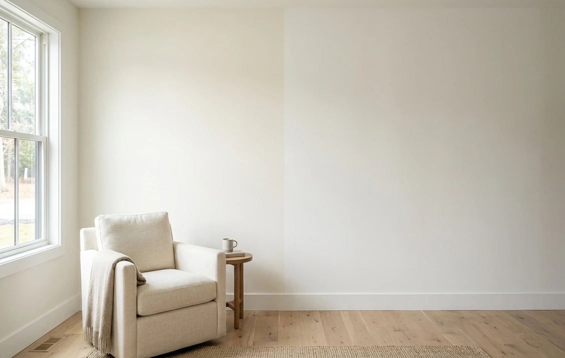
Try it on your house

Every repaint reaches the same moment: two chips taped to the wall, and a week of second-guessing. Agreeable Gray or Repose Gray. Alabaster or White Dove. The two finalists look almost identical in the store, then behave completely differently once a whole wall wears them. Knowing how to compare paint colors properly is the difference between choosing with confidence and repainting in October.
This is the hub for that decision. It gives you the side-by-side method we use for every color duel on this site: which numbers to pull before you buy anything, how to run a fair wall test, and the mistakes that quietly rig the result. Individual matchups (one pair of colors, one verdict) branch off from here as we publish them.
Upload one photo of your room or facade and preview your two finalists side by side in about 30 seconds, free.
Why you cannot settle a duel at the store
Paint chips are engineered to be compared against other paint chips, not against your room. Three things distort the read. First, scale: a 2-inch chip reflects so little area that colors read 25 to 35 percent lighter than the same paint rolled across a wall. Second, surrounding colors: a gray sitting next to a strong blue chip on the rack borrows warmth it does not have, an effect called simultaneous contrast. Third, store lighting: most aisles run cool fluorescent or LED around 4000K, while your living room at 7 pm runs warm bulbs at 2700K plus whatever daylight your windows face.
So the store can shortlist your two finalists, but it cannot pick the winner. That happens on paper first (the numbers below), then on your actual wall.
The four things to compare before buying a single sample
Every US manufacturer publishes technical data for every color. Pull these four data points for both candidates; they settle more duels than any amount of squinting.
| What to compare | Where to find it | What it decides |
|---|---|---|
| LRV (Light Reflectance Value) | Manufacturer color page or technical data sheet | How light or dark each color really is; a 3+ point gap is visible side by side |
| Undertone | Hold each chip against pure white paper | What the color shifts toward at dusk and under your bulbs (blue, green, violet, yellow) |
| Hue family | Color name plus the brand fan deck position | Whether the two are true rivals or actually different colors (a greige is not a gray) |
| Sheen | Your own spec for the room | Perceived depth: the same color reads darker in matte and lighter in eggshell or satin |
Try it on your house
No photo? Try a sample
LRV does the heaviest lifting. It runs from 0 (pure black) to 100 (pure white) and is measured, not marketed, so it is the one spec you can trust across brands. As a rule of thumb from the duels we have run: a gap under 2 points is essentially invisible once the colors are on separate walls; 2 to 4 points reads as "slightly lighter"; beyond 5 points you are comparing two different depths, and the duel is really about undertone. If you are new to undertones and families, the interior color families guide maps that landscape.
One caveat before you apply the four points. They settle a duel between two neutrals, which is what most duels are. Between two saturated colors they fall short, because the variable that decides those is chroma, and no manufacturer publishes a number for it. The orange family shows it most plainly: two shades sitting at the same LRV can land as a designed clay or as a traffic cone. Our roundup of tangerine and terracotta interior colors flags which ones hold up across a whole room and which only survive on a single wall, a judgment the data sheet will never make for you.
The other blind spot is the surface. All four data points assume a flat, opaque wall. On open-grain wood the substrate keeps voting after the paint has dried, because the grain reads as fine shadow and pulls the perceived depth down: the same color can look a half-step darker on oak doors than on the drywall next to them, and the two will never quite match no matter how carefully you compared the chips. Our guide to painted oak cabinets before and after shows how wide that gap gets, and why a deep color has to have the grain filled before any comparison you ran on paper still means anything.
The side-by-side method, step by step
Step 1: Put the numbers on one line. Write both colors down with code, LRV, and stated undertone. If the LRV gap is bigger than about 5 points, decide first whether you want the lighter or the deeper room; that alone often ends the debate.
Step 2: Run the white-paper test. Tape both chips to a sheet of bright white printer paper by a window. Against a true white reference, hidden undertones surface fast: one gray goes faintly violet, the other faintly green. Whichever undertone appears is the one your floors, countertops, and sofa will have to live with.
Step 3: Preview the duel digitally before buying samples. A visualizer will not replace paint, but it kills the obviously wrong candidate in minutes instead of days. Upload a photo of the actual room, apply both finalists, and look at them at full-wall scale with your furniture in frame. In most duels one contender drops out immediately, and you only buy one sample pot instead of four.
Free AI visualizer: preview two rival colors on your own walls before spending on samples.
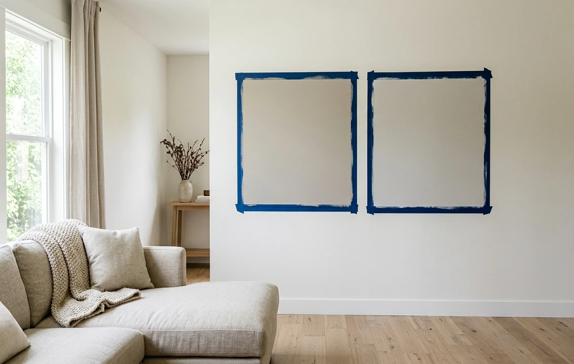
Step 4: Sample both on the same wall. Two coats each, patches at least 12 by 12 inches, side by side on the wall that gets the most daylight, plus a second pair on the darkest wall of the same room. Leave a 2-inch gap of existing wall color between the patches, or frame each patch with painter tape and a white border so the old color does not contaminate the read. Peel-and-stick samples work as well as painted squares and move from wall to wall.
Step 5: Judge at three times of day, then sleep on it. Morning daylight, mid-afternoon, and after dark under your normal bulbs. Undertones swap ranking as light warms: a gray that wins at noon can lose at 8 pm. The classic advice from color consultants holds: the color you stop noticing is usually the right one; the color that keeps catching your eye is usually the one with the undertone problem.
A worked example: Agreeable Gray vs Repose Gray
The most cross-shopped pair in the Sherwin-Williams deck shows the method in action. On paper: Agreeable Gray (SW 7029) has an LRV of 60 with a warm greige base, while Repose Gray (SW 7015) sits at LRV 58 and leans cooler, with a faint violet-taupe cast. The 2-point LRV gap is background noise; this duel is pure undertone.
So the white-paper test decides it: next to white, Agreeable Gray shows beige warmth and Repose Gray shows its cool gray-violet side. From there the room picks the winner. Warm wood floors, cream trim, brass hardware, or a north-facing exposure argue for Agreeable Gray, which holds its warmth in cool light. Cooler marble, black metal, crisp white trim, or a bright south-facing room let Repose Gray look sophisticated instead of chilly. Same method, different winners in different houses, which is exactly the point. For the same framework applied to the taupe-greige heavyweights, see the Revere Pewter vs Edgecomb Gray duel.
Cross-brand duels: compare colors, then compare paints
When the two finalists come from different brands, run the color duel exactly the same way; LRV is measured on the same scale everywhere. A classic example is Sherwin-Williams Alabaster against Benjamin Moore White Dove (OC-17): both are soft warm whites, but Alabaster (LRV 82) carries a touch more cream while White Dove (LRV 85) reads a hair brighter and grayer in shade, a difference that only shows at full-wall scale or in a tricky exposure like the one covered in the Alabaster north-facing guide.
The harder version of the same exercise is the duel where the LRVs land on top of each other and the depth test returns nothing. Sherwin-Williams Sea Salt (LRV 63) and Benjamin Moore Quiet Moments (about 61) are two points apart, close enough that no amount of squinting at the numbers will separate them; the decision falls entirely to the lean, coastal green-blue against spa blue-gray. Our Sea Salt vs Quiet Moments comparison runs that one room by room, and it is the template for any pair whose LRVs effectively tie.
Two extra layers matter across brands. The paint itself differs (coverage, self-leveling, price per gallon), which our Sherwin-Williams vs Benjamin Moore comparison breaks down. And if you love a color but want to buy it in the other brand, that is a matching problem rather than a duel: the paint color matching guide covers finding the closest equivalent and checking it honestly. For an exterior-flavored example of a full cross-brand duel, see Behr Cracked Pepper vs SW Iron Ore.
Five mistakes that rig the comparison
- Sampling on different walls. Each wall has its own light. Two colors on two walls is two experiments, not one comparison.
- Painting one coat. Most mid-tones need two coats to reach their real depth; one coat reads lighter and patchier and flatters the wrong color.
- Judging against the old wall color. A dated beige surround makes any gray look blue. Frame the patches with white borders.
- Ignoring sheen. Comparing a matte sample of one color to an eggshell sample of the other adds a fake half-shade of difference.
- Deciding in one sitting. A color that wins at noon can lose at night. No verdict before you have seen both patches in morning, afternoon, and evening light.
Frequently asked questions
What LRV difference between two paint colors is actually noticeable?
Side by side on the same wall, a gap of about 3 points is where most people start seeing a clear lighter-darker difference. Under 2 points the two colors are effectively the same depth and the duel is decided by undertone alone. Beyond 5 points you are choosing between two different levels of brightness, so decide how light you want the room before debating undertones.
How do I compare two paint colors on the same wall?
Paint two coats of each in patches at least 12 by 12 inches, side by side on the brightest wall, with a gap or a white tape border between them so the old wall color does not distort the read. Repeat the pair on the darkest wall of the room, then judge in the morning, mid-afternoon, and at night under your normal bulbs before picking a winner.
Can I compare paint colors online before buying samples?
Yes. An AI visualizer lets you upload a photo of your actual room or facade and preview both candidate colors at full-wall scale with your real floors, trim, and furniture in frame. It will not replace a physical sample for the final call, but it reliably eliminates the weaker candidate first, so you buy one sample pot instead of several.
Why do two colors that looked different in the store look identical at home?
Store aisles run cool, bright lighting around 4000K that exaggerates small differences between chips, and neighboring chips on the rack shift how each color reads. At home, warmer bulbs and larger painted areas compress those differences. That is why the store is only good for shortlisting: the real comparison happens on your wall, at your light levels, at full scale.
Upload your photo, preview both finalists on your real walls, and walk into the paint store already decided.
Disclaimer: Sherwin-Williams, Benjamin Moore, and Behr, along with the specific color names and codes referenced here (SW 7029 Agreeable Gray, SW 7015 Repose Gray, SW 7008 Alabaster, SW 7069 Iron Ore, SW 7036 Accessible Beige, BM OC-17 White Dove, BM HC-172 Revere Pewter, Behr Cracked Pepper), are trademarks of their respective owners. FacadeColorizer is an independent paint visualization service and is not affiliated with, endorsed by, or sponsored by any paint manufacturer. Screen previews approximate manufacturer chips; always confirm with a physical sample before purchase. LRV figures are drawn from the respective manufacturer technical data sheets (2026).
Trademarks mentioned (Sherwin-Williams, Benjamin Moore, Behr, Caparol, Brillux, Sto, Alpina, Valspar, PPG, Glidden, Dulux, Crown Trade, Sandtex, Farrow & Ball, Johnstone's, Leyland) are property of their respective owners. FacadeColorizer is independent and not affiliated with any of them. Nominative fair use under Lanham Act §1125.