Try it on your house

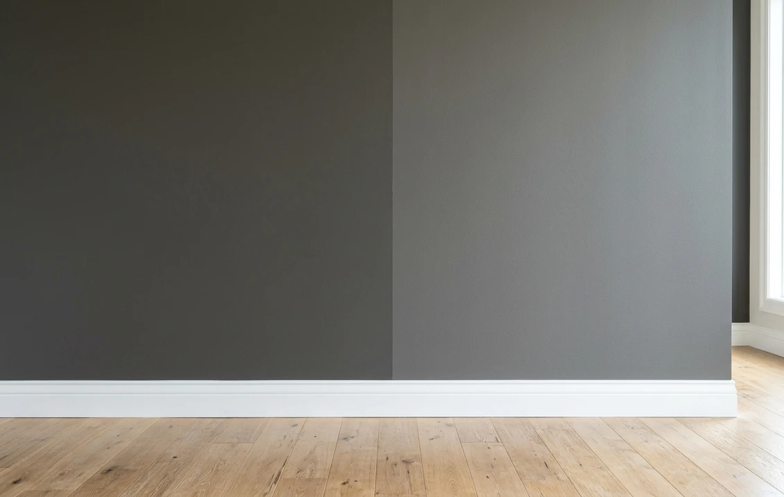
The verdict in three lines. Iron Ore SW 7069 (LRV 6) is the near-black: from across the room it reads black, with a soft, faintly warm edge that keeps it from feeling harsh.
Peppercorn SW 7674 (LRV 10) is the charcoal: a clear step lighter, near-neutral with a faint cool lean, and it never fully lets go of its gray identity.
Unlike most duels, depth decides this one before undertone does. Want "black without the black"? Iron Ore. Want a dark gray that stays visibly gray? Peppercorn. The tiebreaker is seeing both on a photo of your own room.
Sherwin-Williams Iron Ore (SW 7069) and Peppercorn (SW 7674) are the two dark grays Sherwin-Williams shoppers shortlist most often for accent walls, doors, islands, and moody dens. On a chip they look close; on a full wall one is effectively a black and the other is emphatically a charcoal. This head-to-head puts the numbers side by side, walks the duel room by room, and tells you exactly when each color wins. For the general method behind any two-color decision, start with our side-by-side method for comparing paint colors.
The numbers side by side
| Attribute | Iron Ore SW 7069 | Peppercorn SW 7674 |
|---|---|---|
| Family | Soft near-black | Dark charcoal gray |
| LRV | 6 | 10 |
| Approximate hex | #434341 | #585858 |
| Approximate RGB | 67, 67, 65 | 88, 88, 88 |
| Undertone | Faintly warm; the blue channel dips just under red and green | Dead-even channels; near-neutral with a faint cool read in cool light |
| Loves | Warm woods, cream whites, brass, board-and-batten | Crisp white trim, black metal, marble, cooler palettes |
| Watch out for | In dim rooms it goes flat black; sheen changes it more than hue | Can turn flinty, almost slate, under north light or cool LEDs |
| Overall vibe | Dramatic, grounded, modern farmhouse to mountain modern | Moody but clearly gray, a softer commitment than black |
Try it on your house
No photo? Try a sample
LRV values are the published Sherwin-Williams figures. Hex and RGB are approximate digital renderings; the authoritative reference is a physical Sherwin-Williams chip or peel-and-stick sample.
In most color duels the LRV row is a footnote and the undertone row is the story. Here it is the reverse. Four points may not sound like much, but at the dark end of the scale Peppercorn reflects roughly two thirds more light than Iron Ore, and your eye registers that gap instantly: Iron Ore passes for black, Peppercorn never quite does. Undertone matters at the margins. Iron Ore's slightly suppressed blue channel gives it a soft, warm cast in strong daylight, while Peppercorn's even mix stays neutral and can flash cool under flat light. Hold both chips against white printer paper and the depth gap shows first, the temperature gap second.
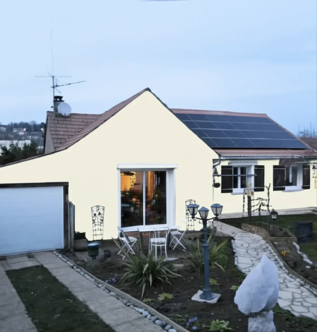
Upload one photo, get a photorealistic render, then swap to Peppercorn in one click. Free, no signup.
Room by room, exposure by exposure
Because these two are separated by real depth, the winner usually depends on how much darkness the room can absorb and how much light it gets. Here is how the duel typically plays out.
| Situation | Usual winner | Why |
|---|---|---|
| All four walls of a bedroom or den | Peppercorn | LRV 10 keeps a hint of dimension in the corners; Iron Ore can swallow the whole room |
| Front door and interior doors | Iron Ore | Reads as a classic black door without the hardness of a true black |
| North-facing accent wall | Peppercorn | Keeps some gray identity in flat light, where Iron Ore collapses to plain black |
| Bright south-facing living room | Iron Ore | Strong sun reveals its soft warm edge and it stays anchored instead of washing out |
| Kitchen island or cabinets | Either, pick by finishes | Warm woods and brass favor Iron Ore; marble, chrome, and cool whites favor Peppercorn |
| Exterior body color | Iron Ore | A proven near-black exterior; the Iron Ore exterior guide covers siding, trim, and orientation |
When to choose Iron Ore
- You want the black look without true black. Iron Ore delivers the silhouette of a black door, island, or accent wall while staying a hair softer and warmer than a dead-flat black like Tricorn Black.
- Your palette is warm. Oak and walnut, cream whites, leather, and brass all sit comfortably next to Iron Ore's faintly warm base.
- The surface is architectural, not enveloping. Doors, window sashes, islands, fireplace surrounds, and board-and-batten walls show off a near-black without darkening the whole room.
- The project continues outside. Iron Ore is one of the most used dark exterior colors in the US, so one can carries from the powder room to the siding.
For its full undertone breakdown, sheen behavior, and trim pairings, see the dedicated Iron Ore undertones and best rooms profile. The four-point LRV gap doing the work here is worth remembering, because it is the same distance that separates the two most popular navies: Benjamin Moore Hale Navy against Sherwin-Williams Naval, LRV about 8 against about 4, where four points decide which one still reads as blue in a dim room.
When to choose Peppercorn
- You want dark walls you can live inside. At LRV 10, Peppercorn wraps a bedroom, office, or den in charcoal while leaving enough reflected light for shadows and texture to read.
- Your fixed finishes are cool. Bright white trim, black window frames, marble, and chrome look intentional against its dead-neutral base.
- You want a gray that stays gray. Even in the darkest corner, Peppercorn reads charcoal rather than black, which keeps a moody room from feeling like a cave.
- You are deciding between charcoals, not blacks. If your shortlist is drifting lighter, the Peppercorn profile's section comparing it with SW Charcoal Gray sorts out that neighboring family in detail.
The full room-by-room treatment, including its lighting behavior and that charcoal family comparison, lives in the Peppercorn room-by-room profile. And if your real dilemma is between two near-blacks rather than a near-black and a charcoal, the Iron Ore vs Wrought Iron duel settles the soft-black question. If the dark is destined for cabinets or a front door and you would rather have that weight with some color in it, the sage version of the same decision is our Dried Thyme vs Clary Sage duel: same architectural placements, one deep enough to anchor a door, one light enough for open walls.
Same wall, both darks, your actual light. Free render in about 30 seconds.
Frequently asked questions
Is Iron Ore darker than Peppercorn?
Yes, clearly. Iron Ore SW 7069 has a published LRV of 6 while Peppercorn SW 7674 sits at 10. At the dark end of the scale that four-point gap is easy to see on a wall: Iron Ore reads as a soft black, while Peppercorn reads as a deep charcoal gray that never fully passes for black.
What is the difference between SW Iron Ore and Peppercorn?
Depth first, temperature second. Iron Ore is a near-black with a faintly warm cast, best where you want the look of black with a softer edge: doors, islands, exteriors. Peppercorn is a lighter, near-neutral charcoal with a faint cool lean, best where you want dark gray walls that keep their dimension.
Which is better for a dark accent wall, Iron Ore or Peppercorn?
In a bright room, either works: pick Iron Ore for maximum drama and Peppercorn for a softer charcoal statement. In a dim or north-facing room, Peppercorn is usually the safer call because it keeps some gray identity where Iron Ore collapses into plain black. Sample both on that specific wall before committing.
Can I use Iron Ore and Peppercorn together in the same house?
Yes, and it works better than pairing two colors of equal depth. The four-point LRV gap is enough to read as a deliberate step: Peppercorn on the walls of a den with Iron Ore on the built-ins or doors gives a layered, tonal scheme. Just keep each color to its own plane so the pairing looks planned.
Settle it on your photo
Dark colors are the hardest to judge from a chip: a two-inch square of near-black says almost nothing about how a whole wall will absorb your room's light. The fastest honest answer is to test both on a photo of your actual room and let your own trim, floor, and windows pick the winner. If the duel widens into a full shortlist, the 2026 Sherwin-Williams interior color guide maps the rest of the deck.
1 HD render plus 3 free color variations. Start with Iron Ore, swap to Peppercorn in one click.
Trademark notice. Sherwin-Williams®, Iron Ore®, Peppercorn® and Tricorn Black® are trademarks of The Sherwin-Williams Company. Benjamin Moore® and Wrought Iron® are trademarks of Benjamin Moore & Co. FacadeColorizer is not affiliated with, endorsed by, or sponsored by either company. Brand and color names are used for descriptive and editorial purposes only, consistent with nominative fair use. Hex and RGB values are approximate digital renderings; the only authoritative reference is a physical color sample.
Trademarks mentioned (Sherwin-Williams, Benjamin Moore, Behr, Caparol, Brillux, Sto, Alpina, Valspar, PPG, Glidden, Dulux, Crown Trade, Sandtex, Farrow & Ball, Johnstone's, Leyland) are property of their respective owners. FacadeColorizer is independent and not affiliated with any of them. Nominative fair use under Lanham Act §1125.