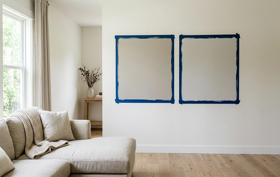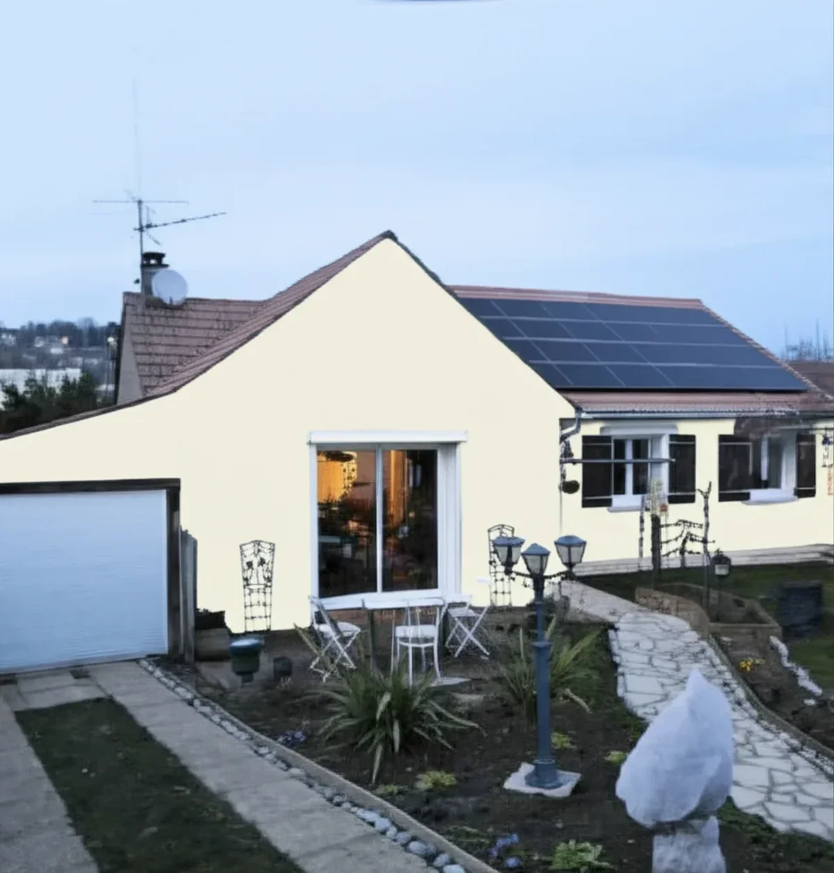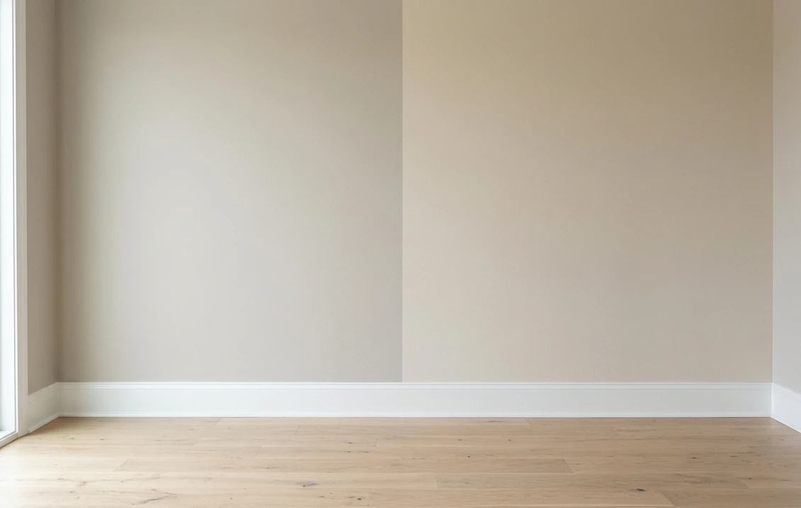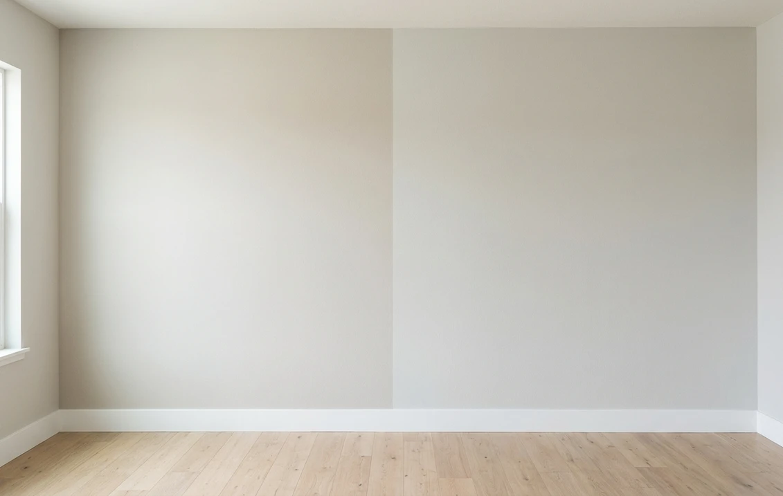
Try it on your house

The verdict in three lines. White Dove OC-17 (LRV 85.38) is the muted soft white: a drop of gray calms it down, so it never reads yellow and flatters modern and transitional palettes.
Cloud White OC-130 sits at essentially the same light level but leans a touch creamier, with a whisper of pink-cream warmth that suits traditional homes and warm wood.
On paper they are nearly twins. On a full wall the character gap is real, so the only honest tiebreaker is seeing both on a photo of your own room.
Benjamin Moore White Dove (OC-17) and Cloud White (OC-130) are two of the most specified soft whites in the Benjamin Moore Off-White collection, and they get cross-shopped constantly because both hover right around LRV 85 and look interchangeable on a chip. This head-to-head lines up the numbers, walks the duel room by room and exposure by exposure, and tells you exactly when each white wins. For the general method behind any two-color decision, start with our side-by-side method for comparing paint colors.
The numbers side by side
| Attribute | White Dove OC-17 | Cloud White OC-130 |
|---|---|---|
| Family | Muted soft white | Creamy soft white |
| LRV | 85.38 | About 85, effectively the same depth |
| Approximate hex | #F0EFE6 | #F3F2E7 |
| Approximate RGB | 240, 239, 230 | 243, 242, 231 |
| Undertone | Warm base softened by a drop of gray | Creamier, can flash a faint pink-cream cast in warm light |
| Loves | Muted greiges, soft blues, black accents, cabinets and trim | Warm wood, antique brass, heritage palettes, traditional millwork |
| Watch out for | Can read slightly flat or gray in dim north light | Strong sun and warm bulbs can push it visibly creamy |
| Overall vibe | Calm, current, hard to get wrong | Softer, warmer, classic |
Try it on your house
No photo? Try a sample
White Dove's LRV is the published Benjamin Moore figure; Cloud White is listed at essentially the same level. Hex and RGB are approximate digital renderings; the authoritative reference is a physical Benjamin Moore chip or peel-and-stick sample.
Read that table once and the shape of the duel is clear. Depth is a dead tie: both whites bounce back roughly 85 percent of visible light, so neither will ever be "the darker one" in your house. Everything happens in the undertone row. White Dove carries a small dose of gray that mutes its warmth. Cloud White skips that gray filter: it is a hair brighter and noticeably creamier, and in warm evening light some eyes catch a faint pink-cream blush. Hold each chip against plain white printer paper and the split shows up in seconds. That white-paper trick, plus the two-coat sample rule, comes straight from the comparison method in the pillar guide linked above.
Upload one photo, get a photorealistic render, then swap to Cloud White in one click. Free, no signup.
Room by room, exposure by exposure
Because the depth gap is zero, the same room can crown either white depending on its light and its fixed finishes. Here is how the duel typically plays out.
| Situation | Usual winner | Why |
|---|---|---|
| North-facing living room | Cloud White | Its extra cream counteracts cool, flat light; White Dove's gray drop can read slightly dingy there |
| Bright south-facing room | White Dove | The gray keeps it composed in full sun, which amplifies Cloud White's cream |
| Walls, trim, and ceiling in one color | White Dove | The classic whole-envelope white: muted enough to avoid glare on large surfaces |
| Traditional home with warm wood and antiques | Cloud White | The creamier base joins heritage palettes instead of cooling them down |
| Kitchen cabinets and built-ins | White Dove | A long-running cabinet favorite whose muted base sits well next to most counters and walls |
| Exterior body or trim | Either, sample outside | Daylight shifts both; each has a dedicated exterior guide linked below |
Outdoors the same logic applies with harsher light. If your shortlist is for the outside of the house rather than the walls, the White Dove exterior guide and the Cloud White exterior guide cover orientation, trim pairings, and siding materials for each color in full.
When to choose White Dove
- You want one white for walls, trim, and ceiling. White Dove is the go-to whole-envelope white: soft enough to live on every surface without glare, warm enough to never feel clinical.
- The room gets strong direct sun. Its drop of gray absorbs the excess warmth of south and west light, where a creamier white starts to look visibly yellow by afternoon.
- Your palette is muted or modern. Soft greiges, dusty blues, matte black hardware: White Dove's slightly grayed base sits beside them without fighting.
- You are painting cabinets or built-ins. It is one of the most specified cabinet whites in the Benjamin Moore deck, and it bridges wall and counter colors gracefully.
For its full undertone breakdown, best rooms, and trim pairings, see the dedicated White Dove undertones and best rooms profile.
When to choose Cloud White
- The room faces north or feels cold. Cloud White's creamier base pushes back against flat, cool light, where White Dove can drift toward a faint gray.
- The house is traditional. Warm oak or cherry, antique brass, wainscoting, heritage wall colors: Cloud White reads native in that company. The heritage wall color in question is often one of the two Historical Collection navies, and our Hale Navy vs Newburyport Blue duel settles which one, since Hale Navy's gray base and Newburyport's truer blue do not ask for the same white.
- White Dove felt "a little gray" on your sample board. That reaction is common, and Cloud White is the closest step warmer without jumping to an obvious cream.
- You like a white that glows at night. Under warm evening bulbs Cloud White turns gently golden and cozy instead of dimming out.
The full room-by-room treatment, including its lighting behavior and companion shades, lives in the Cloud White room-by-room review.
A duel decided on undertone alone, with the depths effectively tied, repeats one step down the Benjamin Moore neutral ladder: Edgecomb Gray HC-173 and Balboa Mist OC-27 sit four LRV points apart at 63 and 67, close enough that the warm beige of one and the faint gray-violet of the other do all the deciding. It matters here because the two duels resolve together. Cloud White's cream reads at home against Edgecomb Gray's warm base, which is the side of that table marked for cream trim, while Balboa Mist is the one built for a crisper white. Our Edgecomb Gray versus Balboa Mist comparison has the room-by-room version.
Same wall, both whites, your actual light. Free render in about 30 seconds.
Frequently asked questions
What is the real difference between White Dove and Cloud White?
Undertone, not depth. Both sit right around LRV 85, so they are equally light on the wall. White Dove OC-17 is calmed by a small dose of gray, which keeps it muted and modern. Cloud White OC-130 skips that gray filter and reads a touch brighter and creamier, sometimes with a faint pink-cream cast in warm light.
Is Cloud White warmer than White Dove?
Slightly, yes. Hold both chips against white printer paper and Cloud White shows a cleaner cream warmth while White Dove looks softer and faintly grayed. The gap is small but it compounds on a full wall: Cloud White glows warmer at night, White Dove stays more neutral around the clock.
Which is better for trim and cabinets, White Dove or Cloud White?
White Dove for most modern and transitional palettes: it is one of the most specified trim and cabinet whites in the Benjamin Moore deck and pairs cleanly with muted wall colors. Choose Cloud White for trim when the walls carry warm heritage colors or the millwork sits against warm wood, where its creamier base looks intentional.
Can I use White Dove and Cloud White together in the same room?
Avoid putting them on adjoining surfaces. They are so close in depth that the pairing reads like a batch mismatch rather than a deliberate contrast. A cleaner plan is to pick one white and vary the sheen: matte or eggshell on walls, satin or semi-gloss on trim, which creates subtle definition without an undertone clash.
Settle it on your photo
Chips lie, screens lie, and two whites separated by a whisper of gray are the hardest case of all. The fastest honest answer to White Dove vs Cloud White is to test both on a photo of your actual room and let your own floors, trim, and windows pick the winner. If the shortlist is still growing, the SW Alabaster vs BM White Dove duel settles the cross-brand question, and the Swiss Coffee vs Alabaster cream-white match-up covers the next warmth step down.
1 HD render plus 3 free color variations. Start with White Dove, swap to Cloud White in one click.
Trademark notice. Benjamin Moore®, White Dove®, Cloud White, Simply White® and Chantilly Lace are trademarks of Benjamin Moore & Co. FacadeColorizer is not affiliated with, endorsed by, or sponsored by Benjamin Moore & Co. Brand and color names are used for descriptive and editorial purposes only, consistent with nominative fair use. Hex and RGB values are approximate digital renderings; the only authoritative reference is a physical Benjamin Moore color sample.
Trademarks mentioned (Sherwin-Williams, Benjamin Moore, Behr, Caparol, Brillux, Sto, Alpina, Valspar, PPG, Glidden, Dulux, Crown Trade, Sandtex, Farrow & Ball, Johnstone's, Leyland) are property of their respective owners. FacadeColorizer is independent and not affiliated with any of them. Nominative fair use under Lanham Act §1125.