Try it on your house

The verdict in three lines. Kendall Charcoal HC-166 (LRV about 12) is the true charcoal: a deep, sober gray with a soft green-brown lean that turns walls, cabinets, and doors into a statement.
Chelsea Gray HC-168 (LRV about 22) is the livable middleweight: a warm medium-dark gray from the same family that keeps a room readable even without strong sun.
Undertone is not the battleground here; the two are close cousins. Depth decides this duel, so your room's light is the judge.
Benjamin Moore Kendall Charcoal (HC-166) and Chelsea Gray (HC-168) sit two doors apart in the Historic Colors deck, and homeowners hunting for a dark, sophisticated gray cross-shop them constantly. This is the rare gray duel where undertone is not the deciding factor: both live on the warm side of gray with a similar green-brown character. What separates them is a roughly 10-point gulf in Light Reflectance Value, and that gap changes which rooms each one can carry. This head-to-head puts the numbers side by side and tells you exactly when each color wins. For the general method behind any two-color decision, start with our side-by-side method for comparing paint colors.
The numbers side by side
| Attribute | Kendall Charcoal HC-166 | Chelsea Gray HC-168 |
|---|---|---|
| Family | True charcoal | Warm medium-dark gray, greige-leaning |
| LRV | About 12 | About 22 |
| Approximate hex | #676662 | #86847C |
| Approximate RGB | 103, 102, 98 | 134, 132, 124 |
| Undertone | Green-brown lean; the more sober, slightly cooler of the two | Green-taupe with a quiet brown bias; reads warmer next to Kendall |
| Loves | Crisp white trim, walnut, brass, leather | Oak floors, cream or white trim, black hardware |
| Watch out for | Slides toward black in dim north light | Can wash a step lighter and show its green side in strong sun |
| Overall vibe | Dramatic, grounded, deliberate | Balanced, versatile, resale-safe |
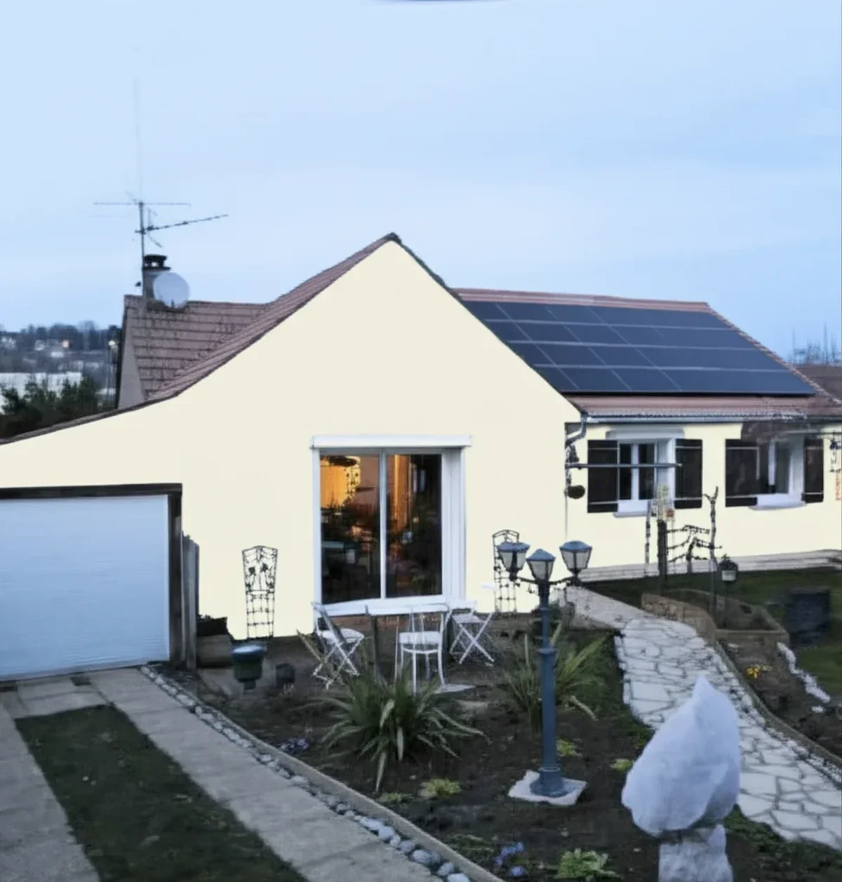
Try it on your house
No photo? Try a sample
LRV figures are rounded from Benjamin Moore's published values. Hex and RGB are approximate digital renderings; the authoritative reference is a physical Benjamin Moore chip or peel-and-stick sample.
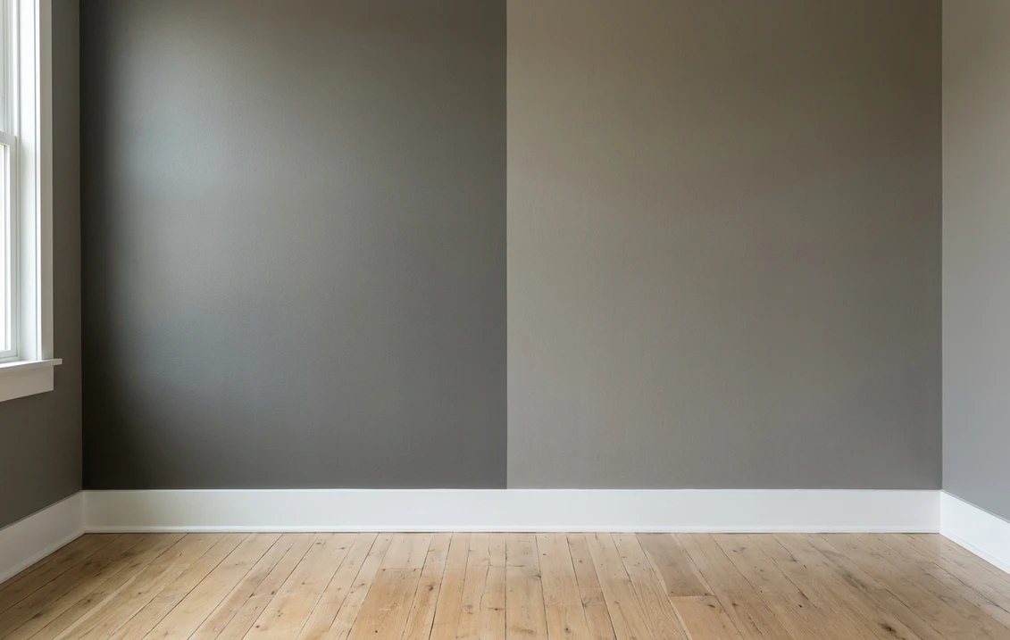
Read that table once and you can see this duel is the mirror image of most gray matchups. Usually two cross-shopped grays sit at nearly the same depth and the undertone row settles it. Here the undertone rows nearly rhyme; the LRV row is where everything happens. At about 12 versus about 22, Kendall Charcoal absorbs far more light than Chelsea Gray, and no styling changes that physics. So the practical test is a depth test: two-coat samples on the same wall, checked at noon and again after dark with the lamps on. The color that still looks right at 9 pm wins, exactly the routine from the pillar guide above.
Upload one photo, then swap between both grays in one click. Free, no signup.
Room by room, exposure by exposure
Because the depth gap is large, the same room rarely flatters both. Here is how the duel typically plays out.
| Situation | Usual winner | Why |
|---|---|---|
| Dim or north-facing living room | Chelsea Gray | Stays a readable warm gray in flat light; Kendall slides toward black |
| Bright south-facing room | Kendall Charcoal | Generous sun keeps its depth rich instead of heavy; Chelsea can wash a step lighter |
| Small bedroom or hallway | Chelsea Gray | Delivers the dark-gray mood without visually shrinking the space |
| Accent wall or media room | Kendall Charcoal | The extra depth is the whole point; it anchors screens, art, and headboards |
| Kitchen island or lower cabinets | Either, pick by contrast | Chelsea steps softly off white counters; Kendall makes a near-black statement |
| Front door and shutters | Kendall Charcoal | Reads richer than plain black at curb distance and pairs with white or mid-gray siding |
If the shortlist keeps sliding darker, the SW Iron Ore vs BM Wrought Iron soft-black duel compares the step below Kendall Charcoal. If it slides lighter instead, the Coventry Gray vs Stonington Gray matchup runs the same exercise for Benjamin Moore's lighter grays.
When to choose Kendall Charcoal
- You want a statement, not a backdrop. Kendall Charcoal is a destination color: an accent wall, a paneled den, a fireplace wall. It draws the eye on purpose.
- The room has real daylight, or moodiness is the brief. Bright rooms keep it charcoal; in a dim media room or study, leaning into the darkness is the whole effect.
- You are painting joinery. Islands, built-ins, front doors, and shutters carry deep color better than big wall planes, and Kendall reads as quality on cabinetry.
- Your palette leans warm. Brass, walnut, leather, and aged bronze all sit comfortably against its green-brown base, with crisp white trim for contrast.
For its full light-by-light behavior, trim pairings, and the rooms where it shines, see the dedicated Kendall Charcoal undertones and best rooms profile.
When to choose Chelsea Gray
- You want dark-ish walls in a small, dim, or north-facing room. At an LRV around 22, Chelsea Gray keeps enough light in play to stay clearly gray instead of collapsing to black.
- You are coloring a whole room, not one wall. Four walls of Chelsea feel enveloping but livable; four walls of Kendall demand a big, bright space to pull that off.
- You need the resale-safe middle ground. Chelsea sits between light greige and true charcoal, which is why it anchors so many repaint lists.
- You plan lighter layering. White trim, oak floors, and linen textiles read fresh against Chelsea; against Kendall the same pairing turns high-contrast and formal.
The full room-by-room treatment, including its lighting behavior and companion shades, lives in the Chelsea Gray HC-168 room-by-room review.
Same wall, both grays, your actual light. Free render in about 30 seconds.
Frequently asked questions
What is the real difference between Kendall Charcoal and Chelsea Gray?
Depth, not undertone. Both are warm-leaning Benjamin Moore grays with a similar green-brown character, but Kendall Charcoal HC-166 has an LRV of about 12 while Chelsea Gray HC-168 sits near 22. On a wall that gap is dramatic: Kendall reads as a true charcoal, while Chelsea reads as a medium-dark gray that keeps a room readable.
Is Kendall Charcoal too dark for a whole room?
It depends on the light. In a bright, generous space, whole-room Kendall Charcoal looks intentional and luxurious. In a small or north-facing room it can slide toward black and swallow the corners, which is why most homeowners use it there as an accent wall, cabinet, or door color and give the remaining walls to a lighter neutral such as Chelsea Gray.
Do Kendall Charcoal and Chelsea Gray share the same undertones?
They are close cousins. Both sit on the warm side of gray with a green-brown lean. Side by side, Chelsea Gray reads a touch warmer and more greige, while Kendall Charcoal reads more sober and slightly cooler. Neither one flashes blue the way many popular charcoals do.
Can I use Kendall Charcoal and Chelsea Gray together?
Yes, and it is one of the safer two-color pairings in the Benjamin Moore deck. Because the undertones are related and the depth gap is real (about 10 LRV points), the contrast looks deliberate rather than mismatched. A classic split is Chelsea Gray walls with a Kendall Charcoal island, built-in, or front door.
Settle it on your photo
Chips lie, and dark chips lie hardest: a two-inch charcoal swatch says nothing about whether a full wall will feel cocooning or crushing. The fastest honest answer to Kendall Charcoal vs Chelsea Gray is to render both on a photo of your actual room and let your own windows, trim, and floor pick the winner.
1 HD render plus 3 free color variations. Start with Kendall Charcoal, swap to Chelsea Gray in one click.
Trademark notice. Benjamin Moore®, Kendall Charcoal, Chelsea Gray, and Amherst Gray are trademarks or color names of Benjamin Moore & Co. FacadeColorizer is not affiliated with, endorsed by, or sponsored by Benjamin Moore & Co. Brand and color names are used for descriptive and editorial purposes only, consistent with nominative fair use. The only authoritative color reference is a physical Benjamin Moore sample.
Trademarks mentioned (Sherwin-Williams, Benjamin Moore, Behr, Caparol, Brillux, Sto, Alpina, Valspar, PPG, Glidden, Dulux, Crown Trade, Sandtex, Farrow & Ball, Johnstone's, Leyland) are property of their respective owners. FacadeColorizer is independent and not affiliated with any of them. Nominative fair use under Lanham Act §1125.