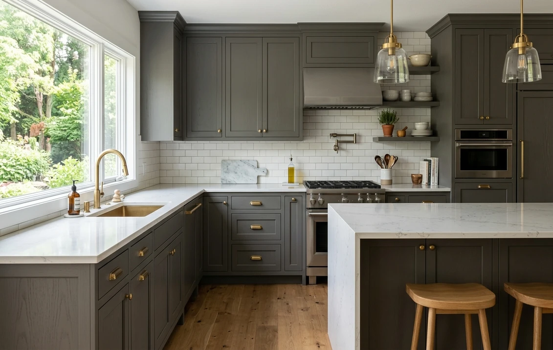

The first time I sprayed Benjamin Moore Chelsea Gray (HC-168) on a set of kitchen base cabinets, the homeowner panicked at the first coat: in raw daylight it looked like it might be sliding toward brown. By the time the doors went back on, under the under-cabinet LEDs and against the white quartz, it had settled into exactly what she wanted: a deep, grounded, slightly architectural gray that looks expensive without going black. That is the whole story of Chelsea Gray. It is one of Benjamin Moore's true mid-to-deep greiges, a gray with a warm green-taupe core, and it behaves like a chameleon depending on light and what sits beside it. This is the color people reach for on islands, lower cabinets, built-ins, and accent walls when plain charcoal feels too cold and a light greige feels too timid. Here is how it actually reads indoors, and how to keep it from drifting brown when you do not want it to.
Quick orientation before the deep dive. Chelsea Gray HC-168 has a published LRV of about 23 and a hex approximation of #66665E (RGB 102, 102, 94). That places it firmly in deep mid-tone territory: dark enough to anchor a room and carry an island or a lower run of cabinets, but lighter and more flexible than a near-black charcoal. The undertone is the part everyone gets wrong, so it gets its own section below. This profile is one stop in our wider Benjamin Moore interior paint colors guide, and where the lighter grays in that family keep walls airy, Chelsea Gray is the one you bring in to add weight and contrast.
Upload a photo of your real kitchen or room and preview BM Chelsea Gray under your own light in about 30 seconds. Free.
Chelsea Gray at a glance: the numbers that matter
Before opinions, here are the verifiable specs straight from the Benjamin Moore color library. These are the values you can take to a paint counter:
| Spec | Chelsea Gray HC-168 |
|---|---|
| Color number | HC-168 (Historical Color collection) |
| LRV (Light Reflectance Value) | Approximately 23: deep mid-tone that anchors a room without going black |
| Hex / RGB (approx.) | #66665E / 102, 102, 94 |
| Color family | Deep warm gray (greige) |
| Primary undertone | Green-taupe, with a brown bias that surfaces in warm light |
| Best base / finish | Medium or deep tint base; eggshell on walls, satin or semi-gloss on cabinets and trim |
The takeaway from those numbers: Chelsea Gray is not a cold gray and not a black. At LRV 23 it is roughly a third as reflective as a soft light gray, which is why it photographs as a confident, saturated mid-dark color and why it needs good light to show its nuance. On a small chip it looks like a plain dark gray; rolled across a real wall or sprayed on cabinet fronts, the warm green-taupe core comes alive. That warmth is the entire reason designers keep specifying it on cabinetry where a true charcoal would feel clinical.
Is Chelsea Gray warm or cool? The undertone, decoded
Chelsea Gray is a warm gray, and that surprises people who expect "gray" to mean cool. The base is a balanced gray, but riding underneath it is a green-taupe pigment with a quiet brown bias. That combination is what makes it a greige rather than a true neutral gray, and it is exactly why it can look like three slightly different colors across one day.
In bright, warm light the brown bias wakes up and Chelsea Gray can edge toward a deep taupe or even a mushroom-brown read. This is the moment a nervous homeowner thinks they painted their cabinets the wrong color. In cool or indirect light the brown recedes and the green-gray core dominates, so the same surface reads as a calm, sophisticated dark sage-gray. It almost never goes blue and it never goes purple, which is what makes it so dependable as a deep cabinet color: its shifts stay inside the warm half of the wheel, so it always plays nicely with wood tones, brass, and warm whites.
One practical quirk: because Chelsea Gray is a deep color, it absorbs light rather than bounces it, so its undertone is most visible at the edges of a surface and where light grazes across it, and least visible in flat, shadowed sections that just read "dark gray." If you want to predict how it will land in your space, look at it on a vertical surface near a window, not flat on a sample card in your hand.
| Indoor light | How Chelsea Gray reads |
|---|---|
| South-facing (bright, warm) | Warmest read: the brown-taupe bias surfaces, can edge toward a deep mushroom in strong sun |
| West-facing (warm afternoon) | Rich and grounded; late sun deepens it and pulls out the warm taupe |
| East-facing (cool after noon) | Greener and more balanced once the morning sun moves off, reads as a sage-gray |
| North-facing (cool, indirect) | At its grayest and most muted; the green-gray core dominates, taupe goes quiet |
| Artificial light at night | Warm 2700K bulbs push it toward taupe and cozy; cool 4000K bulbs hold it as a crisp slate-gray |
Sources: Benjamin Moore HC-168 color data 2026; greige and undertone field reports compiled by FacadeColorizer.
Free AI visualizer. See whether it leans taupe or sage-gray in your actual room before buying a sample pot.
Best rooms and surfaces for Chelsea Gray
Deep, warm, and architectural, Chelsea Gray earns its reputation on surfaces that benefit from weight and contrast. It is less a four-walls whole-room color and more a color you deploy with intent. Here is where it consistently delivers:
Kitchen cabinets and islands
This is Chelsea Gray's signature application. On lower cabinets or a kitchen island paired with white or light-gray uppers, it reads as a high-end, designer two-tone scheme without committing to true black. Its warmth flatters butcher block, walnut, and brass hardware, and the green-taupe core keeps it from clashing with warm-white countertops the way a cold charcoal can. If a two-tone kitchen is your goal, see how deep grays sit in our roundup of the best gray kitchen cabinet paint colors, and our broader kitchen cabinet color guide covers finish and base choices for a deep color like this.
Built-ins, libraries, and accent walls
On a wall of bookcases, a fireplace surround, or a single moody accent wall, Chelsea Gray adds depth and a tailored, gentleman's-study feel. Because it is a greige rather than a flat charcoal, it stays inviting rather than severe, and it is forgiving next to warm wood shelves and amber lighting. It is a smart pick when you want drama with warmth instead of a cold contemporary edge.
Bathroom vanities, mudrooms, and laundry rooms
On a vanity or a run of mudroom lockers, Chelsea Gray hides scuffs and daily wear far better than a light color while still reading refined. In a powder room it can wrap the walls for a cocooning, jewel-box effect, especially with brass fixtures and a warm white ceiling. It is one of the more practical deep greiges for high-traffic, hard-working rooms.
Where to think twice
A small, dim, north-facing room with no natural light is where Chelsea Gray on all four walls can feel heavy and cavernous, and where its nuance disappears into a flat dark gray. In a strongly south-facing room with warm bulbs, be ready for it to lean noticeably taupe-brown; if you want it to stay gray, balance it with cooler 4000K lighting and crisp white trim. It rewards light and intention, so do not bury it in a windowless box and expect subtlety.
Trim, ceiling, and decor pairings
A deep greige lives or dies on its contrast partners. Get the white right and Chelsea Gray looks crisp and tailored; get it wrong and it can look either muddy or harshly cut out.
- Soft warm trim (most cohesive): BM White Dove (OC-17, LRV 85) is the designer default. Its gentle cream bias echoes Chelsea Gray's warmth, so the contrast reads intentional and soft rather than stark. This is the safe, elegant pick for cabinets and built-ins.
- Crisper white (cleaner, more modern): BM Chantilly Lace (OC-65) gives a sharp, high-contrast edge that leans contemporary and pulls Chelsea slightly cooler. Best when you want a punchy, graphic two-tone kitchen.
- Warm whites and creams: BM Cloud White (OC-130) and Simply White (OC-117) both flatter Chelsea Gray's green-taupe core; favor these in warm, south-lit rooms to keep the scheme harmonious.
- Avoid: a cold blue-white trim next to Chelsea Gray. The clash can make the gray look dingy and the trim look icy by comparison.
- Ceilings: a clean warm white above keeps a Chelsea Gray room from feeling top-heavy. On an accent wall, carry the trim white onto the ceiling for cohesion.
- Floors and decor: warm white oak, walnut, brass, aged bronze, leather, and natural linen all reinforce its warmth. Pair with a few cooler textiles if you want to nudge it back toward sage-gray.
For a high-contrast moment, Chelsea Gray cabinets under a warm white wall, or a navy island next to Chelsea Gray perimeter cabinets, both read tailored and current; our Benjamin Moore Hale Navy HC-154 review covers that navy partner if you want to layer two deep colors.
See cabinets, trim, and counters together in one preview. Free.
Chelsea Gray vs the colors people confuse it with
Chelsea Gray sits in a crowded stretch of Benjamin Moore's deep neutrals, and three colors come up in nearly every side-by-side. They look related on a fan deck but behave very differently on a wall:
- vs BM Kendall Charcoal (HC-166): the most common cross-shop. Kendall Charcoal (LRV around 13) is noticeably darker and cooler, a true deep charcoal that reads almost black in low light. Chelsea Gray (LRV 23) is lighter, warmer, and clearly greige, so it shows more nuance and never goes as cave-like. Choose Kendall when you want dramatic near-black depth, choose Chelsea when you want a warm, readable mid-dark that flatters wood and brass. Our full Benjamin Moore Kendall Charcoal HC-166 review breaks down that darker neighbor.
- vs BM Amherst Gray (HC-167): the trickiest twin because they are adjacent HC numbers. Amherst Gray is a touch cooler and leans more blue-green-gray, reading as a moodier slate, while Chelsea Gray sits warmer with that brown-taupe bias. In the same room Amherst will look more like a stormy gray and Chelsea more like a warm greige. Pick Amherst for a cooler, contemporary slate, Chelsea for a warmer, more transitional feel.
- vs SW Dovetail (SW 7018): Sherwin-Williams Dovetail is the closest cross-brand match people reach for, but Dovetail is a hair lighter and leans cooler and more purple-gray, while Chelsea Gray leans warmer and greener. If you are color-matching across brands, expect Chelsea to read warmer and slightly deeper than Dovetail, not identical.
Spelling note: chelsea grey, BM Chelsea Gray, and Chelsea Gray Benjamin Moore all point to this same HC-168.
How to test Chelsea Gray before you commit
Deep greiges are the riskiest colors to choose from a small chip, because the chip cannot show how the brown bias swells in warm light or how the green-gray core takes over in cool light. Two better methods:
- Paint a large swatch: roll a 12-by-12-inch sample (or a peel-and-stick sample) on a cabinet door or a vertical board and move it around the room. Check it by the window mid-morning, in the afternoon, and at night under your normal bulbs. Watch specifically for how taupe-brown it goes in your warmest spot; that tells you whether you will love it or fight it.
- Preview it digitally first: upload a real photo of your kitchen or room and apply Chelsea Gray alongside a darker option (Kendall Charcoal) and a cooler one (Amherst Gray) before you buy any sample pots, narrowing three contenders to the one worth painting. Pricing context for a full cabinet or room repaint is in our interior house painting cost guide for 2026.
Preview Chelsea Gray against Kendall Charcoal and Amherst Gray, side by side. Free.
Frequently asked questions
Is Chelsea Gray warm or cool?
Chelsea Gray (HC-168) is a warm gray, technically a greige, with a green-taupe core and a quiet brown bias. In bright or warm light the brown surfaces and it can edge toward a deep taupe or mushroom; in cool or north light the green-gray core takes over and it reads as a calm dark sage-gray. It almost never goes blue or purple, which is why it pairs so reliably with wood, brass, and warm whites.
What is the LRV of Chelsea Gray?
Chelsea Gray has a Light Reflectance Value of about 23 on the Benjamin Moore color data, with a hex approximation of #66665E (RGB 102, 102, 94). That makes it a deep mid-tone: dark enough to anchor a room, an island, or a run of cabinets, but lighter and more flexible than a near-black charcoal, so it shows more of its warm undertone in good light.
Is Chelsea Gray good for kitchen cabinets?
Yes, kitchen cabinets and islands are Chelsea Gray's signature use. Its warm green-taupe undertone flatters white and warm-white countertops, butcher block, walnut, and brass hardware, and at LRV 23 it gives a high-end two-tone look against light uppers without the cold severity of a true charcoal. Use a satin or semi-gloss finish on a medium or deep tint base for the best durability and depth.
What is the difference between Chelsea Gray and Kendall Charcoal?
Kendall Charcoal (HC-166, LRV around 13) is darker and cooler, a true deep charcoal that can read almost black in low light. Chelsea Gray (HC-168, LRV 23) is lighter, warmer, and clearly greige, so it shows more nuance and never feels as cave-like. Choose Kendall for dramatic near-black depth, and Chelsea when you want a warm, readable mid-dark that flatters wood and brass.
Chelsea Gray vs Amherst Gray: which is warmer?
Chelsea Gray (HC-168) is the warmer of the two, with a brown-taupe bias, while its neighbor Amherst Gray (HC-167) is a touch cooler and leans more blue-green slate. In the same room Amherst reads as a moodier, stormier gray and Chelsea as a warmer, more transitional greige. Pick Amherst for a cool contemporary slate and Chelsea for a warmer, wood-friendly feel.
What trim color goes with Chelsea Gray?
BM White Dove (OC-17) is the most cohesive trim because its gentle cream bias echoes Chelsea Gray's warmth, so the contrast reads intentional and soft. BM Chantilly Lace (OC-65) gives a crisper, more modern high-contrast edge for a graphic two-tone kitchen. Avoid a cold blue-white, which can make Chelsea Gray look dingy and the trim look icy by comparison.
Preview BM Chelsea Gray on your actual cabinets or walls under your own light before buying a single sample.
Disclaimer: Benjamin Moore, Chelsea Gray (HC-168), Kendall Charcoal (HC-166), Amherst Gray (HC-167), White Dove (OC-17), Chantilly Lace (OC-65), Cloud White (OC-130), Simply White (OC-117), and Hale Navy (HC-154) are trademarks of Benjamin Moore & Co. Sherwin-Williams and Dovetail (SW 7018) are trademarks of The Sherwin-Williams Company. FacadeColorizer is an independent paint visualization service and is not affiliated with, endorsed by, or sponsored by Benjamin Moore or Sherwin-Williams. Color reproduction on screens approximates the manufacturer's chip; always confirm with a manufacturer sample under your own light before purchase. Sources: Benjamin Moore HC-168 Chelsea Gray color data 2026, Benjamin Moore HC-166 Kendall Charcoal and HC-167 Amherst Gray color data 2026, greige and undertone field reports compiled by FacadeColorizer.
Trademarks mentioned (Sherwin-Williams, Benjamin Moore, Behr, Caparol, Brillux, Sto, Alpina, Valspar, PPG, Glidden, Dulux, Crown Trade, Sandtex, Farrow & Ball, Johnstone's, Leyland) are property of their respective owners. FacadeColorizer is independent and not affiliated with any of them. Nominative fair use under Lanham Act §1125.


