
Benjamin Moore Nimbus Gray (2131-50) is one of those grays that behaves itself in the can and then surprises people on the wall. It looks like a safe, mid-toned gray on the fan deck, but it carries a soft violet-taupe undertone that wakes up in certain light, and that is the whole reason it gets searched, second-guessed, and occasionally returned. I have specified it most often for clients who wanted a gray with some warmth and weight, something a half-step deeper than the usual builder greige, and when it lands in the right room it reads sophisticated and quietly moody. The question everyone types into a search bar is some version of: is Nimbus Gray purple, and is it too dark for my space? Here is exactly how it reads indoors, and how to keep the violet from running the show.
Quick orientation before the deep dive. Nimbus Gray 2131-50 has a published LRV of about 50 and a hex approximation of #B0AFAB (RGB 176, 175, 171). That puts it squarely in true medium-gray territory: not light and airy like an off-white gray, not a dramatic charcoal, but a real mid-tone with presence. The undertone is a soft violet-taupe, a mauve-gray lean that is what separates Nimbus from the cooler blue-grays and the warmer beige-greiges. This profile is one stop in our wider Benjamin Moore interior paint colors guide, and it sits alongside our reviews of lighter cousins like Balboa Mist OC-27 and Light Pewter 1464. This page stays focused on Nimbus itself: its undertone, light behavior, best rooms, and pairings.
Upload a photo of your actual room and preview BM Nimbus Gray under your own light in about 30 seconds. Free: 1 HD render plus 3 variations.
Nimbus Gray at a glance: the numbers that matter
Before opinions, here are the verifiable specs you can take to a paint counter:
| Spec | Nimbus Gray 2131-50 |
|---|---|
| Color number | 2131-50 (Color Preview / Classic Colors) |
| LRV (Light Reflectance Value) | Approximately 50: true medium gray with real weight |
| Hex / RGB (approx.) | #B0AFAB / 176, 175, 171 |
| Color family | Medium gray-taupe (warm-leaning gray) |
| Primary undertone | Soft violet-taupe (mauve-gray), with a faint warm-gray base |
| Best base / finish | Medium tint base; eggshell or matte on walls, satin on trim |
The takeaway from those numbers: at LRV 50, Nimbus Gray sits right at the midpoint of the value scale, which is unusual for a popular interior gray. Most crowd-pleasers (Repose, Gray Owl, Balboa Mist) hover up in the high 50s to 70s so they stay safe and light. Nimbus deliberately goes deeper. That extra depth is why it photographs so well and why it can swallow a small, dim room if you are not careful. The violet-taupe undertone is the other half of its identity: it is what makes Nimbus feel softer and more enveloping than a clean steel gray, and also what can tip it slightly mauve in the wrong light. Depth plus a purple lean: hold those two facts and the rest of this page makes sense.
Is Nimbus Gray purple? The undertone, decoded
Nimbus Gray is a warm-leaning gray with a violet-taupe undertone. Anyone who tells you it is a perfectly neutral gray has not lived with it through a full day. But understanding the violet is what keeps Nimbus from ambushing you, because the purple is conditional, not constant.
Here is the mechanism. Underneath the gray sits a quiet mauve pigment riding on a warm-taupe base. In neutral, even daylight the two cancel into a handsome, slightly warm medium gray, and the violet stays a whisper. But violet undertones are notoriously light-sensitive. In cool, indirect light (a north room, an overcast day, or under crisp 4000K LED bulbs) the warm wavelengths drain out of the room, the taupe base recedes, and the mauve marches forward: that is the moment Nimbus can look distinctly lavender-gray on a wall. Conversely, in warm afternoon sun or under 2700K bulbs the taupe base dominates and Nimbus reads as a grounded, almost mushroom-gray with the purple barely visible. So the honest answer to is Nimbus Gray purple is: only when the light is cool, and especially against very white trim that throws the contrast into relief.
One quirk to plan for. Because Nimbus is a medium tone, the undertone reads more emphatically than it would in a pale color. A 2-inch chip exaggerates the gray and hides the mauve; a full wall does the opposite, letting the violet breathe. So if you only judged Nimbus from a fan deck, assume the finished wall will show more warmth and more occasional purple than the chip suggested. This is the single most common reason people are surprised by it.
| Indoor light | How Nimbus Gray reads |
|---|---|
| South-facing (bright, warm) | Grounded warm gray-taupe, its most flattering read; violet stays a whisper |
| West-facing (warm afternoon) | Richest and warmest, leaning mushroom-gray as the sun drops; deep but cozy |
| East-facing (cool after noon) | Balanced in morning, then the mauve creeps in by afternoon as light cools |
| North-facing (cool, indirect) | At its most violet and its deepest; can read lavender-gray and feel heavy |
| Artificial light at night | 2700K bulbs warm it to a soft taupe; 4000K bulbs pull the purple forward and cool it down |
Sources: Benjamin Moore 2131-50 color data 2026; The Spruce gray-paint undertone coverage; designer field reports compiled by FacadeColorizer.
Free AI visualizer. Test Nimbus Gray on your real walls and light before buying a single sample pot.
Best rooms for Nimbus Gray
Medium-depth, warm, and quietly moody, Nimbus Gray is happiest where you want a gray with substance rather than a barely-there backdrop. It is not the safe whole-home light gray; it is the gray you choose when you want a room to feel enveloping and a little dramatic. Here is where it consistently earns its keep:
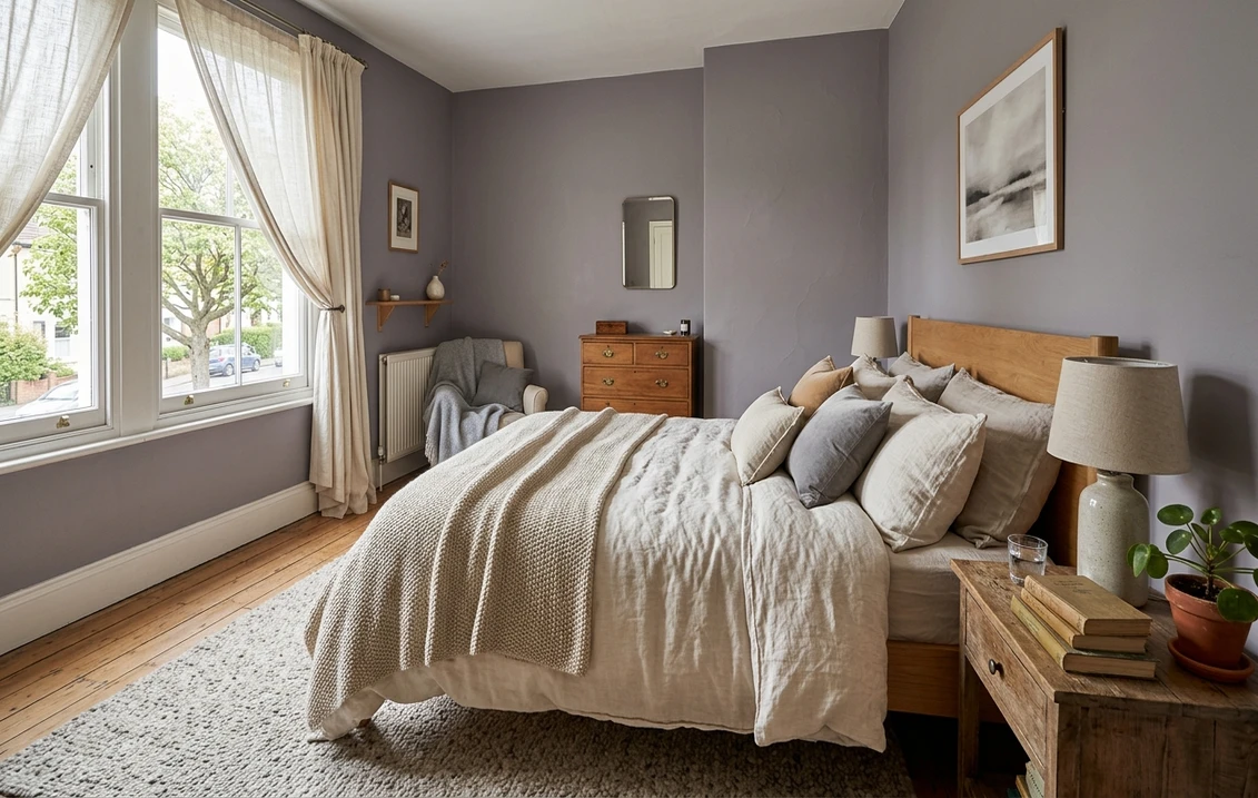
Bedrooms aiming for cocoon and calm
This is Nimbus Gray's sweet spot. At LRV 50 it wraps a bedroom in soft, restful depth without going as dark as a true charcoal, and the warm violet-taupe undertone reads soothing rather than sterile. It is gorgeous behind a linen headboard with white bedding and warm wood. Because it is on the deeper side, pair it with good lamp light (2700K) so the violet stays warm at night. For where it sits among other restful picks, see our guide to calming master bedroom paint colors.
Living rooms and dens with good light
In a south- or west-facing living room with steady daylight, Nimbus loses its chill and becomes a rich, sophisticated backdrop that makes art, brass, and warm wood pop. It is excellent in a den or study where you want a contemplative, slightly cocooning feel. In an open layout, balance it with a lighter ceiling and warm-white trim so the room does not feel closed in. Our wider interior gray paint shades guide shows how Nimbus compares to the lighter grays in the same family.
Powder rooms, accent walls, and built-ins
A small powder room is the perfect place to lean into Nimbus and let it go moody on purpose. Its depth and faint violet make a jewel-box bath feel intentional rather than cramped. It is also a strong accent-wall and built-in color: painting a fireplace surround, library shelves, or a single bedroom wall in Nimbus gives weight without committing the whole room. Lighter grays in our light gray paint guide are the better call if you want the whole room to stay airy.
Where to think twice
A small, dim, north-facing room with only cool LED light is where Nimbus Gray can go wrong twice over: it reads both too dark and too purple there, and a cozy space can tip lavender and heavy. If that room needs to feel light and airy, this is the wrong gray; reach for a lighter warm greige like Balboa Mist instead, or at minimum commit to warm 2700K bulbs and a bright white ceiling. Nimbus rewards light and depth, so do not bury it in a windowless box you wanted to feel open.
Trim, ceiling, and decor pairings
A medium violet-taupe lives or dies on what sits next to it. The right trim makes Nimbus look tailored and warm; the wrong trim makes the purple shout or the walls look dingy.
- Soft warm trim (most balanced): BM White Dove (OC-17, LRV 85) is the designer default. Its gentle cream bias warms the room and keeps Nimbus's violet from sharpening against the trim line. This is the safe, cohesive pick for most homes and the easiest way to keep Nimbus warm.
- Creamier trim (warmest): BM Simply White (OC-117) or a soft antique white pushes Nimbus firmly toward its taupe side and all but erases the purple. Best if you want a warm, traditional, enveloping room and never want to see lavender.
- Avoid: a stark, blue-white trim like a cool bright white next to Nimbus. The high cool contrast is exactly what makes the violet undertone jump forward, especially in north light.
- Ceilings: a clean warm white (often the trim color) keeps the room from feeling top-heavy. Because Nimbus is medium-deep, a too-bright cool ceiling can look disconnected, so favor a soft white above.
- Floors and decor: warm oak, walnut, brass, aged bronze, and natural linen flatter the taupe base and ground the violet. Cool chrome and stark white marble can amplify the purple, so balance them with warm textiles.
For a deeper, coordinated scheme, Nimbus pairs beautifully with a soft white and a warm wood tone, and its lighter relative for an adjacent room or trim is well covered in our Benjamin Moore Classic Gray OC-23 review. Using Classic Gray in the hallway and Nimbus in the bedroom is a classic light-to-deep flow within one warm-gray family.
See walls, trim, and floor together in one preview, free.
Nimbus Gray vs the colors people confuse it with
Nimbus has several close cousins inside Benjamin Moore's own gray-taupe range, and mixing them up is the fastest way to end up disappointed. These are the three that get held up against it most often, and how Nimbus is genuinely different from each:
- vs BM Silver Mist (1619): Silver Mist is the cooler, greener sibling. It leans gray-green where Nimbus leans violet-taupe, and at a similar mid-tone depth it reads cleaner and more contemporary, with none of Nimbus's mauve risk. Choose Silver Mist if you want a calm, cool-neutral medium gray; choose Nimbus when you want warmth and a soft purple character.
- vs BM Pale Smoke (1584): Pale Smoke is much lighter and clearly cooler, with a blue-gray-green cast and a high LRV that keeps a room airy. Nimbus is several steps deeper and warmer. They are not interchangeable: Pale Smoke is a light, breezy gray for small or dim rooms, while Nimbus is a medium, enveloping gray for rooms with light to spare. If Nimbus felt too dark or too purple on your wall, Pale Smoke is the lighter, cooler escape hatch.
- vs BM Heather Gray (2138-40): Heather Gray is the trap, because the name promises purple but the color delivers a green-gray. Heather Gray actually reads as a soft sage-tinged gray, cooler and earthier, with a green undertone, while Nimbus is the one that carries the genuine violet lean. If you searched for a gray with a touch of purple, Nimbus is your color and Heather Gray will surprise you by going green.
Spelling note: nimbus grey, BM Nimbus Gray, and Nimbus Gray Benjamin Moore all point to this same 2131-50.
How to test Nimbus Gray before you commit
With a medium violet-taupe, a small chip is the number-one reason people get a surprise on the wall: it hides both the depth and the mauve. Two better methods:
- Paint a large swatch: roll a 12-by-12-inch sample (or a peel-and-stick sample) on two different walls and check it mid-morning, mid-afternoon, and at night under your normal bulbs. Watch specifically for purple in your coolest corner and for heaviness at night; those two moments tell you whether Nimbus is right for the room.
- Preview it digitally first: upload a real photo of your room and apply Nimbus Gray alongside a lighter alternative such as Balboa Mist and a cooler one such as Silver Mist before you buy any samples, narrowing three contenders to the one worth painting. Budget context for the full repaint is in our interior house painting cost guide for 2026.
Preview Nimbus Gray against a lighter and a cooler gray, side by side, free.
Frequently asked questions
Is Nimbus Gray purple or warm?
Nimbus Gray (2131-50) is a warm-leaning medium gray with a soft violet-taupe undertone. In neutral or warm light the taupe base dominates and it reads as a grounded, slightly mushroom gray. In cool, indirect, or north light, or under crisp 4000K bulbs, the mauve steps forward and it can look distinctly lavender-gray. So it is warm most of the time but it has a real, conditional purple side that surfaces in cool light and against very white trim.
What is the LRV of Nimbus Gray?
Nimbus Gray has a Light Reflectance Value of about 50, with a hex approximation of #B0AFAB (RGB 176, 175, 171). That makes it a true medium gray sitting right at the midpoint of the value scale: deeper and more enveloping than the popular high-50s light grays, but not as dark as a charcoal. The medium depth is why it photographs so richly and why it can overwhelm a small, dim room without enough light.
What are the best rooms for Nimbus Gray?
Bedrooms aiming for a calm cocoon, living rooms and dens with good daylight, and powder rooms or accent walls where you want intentional moody depth are where Nimbus Gray shines, because its medium depth and warm violet-taupe undertone read enveloping and sophisticated. It is least reliable in small, dim, north-facing rooms with cool LED light, where it can look both too dark and too purple; a lighter warm greige or 2700K bulbs help there.
What trim color goes with Nimbus Gray?
BM White Dove (OC-17) is the most balanced trim because its gentle cream bias warms the room and keeps Nimbus's violet from sharpening against the trim line. BM Simply White (OC-117) or a soft antique white pushes Nimbus even further toward its warm taupe side and all but erases the purple. Avoid a stark blue-white trim, which is exactly what makes the violet undertone jump forward, especially in north light.
What is the difference between Nimbus Gray and Heather Gray?
Despite its name, Heather Gray (2138-40) actually reads as a soft green-gray, cooler and earthier with a green undertone, while Nimbus Gray (2131-50) is the one that carries a genuine violet-taupe lean. They also differ in depth, with Nimbus reading as a warmer medium gray. If you want a gray with a touch of purple, Nimbus is the right pick, and Heather Gray will surprise you by going sage-green instead.
Preview BM Nimbus Gray on your actual walls under your own light before buying a single sample. Free: 1 HD render plus 3 variations.
Disclaimer: Benjamin Moore, Nimbus Gray (2131-50), Silver Mist (1619), Pale Smoke (1584), Heather Gray (2138-40), Balboa Mist (OC-27), Light Pewter (1464), Classic Gray (OC-23), White Dove (OC-17), and Simply White (OC-117) are trademarks of Benjamin Moore & Co. FacadeColorizer is an independent paint visualization service and is not affiliated with, endorsed by, or sponsored by Benjamin Moore. Color reproduction on screens approximates the manufacturer's chip; always confirm with a manufacturer sample under your own light before purchase. Sources: Benjamin Moore 2131-50 Nimbus Gray color data 2026, Benjamin Moore 1619 Silver Mist, 1584 Pale Smoke and 2138-40 Heather Gray color data 2026, The Spruce gray-paint undertone coverage, designer field reports compiled by FacadeColorizer.
Trademarks mentioned (Sherwin-Williams, Benjamin Moore, Behr, Caparol, Brillux, Sto, Alpina, Valspar, PPG, Glidden, Dulux, Crown Trade, Sandtex, Farrow & Ball, Johnstone's, Leyland) are property of their respective owners. FacadeColorizer is independent and not affiliated with any of them. Nominative fair use under Lanham Act §1125.


