
Benjamin Moore Amherst Gray (HC-167) is one of those colors that fools you twice. From across a room it reads as a confident, almost dressy charcoal. Then you walk up, the light catches it, and suddenly there is green in the wall, a quiet pine-and-moss green that was hiding inside the gray the whole time. That double life is exactly why Amherst Gray has become a quiet favorite for cabinets, studies, and front doors, and exactly why so many people get burned by it: they buy it expecting a clean gray and end up with a deep green that surprises them on day one. This page is about what Amherst Gray actually does on an interior wall, where it earns its keep, and how to tell it apart from the three deep Benjamin Moore grays it is constantly confused with.
Quick orientation before the deep dive. Amherst Gray HC-167 has a published LRV of about 12 and a hex approximation of #6C6F62 (RGB 108, 111, 98). That puts it firmly in deep, dramatic territory: dark enough to read as a near-charcoal feature color, but several stops lighter and softer than a true black. The undertone is the whole story here, a genuine gray-green with a faint warm earthiness, which is what separates it from the cooler, browner, and bluer deep grays in the Benjamin Moore Historical Color line. This profile is one stop in our wider Benjamin Moore interior paint colors guide, and it sits right between its two HC neighbors, the cooler Kendall Charcoal HC-166 on one side and Chelsea Gray HC-168 on the other.
Upload a photo of your actual room and preview BM Amherst Gray under your own light in about 30 seconds. Free: 1 HD render plus 3 variations.
Amherst Gray at a glance: the numbers that matter
Before opinions, here are the verifiable specs straight from the Benjamin Moore color library. These are the values you can take to a paint counter:
| Spec | Amherst Gray HC-167 |
|---|---|
| Color number | HC-167 (Historical Color collection) |
| LRV (Light Reflectance Value) | Approximately 12: deep and dramatic, absorbs light |
| Hex / RGB (approx.) | #6C6F62 / 108, 111, 98 |
| Color family | Deep green-gray (charcoal with green) |
| Primary undertone | Gray-green, with a faint warm earthiness |
| Best base / finish | Deep base; matte or eggshell on walls, satin or semi-gloss on cabinets and trim |
The takeaway from those numbers: at LRV 12, Amherst Gray is a low-reflectance, light-eating color. That is not a flaw, it is the point. It is built to add depth and a tailored, slightly old-money mood to a wall, a built-in, or a kitchen island. But it means you cannot treat it like a light neutral: in a dim room it will read almost black and the green will go into hiding, while in good light the green steps forward and the whole color softens. The single most important thing to understand is that Amherst Gray is a green that masquerades as a charcoal, not a charcoal with a hint of green. Decide whether you want that green, and the rest of the decision gets easy.
Is Amherst Gray green or gray? The undertone, decoded
Amherst Gray is a green-gray, and anyone selling it to you as a plain charcoal is setting you up for a surprise. But there is real nuance in how that green shows up, and getting it right is the difference between a wall that looks like a sophisticated forest-and-stone deep neutral and one that looks like an unexpected swamp green you did not order. Here is what is happening underneath.
The dominant undertone is a muted, dusty green, somewhere between pine, slate, and moss. It is desaturated, so it never reads like a bright bottle green; instead it sits quietly under the gray until light hits it. There is also a faint warm earthiness riding alongside, a whisper of brown-khaki, which keeps Amherst from going cold or icy the way a blue-gray would. That warm thread is subtle but it is why Amherst plays so beautifully with wood, brass, and natural stone. What Amherst Gray does not have is any blue, and that is the cleanest way to tell it apart from the navy-adjacent deep colors people cross-shop it with.
Watch out for the green flip. In bright daylight and against warm wood, Amherst reads as a refined green-charcoal that feels expensive and grounded. But in poor light, or next to a stark cool white trim, or under cold 4000K bulbs, the green can either vanish into flat black (so you lose the whole reason you chose it) or, worse, pull toward a slightly murky olive. Both extremes are about light and pairings, not about the paint being bad. Amherst rewards a room where you can actually see it.
| Indoor light | How Amherst Gray reads |
|---|---|
| South-facing (bright, warm) | Its best read: the green comes alive and warms, looking like rich pine-charcoal |
| West-facing (warm afternoon) | Deep and earthy in late sun, the green warms toward a soft olive-charcoal |
| East-facing (cool after noon) | Green is clear and fresh in morning, then settles darker and grayer by afternoon |
| North-facing (cool, indirect) | Green recedes and it leans grayer and moodier; can read near-black in dim corners |
| Artificial light at night | Warm 2700K bulbs revive the green and earthiness; cool 4000K bulbs flatten it toward black |
Sources: Benjamin Moore HC-167 color data 2026; The Spruce green-gray paint coverage; designer field reports compiled by FacadeColorizer.
Free AI visualizer. See whether the green shows up in your room before buying a single sample pot.
Best rooms for Amherst Gray
Deep, green, and tailored, Amherst Gray is a feature color, not a whole-home neutral. It belongs in rooms and on surfaces where you want depth, cocooning, and a touch of heritage polish. Here is where it consistently delivers:
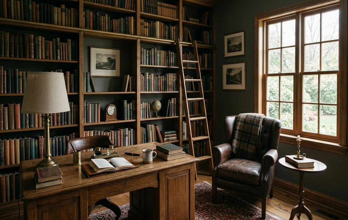
Studies, libraries, and home offices
This is Amherst Gray's natural home. The green-charcoal reads scholarly and grounded, the kind of backdrop that makes built-in bookshelves and a leather chair look intentional. Its low LRV wraps a small study in focus rather than making it feel like a cave, especially with good task lighting. If a working room is your project, our guide to home office paint colors for productivity shows how deep, focused tones like this one sit next to the lighter options.
Kitchen islands, cabinets, and built-ins
Amherst Gray is a cabinet color through and through. On a kitchen island or a run of lowers it reads as a sophisticated green that flatters brass hardware, butcher block, white oak, and natural stone countertops. Because the green is muted, it works in classic and modern kitchens alike, and it hides fingerprints and scuffs far better than a true charcoal black. In satin or semi-gloss it gives cabinetry a deep, furniture-grade finish.
Dining rooms and moody accent walls
For a dining room you want to feel dressy after dark, Amherst Gray is hard to beat: under warm bulbs and candlelight the green deepens and the room turns intimate. It is a strong color-drenched choice (walls, trim, and ceiling in one tone) for a small powder room or dining nook. For more elegant deep options to weigh against it, see our roundup of elegant dining room paint colors.
Where to think twice
A large, bright, all-purpose living room or an open-plan main wall is usually too much real estate for a color this deep, unless you genuinely want a dramatic, enveloping space. And a small, north-facing room with only cool LED light is where Amherst loses its green and goes flat black, which defeats the purpose. If you want depth there, switch to 2700K bulbs first, or accept that you are choosing a near-black rather than a green-gray. For lighter, more flexible deep grays, our interior gray paint shades guide maps the full range.
Trim, ceiling, and decor pairings
A deep green-gray lives or dies on what sits next to it. The right white makes the green look intentional and rich; the wrong one either kills the green or makes the wall look dirty.
- Soft warm white trim (most balanced): BM White Dove (OC-17, LRV 85) is the designer default against Amherst. Its gentle cream bias echoes Amherst's warm earthiness and lets the green read as deliberate rather than accidental. This is the safe, cohesive pick.
- Creamy off-white (cozy heritage look): BM Simply White (OC-117) or a soft antique-leaning white plays up the old-money, library mood and warms the whole pairing. Great for studies and traditional kitchens.
- Avoid: a stark, blue-cool white like a bright builder white directly next to Amherst. The cool white amplifies the gray and can flatten the green, and the contrast can make the wall look harsh.
- Ceilings: for a color-drenched look, carry Amherst onto the ceiling for a cocooning room; otherwise a soft warm white ceiling keeps things from feeling too closed.
- Hardware, floors, and decor: brass and unlacquered bronze, white oak and walnut, leather, marble, and soapstone all flatter Amherst's warm green. Chrome and cool nickel fight it; if you must use them, pull more warm wood into the room to balance.
For contrast, a warm white or a natural wood tone reads beautifully against Amherst walls or cabinets. If you want a deeper dive on the warm-white side of the pairing, our Benjamin Moore White Dove OC-17 review covers the trim color most often used with it.
See walls, trim, and wood tones together in one preview, free.
Amherst Gray vs the deep grays people confuse it with
This is where most Amherst Gray decisions are actually made, because it sits in a tight cluster of deep Benjamin Moore grays that look almost identical on a chip but behave very differently on a wall. Here is how to tell them apart, all four side by side.
- vs BM Kendall Charcoal (HC-166): the number-one mix-up, because they are HC neighbors. Kendall Charcoal (LRV near 13) is a true neutral charcoal with a faint warm brown lean and essentially no green. Amherst (LRV 12) is the one with the visible gray-green. Side by side, Amherst looks distinctly greener and a touch deeper; Kendall looks like a clean, almost taupe-tinged charcoal. Choose Kendall when you want a safe deep neutral with zero color risk, and Amherst when you specifically want that green. The full breakdown lives in our Kendall Charcoal HC-166 review.
- vs BM Cromwell Gray (HC-103): Cromwell is the trap for anyone chasing a green deep gray, because it is lighter and more clearly blue-green-gray (a slate, almost denim-adjacent gray) and noticeably higher in LRV. Amherst is darker, more saturated, and its green is warmer and earthier, not cool and slatey. If a wall is reading too blue or too washy, you probably wanted Amherst, not Cromwell; if it reads too heavy and dark, you may have wanted Cromwell.
- vs BM Chelsea Gray (HC-168): the other HC neighbor, one number up. Chelsea Gray (LRV near 21) is a popular mid-depth greige-charcoal with a warm, slightly brown-taupe undertone and no green. It is meaningfully lighter and more flexible than Amherst, which is why Chelsea works on full walls and cabinets in a wide range of rooms while Amherst stays a deeper, greener feature. Choose Chelsea for a versatile warm charcoal, and Amherst when you want more drama and an unmistakable green.
If your goal is deep drama but you would rather lean blue than green, the natural alternative is a navy: our Benjamin Moore Hale Navy HC-154 review covers the most-used deep blue for the same study, cabinet, and dining-room jobs Amherst is chosen for.
Spelling note: amherst grey, BM Amherst Gray, and Amherst Gray Benjamin Moore all point to this same HC-167.
How to test Amherst Gray before you commit
A small fan-deck chip is the worst possible way to judge a deep green-gray. At LRV 12 the chip looks almost black and the green barely registers, so people either reject Amherst as too dark or buy it blind and get surprised by the green at scale. Two better methods:
- Paint a large swatch: roll a generous 2-by-2-foot sample (or a peel-and-stick sample) on two different walls and check it in morning, mid-afternoon, and at night under your normal bulbs. Watch specifically for the green: where it shows, where it goes flat black, and how it reacts to your wood and trim. A deep color this opaque also usually needs a deep-base primer and two coats, so factor that in. Our interior house painting cost guide covers what a dark accent or cabinet job typically runs.
- Preview it digitally first: upload a real photo of your room and apply Amherst Gray (plus Kendall Charcoal and a navy as alternates) before you buy any samples. That narrows a confusing three-way deep-gray choice to the one worth painting, and it shows the green flip in your own light instantly.
Preview Amherst Gray against Kendall Charcoal and a navy, side by side, free.
Frequently asked questions
Is Amherst Gray green or gray?
Amherst Gray (HC-167) is a deep green-gray: it reads as a charcoal from a distance but shows a clear muted gray-green undertone up close and in good light. The green is dusty and desaturated, somewhere between pine and slate, with a faint warm earthiness and no blue. In bright or warm light the green comes alive; in dim or cold light it can recede toward flat black. So it is best described as a green that masquerades as a charcoal, not a plain gray.
What is the LRV of Amherst Gray?
Amherst Gray has a Light Reflectance Value of about 12 on the Benjamin Moore color data, with a hex approximation of #6C6F62 (RGB 108, 111, 98). That makes it a deep, dramatic, light-absorbing color, the kind you use to add depth and a tailored mood rather than to brighten a room. Because it is so low in LRV, it usually needs a deep-base primer and two coats for even coverage, and it shows the most color in rooms with good natural or warm artificial light.
What is the difference between Amherst Gray and Kendall Charcoal?
They are Benjamin Moore HC neighbors and look almost identical on a chip, but Kendall Charcoal (HC-166, LRV near 13) is a true neutral charcoal with a faint warm brown lean and essentially no green, while Amherst Gray (HC-167, LRV 12) has a visible gray-green undertone and reads slightly deeper. Side by side, Amherst looks distinctly greener and Kendall looks like a clean, almost taupe-tinged charcoal. Choose Kendall for a no-risk deep neutral and Amherst when you specifically want that green.
What are the best rooms for Amherst Gray?
Studies, libraries, home offices, kitchen islands and cabinets, built-ins, and moody dining rooms are where Amherst Gray shines, because its deep green-charcoal reads grounded and dressy and flatters brass, white oak, leather, and natural stone. It is least reliable on large bright living-room walls (too much heavy color) and in small, north-facing rooms with only cool LED light, where the green disappears and it goes flat black; warm 2700K bulbs help there.
What trim color goes with Amherst Gray?
BM White Dove (OC-17) is the most balanced trim because its gentle cream bias echoes Amherst's warm earthiness and lets the green read as deliberate. A creamy off-white like Simply White (OC-117) leans into the heritage, library mood. Avoid a stark blue-cool builder white directly against Amherst, which flattens the green and can look harsh; pair the color with brass, wood, and warm whites rather than chrome and cool whites.
Preview BM Amherst Gray on your actual walls and cabinets under your own light before buying a single sample. Free: 1 HD render plus 3 variations.
Disclaimer: Benjamin Moore, Amherst Gray (HC-167), Kendall Charcoal (HC-166), Chelsea Gray (HC-168), Cromwell Gray (HC-103), Hale Navy (HC-154), White Dove (OC-17), and Simply White (OC-117) are trademarks of Benjamin Moore & Co. FacadeColorizer is an independent paint visualization service and is not affiliated with, endorsed by, or sponsored by Benjamin Moore. Color reproduction on screens approximates the manufacturer's chip; always confirm with a manufacturer sample under your own light before purchase. Sources: Benjamin Moore HC-167 Amherst Gray color data 2026, Benjamin Moore HC-166 Kendall Charcoal and HC-168 Chelsea Gray color data 2026, The Spruce green-gray paint coverage, designer field reports compiled by FacadeColorizer.
Trademarks mentioned (Sherwin-Williams, Benjamin Moore, Behr, Caparol, Brillux, Sto, Alpina, Valspar, PPG, Glidden, Dulux, Crown Trade, Sandtex, Farrow & Ball, Johnstone's, Leyland) are property of their respective owners. FacadeColorizer is independent and not affiliated with any of them. Nominative fair use under Lanham Act §1125.


