
Benjamin Moore Louisburg Green (HC-113) is one of those Historical Color greens that looks almost neutral on the chip and then surprises everyone once it covers a wall. It is a grayed, slightly muddy sage with a colonial-revival pedigree, the kind of green you find on the paneled walls of an old New England dining room or the library of a 1920s center-hall colonial. People search for it expecting a soft, safe sage and discover something with more weight and more character than they bargained for. That is not a flaw. It is the entire reason to use it. The trick is knowing where that earthy depth flatters a room and where it quietly swallows the light. Here is exactly how Louisburg Green behaves on real interior walls.
Quick orientation before the deep dive. Louisburg Green HC-113 has a published LRV of about 41 and a hex approximation of #94997F (RGB 148, 153, 127). That puts it squarely in mid-tone territory: not a pale wash and not a deep forest, but a confident medium green-gray that reads as a real color on the wall. The undertone is gray-sage with a faint olive-yellow base, which is what gives it that aged, historic quality rather than a fresh garden green. This profile is one stop in our wider Benjamin Moore interior paint colors guide, and it sits next to the lighter sages covered in our best interior green paint shades guide. This page stays on Louisburg specifically: its undertone, light behavior, best rooms, and the near-twins it gets confused with.
Upload a photo of your actual room and preview BM Louisburg Green under your own light in about 30 seconds, free.
Louisburg Green at a glance: the numbers that matter
Before opinions, here are the verifiable specs straight from the Benjamin Moore color library. These are the values you can take to a paint counter:
| Spec | Louisburg Green HC-113 |
|---|---|
| Color number | HC-113 (Historical Color collection) |
| LRV (Light Reflectance Value) | Approximately 41: a true mid-tone, holds real color on the wall |
| Hex / RGB (approx.) | #94997F / 148, 153, 127 |
| Color family | Grayed sage green |
| Primary undertone | Gray-sage over a soft olive-yellow base; a whisper of warmth |
| Best base / finish | Medium tint base; eggshell or matte on walls, satin on trim and paneling |
The takeaway from those numbers: at LRV 41, Louisburg Green is meaningfully darker than the sages most people picture when they hear the word. For context, the popular light sage October Mist sits up near LRV 65; Louisburg lands a full 24 points lower. That single fact explains almost every Louisburg surprise. It will not keep a small, dim room feeling airy the way a pale sage does. Instead it builds an enveloping, grounded, historic atmosphere. Used in the right room that depth is its superpower; used in the wrong one it reads heavy. The olive-yellow base is the second half of the story: it is the reason Louisburg looks aged and architectural rather than bright and herbal.
Is Louisburg Green too gray, too dark, or too olive? The undertone, decoded
Louisburg Green is a grayed green first and a sage second. The gray is what tames it, keeping it from looking like a fresh garden or a child's mint. Underneath that gray sits a soft olive-yellow base that warms the color and gives it the dusty, time-worn quality colonial restorers love. There is no blue in it to speak of, which is the key difference from cooler sage-grays. That means Louisburg never goes cold or steely; when it shifts, it shifts warmer and earthier, not icier.
The mid-tone LRV changes how the undertone behaves compared to a pale sage. Because Louisburg holds so much pigment, light does not wash it out; instead, light reveals different facets of it. In strong, warm daylight the olive base wakes up and the wall reads as a soft, sunlit moss with real life in it. In flat, cool, or low light the gray takes over and Louisburg settles into a quiet, almost putty-green that can verge on drab if the room is starved of light. It does not turn muddy-brown the way some olive greens do, but in a dim corner it can lose its green and read as a heavy gray. The richness that makes it gorgeous in a sunny library is exactly what makes it risky in a windowless one.
Watch out for one quirk specific to mid-tone greens. On a 2-inch chip Louisburg looks far lighter and friendlier than it does as a finished, rolled wall under real lamps. A medium green darkens visually as it spreads across a large surface and as the second coat builds, so the finished room usually lands a half-step deeper and moodier than the fan deck suggested. Plan for that, and you will not be startled the day the painter cleans up.
| Indoor light | How Louisburg Green reads |
|---|---|
| South-facing (bright, warm) | At its best: a warm, sunlit sage where the olive base glows; rich without going dark |
| West-facing (warm afternoon) | Deepens into a golden-olive moss in late sun; the most dramatic, enveloping read |
| East-facing (cool after noon) | Fresh sage in morning light, then grays down and quiets as the sun leaves |
| North-facing (cool, indirect) | Grayest and moodiest; the green recedes and it can read as a heavy putty-gray |
| Artificial light at night | Warm 2700K bulbs bring out the olive and make it cozy; cool 4000K bulbs flatten it toward gray-green |
Sources: Benjamin Moore HC-113 color data 2026; The Spruce sage-green undertone coverage; designer field reports compiled by FacadeColorizer.
Free AI visualizer. Test Louisburg Green on your real walls before buying a single sample pot.
Best rooms for Louisburg Green
Louisburg Green is a depth color, not an everywhere color. It rewards rooms where you want enclosure, atmosphere, and a sense of history rather than bright openness. Used with intent, it is one of the most flattering greens Benjamin Moore makes. Here is where it consistently earns its keep:
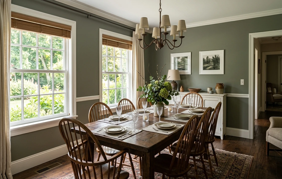
Dining rooms and formal spaces
This is Louisburg's home turf. A dining room is one place where a darker, enveloping color is an asset: it makes the room feel intimate by candlelight and frames a table beautifully. The olive-sage flatters wood furniture, brass, and warm metals, and against crisp white wainscoting or chair rail it looks distinctly colonial and considered. If green is on your dining room shortlist, see how it compares to other picks in our green dining room paint ideas guide.
Libraries, studies, and dens
A study or den is where Louisburg Green earns its keep most reliably. The grayed depth makes a room feel like a retreat, and it pairs naturally with bookcases, leather, and antique wood. On full-height paneling or built-ins the color reads architectural and expensive, the look of a well-aged old-money library rather than a fresh repaint.
Bedrooms wanting cocoon, not airy
In a bedroom Louisburg trades the bright-and-fresh sage look for something cocooning and restful. With warm 2700K lamps and natural linen it is deeply calming. It is the right green if you want a bedroom that feels grounded and enveloping; it is the wrong green if you want light and airy. Browse the lighter, brighter alternatives in our green bedroom paint ideas guide if cocoon is not your goal.
Where to think twice
A small, dim, north-facing room with only cool LED light is where Louisburg Green can tip from historic to drab. There the green recedes, the gray dominates, and the space can feel closed and heavy. It is also a lot of color for a tiny windowless powder room unless you genuinely want a dark jewel-box effect. If you love the sage idea but need brightness, a much lighter pick like October Mist or a true light sage will serve a dim room far better.
Trim, ceiling, and coordinating colors
A grayed mid-tone green lives or dies on what sits next to it. Get the trim right and Louisburg Green looks historic and intentional; get it wrong and it can read military or muddy. These are the Benjamin Moore pairings that consistently work:
- Soft warm trim (most balanced): BM White Dove (OC-17, LRV 85) is the designer default for Louisburg. Its gentle cream bias echoes the olive warmth in the green, so the whole room reads cohesive and historic rather than stark. Detail in our White Dove OC-17 review.
- Clean bright trim (more contrast): BM Simply White (OC-117) gives a crisper, brighter line that pops the green and reads a touch more modern; good if you want the wainscoting to feel fresh against the depth.
- Avoid: a cool, blue-white trim against Louisburg. The warm olive green and a stark cool white can clash and make the green look dingy and slightly gray-brown by comparison.
- Ceilings: a warm white (often the trim color) keeps the room from feeling top-heavy. A stark blue-white ceiling over a warm green can look disconnected, so favor a soft white above.
- Coordinating colors and decor: warm walnut and oak, brass and aged bronze, oxblood and terracotta accents, cream upholstery, and natural jute all flatter Louisburg's earthy warmth. A deep navy or near-black makes a handsome contrast on a door or built-in.
If you want a full palette built around the green rather than just trim, our guide to colors that go with sage green maps the warm and cool companions that work with a grayed sage like this one.
See walls, trim, and floor together in one preview, free.
Louisburg Green vs the greens people confuse it with
Almost every Louisburg Green search ends in a side-by-side. The three comparisons that matter most indoors, with the differences spelled out clearly:
- vs BM Hollingsworth Green (HC-141): the closest historic sibling and the comparison that trips people up. Hollingsworth is a deeper, richer green with more saturation and a touch more blue-green in it, so it reads as a fuller, more jewel-toned color, almost a soft hunter. Louisburg (LRV 41) is grayer, dustier, and a step lighter, leaning olive rather than blue-green. Choose Hollingsworth when you want a saturated, dramatic green for a moody dining room or library; choose Louisburg when you want the quieter, more grayed, more neutral-leaning historic sage that is easier to live with all day.
- vs BM Soft Fern (2144-40): Soft Fern is a brighter, cleaner, fresher green with far less gray, so it reads cheerful and herbal, closer to a true garden sage. Louisburg is muddier, grayer, and more aged by comparison. Side by side, Soft Fern looks like new spring growth and Louisburg looks like a patina that has been on the wall for a century. Pick Soft Fern for a light, lively kitchen or kid's room; pick Louisburg for atmosphere and history.
- vs BM October Mist (1495): the airiness comparison. October Mist (LRV near 65) is a pale, gray-green whisper that keeps a room bright and barely-there; Louisburg is roughly 24 LRV points darker and reads as a full, committed color. They are not interchangeable at all: October Mist is for soft and light, Louisburg is for grounded and deep. See the lighter option in our October Mist 1495 review.
Spelling and search note: louisburg green benjamin moore, BM Louisburg Green, Louisburg Green HC-113, and the occasional misspelling lewisburg green all point to this same Historical Color HC-113.
How to test Louisburg Green before you commit
A 2-inch fan-deck chip is the number-one reason people pick a mid-tone green that disappoints: it shows Louisburg far lighter and friendlier than the finished wall, and it cannot reveal how much the gray takes over in your darker corners. Two better methods:
- Paint a large swatch: roll a 2-by-2-foot sample (or a peel-and-stick sample) on two different walls and check it mid-morning, mid-afternoon, and at night under your normal bulbs. Watch specifically for how gray and how dark it goes in your shadiest corner; that corner tells you the truth about whether the room has enough light for it.
- Preview it digitally first: upload a real photo of your room and apply Louisburg Green (plus a lighter alternative such as October Mist and a richer one such as Hollingsworth Green) before you buy any samples, narrowing three contenders to the one worth painting. Pricing context for the full repaint is in our interior house painting cost guide for 2026.
Preview Louisburg Green against a lighter and a richer green, side by side, free.
Frequently asked questions
Is Louisburg Green warm or cool?
Louisburg Green (HC-113) is a warm-leaning color. It is a grayed sage over a soft olive-yellow base, with essentially no blue in it, so it never goes cold or steely the way a blue-gray sage does. In bright or south light the olive warmth glows; in flat, cool, or low light the gray takes over and it settles into a quieter, putty-green. When it shifts, it shifts warmer and earthier, not icier.
What is the LRV of Louisburg Green?
Louisburg Green has a Light Reflectance Value of about 41 on the Benjamin Moore color data, with a hex approximation of #94997F (RGB 148, 153, 127). That makes it a true mid-tone green: it holds real color on the wall rather than washing out, but it is meaningfully darker than light sages like October Mist (LRV near 65), so it will not keep a dim room feeling airy.
What are the best rooms for Louisburg Green?
Dining rooms, libraries, studies, dens, and cocooning bedrooms are where Louisburg Green shines, because its grayed mid-tone depth makes a space feel enveloping, intimate, and historic, and it flatters wood, brass, and leather. It is least reliable in small, dim, north-facing rooms with only cool LED light, where the green recedes and it can read as a heavy putty-gray; a much lighter sage suits a dark room better.
What trim color goes with Louisburg Green?
BM White Dove (OC-17) is the most balanced trim because its gentle cream bias echoes Louisburg's olive warmth, keeping the room cohesive and historic rather than stark. BM Simply White (OC-117) is the crisper, brighter option if you want more contrast. Avoid a cool blue-white trim, which can clash with the warm green and make it look dingy by comparison.
What is the difference between Louisburg Green and Hollingsworth Green?
Hollingsworth Green (HC-141) is deeper and more saturated with a touch more blue-green, so it reads as a fuller, almost soft-hunter jewel tone. Louisburg Green (HC-113, LRV 41) is grayer, dustier, a step lighter, and leans olive rather than blue-green. Choose Hollingsworth for a saturated, dramatic green, and Louisburg for a quieter, more grayed, easier-to-live-with historic sage.
Preview BM Louisburg Green on your actual walls under your own light before buying a single sample.
Disclaimer: Benjamin Moore, Louisburg Green (HC-113), Hollingsworth Green (HC-141), Soft Fern (2144-40), October Mist (1495), White Dove (OC-17), and Simply White (OC-117) are trademarks of Benjamin Moore & Co. FacadeColorizer is an independent paint visualization service and is not affiliated with, endorsed by, or sponsored by Benjamin Moore. Color reproduction on screens approximates the manufacturer's chip; always confirm with a manufacturer sample under your own light before purchase. Sources: Benjamin Moore HC-113 Louisburg Green color data 2026, Benjamin Moore HC-141 Hollingsworth Green and 2144-40 Soft Fern color data 2026, The Spruce sage-green undertone coverage, designer field reports compiled by FacadeColorizer.
Trademarks mentioned (Sherwin-Williams, Benjamin Moore, Behr, Caparol, Brillux, Sto, Alpina, Valspar, PPG, Glidden, Dulux, Crown Trade, Sandtex, Farrow & Ball, Johnstone's, Leyland) are property of their respective owners. FacadeColorizer is independent and not affiliated with any of them. Nominative fair use under Lanham Act §1125.


