
Benjamin Moore Soft Fern (2144-40) is the green people fall for in a paint store and then second-guess at home, and I understand exactly why. On the chip it looks like the friendliest sage imaginable: soft, sunny, a little garden-fresh. Then it goes up on a wall, the afternoon light hits it, and the homeowner squints and asks the question that fills every search bar: is this thing going to read yellow, or olive, or even a little green-gold? The honest answer is that Soft Fern is the warmest, most yellow-leaning member of the popular sage family, and that warmth is its whole personality. Lean into it and you get a cozy, organic, sunlit green. Fight it with the wrong light and trim and it can tip toward olive. Here is how it actually behaves on real interior walls.
Quick orientation before the deep dive. Soft Fern 2144-40 has a published LRV of about 53 and a hex approximation of #BFC2A9 (RGB 191, 194, 169). That puts it squarely in mid-light territory: bright enough to keep a room open and easy, deep enough to read as a real color rather than a tinted off-white. The undertone is a clear yellow-green, the warm end of sage, with just enough gray in the mix to keep it from going lime or pastel. This profile is one stop in our wider Benjamin Moore interior paint colors guide, and it sits next to the other sages in our roundup of the best sage green interior shades and pairings. If you want the whole green family at a glance, the interior green paint shades guide maps where Soft Fern lands among them.
Upload a photo of your actual room and preview BM Soft Fern under your own light in about 30 seconds. First HD render and three variations are free.
Soft Fern at a glance: the numbers that matter
Before opinions, here are the verifiable specs straight from the Benjamin Moore color library. These are the values you can take to a paint counter:
| Spec | Soft Fern 2144-40 |
|---|---|
| Color number | 2144-40 (Color Preview collection) |
| LRV (Light Reflectance Value) | Approximately 53: mid-light, keeps a room open without washing out |
| Hex / RGB (approx.) | #BFC2A9 / 191, 194, 169 |
| Color family | Warm sage / yellow-green |
| Primary undertone | Yellow-green, with a touch of gray to mute it |
| Best base / finish | Medium tint base; eggshell or matte on walls, satin on trim and cabinetry |
The takeaway from those numbers: Soft Fern is a true warm sage, not a gray that happens to look green. At LRV 53 it sits a noticeable step deeper than the very palest sages, which is why it reads as an actual color on the wall rather than dissolving into off-white the way a high-LRV greige would. The yellow-green undertone is the whole identity. In a sunny room it reads like sunlight filtered through new leaves; in a dim room with cool bulbs it can pull toward a flatter olive. That single tension is the entire Soft Fern decision.
Is Soft Fern too yellow? The undertone, decoded
Soft Fern is the warm sage, full stop. Anyone selling it as a cool, gray-leaning green is describing a different color. But warm is not the same as yellow, and knowing the difference is what separates a room that feels organic and sunlit from one that looks faintly like split-pea soup. Here is what is happening underneath.
The yellow-green base is dominant, and it is loudest in warm, bright light. There is also a quiet gray in the mix, the muting pigment that keeps Soft Fern from going lime or pastel mint. In south or west light the yellow warms the whole wall and the green reads fresh, lively, almost botanical. In cool, indirect, or north light the warm wavelengths drain out of the room, the yellow loses its lift, and the gray steps forward: that is the moment Soft Fern can read flatter, grayer, and a little more olive than the chip promised. It rarely goes muddy if the trim is right, but it will absolutely lose its sunshine in a cool, dim corner.
Watch out for one quirk specific to warm sages. Soft Fern reads more clearly yellow on a small chip held against a bright white counter than it does as a finished, rolled wall under real lamps. So if you are choosing from a fan deck or a Pinterest photo alone, assume the actual wall will land a half-step softer, grayer, and more grounded than the swatch, especially once the room fills with furniture and the warm bulbs come on at night.
| Indoor light | How Soft Fern reads |
|---|---|
| South-facing (bright, warm) | Fresh, sunlit, garden-green; its happiest and most flattering read |
| West-facing (warm afternoon) | Warmest and most golden in late-day sun, the yellow comes forward |
| East-facing (cool after noon) | Lively and clear in morning, settles into a calmer muted sage by afternoon |
| North-facing (cool, indirect) | At its grayest and most olive; pair with warm wood and 2700K bulbs to keep it alive |
| Artificial light at night | Warm 2700K bulbs deepen the cozy green; cool 4000K bulbs flatten it toward gray-olive |
Sources: Benjamin Moore 2144-40 color data 2026; The Spruce sage and green-paint undertone coverage; designer field reports compiled by FacadeColorizer.
Free AI visualizer. Test Soft Fern on your real walls before buying a single sample pot.
Best rooms for Soft Fern
Warm, organic, and easy to live with, Soft Fern is happiest in rooms where you want a connection to the outdoors and a little sunlit warmth. It is not the cool, designer gray-sage; it is the cozy garden green that makes a room feel grown and relaxed. Here is where it consistently earns its keep:
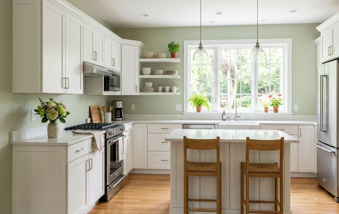
Kitchens and kitchen cabinetry
This is one of Soft Fern's strongest plays. On lower cabinets or a full set of shaker fronts, the warm yellow-green reads earthy and timeless next to white oak, brass hardware, and a creamy backsplash, never trendy-cold the way a blue-gray cabinet can. At LRV 53 it has enough body to look substantial on cabinetry without dragging the room dark. If a green kitchen is your project, the sage-on-cabinets ideas in our wider green guides translate directly to Soft Fern.
Living rooms, studies, and dens
In a south- or west-facing living room or a book-lined study, Soft Fern reads as a warm, enveloping backdrop that flatters wood furniture, leather, and brass. It is the kind of green that makes a room feel collected and lived-in rather than decorated. For where it sits among the year's other green options, our interior green paint shades guide is a useful map, and the pairing ideas in colors that go with sage green apply cleanly to Soft Fern's warm end.
Bedrooms and powder rooms wanting warmth
In a bedroom the warm sage reads restful and grounding without the chill some cool greens carry, which makes it a good fit for a cozy, nature-leaning retreat. In a powder room with warm sconces it turns rich and intimate. If a calm bedroom is the goal, see how warm greens sit beside other quiet picks in our calming master bedroom paint colors guide.
Where to think twice
A small, dim, north-facing room lit only by cool LED light is where Soft Fern can tip from sunlit sage to flat olive. There the yellow loses its lift and the gray takes over. If that room must feel cool and crisp, this is the wrong green; reach for a grayer sage like October Mist instead, or at minimum switch to warm 2700K bulbs. Soft Fern rewards warm light, so do not strand it in a cold corner.
Trim, ceiling, and decor pairings
A warm sage lives or dies on what sits next to it. Get the trim right and Soft Fern looks fresh and intentional; get it wrong and it can read either yellow-olive or oddly dull.
- Soft warm white trim (most balanced): BM White Dove (OC-17, LRV 85) is the designer default. Its gentle cream bias shares Soft Fern's warmth, so the two read as one cohesive, organic palette rather than fighting. This is the safe, flattering pick for most homes, and you can see its full behavior in our White Dove OC-17 review.
- Crisp white trim (cleaner, fresher): BM Chantilly Lace (OC-65) gives a bright, modern edge that snaps the green into focus and reads more contemporary. Best for kitchens, baths, and homes with black windows. Its undertones are covered in our Chantilly Lace OC-65 review.
- Avoid: a stark, blue-white trim next to Soft Fern. The cool-warm clash makes the green look muddier and more yellow by contrast, the opposite of what you want.
- Ceilings: a clean warm white (often the trim color) keeps the room bright and the sage cheerful. A cool builder white above a warm green can look slightly gray and disconnected.
- Floors and decor: white oak, walnut, rattan, brass, terracotta, and cream linen all flatter Soft Fern and reinforce its organic read. Cool chrome and stark blue-grays tend to fight the warmth; temper them with natural textures.
For contrast, a deep forest green or warm charcoal on a door, island, or built-in reads tailored and grounded against the soft sage walls, while a soft terracotta or clay accent leans into Soft Fern's earthy side. If you want the full menu of complements, our colors that go with sage green guide lays out twelve pairings that work with Soft Fern's warm tone.
See walls, trim, and floor together in one preview. First HD render and three variations are free.
Soft Fern vs the greens people confuse it with
Almost every Soft Fern search ends in a side-by-side with another Benjamin Moore sage. These three are the ones that actually matter indoors, and the differences are real even though the chips look close:
- vs BM October Mist (1495): the classic dilemma, and the most important one. October Mist (LRV near 47) is grayer, softer, and more muted, a quiet whisper of sage that almost reads neutral in some light. Soft Fern is brighter, warmer, and clearly more yellow-green, a sage that announces itself as a color. Choose October Mist when you want a barely-there gray-sage that behaves like a soft neutral; choose Soft Fern when you want the room to read as a true, sunlit green. The full breakdown is in our October Mist 1495 review.
- vs BM Hollingsworth Green (HC-141): Hollingsworth is the deeper, richer cousin. It is a darker, more saturated mid-tone green with a stronger blue-green lean and a moodier presence, the kind of color that makes a statement on a study or dining room. Soft Fern is lighter, warmer, and far more livable across a whole room. Pick Hollingsworth for drama and depth on a single feature space; pick Soft Fern when you want an airy, everyday sage you can live with on every wall.
- vs BM Healing Aloe (1562): this is the trickiest near-twin because both are pale and soft, but they lean opposite ways. Healing Aloe is a cool, spa-like blue-green that reads almost like a gray with a green-blue ghost, calming and crisp. Soft Fern is warm and yellow-green, cozy and earthy. Hold them together and the difference is obvious: Healing Aloe cools a room, Soft Fern warms it. Choose Healing Aloe for a serene cool bathroom or bedroom; choose Soft Fern for a warm, organic kitchen, living room, or den.
Spelling note: soft fern green, BM Soft Fern, and Soft Fern Benjamin Moore all point to this same 2144-40.
How to test Soft Fern before you commit
A 2-inch fan-deck chip is the number-one reason people pick a warm sage that disappoints: it exaggerates the yellow against the white card and cannot show how the gray steps in across a real day on a real wall. Two better methods:
- Paint a large swatch: roll a 12-by-12-inch sample (or a peel-and-stick sample) on two different walls and check it mid-morning, mid-afternoon, and at night under your normal bulbs. Watch specifically for how olive it goes in your coolest corner; that corner tells you the truth about whether Soft Fern will stay sunlit in your room.
- Preview it digitally first: upload a real photo of your room and apply Soft Fern (plus a grayer alternative such as October Mist and a cooler one such as Healing Aloe) before you buy any samples, narrowing three contenders to the one worth painting. Pricing context for the full repaint is in our interior house painting cost guide for 2026.
Preview Soft Fern against a grayer and a cooler sage, side by side, free.
Frequently asked questions
Is Soft Fern warm or cool?
Soft Fern (2144-40) is a warm color: a sage with a clear yellow-green undertone and just enough gray to keep it from going lime. In bright, south, or west light it reads fresh and sunlit, almost botanical. In cool, indirect, or north light the yellow loses its lift and the green can flatten toward olive-gray. It is the warmest member of the popular Benjamin Moore sage family, not a cool gray-green.
What is the LRV of Soft Fern?
Soft Fern has a Light Reflectance Value of about 53 on the Benjamin Moore color data, with a hex approximation of #BFC2A9 (RGB 191, 194, 169). That makes it a mid-light color: bright enough to keep a room open and airy, but with enough depth to read as a genuine sage rather than washing out the way a pale, high-LRV off-white green would.
What are the best rooms for Soft Fern?
Kitchens and kitchen cabinetry, living rooms, studies, dens, warm bedrooms, and powder rooms are where Soft Fern shines, because its warm yellow-green reads organic and cozy next to white oak, brass, and cream. It is least reliable in small, dim, north-facing rooms lit only by cool LED light, where it can tip toward flat olive; a grayer sage or 2700K bulbs help there.
What trim color goes with Soft Fern?
BM White Dove (OC-17) is the most balanced trim because its gentle cream bias shares Soft Fern's warmth, so walls and trim read as one cohesive palette. BM Chantilly Lace (OC-65) is the crisper, fresher option for kitchens, baths, and black-window homes. Avoid a stark blue-white trim, which makes Soft Fern look muddier and more yellow by contrast.
What is the difference between Soft Fern and October Mist?
October Mist (1495, LRV near 47) is grayer, softer, and more muted, a quiet sage that almost reads neutral in some light. Soft Fern (2144-40, LRV near 53) is brighter, warmer, and clearly more yellow-green, a sage that reads as a true color. Choose October Mist for a barely-there gray-sage that behaves like a soft neutral, and Soft Fern when you want the room to read as a sunlit, organic green.
Preview BM Soft Fern on your actual walls under your own light before buying a single sample. First HD render and three variations are free.
Disclaimer: Benjamin Moore, Soft Fern (2144-40), October Mist (1495), Hollingsworth Green (HC-141), Healing Aloe (1562), White Dove (OC-17), and Chantilly Lace (OC-65) are trademarks of Benjamin Moore & Co. FacadeColorizer is an independent paint visualization service and is not affiliated with, endorsed by, or sponsored by Benjamin Moore. Color reproduction on screens approximates the manufacturer's chip; always confirm with a manufacturer sample under your own light before purchase. Sources: Benjamin Moore 2144-40 Soft Fern color data 2026, Benjamin Moore 1495 October Mist, HC-141 Hollingsworth Green, 1562 Healing Aloe, OC-17 White Dove and OC-65 Chantilly Lace color data 2026, The Spruce sage and green-paint undertone coverage, designer field reports compiled by FacadeColorizer.
Trademarks mentioned (Sherwin-Williams, Benjamin Moore, Behr, Caparol, Brillux, Sto, Alpina, Valspar, PPG, Glidden, Dulux, Crown Trade, Sandtex, Farrow & Ball, Johnstone's, Leyland) are property of their respective owners. FacadeColorizer is independent and not affiliated with any of them. Nominative fair use under Lanham Act §1125.


