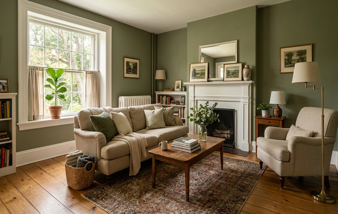

There is a moment that repeats every time I brush out Benjamin Moore Hollingsworth Green (HC-141) in a client's home: they expect a forest green, a hunter green, something bold and a little risky, and instead a soft, dusty sage settles onto the wall and the whole room exhales. Hollingsworth Green is one of those quietly clever Historical Colors that does more than its swatch suggests. It is a medium gray-green with a faint warm undertone, deep enough to read as real, committed color but soft enough that it never shouts. The questions that flood every search bar are whether it is too dark for a small room, whether it goes muddy or murky under poor light, and how it stacks up against the louder historic greens it gets confused with. Here is exactly how HC-141 behaves on interior walls.
Quick orientation before the deep dive. Hollingsworth Green HC-141 sits in the Benjamin Moore Historical Color collection with a published LRV of about 24 and a hex approximation of #6E7355 (RGB 110, 115, 85). That places it squarely in medium-depth territory: this is not a pale powdery sage, and it is not an almost-black like Charleston Green. It is a true mid-tone gray-green, the kind of color that anchors a dining room or wraps a study in calm. The undertone is a balanced sage with a quiet gray-brown softness and a barely-there yellow warmth, which is what keeps it from going cold or clinical. This profile is one stop in our wider Benjamin Moore interior paint colors guide, and it pairs naturally with our broader look at the best sage green interior shades and pairings: this page stays focused on HC-141 specifically, while those cover the wider family.
Upload a photo of your actual room and preview BM Hollingsworth Green under your own light in about 30 seconds. One HD preview plus three variations are free.
Hollingsworth Green at a glance: the numbers that matter
Before opinions, here are the verifiable specs straight from the Benjamin Moore color library. These are the values you can take to a paint counter:
| Spec | Hollingsworth Green HC-141 |
|---|---|
| Color number | HC-141 (Historical Color collection) |
| LRV (Light Reflectance Value) | Approximately 24: medium-depth, reads as committed color |
| Hex / RGB (approx.) | #6E7355 / 110, 115, 85 |
| Color family | Medium gray-green (sage) |
| Primary undertone | Balanced sage with soft gray-brown and a faint warm yellow |
| Best base / finish | Medium tint base; matte or eggshell on walls, satin on trim and cabinetry |
The takeaway from those numbers: at LRV 24, Hollingsworth Green is a genuine mid-tone, not the breezy whisper-sage so common on builder spec sheets. That single figure is the most important thing to understand before you commit. An LRV in the low 20s means the color absorbs more light than it bounces back, so it will deepen a room and add coziness, but it asks for decent natural or layered artificial light to avoid going heavy. The gray in the mix is what keeps it grounded and modern instead of country-kitchen dated, while the trace of warm yellow stops it from sliding into cold institutional green. Embrace the depth in the right room and it feels like quiet luxury; force it into a dim closet of a space and it can feel like the walls are closing in. That tension is the whole decision.
Is Hollingsworth Green muddy? The undertone, decoded
The fear with any medium sage is that it will go murky, sad, or vaguely military. Hollingsworth Green sidesteps that, but only if you respect what is happening underneath the color. Here is the breakdown.
The dominant note is sage, a soft green that leans neither sharply yellow nor sharply blue. Riding under that green is a substantial gray, which is the pigment doing the heavy lifting: it mutes the chroma, takes the candy out of the green, and gives HC-141 its grown-up, slightly antique character. Beneath the gray sits a faint warm yellow whisper, the historic-paint warmth that keeps the color from reading cold. In strong, warm daylight that yellow surfaces and the wall reads as a soft, sunlit olive-sage, alive and inviting. In flat, cool, or low light the yellow drains away, the gray takes over, and the color reads grayer, deeper, and more serious. This is where the muddy fear comes from: in a poorly lit corner the green can flatten toward a stony gray-green. It does not turn brown or dirty the way an overly warm olive can, which is its saving grace, but it will absolutely shift between lively-sage and serious-gray-green depending on your light.
One quirk worth knowing: Hollingsworth Green photographs deeper and a touch bluer than it lives on a real wall under lamps. So if you are judging it from a Pinterest moody dining room, assume your finished wall will land a half-step softer, warmer, and more sage than the photo, especially once warm bulbs come on at night.
| Indoor light | How Hollingsworth Green reads |
|---|---|
| South-facing (bright, warm) | Its best read: a lively, sunlit olive-sage with the warm yellow gently awake |
| West-facing (warm afternoon) | Richest and warmest late in the day, deepens toward a glowing forest-sage |
| East-facing (cool after noon) | Fresh sage in morning light, settles grayer and quieter by afternoon |
| North-facing (cool, indirect) | Grayest and most serious; the gray dominates and it reads as a moody stone-green |
| Artificial light at night | Warm 2700K bulbs wake the sage and warmth; cool 4000K bulbs push it grayer and flatter |
Sources: Benjamin Moore HC-141 color data 2026; The Spruce green-paint undertone coverage; designer field reports compiled by FacadeColorizer.
Free AI visualizer. Test Hollingsworth Green on your real walls before buying a single sample pot.
Best rooms for Hollingsworth Green
Medium, grounded, and quietly historic, Hollingsworth Green is happiest in rooms where you want depth, warmth, and a sense of enclosure. It is not the airy whole-home neutral; it is the color you choose when you want a space to feel deliberate and enveloping. Here is where HC-141 consistently earns its keep:
Dining rooms and studies
This is Hollingsworth Green's home turf. At LRV 24 it wraps a dining room or home office in a cocooning, slightly old-world richness that feels expensive and considered. Against warm wood furniture, brass fixtures, and antique rugs it reads like the green of a stately library. The medium depth is forgiving here precisely because these rooms tend to be used in the evening, when warm light flatters the sage. It is one of the colors people reach for when they want a moody, grown-up space that still feels inviting rather than cold.
Kitchen cabinetry and built-ins
Sage greens have become a default for cabinetry, and Hollingsworth Green is a strong pick because its gray base keeps it modern rather than country-cute. On lower cabinets or an island, paired with white or cream uppers and a wood countertop, it grounds a kitchen with color without dating it. The depth that can feel heavy on four walls becomes an asset on cabinet fronts, where it adds richness at eye level. If cabinets are your project, our roundup of the best sage green kitchen cabinet paint colors shows where it sits among the favorites.
Bedrooms and accent walls aiming for calm depth
In a bedroom with good light, Hollingsworth Green reads restful and enveloping, the green equivalent of a deep, slow exhale. It pairs beautifully with white linen, natural wood, and warm metals. If you would rather not commit all four walls to a mid-tone, it makes a superb headboard wall or the inside of a niche. For a sense of how it sits next to other quiet, restful picks, our guide to calming master bedroom paint colors is a helpful map.
Where to think twice
A small, windowless, or strictly north-facing room lit only by cool LED is where Hollingsworth Green can tip from cozy to cave-like. At LRV 24 there is simply not much light bouncing back, so in a dim space the gray takes over and the room can feel heavy and a touch gloomy. If that is your room and you still want sage, drop to a lighter historic green or switch to warm 2700K bulbs and add layered lamps. Hollingsworth rewards light; do not strand it in the dark.
Trim, ceiling, and decor pairings
A medium green lives or dies on what frames it. Get the trim right and Hollingsworth Green looks intentional and rich; get it wrong and it can read either heavy or oddly chalky.
- Warm soft white trim (most balanced): BM White Dove (OC-17, LRV 85) is the go-to. Its gentle cream bias echoes Hollingsworth's own warmth, so the trim and wall feel like one family rather than a stark cut-line. This is the safe, cohesive pick for most homes.
- Creamy off-white (cozier, more historic): BM Mascarpone (AF-20) or Cloud White (OC-130) lean a touch creamier and push the room toward an antique, English-country feel that flatters the sage.
- Avoid: a stark, blue-cool white like a bright modern bath white next to Hollingsworth. The cool-warm clash can make the green look slightly dingy and the trim look icy by comparison.
- Ceilings: a warm white (often the trim color) keeps the room from feeling top-heavy. A cool flat builder white over a warm green can read slightly blue, so favor a creamy white above.
- Floors and decor: warm oak, walnut, terracotta, brass, aged leather, and natural linen all flatter the sage and reinforce its historic warmth. Cool gray flooring can fight the green and pull it toward gloom; temper it with warm textiles and wood tones.
For contrast, a soft cream or a warm tan grounds the green beautifully, while black hardware and warm brass both look tailored against it. If you want to see how green sits among warm neutrals and what pairs with it, our guide to colors that go with sage green covers the full palette of companions in detail.
See walls, trim, and floor together in one preview. One HD render plus three variations free.
Hollingsworth Green vs the historic greens people confuse it with
Almost every Hollingsworth Green search ends in a side-by-side with another Benjamin Moore historic green. These are the three that matter most indoors, and getting the distinction right is the difference between the room you pictured and a near-miss:
- vs BM Narragansett Green (HC-157): the most common mix-up, and the easiest to get wrong. Narragansett (LRV around 6) is dramatically darker and clearly bluer, a near-black teal-green that reads as high-drama, almost like a deep ink. Hollingsworth (LRV 24) is far lighter, sits in true mid-tone territory, and leans gray-sage rather than blue-teal. Choose Narragansett for a bold, enveloping, almost-black green statement on cabinets or a powder room; choose Hollingsworth when you want livable, daylight-friendly sage with depth but not drama.
- vs BM Cushing Green (HC-125): the subtle sibling. Cushing Green (LRV around 27) sits at almost the same depth as Hollingsworth, but it is grayer and more muted, a softer, calmer, more whisper-sage that recedes into the background. Hollingsworth leans slightly warmer, with more green presence and a touch more weight on the wall. Pick Cushing when you want sage to read as a quiet neutral; pick Hollingsworth when you want the green to register a little more clearly as color.
- vs BM Louisburg Green (HC-113): the warm cousin. Louisburg (LRV around 41) is lighter and leans warmer and a touch more yellow-celadon, a fresher, brighter historic sage. Hollingsworth is darker and grayer, with a more grounded, serious character. Choose Louisburg for an airy, optimistic sage in a bright kitchen or bath; choose Hollingsworth when you want a deeper, more enveloping green for a dining room, study, or moody bedroom.
The short version: Hollingsworth is one of the medium ones. It sits at almost exactly the same depth as Cushing (the difference there is undertone, not value), stays well lighter than the near-black Narragansett, and reads grayer and more grounded than the warmer, lighter Louisburg. If you have been agonizing over these four chips on a wall, that LRV ladder, roughly 6 for Narragansett, 24 for Hollingsworth, 27 for Cushing, 41 for Louisburg, is the cleanest way to tell them apart. For where Hollingsworth lands among the year's other muted, gray-leaning options, our complete gray paint shade guide is a useful cross-reference, since this green borrows so much of its character from gray.
Spelling note: hollingsworth green, BM Hollingsworth Green, and Hollingsworth Green Benjamin Moore all point to this same HC-141. It is also occasionally cross-referenced with the closely related Benjamin Moore October Mist 1495 review, though October Mist is a far lighter, grayer sage and serves a different role.
How to test Hollingsworth Green before you commit
A 2-inch fan-deck chip is the number-one reason people pick a medium green that disappoints: it cannot show you how a low-20s LRV behaves across an entire wall, and it exaggerates both the depth and the blue. Two better methods:
- Paint a large swatch: roll a 12-by-12-inch sample (or a peel-and-stick sample) on two different walls and check it mid-morning, mid-afternoon, and at night under your normal bulbs. Watch specifically for how gray and heavy it goes in your darkest corner; that corner is the honest test of whether the room has enough light for HC-141.
- Preview it digitally first: upload a real photo of your room and apply Hollingsworth Green, plus a lighter and a warmer alternative such as Cushing Green or Louisburg Green, before you buy any samples. That narrows three or four contenders to the one worth painting. Pricing context for the full repaint is in our interior house painting cost guide for 2026.
Preview Hollingsworth Green against Cushing and Louisburg, side by side, free.
Frequently asked questions
What undertones does Hollingsworth Green have?
Hollingsworth Green (HC-141) is a balanced sage with a substantial gray base and a faint warm yellow whisper. The gray mutes the chroma and keeps it modern and grown-up rather than country-cute, while the trace of warmth stops it from going cold. In bright warm light the warm sage surfaces; in flat, cool, or low light the gray dominates and it reads grayer and more serious. It does not go brown or dirty, but it shifts clearly between lively-sage and stone-green with the light.
What is the LRV of Hollingsworth Green?
Hollingsworth Green has a Light Reflectance Value of about 24 on the Benjamin Moore color data, with a hex approximation of #6E7355 (RGB 110, 115, 85). That makes it a true medium-depth gray-green: deep enough to read as committed color and add coziness, but not an almost-black. The low-20s LRV means it absorbs more light than it reflects, so it deepens a room and benefits from good natural or layered artificial light.
What are the best rooms for Hollingsworth Green?
Dining rooms, studies, kitchen cabinetry, and bedrooms or accent walls aiming for calm depth are where Hollingsworth Green shines, because its medium gray-green wraps a space in cozy, old-world richness. It is least reliable in small, windowless, or north-facing rooms lit only by cool LED, where its low LRV can make the room feel heavy and cave-like; a lighter historic green or warm 2700K bulbs help there.
What trim color goes with Hollingsworth Green?
BM White Dove (OC-17) is the most balanced trim because its gentle cream bias echoes Hollingsworth's own warmth, so wall and trim feel like one family. Creamier whites like Mascarpone or Cloud White lean cozier and more historic. Avoid a stark, cool blue-white, which can make the green look dingy and the trim look icy by contrast. Warm brass, black hardware, oak, and walnut all flatter it.
What is the difference between Hollingsworth Green and Narragansett Green?
Narragansett Green (HC-157, LRV around 6) is dramatically darker and bluer, a near-black teal-green that reads as high drama. Hollingsworth Green (HC-141, LRV around 24) is far lighter, a true mid-tone, and leans gray-sage rather than blue-teal. Choose Narragansett for a bold, almost-black green statement; choose Hollingsworth for livable, daylight-friendly sage with depth but not drama. Hollingsworth sits at nearly the same depth as Cushing Green (LRV around 27), with the difference there being undertone rather than value, and is grayer than the warmer, lighter Louisburg Green (LRV around 41).
Preview BM Hollingsworth Green on your actual walls under your own light before buying a single sample. One HD preview plus three variations free.
Disclaimer: Benjamin Moore, Hollingsworth Green (HC-141), Narragansett Green (HC-157), Cushing Green (HC-125), Louisburg Green (HC-113), White Dove (OC-17), Mascarpone (AF-20), Cloud White (OC-130), and October Mist (1495) are trademarks of Benjamin Moore & Co. FacadeColorizer is an independent paint visualization service and is not affiliated with, endorsed by, or sponsored by Benjamin Moore. Color reproduction on screens approximates the manufacturer's chip; always confirm with a manufacturer sample under your own light before purchase. Sources: Benjamin Moore HC-141 Hollingsworth Green color data 2026, Benjamin Moore HC-157, HC-125, and HC-113 color data 2026, The Spruce green-paint undertone coverage, designer field reports compiled by FacadeColorizer.
Trademarks mentioned (Sherwin-Williams, Benjamin Moore, Behr, Caparol, Brillux, Sto, Alpina, Valspar, PPG, Glidden, Dulux, Crown Trade, Sandtex, Farrow & Ball, Johnstone's, Leyland) are property of their respective owners. FacadeColorizer is independent and not affiliated with any of them. Nominative fair use under Lanham Act §1125.


