
Benjamin Moore Moonshine (2140-60) is the color people reach for when they want a wall that does not announce itself. It is one of the palest grays in the Benjamin Moore deck, so light that in many rooms it reads as a soft, faintly cool white rather than a gray at all. And that is exactly why it is so often misjudged. Shoppers hold the chip, see almost nothing, and assume it is a safe non-color, then roll it on a north wall and watch a quiet green ghost float up out of nowhere. Moonshine is not a gray that sits still: it is a near-white chameleon that hovers between pale gray, soft green, and tinted white depending entirely on your light. If you want a barely-there color for a bright room or a ceiling, this profile shows exactly how it behaves on a real wall, and how to tell it apart from the tighter, more colorful pale grays it gets shelved next to.
Quick orientation before the deep dive. Moonshine 2140-60 has a published LRV of about 68 and a hex approximation of #D7DBD4 (RGB 215, 219, 212). That is a high LRV: well into the bright, light-reflecting zone where a color stops behaving like a true wall gray and starts behaving like a tinted white. The undertone is a soft, cool gray-green with a faint blue note underneath, which is what gives Moonshine its watery, slightly ethereal quality when light hits it. This profile is one stop in our wider Benjamin Moore interior paint colors guide, and it sits in the same pale gray family as our Benjamin Moore Gray Owl OC-52 review, the color people most often step up to when Moonshine reads too close to white for them.
Upload a photo of your actual room and preview BM Moonshine 2140-60 under your own light in about 30 seconds. Free: 1 HD render plus 3 variations.
Moonshine at a glance: the numbers that matter
Before opinions, here are the verifiable specs straight from the Benjamin Moore color library. These are the values you can take to a paint counter:
| Spec | Moonshine 2140-60 |
|---|---|
| Color number | 2140-60 (Color Preview collection) |
| LRV (Light Reflectance Value) | Approximately 68: very light, reflects a lot of light, reads almost like a tinted white |
| Hex / RGB (approx.) | #D7DBD4 / 215, 219, 212 |
| Color family | Very pale gray-green (off-white-adjacent) |
| Primary undertone | Soft cool green, with a faint blue note underneath |
| Best base / finish | Light tint base; matte or eggshell on walls and ceilings, satin on trim |
The takeaway from those numbers: at LRV 68, Moonshine is far lighter than the mid-grays it gets compared to. Stonington Gray sits near 59 and Gray Owl near 61; Moonshine is closer to a soft white than to either of them. That high reflectance is the entire reason it works on ceilings and in bright rooms, and the entire reason it can vanish in a dim one. The green ghost is the second half of its identity: it is what keeps Moonshine from being a plain off-white, and it is what makes the color feel calm and watery instead of flat. In low light, though, that green is so quiet it can fade out and leave you with a slightly cool, undefined whitish wall. Light feeds this color; starve it and you lose what makes it interesting.
Is Moonshine gray or green? The undertone, decoded
Moonshine is best described as a pale cool gray with a green soul. The gray is what you see first; the green is what you notice once the color has been on the wall a day or two. Neither is loud. This is a quiet, low-chroma color, and understanding how its two notes trade places in different light is the whole game.
The green is a soft, cool, almost watery green, not a sage and never a mint. It surfaces most in flat, even daylight and in north light, where it can read as a barely-there spa green. The faint blue note sits underneath and cools the whole thing, which is why Moonshine never warms up into a beige or a putty the way some pale grays do. In bright, warm south light the green and blue both recede and Moonshine reads at its whitest and cleanest, a soft tinted white with just enough body to avoid looking sterile. In cool or shaded light the green steps forward and the wall takes on that quiet aqueous calm that fans of the color are chasing. It is genuinely a chameleon: the same gallon can look like a tinted white in one room and a whisper of green in the next.
Watch out for one quirk that trips up almost everyone. Because the LRV is so high, Moonshine reads as basically white on a small fan-deck chip and even on most screens, where the green ghost is invisible. Then on a finished wall, especially across a large surface in north or flat light, the green shows up and surprises people who were expecting a true gray. So if you are choosing Moonshine off a chip alone, assume the real wall will be greener and softer than the chip promised, not grayer.
| Indoor light | How Moonshine reads |
|---|---|
| South-facing (bright, warm) | At its whitest and cleanest: a soft tinted white, green almost invisible |
| West-facing (warm afternoon) | Warm late-day light keeps it pale and creamy-soft; green stays quiet |
| East-facing (cool after noon) | Fresh and pale in morning, the green ghost surfaces gently by afternoon |
| North-facing (cool, indirect) | Greenest and coolest read: a watery pale spa-green; lean into it |
| Dim or windowless rooms | Risk zone: the green fades and the wall can read as an undefined cool white |
| Artificial light at night | Warm 2700K bulbs push it toward soft white; cool 4000K bulbs surface the green and blue |
Sources: Benjamin Moore 2140-60 color data 2026; The Spruce pale-paint undertone coverage; designer field reports compiled by FacadeColorizer.
Free AI visualizer. See whether the green ghost shows in your real light before buying a single sample pot.
Best rooms for Moonshine
Pale, light-reflective, and quietly green, Moonshine is happiest in rooms that already have good light and where you want a soft, airy backdrop rather than a defined wall color. It is the opposite of a moody accent; it is the color you choose when you want walls to recede and the room to breathe. Here is where it consistently earns its keep:
Bright living rooms and open-plan spaces
This is Moonshine's strongest case. In a south- or west-facing living room with generous windows, the high LRV bounces light around and the walls read as a clean, soft, almost-white envelope that flatters art, wood, and furniture without competing with anything. The faint green keeps it from feeling cold or builder-bland the way a flat white can. For an open-plan home where one color has to flow across kitchen, dining, and living, Moonshine is a quiet, forgiving choice precisely because it reads differently and pleasantly in each pocket of light.
Ceilings and trim-to-wall continuity
A pale color with an LRV near 68 is a natural ceiling color, and Moonshine is a favorite for people who want their ceiling to read as a soft, living tint rather than a stark white. Running it on both walls and ceiling in a bright room creates a seamless, enveloping calm. If you are weighing ceiling whites and same-as-walls strategies, our ceiling paint colors and finish guide for 2026 walks through when a tinted ceiling beats a plain white.
Calm bedrooms and bathrooms with light
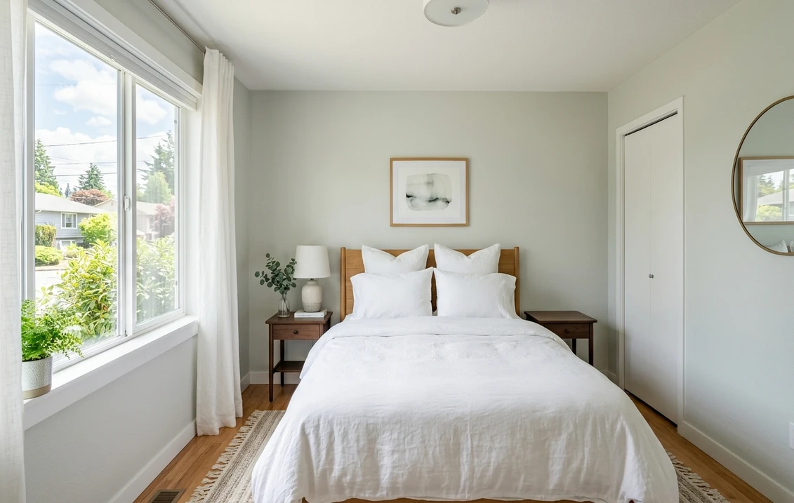
In a bedroom with decent natural light, Moonshine reads serene and restful, the watery green note doing quiet spa duty without committing the room to a color. It pairs beautifully with white linen, pale oak, and natural fibers. In a well-lit bathroom it reads clean and fresh against white tile and chrome. If a restful bedroom is your project, our guide to calming master bedroom paint colors shows how a pale gray-green sits next to other quiet picks, and our roundup of the best bathroom paint colors for 2026 covers where soft, light colors like this one work in a bath.
Where to think twice
A dim, windowless, or heavily shaded room is where Moonshine struggles. With nothing to reflect, the green fades, the body drops out, and you are left with a vague cool white that looks unfinished rather than intentional. If you want presence and definition on the wall, Moonshine is too pale for the job; step up to a clearer mid-gray instead. For a map of where it lands among the year's other grays, our interior gray paint shades guide is a useful reference. Moonshine rewards light, so do not bury it in a cave.
Trim, ceiling, and decor pairings
A near-white wall color is all about contrast and undertone harmony. Because Moonshine is so pale, your trim choice decides whether the room reads as crisp and intentional or as a wash of similar light tones. Here is how to frame it:
- Soft warm trim (most balanced): BM White Dove (OC-17, LRV 85) is the designer default. Its gentle cream bias gives Moonshine a touch of warmth to play against, so the wall reads as a soft tinted color rather than blending into the trim. Because both are soft and high-LRV, the effect is cohesive and serene, not high-contrast.
- Crisp white trim (cleaner contrast): BM Chantilly Lace (OC-65) gives a brighter, cooler frame that pushes Moonshine to read a hair greener and crisper. Best for modern rooms and for bathrooms where you want a clean spa feel.
- Same-color trim and ceiling: running Moonshine on walls, trim, and ceiling in a bright room creates a soft, enveloping monochrome that is very on-trend for calm bedrooms and sunrooms.
- Avoid: a heavy yellow-cream antique white on trim. Against Moonshine's cool green it can look dingy and make the walls read slightly murky rather than fresh.
- Floors and decor: pale and white oak, natural linen, jute, rattan, and unlacquered brass all flatter the soft green and reinforce the airy, organic feel. Very orange-toned wood can fight the cool green; balance it with cooler textiles.
For a hint of contrast without breaking the calm, a soft sage or a muted blue-green on a door, island, or built-in echoes Moonshine's own undertone and reads intentional rather than jarring. If you want a deeper, clearer gray companion for an adjoining room or a stair hall, Gray Owl is the natural step up in depth while staying in the same cool-green-gray family.
See walls, trim, and ceiling together in one preview before you buy.
Moonshine vs the colors people confuse it with
Moonshine lives in a notoriously tight neighborhood of pale Benjamin Moore grays, and almost every search ends in a side-by-side. The difference is real but subtle: it usually comes down to how much color the chip actually commits to. Here are the three that matter most indoors.
- vs BM Pale Smoke (1584): Pale Smoke is the more committed sibling. It holds a consistent, recognizable green-blue body, so it reads as an actual soft spa-green on the wall in most light. Moonshine is paler and more colorless, its green flickering in and out rather than staying put. Choose Pale Smoke when you genuinely want to feel a watery green in the room; choose Moonshine when you want a near-white that only hints at green and mostly disappears.
- vs BM Silver Mist (1619): Silver Mist leans cooler and more clearly blue-green, almost a whisper of aqua, and it carries a touch more depth and color. Moonshine is lighter, softer, and greener-when-it-shows but more neutral overall, sliding toward tinted white rather than aqua. Pick Silver Mist for a crisper, cooler, slightly more colorful read; pick Moonshine for the airier, more disappearing option.
- vs BM Beacon Gray (2128-60): Beacon Gray is the bluest and most clearly cool gray of this group, and it reads as a definite light gray rather than a near-white. Moonshine is markedly lighter (LRV near 68 versus Beacon near 62), warmer-feeling in its neutrality, and tips green where Beacon tips blue. Choose Beacon when you want a true light gray with a coastal blue lean; choose Moonshine when you want something paler and softer that barely commits to a color at all.
The one-line summary: among its near-twins, Moonshine is the palest and the least committed. It is the color you pick when you want the lightest possible wash of cool green-gray, and the others step up in either color (Pale Smoke), coolness (Silver Mist), or true gray depth (Beacon Gray).
Spelling note: moonshine 2140-60, BM Moonshine, and Moonshine Benjamin Moore all point to this same Color Preview shade.
How to test Moonshine before you commit
A 2-inch fan-deck chip is the number-one reason people pick Moonshine and get surprised: at this LRV the chip looks like a plain white and completely hides the green ghost that will show on a finished wall. Worse, in a cluster this tight (Moonshine, Pale Smoke, Silver Mist, Beacon Gray) the chips are nearly indistinguishable, so the chip cannot make the decision for you. Two better methods:
- Paint a large swatch: roll a 12-by-12-inch sample (or a peel-and-stick sample) on two different walls, including your dimmest corner, and check it mid-morning, mid-afternoon, and at night under your normal bulbs. Watch specifically for whether the green shows up where you want it and whether the wall holds enough body in your darkest spot. That corner tells you the truth about whether Moonshine is too pale for the room.
- Preview it digitally first: upload a real photo of your room and apply Moonshine (plus a more colorful option like Pale Smoke and a clearer gray like Gray Owl) before you buy any samples, narrowing three near-twins to the one worth painting. Pricing context for the full repaint is in our interior house painting cost guide for 2026.
Preview Moonshine against a greener and a clearer gray, side by side, free.
Frequently asked questions
Is Benjamin Moore Moonshine gray or green?
Moonshine 2140-60 is a very pale cool gray with a soft green ghost and a faint blue note underneath. The gray reads first, but the green surfaces once it is on the wall, especially in flat or north light, where it can look like a barely-there spa green. In bright south light the green recedes and Moonshine reads almost like a tinted white. It is genuinely a chameleon: more green in cool light, more white in warm light.
What is the LRV of Moonshine 2140-60?
Moonshine has a Light Reflectance Value of about 68 on the Benjamin Moore color data, with a hex approximation of #D7DBD4 (RGB 215, 219, 212). That is a high LRV, which makes it very light and reflective: it behaves more like a tinted white than a true wall gray, keeping rooms bright and airy. The trade-off is that in dim or windowless rooms it can fade toward an undefined cool white because there is little light to bring out its green.
What are the best rooms for Moonshine?
Bright living rooms, open-plan spaces, ceilings, and well-lit bedrooms or bathrooms are where Moonshine shines, because its high LRV near 68 bounces light and its soft green keeps the walls from feeling sterile. It is least reliable in dim, windowless, or heavily shaded rooms, where the green fades and the wall can read as a vague cool white; a clearer mid-gray works better there.
What trim color goes with Moonshine?
BM White Dove (OC-17) is the most balanced trim because its gentle cream bias gives Moonshine a touch of warmth to play against, so the pale wall still reads as a soft tinted color rather than blending into the trim. BM Chantilly Lace (OC-65) is the crisper, cooler option that pushes Moonshine a hair greener for modern rooms and baths. Avoid a heavy yellow-cream antique white, which can make the cool green walls look dingy.
How is Moonshine different from Pale Smoke, Silver Mist, and Beacon Gray?
Moonshine is the palest and least committed of the four. Pale Smoke 1584 holds a more consistent green-blue body, so it reads as an actual soft spa-green. Silver Mist 1619 is cooler and leans toward a whisper of aqua with a touch more depth. Beacon Gray 2128-60 is the bluest and reads as a definite light gray rather than a near-white. Moonshine, at LRV near 68, tips green only when light brings it out and otherwise slides toward a soft tinted white.
Preview BM Moonshine 2140-60 on your actual walls under your own light. Free: 1 HD render plus 3 variations, no sample pot needed.
Disclaimer: Benjamin Moore, Moonshine (2140-60), Pale Smoke (1584), Silver Mist (1619), Beacon Gray (2128-60), Gray Owl (OC-52), Stonington Gray (HC-170), White Dove (OC-17), and Chantilly Lace (OC-65) are trademarks of Benjamin Moore & Co. FacadeColorizer is an independent paint visualization service and is not affiliated with, endorsed by, or sponsored by Benjamin Moore. Color reproduction on screens approximates the manufacturer's chip; always confirm with a manufacturer sample under your own light before purchase. Sources: Benjamin Moore 2140-60 Moonshine color data 2026, Benjamin Moore 1584, 1619, 2128-60, OC-52 and OC-17 color data 2026, The Spruce pale-paint undertone coverage, designer field reports compiled by FacadeColorizer.
Trademarks mentioned (Sherwin-Williams, Benjamin Moore, Behr, Caparol, Brillux, Sto, Alpina, Valspar, PPG, Glidden, Dulux, Crown Trade, Sandtex, Farrow & Ball, Johnstone's, Leyland) are property of their respective owners. FacadeColorizer is independent and not affiliated with any of them. Nominative fair use under Lanham Act §1125.


