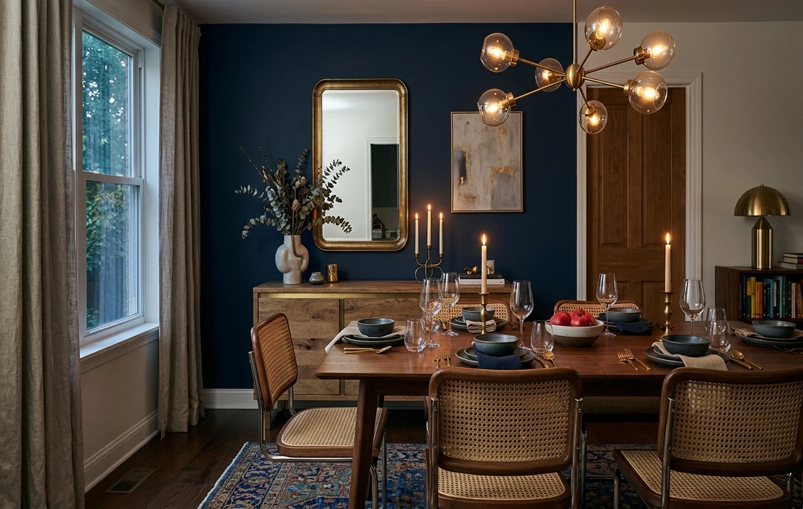

The single most common reaction I get when a client first sees Benjamin Moore Gentleman's Gray (2062-20) rolled onto a cabinet door is some version of "wait, that's not gray, that's navy." They are right, and the name is the most misleading thing about this color. Gentleman's Gray is a deep, dramatic, almost inky blue with a slate base, and the "gray" in the name describes its slightly muted, grayed-down quality rather than its actual hue. On a real wall or a real set of cabinets it reads as a rich, sophisticated dark navy with just enough green underneath to keep it from looking like a flat primary blue. If you searched expecting a charcoal gray, this is your warning to recalibrate: this is a navy, and a beautiful one. Here is exactly how it behaves indoors and how to use it without surprises.
Quick orientation before the deep dive. Gentleman's Gray 2062-20 has a published LRV of about 6 and a hex approximation of #3D434A (RGB 61, 67, 74). That LRV is the headline number: at 6, this is a genuinely dark color that absorbs almost all the light that hits it, in the same depth bracket as Hale Navy and other true statement darks. The undertone is a navy blue grayed with a quiet slate-green base, which is what gives it that moody, expensive, slightly stormy character instead of a cheerful nautical blue. This profile is one stop in our wider Benjamin Moore interior paint colors guide, and it sits firmly in the deep-accent corner of the lineup rather than among the everyday whole-wall neutrals.
Upload a photo of your actual cabinets or walls and preview BM Gentleman's Gray under your own light in about 30 seconds. Free includes 1 HD render and 3 variations.
Gentleman's Gray at a glance: the numbers that matter
Before opinions, here are the verifiable specs straight from the Benjamin Moore color library. These are the values you can take to a paint counter:
| Spec | Gentleman's Gray 2062-20 |
|---|---|
| Color number | 2062-20 (Color Preview collection) |
| LRV (Light Reflectance Value) | Approximately 6: a true deep dark, absorbs almost all light |
| Hex / RGB (approx.) | #3D434A / 61, 67, 74 |
| Color family | Deep navy blue (despite the "gray" name) |
| Primary undertone | Navy blue grayed with a slate-green base |
| Best base / finish | Deep tint base; satin or semi-gloss on cabinets, eggshell on accent walls |
The takeaway from those numbers: do not let the word "gray" fool you. With an LRV near 6, Gentleman's Gray belongs to the deep, light-eating end of the spectrum, not the soft mid-grays like Stonington or Gray Owl. It is a navy first, a slate second, and only "gray" in the sense that it is muted rather than vivid. That muting and the green base are exactly why designers reach for it when a plain navy feels too sweet or too cool. It looks tailored, a little brooding, and decidedly upscale, which is also why it lives almost exclusively on cabinets, islands, doors, and accent walls rather than across a whole bright room.
Is Gentleman's Gray really gray? The undertone, decoded
Let me settle the name question first, because it drives every other decision. Gentleman's Gray is not a gray. It is a navy blue that has been grayed down (desaturated) and given a slate-green base, and the result is a deep, slightly stormy blue rather than a neutral. The "gray" is a description of its temperament, muted and restrained, not its color cast. If you hold a chip of a pure crayon-blue next to it, Gentleman's Gray looks dignified and grown up; if you hold a true charcoal gray next to it, the blue jumps forward instantly.
The undertone has two layers. The dominant one is navy blue. The secondary one is a quiet slate-green that sits underneath and shows up most in lower light and on large surfaces. That green base is the color's signature: it is what keeps Gentleman's Gray from reading as a flat, cool primary navy and gives it that complex, almost teal-tinged depth in certain light. It is also the exact characteristic that links it to Newburg Green, its greener cousin, which I cover in the comparison below. In bright daylight the blue dominates and the wall reads navy. In dim or warm light, the green base surfaces and the color can lean faintly teal or sea-storm gray.
Watch out for one quirk specific to very dark colors like this one. At LRV 6 there is almost no light bouncing back, so the finish you choose changes the perceived color more than it would on a light wall. A flat finish makes Gentleman's Gray look like a soft, velvety dark slate and reads almost gray; a satin or semi-gloss bounces enough light off the surface that the blue and the green base both wake up and the color reads distinctly navier. On cabinets, where satin or semi-gloss is standard, expect the navy character to be obvious.
| Indoor light | How Gentleman's Gray reads |
|---|---|
| South-facing (bright, warm) | Cleanest navy read, blue dominates, slight slate richness; its most flattering light |
| West-facing (warm afternoon) | Warm late sun deepens it and pulls out the slate-green base, very moody and rich |
| East-facing (cool after noon) | Crisp navy in morning, then darkens and flattens to a near-black slate by afternoon |
| North-facing (cool, indirect) | Coolest and darkest; can read almost black-navy, the green base barely whispers |
| Artificial light at night | Warm 2700K bulbs bring out the slate-green and soften it; cool 4000K bulbs push it to a crisp, hard navy |
Sources: Benjamin Moore 2062-20 color data 2026; gray and navy undertone coverage; designer field reports compiled by FacadeColorizer.
Free AI visualizer. Test Gentleman's Gray on your real cabinets before buying a single sample pot.
Best rooms and uses for Gentleman's Gray
At LRV 6 this is a statement color, not a fill color. The rule of thumb: use Gentleman's Gray where you want drama and depth on a defined surface, and let lighter neutrals carry the rest of the room. Here is where it consistently earns its keep:
Kitchen cabinets and islands
This is Gentleman's Gray's natural home. A lower run of cabinets or a kitchen island in this deep blue-slate looks tailored and high-end against white or cream uppers and a light counter, the two-tone look that has dominated kitchens for years. The slate-green base keeps it from reading as a basic navy and pairs beautifully with brass or matte black hardware and warm wood floors. For where it lands among the year's other deep cabinet picks, our guide to the best paint for kitchen cabinets is a useful map, and a satin or semi-gloss enamel is the right finish here.
Accent walls, built-ins, and libraries
On a single accent wall behind a bed, a fireplace, or a bookcase, Gentleman's Gray creates instant depth and a cocooning, library-like mood. Built-in shelving painted in it makes pale ceramics, books, and art pop. Because it is so dark, you only need one wall (or one piece of millwork) to anchor an entire room. If a moody navy room is the goal rather than a single accent, it sits comfortably among the deep blues in our roundup of the best navy interior paint colors.
Interior doors, powder rooms, and a moody full bathroom
A small windowless powder room is one of the few places you can take Gentleman's Gray onto every wall and have it work, because in a tiny jewel-box space the darkness becomes the whole point. Paint the trim and ceiling the same color for a saturated, enveloping effect that makes the room feel intentional rather than dim. Interior doors and a vanity painted in it also read as a subtle, expensive upgrade against lighter walls.
Where to think twice
Do not roll Gentleman's Gray across all four walls of a primary living space you want to feel bright and open. At LRV 6 it will swallow the light and shrink the room, and unless you are deliberately going for a dark, dramatic den, you will likely regret it. It also wants real artificial light support at night; in a north room with only a single fixture it can flatten to near-black. Treat it as a confident accent, not a default neutral, and it almost never disappoints.
Trim, ceiling, and decor pairings
A deep navy-slate lives or dies on its contrast partner. The whole appeal of Gentleman's Gray is the drama between dark and light, so the surrounding colors do most of the work.
- Crisp white trim (highest contrast): BM Chantilly Lace (OC-65) gives a clean, modern, gallery-like edge that maximizes the drama. Best for two-tone kitchens and contemporary spaces where you want the navy to read sharp.
- Soft warm white trim (most livable): BM White Dove (OC-17) softens the contrast just enough to keep the look warm and timeless rather than stark. This is the cozier, classic-home pairing and my default for cabinets.
- Counters and surfaces: white or warm-veined marble, light quartz, and pale oak all let Gentleman's Gray play the lead. Brass, antique gold, and matte black hardware are the strongest metals against it; polished chrome can look a touch cold.
- Ceilings: in a powder room or library, painting the ceiling the same Gentleman's Gray creates a saturated, enveloping cocoon. In a normal-height room, keep the ceiling a bright white to give the eye relief.
- Avoid: pairing it with another competing saturated color (a strong green or a warm terracotta wall) right next to it. With a color this strong, give it light, calm neighbors so it stays the star.
If you want a deeper contrast piece on the same surface, a charcoal like BM Kendall Charcoal makes a softer, less saturated step-down. We break that one down in our Benjamin Moore Kendall Charcoal HC-166 review, which is genuinely gray where Gentleman's Gray is genuinely navy.
See cabinets, trim, and counter together in one preview, free.
Gentleman's Gray vs the colors people confuse it with
Because it is a grayed navy with a green base, Gentleman's Gray gets cross-shopped against two specific Benjamin Moore deep colors. These are not near-twins of each other, and the differences are real and decision-changing. Here is how to tell them apart:
- vs BM Hale Navy (HC-154): This is the comparison that matters most. Hale Navy (LRV about 6) is the more classic, more clearly recognizable navy, slightly warmer and with a faint gray softness but no real green base. Gentleman's Gray is cooler, more slate, and has that distinct green undertone that makes it read moodier and a touch more complex. Put simply: Hale Navy is the safe, all-purpose, reads-as-navy-everywhere choice; Gentleman's Gray is the moodier, greener, more designer-leaning navy that surprises people with depth. If you want a navy that nobody will second-guess, choose Hale Navy; if you want one with more character on cabinets, choose Gentleman's Gray. We profile the classic in our Benjamin Moore Hale Navy HC-154 review.
- vs BM Newburg Green (HC-158): This is the family resemblance taken one step further. Newburg Green is what happens when the same dark blue-green base tips fully past blue into a deep teal-green. Gentleman's Gray still reads as a navy with a green undertone; Newburg Green reads as a dark green with a blue undertone. Side by side, Newburg Green is unmistakably the greener, more forest-teal of the two, while Gentleman's Gray holds its navy identity. Choose Newburg Green if you want the color to read green; choose Gentleman's Gray if you want it to read navy with just a hint of that green complexity.
- vs BM Kendall Charcoal (HC-166): The honest "did you actually want a gray?" check. Kendall Charcoal is a genuine deep gray with a soft green-brown undertone and no navy. If you held both up and the blue in Gentleman's Gray bothered you, Kendall Charcoal is the true charcoal the name "Gentleman's Gray" might have led you to expect.
Spelling note: gentlemans gray, BM Gentleman's Gray, Gentleman's Grey 2062-20, and Gentleman's Gray Benjamin Moore all point to this same 2062-20.
How to test Gentleman's Gray before you commit
With a color this dark, a 2-inch fan-deck chip lies to you twice: it cannot show how much light the wall will eat at full scale, and it exaggerates the green base in a way that disappears once the color is up. Two better methods:
- Paint a large swatch in your finish: roll a 12-by-12-inch sample in the actual finish you plan to use (satin for cabinets, not flat) on the surface itself, and check it in morning, late afternoon, and at night under your normal bulbs. Watch specifically for how navy versus how green it reads as the light changes; the late-afternoon and night reads tell the truth.
- Preview it digitally first: upload a real photo of your kitchen or room and apply Gentleman's Gray alongside Hale Navy and Newburg Green before you buy any samples, so you can settle the navy-versus-green question in minutes instead of repainting. Budget context for the project is in our interior house painting cost guide for 2026.
Preview Gentleman's Gray against Hale Navy and Newburg Green, side by side, free.
Frequently asked questions
Is Benjamin Moore Gentleman's Gray actually gray or navy?
Despite the name, Gentleman's Gray (2062-20) reads as a deep navy blue, not a gray. It is a navy that has been grayed down (muted) and given a slate-green base, so the "gray" describes its restrained, muted character rather than its hue. On a real wall or cabinet, especially in satin or semi-gloss, the blue clearly dominates. If you want a true charcoal gray, Kendall Charcoal HC-166 is the color the name might mislead you into expecting.
What is the LRV of Gentleman's Gray 2062-20?
Gentleman's Gray has a Light Reflectance Value of about 6, with a hex approximation of #3D434A (RGB 61, 67, 74). That makes it a genuinely deep, light-absorbing color in the same dark bracket as Hale Navy. Because it reflects so little light, it works best as a statement on cabinets, islands, accent walls, and small powder rooms rather than across every wall of a bright living space.
What is the difference between Gentleman's Gray and Hale Navy?
Both are deep navies near LRV 6, but Hale Navy (HC-154) is the more classic, slightly warmer, all-purpose navy with no real green base, so it reads as recognizable navy almost everywhere. Gentleman's Gray (2062-20) is cooler and slatier with a distinct green undertone, making it moodier and more designer-leaning. Choose Hale Navy for a safe navy nobody second-guesses, and Gentleman's Gray when you want more character and complexity, especially on cabinets.
What rooms and uses work best for Gentleman's Gray?
Kitchen cabinets and islands, accent walls, built-ins and libraries, interior doors, vanities, and small powder rooms are where Gentleman's Gray shines, because its depth creates drama on a defined surface. Avoid using it across all four walls of a bright living space you want to feel open, since at LRV 6 it absorbs light and shrinks the room. Pair it with crisp or warm white trim and brass or matte black hardware.
How is Gentleman's Gray different from Newburg Green?
They share the same dark blue-green family, but Gentleman's Gray (2062-20) holds its navy identity with just a hint of green underneath, while Newburg Green (HC-158) tips fully past blue into a deep teal-green. Side by side, Newburg Green is clearly the greener, more forest-teal color, and Gentleman's Gray reads as navy. Choose Newburg Green if you want the surface to read green, and Gentleman's Gray if you want it to read navy.
Preview BM Gentleman's Gray on your actual cabinets or walls under your own light before buying a single sample.
Disclaimer: Benjamin Moore, Gentleman's Gray (2062-20), Hale Navy (HC-154), Newburg Green (HC-158), Kendall Charcoal (HC-166), White Dove (OC-17), and Chantilly Lace (OC-65) are trademarks of Benjamin Moore & Co. FacadeColorizer is an independent paint visualization service and is not affiliated with, endorsed by, or sponsored by Benjamin Moore. Color reproduction on screens approximates the manufacturer's chip; always confirm with a manufacturer sample under your own light before purchase. Sources: Benjamin Moore 2062-20 Gentleman's Gray color data 2026, Benjamin Moore HC-154 Hale Navy and HC-158 Newburg Green color data 2026, navy and gray undertone coverage, designer field reports compiled by FacadeColorizer.
Trademarks mentioned (Sherwin-Williams, Benjamin Moore, Behr, Caparol, Brillux, Sto, Alpina, Valspar, PPG, Glidden, Dulux, Crown Trade, Sandtex, Farrow & Ball, Johnstone's, Leyland) are property of their respective owners. FacadeColorizer is independent and not affiliated with any of them. Nominative fair use under Lanham Act §1125.


