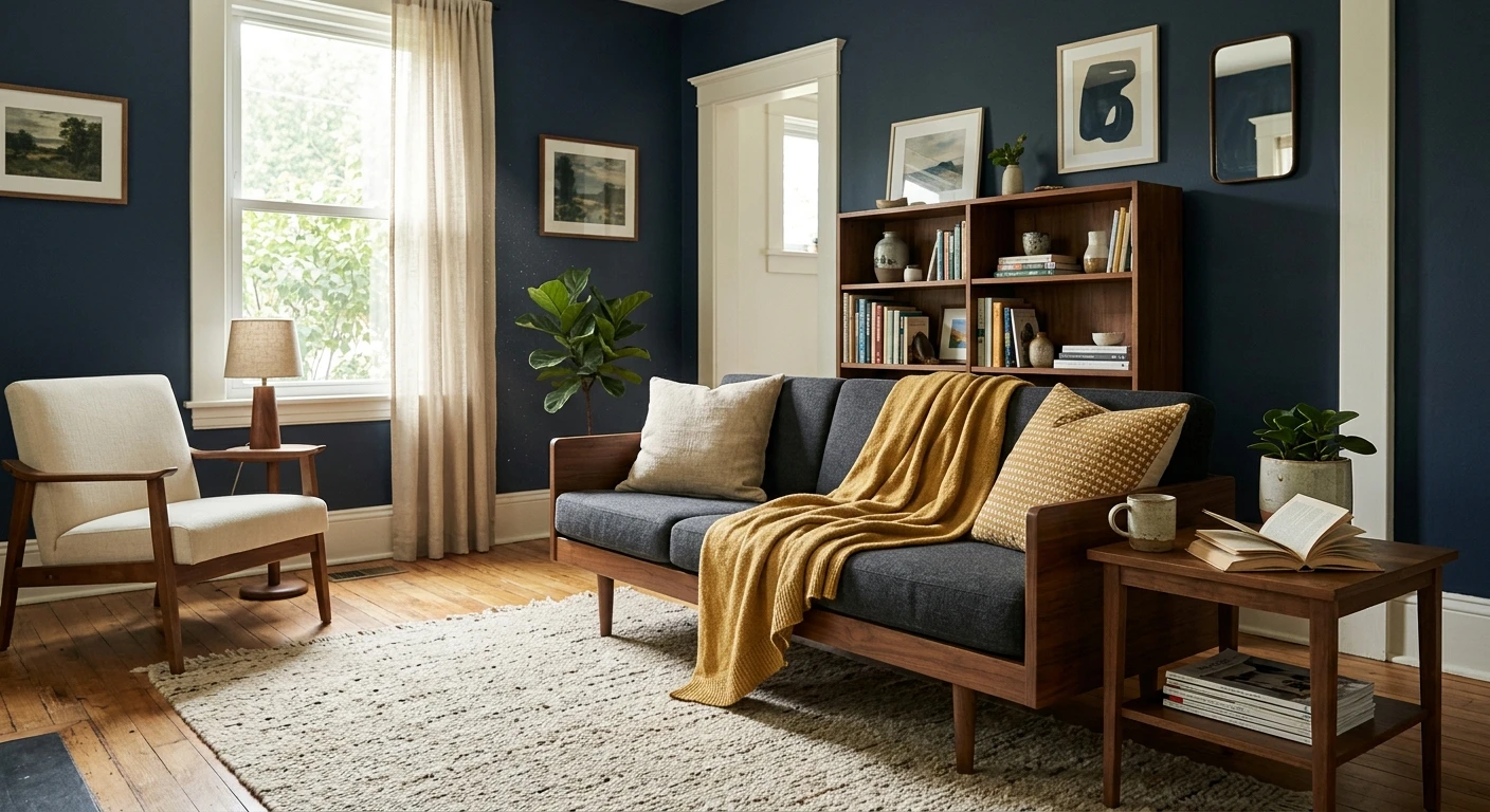

A client painted her dining room a deep inky blue last spring, then called me in a small panic because the room felt like a cold cave at night. The blue was fine. The problem was everything around it: bright white trim, a gray rug, chrome lighting, not one warm note to push back. We added a warm white on the trim, a brass pendant, and a caramel-leather bench, and the same four walls suddenly read like a moody library instead of a waiting room. That is the whole lesson with a dark blue. The wall color is the easy part. The colors that go with dark blue are what decide whether the room feels rich or just dim.
Dark blue (think navy, indigo, slate-blue, a deep teal-leaning blue) is a near-neutral. It behaves almost like a soft black, which is exactly why it anchors a room so well and why it needs warmth and light reflected back at it. This guide is a pairing listicle: the partner colors that genuinely work, the ones that quietly fail, and how to balance them. It sits under our broader interior color schemes guide, and it is the deep-shade companion to our look at pairings for blue across every shade. If you are still choosing the blue itself, start with our interior blue paint shades roundup.
Upload a photo of your actual room and preview a deep blue wall with warm-white trim and accents under your own light in about 30 seconds, free.
Why dark blue acts like a neutral (and why that matters for pairing)
A deep blue has such a low Light Reflectance Value (most navies land around LRV 6 to 12) that it reads as a grounding dark, not a bold accent fighting for attention. That is good news: it pairs as wide as a charcoal or a soft black would. But low LRV also means the wall absorbs light instead of bouncing it, so a dark blue room can tip cold and flat fast. The fix is to choose partner colors that add warmth and brightness rather than piling on more cool tone.
One more thing to read before you pair: your blue's own undertone. A warm navy like Hale Navy leans slightly green-black and loves brass and caramel. A cooler, more saturated royal or indigo leans purple-blue and prefers crisp whites and silver. Get the undertone right and the partner colors fall into place. Here is the short version of what works.
| Partner color | The effect with dark blue | Best for |
|---|---|---|
| Warm white / cream | Brightens and softens; the safest framing color | Trim, ceiling, the 60% in a scheme |
| Brass / warm gold | Adds glow and a touch of luxe; classic with navy | Hardware, lighting, frames |
| Terracotta / rust | High-energy complementary contrast, earthy not loud | Textiles, pottery, one accent chair |
| Caramel / tan wood | Warms the whole room and reads timeless | Floors, leather, oak furniture |
| Blush / dusty pink | Unexpected, soft, modern | Bedrooms, a velvet accent |
| Sage / muted green | Calm, tonal, low-contrast sophistication | Adjacent rooms, layered decor |
| Mustard / ochre | Warm complementary pop with a vintage feel | Pillows, art, a single statement piece |
Sources: Benjamin Moore and Sherwin-Williams color data 2026; color-wheel complementary theory; designer field reports compiled by FacadeColorizer.
The reliable pairings, ranked by how often they actually work
1. Warm white and cream (the one to start with)
If you do nothing else, pair your dark blue with a warm white rather than a stark, blue-white white. This is the single highest-impact decision in the room. A soft cream-white on the trim and ceiling reflects light back, softens the contrast, and stops the blue from feeling like a black hole. Benjamin Moore White Dove (OC-17) is my default partner because its faint warm gray keeps it from going yellow against the blue. Stark whites like a bright blue-white can work in a crisp modern scheme, but next to a warm navy they look almost blue-purple and slightly clinical. For the full shortlist of soft whites that behave next to a deep color, see our warm white paint colors guide and the dedicated White Dove OC-17 review.
2. Brass and warm metals
Brass and dark blue is a pairing that almost never misses. The warm gold catches light against the matte depth of the blue and instantly reads considered, even expensive. Use it on cabinet pulls, a pendant light, picture frames, or legs on a console. The trick is consistency: pick one metal and repeat it three times in the room. Mixing brass, chrome, and black hardware in the same dark blue space is the fastest way to make it look unfinished. Aged or unlacquered brass reads softer and more lived-in than shiny polished brass, which can look a touch flashy in a calm room.
3. Caramel, tan, and natural wood
Wood tones are the quiet workhorse of any dark blue room. White oak floors, a walnut table, a caramel-leather chair: each one bounces warmth back at the blue and grounds it. This is why a navy library or study feels cozy rather than cold. Lean toward warm, honey-leaning woods. Cool gray-washed oak does the opposite and leaves the room feeling flat and a little gray, the same mistake my dining-room client made.
Free AI visualizer. See the walls, trim, and warm accents together before you buy a single sample pot.
4. Terracotta and rust
Here is where it gets interesting. Orange sits opposite blue on the color wheel, so terracotta and rust are technically complementary, which is why they pop so hard against a deep blue. The reason it works in a real home instead of looking like a sports logo is that terracotta is a muted, earthy orange: it carries enough brown and gray to feel grown-up. Use it in textiles, a clay pot, a vintage rug, or one accent chair. A little goes a long way. A whole wall of bright orange against navy would be a lot to live with.
5. Blush and dusty pink
Blush against dark blue is the pairing people are surprised by and then love. A soft, grayed pink (not a bubblegum pink) reads modern and a little romantic without going sweet. It is especially good in bedrooms: a dusty-rose velvet headboard or throw against a deep navy wall is calm and current. Keep the pink muted and dusty; a clean bright pink fights the sophistication of the blue.
6. Sage and muted green
Blue and green are neighbors on the color wheel, so a grayed sage sits in the same calm, slightly moody family as a dark blue. This is a tonal, low-contrast pairing: think a navy room that opens to a sage hallway, or sage botanical art on a blue wall. It is restful rather than punchy. If you want to build a whole quiet palette around it, our sage green shades and pairings guide shows how the greens behave next to deeper blues.
7. Mustard and ochre
Mustard is the more saturated cousin of the brass-and-caramel idea, and it brings a warm, vintage complementary pop. It is a stronger flavor, so I keep it to small doses: a few pillows, a piece of art, a single ceramic. In a mid-century or eclectic room, mustard against dark blue is genuinely great. In a quiet traditional space it can read costume-y, so match it to the room's personality.
Pairings that look good in theory and fail in the room
A pairing guide that only lists winners is not much help. Here is what to be careful with, and why these are the combinations I talk people out of most:
- Dark blue plus stark cool gray: two cool, low-warmth tones together drain all the life out of a room. It is the most common dark-blue mistake, and it reads cold and corporate. If you want gray, use a warm greige, not a steel gray.
- Dark blue plus black, with nothing warm: navy and black can be chic, but only with a warm white and a metal to break them up. On their own they turn a room into a void.
- Dark blue plus bright stark white only: high contrast with zero warmth looks like a nautical theme or a corporate logo. Add a cream, a wood, or a metal to rescue it.
- Dark blue plus a second strong cool color (emerald, plum, teal) in equal amounts: two jewel tones competing at full strength is busy and heavy. Let the blue lead and keep the other to an accent.
- Dark blue plus silver and chrome throughout: not wrong, but it pushes cool. If your blue leans warm (a Hale-Navy type), brass will always look better than chrome.
How to balance the pairing: the 60-30-10 rule for a dark blue room
Knowing what goes with dark blue is half the job. The other half is proportion. The classic 60-30-10 split keeps a deep color from overwhelming a space:
- 60% dominant: usually a warm white or light neutral on the bulk of the walls, ceiling, and large furniture, so the room stays bright.
- 30% secondary: your dark blue, on an accent wall, lower cabinets, built-ins, or a large sofa. This is where the blue carries the mood without swallowing the room.
- 10% accent: the warm pop, brass, terracotta, mustard, or blush, in small repeated doses.
If you want the blue to be the dominant color (a full navy bedroom or library), flip it: let the deep blue be the 60%, then push the warm white and wood up to 30% and keep a single bright accent at 10%. Either way, the warmth is non-negotiable. For trim and built-ins, a warm near-black like SW Iron Ore can deepen the scheme without going cold, and the navy itself is profiled in our Hale Navy HC-154 review.
Preview the dominant white, the blue accent, and a warm pop, all on your real walls, free.
Frequently asked questions
What colors go with dark blue walls?
Warm whites and creams are the safest partners, because they brighten dark blue and stop it from feeling cold. From there, brass and warm gold, caramel and natural wood, terracotta or rust, dusty blush, and muted sage all pair beautifully. The common thread is warmth: a dark blue room needs warm accents reflected back at it, so the surest mistake is surrounding it with cool grays and stark whites only.
What goes with dark blue for a warm, cozy room?
For warmth, lean on brass hardware and lighting, honey or caramel wood tones (white oak floors, a walnut table, a leather chair), and a soft cream white on the trim. A terracotta rug or a mustard accent adds a complementary pop. These warm notes counter the low light reflectance of a deep blue, which is exactly why a navy library or study reads cozy rather than cold.
Does gray go with dark blue?
It depends on the gray. A cool steel gray next to dark blue drains the room and looks corporate, so that is the pairing to avoid. A warm greige, on the other hand, works well because it adds a hint of warmth instead of doubling the cool tone. If you want a neutral alongside a deep blue, reach for a warm greige or a cream rather than a true cool gray.
What is the complementary color of dark blue?
On the color wheel, orange sits opposite blue, so the complement of a dark blue is an orange family color. In a home that translates to muted, earthy versions: terracotta, rust, caramel, mustard, and ochre. Those grayed-down oranges give you the high-contrast energy of a true complement without the loud, sporty look of a bright orange against navy.
What trim and ceiling color works with dark blue?
A warm white is the best trim and ceiling choice. Benjamin Moore White Dove (OC-17) is a reliable pick because its soft warm gray frames the blue without going yellow or stark. Avoid a bright blue-white white next to a warm navy, as it can read slightly blue-purple and clinical. A warm white on the ceiling also reflects more light, which a low-LRV dark blue room needs.
Preview a deep blue wall with warm-white trim, wood, and one accent color on your actual room before buying a single sample.
Disclaimer: Benjamin Moore, Hale Navy (HC-154), and White Dove (OC-17) are trademarks of Benjamin Moore & Co. Sherwin-Williams and Iron Ore are trademarks of The Sherwin-Williams Company. FacadeColorizer is an independent paint visualization service and is not affiliated with, endorsed by, or sponsored by Benjamin Moore or Sherwin-Williams. Color reproduction on screens approximates the manufacturer's chip; always confirm with a manufacturer sample under your own light before purchase. Sources: Benjamin Moore and Sherwin-Williams color data 2026, color-wheel complementary theory, designer field reports compiled by FacadeColorizer.
Trademarks mentioned (Sherwin-Williams, Benjamin Moore, Behr, Caparol, Brillux, Sto, Alpina, Valspar, PPG, Glidden, Dulux, Crown Trade, Sandtex, Farrow & Ball, Johnstone's, Leyland) are property of their respective owners. FacadeColorizer is independent and not affiliated with any of them. Nominative fair use under Lanham Act §1125.


