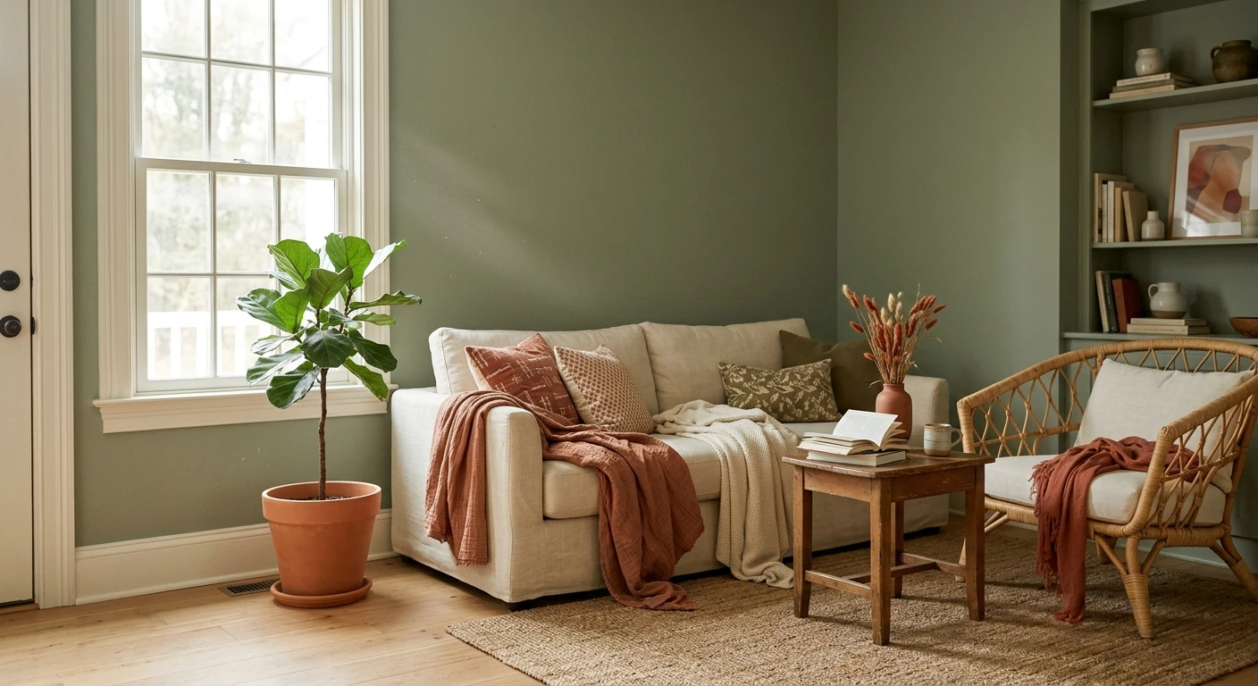

The sage was already on the wall when the trouble started. A client of mine had rolled a beautiful muted green across her dining room, loved it for a week, then bought a bright cool-white trim paint on a whim and watched the whole room go cold and a little sad overnight. Nothing was wrong with the sage. The problem was the company it kept. That is the whole game with this color: sage green is gorgeous, but it is a team player, and the colors that go with sage green decide whether the room reads calm and expensive or flat and unfinished. Here are twelve pairings that actually work, plus the ones I steer people away from.
Quick definition first, because "sage" gets used loosely. True sage is a soft, grayed-down green: think of the herb, dusty and muted, not a clean grass green or a bright mint. Most sages carry a gray undertone, and many lean slightly warm with a yellow or olive whisper underneath. That gray is exactly why sage plays so well with neutrals, and why a few clean cool partners can fight it. This piece is the pairing companion to our broader interior color schemes guide for 2026 and our wider look at colors that go with green: this one stays narrowly on sage and the exact tones to put beside it.
Upload a photo of your actual room and preview sage plus a trim or accent color under your own light in about 30 seconds, free.
First, read your sage: warm, cool, or gray
Before you pick a single partner color, work out which way your sage leans. It changes everything. Warm sages (an olive or yellow whisper underneath) want warm partners: cream, terracotta, brass, oak. Cooler, grayer sages take crisper whites and blue-grays better. Hold a true cream and a true white sheet of paper against the wall in daylight. Whichever makes the sage look right, not dingy and not icy, tells you the temperature to chase. Most American sages sit on the warm-to-neutral side, which is why warm white wins so often below.
One painter's note before the list. Sage is a low-LRV-to-mid color depending on the shade, so it eats light. In a north-facing or dim room it can flatten fast, and the wrong cool partner pushes it gray. That is not a reason to avoid sage; it is a reason to pair it warm and to cut in a sample before you commit.
12 colors that go with sage green
Here are my twelve, grouped from safest neutrals out to the bolder accents. The first five are the sage green color combinations I reach for ninety percent of the time.
1. Warm white (the default, and the best)
A creamy warm white on trim, ceiling, and adjacent walls is the single most reliable partner for sage. It reads clean without going clinical, and the shared warmth keeps the green looking soft instead of muddy. This is the pairing that saved my client's dining room: we swapped her cool-white trim for a warm white and the sage instantly warmed back up. For the white side of this equation, our guide to warm white paint colors and their undertones is the place to start.
2. Greige
A warm greige (gray plus beige) is sage's quiet best friend as a body color. Put greige on the main walls and let sage carry a cabinet, an island, or built-ins. The two grayed tones speak the same language and the room feels collected rather than busy. See how greige behaves in our warm greige paint colors guide.
3. Taupe and mushroom
For a tonal, layered scheme, taupe is the move. A soft mushroom taupe sits a half-step deeper than sage and turns the whole palette into a hushed, organic blend that looks expensive in person. This is my favorite for a primary bedroom. Our taupe paint colors guide covers the undertones to match.
4. Off-white and soft cream
When warm white feels too yellow for your sage, a clean off-white gives a fresher, more current edge while still staying friendly to the green. Off-white walls with sage cabinetry is a kitchen formula that never looks dated.
5. Natural wood tones
Not a paint, but it belongs on the list. White oak, walnut, rattan, and natural cane bring the warmth that makes sage sing. If your floors and furniture lean warm wood, half your pairing work is already done. This is also why sage works so well on kitchen cabinetry, covered in our green kitchen cabinet paint colors guide.
6. Navy blue
Sage and navy is the pairing that surprises people. A deep blue grounds the soft green and reads classic, almost nautical, without the expected clash because both are muted. Use navy on a lower cabinet, an island, or a single accent and let sage stay the lead. For the full range of deep blues, see our navy interior paint colors guide.
7. Terracotta and warm clay
This is the complementary play. Green and orange sit opposite on the wheel, so a muted terracotta against sage gives natural, earthy contrast that feels straight out of a Tuscan kitchen. Keep the terracotta dusty, not neon, and use it in accents (pillows, a rug, a single wall) rather than fifty-fifty.
8. Black (trim and hardware)
A warm near-black on window frames, a door, or cabinet hardware sharpens sage and stops it from drifting too soft. Black is the punctuation that makes the green look deliberate. Our SW Tricorn Black guide shows how a true black behaves indoors.
9. Blush and dusty pink
For a softer, more feminine scheme, a muted blush against sage is unexpectedly lovely. The two pastels share a gray base, so the combination feels vintage and gentle rather than sweet. Best in bedrooms and reading nooks.
10. Brass and gold (metals)
What goes with sage green in hardware? Warm metals. Aged brass, unlacquered gold, and antique bronze fixtures pull out sage's warmth and lift the whole room. Polished chrome and cool nickel, by contrast, can leave sage looking flat, which brings us to the next part.
11. Charcoal gray
A warm charcoal is a softer alternative to black for grounding sage. It gives depth and a modern edge without the hard line, and it pairs beautifully with sage on a fireplace surround or built-in shelving.
12. Deep olive (tonal green)
Want a richer, moodier room? Layer sage with a deeper olive green. Staying in one color family but shifting depth gives a sophisticated, enveloping result. This monochrome-green approach is one of my favorites for a study or powder room.
Free AI visualizer. See the pairing on your real walls before buying a single sample pot.
Sage green pairings at a glance
Here is the short version: which partner, what mood it creates, and where to use it. Use this as your cheat sheet at the paint counter.
| Partner color | Mood it creates | Best use |
|---|---|---|
| Warm white | Calm, classic, fresh | Trim, ceiling, adjacent walls (safest) |
| Greige | Collected, neutral | Body walls with sage as accent |
| Taupe | Tonal, organic, restful | Bedrooms, layered living rooms |
| Navy blue | Classic, grounded, bold | Island, lower cabinets, accent |
| Terracotta | Earthy, warm, Mediterranean | Accents, rugs, one feature wall |
| Black | Sharp, deliberate, modern | Window frames, hardware, a door |
| Brass / gold | Warm, elevated, vintage | Fixtures, hardware, lighting |
Sources: color-theory complementary and analogous pairing principles; The Spruce and designer field reports on sage-green palettes compiled by FacadeColorizer 2026.
Free AI visualizer. Test sage against a warm and a cool partner side by side.
What does NOT go with sage green
A pairing list is only honest if it tells you the misses too. These are the combinations I talk clients out of:
- Stark cool blue-whites: the most common mistake. A bright, blue-based white next to sage drains the warmth and leaves the green looking gray and tired. This is what wrecked my client's dining room. Choose a warm or soft white instead.
- Polished chrome and cool nickel everywhere: a little is fine, but a room full of cool silver metal flattens sage. Warm metals flatter it far more.
- Bright, clean primary colors: a true fire-engine red or a saturated cobalt fights sage's muted nature and makes the green look dull by comparison. Keep accents grayed-down.
- Cool gray-washed floors: they pull sage toward gray and the room goes cold. Warm wood is the fix.
- Too much sage: sage on walls, sofa, rug, and curtains reads flat and one-note. It needs a neutral and one accent to breathe.
How to test sage pairings before you commit
A fan-deck chip lies about sage. It reads lighter and cleaner than a rolled wall, and it cannot show you how a partner color shifts the green across the day. Two better methods:
- Sample large, together: roll a 12-by-12-inch sage swatch and put your candidate white or accent right beside it, not across the room. Check it mid-morning, mid-afternoon, and at night under your normal bulbs. The relationship between the two colors is what you are judging, not either one alone.
- Preview it digitally first: upload a real photo of your room and apply sage plus a warm white, a navy, and a terracotta before you buy any samples, narrowing the field to the one combination worth painting. For where a full sage scheme fits among other palettes, our interior color schemes guide for 2026 is a useful map, and our sage green interior shades and pairings guide goes deeper on the green itself.
Preview sage against a warm and a cool partner, side by side, free.
Frequently asked questions
What colors go best with sage green?
Warm white is the most reliable partner for sage green, because the shared warmth keeps the green soft instead of muddy. After that, greige, taupe, and natural wood make calm tonal schemes, while navy, terracotta, black, and brass add contrast and depth. The key is matching temperature: most sages lean warm, so warm partners flatter them most.
What does NOT go with sage green?
Stark blue-based cool whites are the biggest mistake, because they drain sage's warmth and make it look gray and tired. Also avoid a room full of polished chrome or cool nickel, bright clean primary colors that fight sage's muted nature, and cool gray-washed floors that pull the green toward gray. Sage needs warm or grayed-down company.
Does navy blue go with sage green?
Yes, sage green and navy blue is a classic pairing. Both colors are muted and grounded, so they sit together without clashing the way brighter green and blue would. Use navy on a single element (an island, lower cabinets, or one accent) and keep sage as the lead color for a balanced, slightly nautical look.
What metal hardware looks best with sage green?
Warm metals look best with sage green. Aged brass, unlacquered gold, and antique bronze pull out the green's warmth and lift the room, which is why they are so popular for sage kitchen and bath hardware. Polished chrome and cool nickel tend to flatten sage, so use cool metals sparingly if at all.
What white trim should I use with sage green walls?
Use a warm or soft white, not a stark blue-white. A creamy warm white keeps sage walls looking soft and intentional, while a bright cool white can make the green read cold and dingy. If a warm white looks too yellow against your particular sage, step to a clean off-white rather than jumping to a blue-based white.
Preview sage with your chosen trim or accent on your actual walls under your own light before buying a single sample.
Disclaimer: Sage green, warm white, greige, taupe, off-white, navy, terracotta, black, and the other tones described here are color descriptions, not specific products, and exact shades vary by manufacturer. FacadeColorizer is an independent paint visualization service and is not affiliated with, endorsed by, or sponsored by any paint brand. Color reproduction on screens approximates real paint; always confirm with a manufacturer sample under your own light before purchase. Sources: color-theory complementary and analogous pairing principles, The Spruce sage-green palette coverage, and designer field reports compiled by FacadeColorizer 2026.


