
The first bedroom I repainted for a client was a north-facing box with one small window and a gray I had talked her into off a fan deck. By 9 p.m. under her lamps it read like wet concrete, and we repainted it warm the next weekend. That is the whole problem with bedroom color schemes in one story: a bedroom is a room you mostly see at dawn and after dark, almost never in flat noon light, so the scheme has to hold up under low light and warm bulbs, not on a showroom card. Below are 12 complete schemes, each a wall, trim, and accent with real hex values, built to survive that test.
A note on how to read these. Every scheme follows a simple 60/30/10 split: roughly 60 percent wall color, 30 percent trim and large textiles (bedding, curtains, an upholstered headboard), 10 percent accent (a feature wall, a lamp, a throw, art). The hex codes are screen approximations of the manufacturer chips, close enough to plan around but not a substitute for a real sample. This guide sits inside our wider interior color schemes guide; if you want a deeper dive on the most restful single colors rather than full palettes, start with our calming master bedroom guide.
Upload a photo of your actual bedroom and preview any palette below under your own light in about 30 seconds, free.
How to build a bedroom color scheme that lasts
Before the palettes, four rules I give every client. They do more for color schemes for bedrooms than any trendy color.
- Match warmth to your window, not the trend. North-facing and basement bedrooms strip warmth out, so cool grays and stark whites go flat and clinical there. Reserve those for south and west rooms with real sun. A good bedroom wall color combination starts with the light, then the color.
- Keep the wall in the LRV 50 to 75 band for a restful room. LRV (Light Reflectance Value) measures how much light a color bounces back. Too high (a brilliant white) and the room feels like an office; too low and it closes in. Mid-tones read calm.
- Let one element carry the drama. A moody color works when it lives on one feature wall or in the bedding, not on all four walls plus the ceiling. On one wall it cocoons; everywhere it feels heavy.
- Test on the wall you wake up looking at. Roll a large swatch behind the headboard and check it at 7 a.m., at dusk, and under your real bulbs. A 2700K warm bulb and a 4000K cool bulb pull a color in opposite directions.
The 12 bedroom color schemes at a glance
Here is the full set in one table so you can scan for a vibe and the hex values before reading the detail. Wall is the body color, trim covers woodwork and large textiles, accent is the feature wall or decor pop. Best-light notes are in each scheme's detail below.
| Scheme | Wall (hex) | Trim (hex) | Accent (hex) |
|---|---|---|---|
| 1. Warm greige neutral | Agreeable Gray #D1CCC0 | Alabaster #EDEAE0 | Urbane Bronze #54504A |
| 2. Moody navy + brass | Cool White #EFF0EC | White Dove #F2EFE3 | Hale Navy #313D49 |
| 3. Soft sage retreat | Evergreen-lean sage #B8BBAA | Warm white #F4F1E8 | Walnut wood #5A4632 |
| 4. Blush + charcoal | Warm blush #E7D4CC | Creamy white #F1ECE2 | Charcoal #3B3A38 |
| 5. Blue-gray calm | Blue-gray #B3BBC0 | Soft white #EFEEE9 | Deep teal #2E4A4E |
| 6. Creamy white + oak | Warm white #F0EADD | Bright white #F7F4EC | Honey oak #8A6A45 |
| 7. Terracotta + cream | Creamy white #F1ECE2 | Warm white #F4F1E8 | Terracotta #B06A4F |
| 8. Greige + lavender | Light greige #D9D3C8 | Soft white #EFEEE9 | Dusty lavender #9C95A6 |
| 9. Black feature + warm white | Warm white #F0EADD | Same warm white | Tricorn Black #2B2B2B |
| 10. Olive + camel | Muted olive #8E8A6E | Soft cream #EDE7D7 | Camel leather #A9794E |
| 11. Pale blush monochrome | Pale blush #EFE2DC | Bright white #F7F4EC | Deeper rose #C99A8E |
| 12. Taupe + ivory + black | Warm taupe #B5A998 | Ivory #F1ECE0 | Soft black #353331 |
Hex values are screen approximations of Sherwin-Williams, Benjamin Moore, and Behr chips, compiled by FacadeColorizer; confirm with a manufacturer sample.
Free AI visualizer. Test any scheme on your bedroom before buying a single sample pot.
The 12 schemes, one by one
1. Warm greige neutral (the failsafe)
Wall SW Agreeable Gray (LRV 60), trim SW Alabaster, accent SW Urbane Bronze on a headboard wall or built-ins. This is what I reach for when a client wants a room they will still like in five years. The greige stays warm under lamp light, the bronze grounds it so it does not read builder-bland, and it is the easiest scheme here to live with in a cool north room. For the undertone story, see our greige paint colors guide.
2. Moody navy and brass
Walls a quiet cool white, trim BM White Dove, accent BM Hale Navy (LRV around 7) behind the bed, with warm brass lamps and hardware. This is the most requested "grown-up hotel" look right now and it earns it. Keep the navy to one wall, since four navy walls in a small bedroom feel like a submarine, and pick brass over chrome to keep it warm. The full profile is in our Benjamin Moore Hale Navy HC-154 review; for which wall to pick, see our bedroom accent wall ideas.
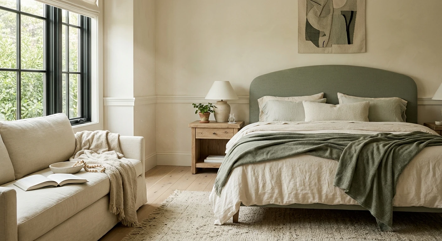
3. Soft sage retreat
Wall a muted sage in the softened Evergreen Fog direction, trim a warm white, accent walnut wood in the nightstands and frame. Sage is the calming green that reads neutral, not Kermit, and it flatters natural light and linen. It is my favorite for a couple who cannot agree on warm versus cool, since muted green sits between the two. More pairings live in our sage green shades and pairings guide.
4. Blush and charcoal
Wall a warm blush, trim creamy white, accent charcoal in the bedding and one piece of furniture. This is how you do pink without it reading nursery: a blush with brown in it, grounded by charcoal so it has a spine. It is one of the few schemes that improves in a cool north room, where dim light tones the pink down to a sophisticated putty.
5. Blue-gray calm
Wall a true blue-gray, trim soft white, accent deep teal. Blue lowers the perceived temperature of a room, which is why it suits a sunny south or west bedroom that runs hot in the afternoon. The risk: in a dim north room it slides cold and sad, so I only use it where there is real sun. See undertone behavior in our blue-gray paint colors guide.
6. Creamy white and oak (the small-room rescue)
Wall a warm white, trim a slightly brighter white, accent honey oak in flooring and furniture. This is the best paint combination for bedroom spaces that are small, dim, or north-facing, where any real color goes muddy. Warm white plus wood reads light and airy. Skip cool blue-whites here; they expose every shadow.
7. Terracotta and cream
Wall creamy white, trim warm white, accent terracotta on a feature wall or in textiles. Terracotta is the warm clay tone that makes a sunny room feel like a Mediterranean afternoon. Keep it to an accent, since a full terracotta room runs dark, and pair it with rattan and linen.
8. Greige and dusty lavender
Wall light greige, trim soft white, accent dusty lavender in bedding and a single chair. Lavender turns juvenile fast, but a grayed-off, dusty version against warm greige reads like a quiet French bedroom. Best in soft east or north light, where it stays muted rather than purple.
9. Black feature wall and warm white
Wall and trim a warm white, accent SW Tricorn Black on one wall behind the bed. Done right this is dramatic and restful at once, because black behind your head is something you feel rather than stare at. The catch: it needs decent light and warm white everywhere else, or the room tips cave-like. Choose a soft warm black, not a blue-black.
10. Olive and camel
Wall a muted olive, trim soft cream, accent camel leather. The coziest scheme here, an enveloping green-brown for a bedroom you want to feel like a den. It needs sun to keep the olive from going gray, so reserve it for south or west rooms.
11. Pale blush monochrome
Wall pale blush, trim bright white, accent a deeper rose in textiles. A near-tonal pink room, soft and quiet, with one deeper rose for depth so it does not read flat. Like scheme 4, the warmth makes it kind to north-facing rooms, and it is the palette I recommend most to people who find gray cold.
12. Taupe, ivory, and black
Wall warm taupe, trim ivory, accent soft black in lighting and frames. Taupe is the warm gray-brown that flatters almost any wood and metal, and the black gives it an editorial edge. It is the most flexible scheme here and reads well in any light. For the gray side of taupe, our colors that go with gray guide is the companion read.
Matching a scheme to your room (a 60-second decision tree)
If you are stuck, decide in this order, the same triage I run on a site visit.
- North-facing or basement bedroom: go warm. Schemes 1, 4, 6, 8, and 11 hold up; cool blues and stark whites will not.
- South or west with strong sun: you have earned the cooler, moodier picks. Schemes 2, 5, 9, and 10 sing here.
- Small bedroom: keep the wall light (LRV 60 plus) and put the color in the bedding and one accent. Scheme 6 is built for this; a feature wall reads larger than four dark walls.
- Low effort, high payoff: scheme 1 or 12, both forgiving in any light and easy to accessorize.
- Sharing with someone who disagrees: scheme 3 (sage) or 12 (taupe) sit between warm and cool and satisfy both camps.
One painter habit worth stealing: when you buy, cut in the trim first, then roll the walls, and plan a second coat on the deep accent colors (navy, black, terracotta). Rich pigments rarely cover in one pass, and a thin coat is where streaks live.
Frequently asked questions
What is the best color scheme for a bedroom?
There is no single best one; it depends on your light. For a forgiving, restful room that works in almost any window direction, a warm greige wall with cream trim and a bronze or wood accent (scheme 1 above) is the safest bet. North-facing and small bedrooms do best with warm schemes (greige, blush, creamy white plus oak), while sunny south and west rooms can carry the moodier navy, black, and olive palettes.
How do I pick a bedroom wall color combination?
Use a 60/30/10 split: about 60 percent wall color, 30 percent trim and large textiles, and 10 percent accent (a feature wall or decor pop). Start by matching warmth to your window (warm colors for north and dim rooms, cooler or moodier ones for sunny rooms), keep the main wall in roughly the LRV 50 to 75 range for a calm feel, and let only one element carry the drama.
What colors make a bedroom feel calm?
Muted, mid-tone colors read most restful: soft sage green, dusty blue-gray, warm greige, blush, and taupe. Brilliant pure whites can feel clinical at night, and very saturated brights tend to feel energizing rather than calming. The calming bedroom palettes in this guide (schemes 1, 3, 5, 8, and 11) all keep the wall soft and put any stronger color in a single accent.
Can I use a dark color in a small bedroom?
Yes, but put it on one feature wall (usually behind the bed) rather than all four, and keep the trim and other walls light and warm. A single navy, charcoal, or soft-black accent wall actually adds depth and can make a small room feel larger and cozier at once. Painting every wall dark in a small, low-light bedroom is where it tips cave-like.
How many colors should a bedroom have?
Three is the sweet spot: a wall color, a trim or large-textile color, and one accent. Every scheme in this guide follows that structure. You can layer in a fourth as a small accessory, but more than three working colors competing for attention usually makes a bedroom feel busy rather than restful.
Preview any of these 12 palettes on your actual walls under your own light before buying a single sample.
Disclaimer: Sherwin-Williams, Agreeable Gray (SW 7029), Alabaster (SW 7008), Urbane Bronze (SW 7048), Evergreen Fog (SW 9130), and Tricorn Black (SW 6258) are trademarks of The Sherwin-Williams Company. Benjamin Moore, Hale Navy (HC-154), and White Dove (OC-17) are trademarks of Benjamin Moore & Co. Behr is a trademark of Behr Process Corporation. FacadeColorizer is an independent paint visualization service and is not affiliated with, endorsed by, or sponsored by Sherwin-Williams, Benjamin Moore, or Behr. Hex and LRV values are screen approximations of the manufacturers' chips; always confirm with a manufacturer sample under your own light before purchase. Sources: Sherwin-Williams and Benjamin Moore color data 2026, designer field reports compiled by FacadeColorizer.
Trademarks mentioned (Sherwin-Williams, Benjamin Moore, Behr, Caparol, Brillux, Sto, Alpina, Valspar, PPG, Glidden, Dulux, Crown Trade, Sandtex, Farrow & Ball, Johnstone's, Leyland) are property of their respective owners. FacadeColorizer is independent and not affiliated with any of them. Nominative fair use under Lanham Act §1125.


