The drywall went up gray, the trim was already white, and now the throw pillows in the cart all look wrong. I get this message constantly: someone painted a perfectly nice gray, lived with it for a week, and realized the room felt flat instead of calm. Gray is not the problem. The problem is treating gray as one color when it is really three or four different colors hiding under the same name. The colors that go with gray depend entirely on which gray you actually have on the wall, so the first job is to read its undertone, then pick partners that agree with it.
Here is the short version before the long one. A warm greige wants warm partners (cream, blush, terracotta, oak). A cool or blue-leaning gray wants cooler, crisper partners (navy, sage, true white, brass for contrast). Mix the temperatures by accident and the room reads muddy. This guide is part of our wider interior color schemes guide, and it focuses on one question only: once gray is on the wall, what goes next to it. If you are still choosing the gray itself, start with our breakdown of interior gray shades by undertone first, then come back here for the pairings.
Upload a photo of your actual room and preview gray next to its best match under your own light in about 30 seconds, free.
First, read your gray's undertone
Before a single pairing makes sense, you have to know which way your gray leans. Hold a true white card (a fresh sheet of printer paper works) right against the wall. The white will instantly expose the bias you have been ignoring. Three broad buckets cover almost every interior gray:
- Warm gray / greige: leans beige, taupe, or cream. Think Agreeable Gray (SW 7029) or Revere Pewter (HC-172). Against white paper it looks soft and slightly dirty in a good way. For the full warm story, see our Agreeable Gray undertones guide.
- Neutral / true gray: reads gray with only a faint violet or green whisper, like Repose Gray (SW 7015). The most flexible bucket, and the one our Repose Gray guide covers in detail.
- Cool gray / blue gray: a clear blue or steel lean. Crisp and modern, but cold in north light. Our blue gray undertones guide and light gray undertones guide map this group.
One painter rule worth repeating: warm grays pair with warm colors, cool grays pair with cool colors, and you cross the line only on purpose for contrast (a brass lamp on a cool gray, say). Get that right and everything below clicks.
Best colors that go with warm gray (greige)
Warm gray is forgiving, which is why it is the most-painted neutral in the country. Its cream-beige base reflects warm light, so it loves partners that lean warm too. These are the pairings I reach for first:
- Soft cream (#F3EBD8): the safest move there is. Cream trim or drapery flatters greige instead of exposing it, and the room reads collected. This is the everyday best color combination for gray when you want calm, not drama.
- Warm white, like White Dove (OC-17): a slightly off white on trim keeps a greige from ever tipping cold. Avoid stark blue-whites here; they make warm gray walls look slightly green and dingy by comparison.
- Blush / dusty rose (#D9A7A0): a muted pink picks up the warm undertone and reads grown-up, not nursery. Beautiful in bedrooms and powder rooms.
- Terracotta / clay (#B5673F): for a bolder warm scheme. A clay accent wall or sofa against greige feels earthy and current.
- Olive or muted green (#7C7A52): warm-leaning greens sit naturally beside greige and bring in a sage, organic note without going cold.
- Natural oak and walnut (decor, not paint): wood tones are the unsung partner. Warm gray plus white oak floors is the look most people are actually chasing when they search what goes with gray walls.
What to skip with warm gray: icy true-white trim, cold steel-blue, and anything lavender. Those fight the cream base and leave the wall looking muddy.
Free AI visualizer. Test warm gray against its partner colors on your real walls before buying samples.
Best colors that go with cool and blue gray
Cool and blue grays read crisp, architectural, and a little serious. They want partners that hold their own coolness or provide a clean contrast. Push warm colors here and the gray can look drab, so choose deliberately:
- Navy, like Hale Navy (HC-154) (#2C3E50): the classic deep partner for a cool gray. Use it on an accent wall, lower cabinets, or a built-in for instant weight and depth. This is one of the strongest gray color combinations for a study or moody dining room.
- Crisp true white (#FBFCFD): a clean cool white on trim and ceiling lets a blue gray feel modern and gallery-like. Here the stark white that ruined warm gray is exactly right.
- Sage and eucalyptus green (#9FB0A2): a cool-leaning green is a quiet, sophisticated companion that keeps the temperature consistent.
- Charcoal and black (#1A1A1A): black window frames, hardware, or a charcoal accent wall give a light cool gray the contrast it needs to not read flat.
- Brass and gold (decor accent): the one warm exception. A brass lamp, frame, or faucet against cool gray is a deliberate contrast that warms the room just enough without muddying it.
- Soft lavender (#B8AEC6): blue grays already flirt with violet, so a true lavender accent extends that gracefully in a bedroom or nursery.
What to skip with cool gray: cream, tan, and orange-leaning wood. Warm partners pull against a blue base and the whole room can read gloomy rather than serene.
Gray pairing cheat sheet
Here are the ten pairings above in one place, with an approximate hex for the partner and the gray temperature each one is built for. Take this to the paint counter:
| Partner color | Approx. hex | Best with which gray | Mood |
|---|---|---|---|
| Soft cream | #F3EBD8 | Warm greige | Calm, collected |
| Warm white (White Dove) | #F4F0E6 | Warm greige | Soft, traditional |
| Blush / dusty rose | #D9A7A0 | Warm greige | Grown-up, warm |
| Terracotta / clay | #B5673F | Warm greige | Earthy, bold |
| Olive / muted green | #7C7A52 | Warm greige | Organic, current |
| Navy (Hale Navy) | #2C3E50 | Cool / blue gray | Deep, classic |
| Crisp true white | #FBFCFD | Cool / blue gray | Modern, clean |
| Sage / eucalyptus | #9FB0A2 | Cool / blue gray | Quiet, refined |
| Charcoal / black | #1A1A1A | Cool / light gray | Graphic, sharp |
| Brass / gold (accent) | #B08D4F | Cool gray (contrast) | Warm pop |
Hex values are screen approximations of decor and paint tones; confirm any paint shade with a manufacturer chip. Sources: Sherwin-Williams and Benjamin Moore color data 2026; designer field reports compiled by FacadeColorizer.
See walls, trim, and an accent color together in one preview, free.
Pairings by room
The same gray asks for slightly different partners depending on the room's job and its light. A few that consistently land:
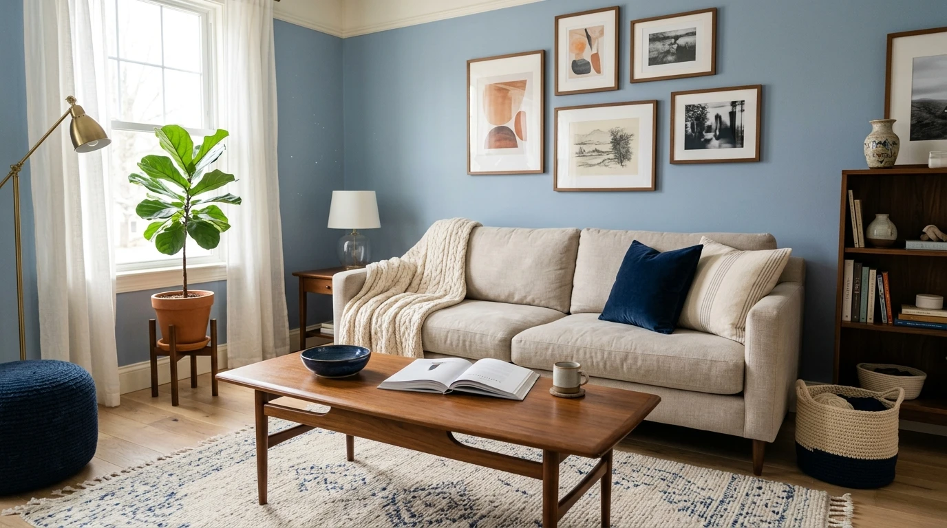
Living room
Warm gray walls plus cream trim plus a clay or olive accent reads relaxed and layered. For a cooler gray, swap to crisp white trim with a navy or charcoal accent wall and brass lighting. The wood floor tone is the tiebreaker: oak pushes you warm, gray-washed plank pushes you cool.
Bedroom
Bedrooms are where blush and lavender earn their place. A warm greige with dusty-rose bedding feels restful and adult; a blue gray with soft lavender and white linens feels serene and cool. Keep contrast low for sleep.
Kitchen
Gray cabinets are a whole project of their own. Warm greige cabinets love brass hardware, white oak, and a creamy backsplash; cool gray cabinets take black or brushed-nickel hardware and a bright white counter. For the full cabinet treatment, see our guide to gray kitchen cabinet paint colors.
The mistakes that make gray look flat
Most gray rooms that disappoint are not badly painted; they are badly paired. The repeat offenders:
- Mixing temperatures by accident: warm greige walls with cold steel-blue accents (or cool gray walls with cream curtains) is the single most common reason a room reads muddy. Pick a lane.
- All gray, no contrast: gray walls, gray sofa, gray rug, and gray pillows give you a room that photographs flat and feels lifeless in person. Every gray scheme needs one darker anchor (navy, charcoal, black) and one warmer or brighter note.
- The wrong white trim: stark blue-white next to warm gray, or creamy white next to cool gray, undercuts both. Match the white to the wall's temperature.
- Forgetting the light: a north-facing room drains warmth, so a borderline gray can tip cool and its partners shift with it. Always judge pairings in the actual room, at more than one time of day.
Preview wall, trim, and accent together before you buy a single sample pot, free.
Frequently asked questions
What colors go best with gray walls?
It depends on the gray's undertone. Warm greige (like Agreeable Gray) pairs best with cream, blush, terracotta, olive, and natural oak. Cool or blue gray pairs best with navy, crisp white, sage, charcoal, and a brass accent for contrast. The one rule that prevents a muddy room: match warm grays to warm partners and cool grays to cool partners, crossing over only on purpose.
What is the best color combination for gray and navy?
Navy (such as Benjamin Moore Hale Navy HC-154, roughly #2C3E50) is the classic partner for a cool or neutral gray. Put navy on an accent wall, lower cabinets, or a built-in, keep the rest of the trim a crisp white, and add a brass or black metal accent. It reads deep and timeless, especially in studies, dining rooms, and kitchens. Navy works less well against a strongly warm greige, where it can look slightly out of step.
What accent color makes a gray room less boring?
Add one warmer or bolder note and one darker anchor. For warm gray, a blush, terracotta, or olive accent plus warm wood does it. For cool gray, navy or charcoal as the anchor plus a brass pop. The mistake is going all-gray (walls, sofa, rug, pillows), which photographs flat and feels lifeless; a single contrasting color brings the whole scheme to life.
Does gray go with beige and warm tones?
A warm gray (greige) goes beautifully with beige, cream, and warm wood because they share the same temperature; this is the foundation of the "greige plus oak" look most people want. A cool or blue gray is a different story: beige and tan pull against its blue base and can make the room read drab. Read your gray against a white card first, then decide.
What white trim goes with gray?
Match the white to the gray's temperature. A warm greige looks best with a soft warm white like White Dove (OC-17), which keeps it from ever reading cold. A cool or blue gray looks best with a crisp, clean white that lets it feel modern. Putting a stark blue-white next to warm gray, or a creamy white next to cool gray, undercuts both and is a common reason gray trim looks slightly off.
Preview gray next to navy, blush, sage, or cream on your actual walls under your own light before buying a single sample.
Disclaimer: Sherwin-Williams, Agreeable Gray (SW 7029), and Repose Gray (SW 7015) are trademarks of The Sherwin-Williams Company. Benjamin Moore, Hale Navy (HC-154), and White Dove (OC-17) are trademarks of Benjamin Moore & Co. FacadeColorizer is an independent paint visualization service and is not affiliated with, endorsed by, or sponsored by Sherwin-Williams or Benjamin Moore. Hex codes for partner and decor colors are screen approximations and will vary by monitor; always confirm a paint shade against a manufacturer sample under your own light before purchase. Sources: Sherwin-Williams and Benjamin Moore color data 2026, The Spruce neutral-paint pairing coverage, designer field reports compiled by FacadeColorizer.
Trademarks mentioned (Sherwin-Williams, Benjamin Moore, Behr, Caparol, Brillux, Sto, Alpina, Valspar, PPG, Glidden, Dulux, Crown Trade, Sandtex, Farrow & Ball, Johnstone's, Leyland) are property of their respective owners. FacadeColorizer is independent and not affiliated with any of them. Nominative fair use under Lanham Act §1125.