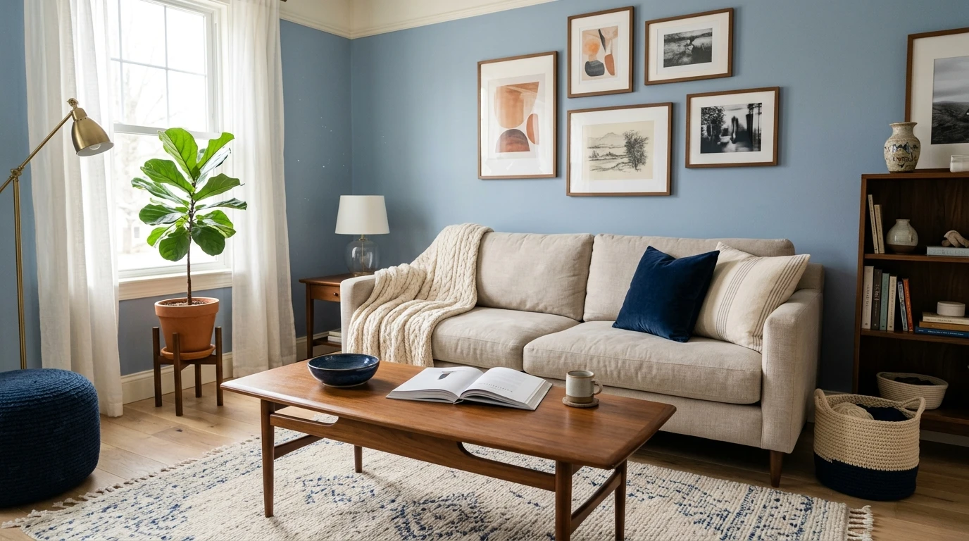

A client once handed me a single navy throw pillow and said, "build the whole room around this." That is usually how it starts. Blue is the color most people commit to first and panic about second, because the question that follows is always the same: what actually goes with it? The good news is that blue is one of the friendliest base colors in the house. It plays nicely with warm whites, soft neutrals, metals, and wood. The bad news is that the wrong partner (a cold stark white, an orange-y oak, a competing teal) can leave a blue room feeling flat or fighting itself. Below are the colors that go with blue indoors, sorted by the three blues people actually paint: deep navy, soft light blue, and muted blue-gray.
One thing before we get into combinations. "Blue" is not one decision, it is a family, and the right pairing depends entirely on which blue you are starting from. A near-black navy at LRV 6 wants different company than a breezy sky blue at LRV 55. So I have split the guide by blue depth, then given you the safe partners and the bolder ones for each. This article sits inside our wider interior color schemes guide, which maps how whole palettes hang together room by room.
Upload a photo of your actual room and preview a blue wall with white trim, brass, and wood in about 30 seconds, free.
The four reliable partners for any blue
Before we split by shade, here are the four pairing categories that flatter almost every blue on the deck. Think of these as your default toolkit, then adjust the exact tone to match how deep or how soft your blue is.
- Warm white: the single most useful partner. A soft warm white (cream-leaning, not blue-white) brightens blue and keeps it from reading cold. This is your trim, your ceiling, and often the surrounding walls.
- Warm neutral (greige, beige, taupe): grounds blue and adds a second quiet layer so the room is not just blue-and-white. Greige is the diplomat that makes navy feel collected instead of nautical.
- Metal accent (brass, gold, bronze): the warm metal that makes blue look intentional. Brass against navy is one of the most dependable combinations in interior design, full stop.
- Natural wood: white oak, walnut, and rattan reflect warmth back onto blue walls and pull the whole scheme toward "cozy" rather than "cold." Wood is the antidote when a blue room feels too crisp.
Notice what is missing from that list: a stark blue-white trim. The most common mistake I cut in to fix is white trim that is cooler than the blue beside it. It makes the blue look muddy and the trim look gray. Keep the white warm and the blue does the work. If you want to understand how blue itself behaves before choosing partners, our breakdown of blue-gray paint undertones and rooms is the place to start on the muted end of the family.
Colors that go with navy blue
Navy is the deep, saturated end of the family, the one people paint on a single accent wall, a built-in, or a kitchen island and then build the room around. Because it is so dark (a true navy like Benjamin Moore Hale Navy HC-154 sits around LRV 6), it reads almost as a neutral and takes contrast beautifully. The pairings that go with navy blue:
- Warm white (the classic): BM White Dove (OC-17) or SW Alabaster against navy is timeless. The soft cream keeps the contrast crisp without going icy. This is the safe, can't-miss pick for trim and ceilings.
- Brass and gold: warm metals are navy's best friend. Cabinet pulls, sconces, a mirror frame, even a faucet in brushed brass make navy look custom rather than dark.
- Warm wood: white oak and walnut soften navy's depth. A walnut floor under navy cabinets is the combination half my kitchen clients end up choosing once they see it.
- Blush and dusty rose: for a bedroom, a muted pink against navy is the unexpected pairing that designers reach for. It warms the navy and reads grown-up, not sweet.
- Mustard and ochre: as an accent in pillows or art, a warm yellow opposite navy on the color wheel makes both colors pop. Use it in small doses.
- Avoid: a competing cool gray that is neither clearly warm nor clearly white. Next to navy it reads dirty and undecided.
For the full undertone breakdown of the navy most of these schemes are built on, see our Benjamin Moore Hale Navy HC-154 review. And if navy cabinetry is where you are headed, our guide to blue kitchen cabinet paint colors shows the exact navy plus countertop plus hardware combinations that hold up.
Free AI visualizer. See your navy wall against warm-white trim and wood before you buy a sample pot.
Colors that go with light blue
Light blue is the breezy, airy end (think sky, powder, soft coastal blues at LRV 50 plus). It reads fresh and calm, which makes it a favorite for bedrooms, bathrooms, and nurseries. Because it is so light, it wants partners that keep that lightness alive rather than weigh it down. The colors that go with light blue:
- Crisp white: here, unlike with navy, a cleaner white actually works. A bright white trim keeps light blue looking fresh and coastal rather than washed out. SW Pure White or BM Chantilly Lace are reliable.
- Sand and warm beige: the coastal pairing. A sandy greige floor or rug grounds light blue and gives it that relaxed seaside feel without trying too hard.
- Soft greens (sage): light blue and a muted sage sit next to each other on the wheel and read serene together. This analogous pairing is gentle and very current for a calm bedroom.
- Natural rattan and light wood: oak, jute, and rattan add warmth and texture so a light blue room does not feel cold or flat.
- Navy as an anchor: a small dose of deep navy (a lamp base, a frame, a striped textile) gives an all-light-blue room a backbone so it does not float away.
- Avoid: heavy, saturated warm colors like terracotta in large amounts. They overpower light blue's delicacy and the balance tips.
If a soft green keeps catching your eye next to the blue, our guide to sage green interior shades and pairings covers exactly which sages sit happily beside a light blue. For more room-level schemes built on blue at any depth, our blue room ideas roundup shows finished combinations across living spaces and bedrooms.
Colors that go with blue-gray
Blue-gray is the muted, sophisticated middle: a gray with a quiet blue undertone, the kind of color that reads as a neutral until the light hits it. It is the easiest blue to live with on full walls, which is why it has become a whole-home favorite. Because it is already so restrained, it pairs with almost anything, but a few partners make it sing:
- Warm white trim: a soft warm white keeps blue-gray from sliding fully cool. This is the pairing that lets blue-gray read as a refined neutral rather than a cold one.
- Greige and taupe: a warm greige on adjacent walls or in furniture balances blue-gray's coolness and builds a layered, tonal scheme. This is the quietest, most livable combination of the three blues.
- Black accents: matte black hardware, window frames, or a light fixture give blue-gray a crisp, modern edge. The contrast feels architectural.
- Brass or aged bronze: as with navy, a warm metal counters the cool and adds polish.
- White oak: light wood floors are the natural match, warming the cool walls without competing.
- Avoid: a second cool gray with a different undertone (a violet-gray next to a blue-gray, say). Two cool grays that do not match make a room look like a paint mistake.
Blue-gray is the shade most people mean when they say they want "blue but not too blue." For the full undertone map of where these colors land and how they shift north versus south, our blue-gray paint undertones guide goes deeper on the family itself.
Free AI visualizer. Test blue-gray against greige, white oak, and black accents on your real walls.
Quick pairing table: blue by depth
Here is the whole guide on one screen. Match the row to the blue you are starting from, then borrow the partners. These are blue color combinations I reach for again and again on real jobs:
| Your blue | Safe partner | Bolder accent | Best white / trim |
|---|---|---|---|
| Deep navy (LRV ~6) | Warm greige, walnut | Brass, blush, mustard | Warm white (White Dove, Alabaster) |
| Mid blue (LRV ~25 to 40) | Greige, white oak | Brass, soft coral, navy | Soft white, slightly warm |
| Light blue (LRV ~50 plus) | Sand, rattan, sage | Navy anchor, crisp white | Crisp white (Pure White, Chantilly Lace) |
| Blue-gray (muted) | Greige, taupe, white oak | Matte black, aged bronze | Warm white |
Sources: color-wheel pairing principles (complementary and analogous schemes); Benjamin Moore and Sherwin-Williams color data 2026; designer field reports compiled by FacadeColorizer.
The three pairing strategies behind every combination above
If you understand why these pairings work, you can build your own. Every combination above leans on one of three color-wheel relationships:
- Complementary (high energy): blue sits opposite orange on the wheel, which is why brass, gold, ochre, terracotta, and warm wood all flatter blue. Opposites create contrast and make each color look more vivid. Use the warm side as the accent, not the whole room.
- Analogous (calm and serene): blue next to its neighbors, green and violet, gives a soft, low-contrast scheme. Light blue with sage, or blue-gray with a gentle lavender-gray, reads restful. Best for bedrooms.
- Neutral-anchored (timeless): blue plus warm white plus a greige or taupe. No bold contrast, just blue carried by quiet warm neutrals. This is the most forgiving and the most resale-friendly. When in doubt, this is the formula.
For a fuller tour of the warm neutrals that anchor these schemes (where beige, greige, and taupe differ and which to reach for), our interior paint color families guide is the reference. And if you are matching blue to a specific room rather than a strategy, our room-by-room paint color ideas shows how these pairings shift from a north-facing bedroom to a bright open kitchen.
How to test your blue pairing before you commit
A pairing that looks perfect on Pinterest can fall apart in your own light, because blue is one of the most light-sensitive colors there is. The same navy reads almost black in a north room and clearly blue in afternoon sun, and that changes which partner works. Two ways to get it right before you buy a thing:
- Sample in context, not in isolation: paint a large swatch of your blue, then physically hold your trim white, a wood sample, and a brass swatch right next to it. Check it morning, afternoon, and at night under your normal bulbs. Cut in a clean edge so you are judging the real color, not a feathered one, and let the second coat dry before you decide.
- Preview the whole palette digitally first: upload a real photo of your room and apply the blue plus its partner trim and accents together, so you are judging the combination, not one color alone. That narrows several contenders to the one worth painting. It is the fastest way to see whether your navy wants White Dove or Pure White next to it.
Preview your blue with warm-white trim, wood, and a metal accent side by side, free.
Frequently asked questions
What colors go with blue walls?
The most reliable partners for blue walls are a warm white (for trim and ceilings), a warm neutral like greige or taupe (on adjacent walls or furniture), a warm metal such as brass or gold (in hardware and lighting), and natural wood like white oak or walnut. For a calmer scheme, soft green (sage) sits beside blue beautifully. Avoid a stark blue-white trim, which can make blue look muddy.
What colors go with navy blue?
Navy blue pairs best with warm white (White Dove or Alabaster), brass and gold metals, and warm wood like walnut, all of which keep its depth from feeling heavy. For accents, blush pink reads grown-up in a bedroom and mustard or ochre creates a vivid complementary pop in small doses. Steer clear of an undecided cool gray next to navy, which can look dirty.
What goes with light blue in a bedroom?
Light blue stays fresh next to crisp white, sand or warm beige (the coastal look), soft sage green for an analogous calm scheme, and natural rattan or light wood for warmth. A small dose of deep navy as an anchor (a lamp, a frame, a stripe) gives an all-light-blue room a backbone. Avoid large amounts of heavy warm colors like terracotta, which overpower its delicacy.
Do gray and blue go together?
Yes, when the undertones agree. A warm greige is the easiest gray to pair with any blue because it balances blue's coolness and reads timeless. Blue-gray (a gray with a quiet blue undertone) is itself one of the most livable blues. The trap is putting two mismatched cool grays together, such as a violet-gray beside a blue-gray, which makes a room look like a paint error.
What metal looks best with blue?
Brass and gold are the standout metals for blue, especially navy, because warm metal sits opposite blue's coolness and makes the whole scheme look intentional and custom. Aged or oil-rubbed bronze works well with blue-gray for a softer, more architectural feel. Polished chrome can read cold next to deep blue; if you use it, keep the rest of the palette warm to compensate.
Preview your blue with warm-white trim, wood, and brass accents on your actual walls before buying a single sample.
Disclaimer: Benjamin Moore, Hale Navy (HC-154), White Dove (OC-17), and Chantilly Lace are trademarks of Benjamin Moore & Co. Sherwin-Williams, Accessible Beige (SW 7036), Alabaster (SW 7008), and Pure White (SW 7005) are trademarks of The Sherwin-Williams Company. FacadeColorizer is an independent paint visualization service and is not affiliated with, endorsed by, or sponsored by Benjamin Moore or Sherwin-Williams. Color reproduction on screens approximates the manufacturer's chip; always confirm with a manufacturer sample under your own light before purchase. Sources: color-wheel pairing principles for complementary and analogous schemes, Benjamin Moore and Sherwin-Williams color data 2026, designer field reports compiled by FacadeColorizer.
Trademarks mentioned (Sherwin-Williams, Benjamin Moore, Behr, Caparol, Brillux, Sto, Alpina, Valspar, PPG, Glidden, Dulux, Crown Trade, Sandtex, Farrow & Ball, Johnstone's, Leyland) are property of their respective owners. FacadeColorizer is independent and not affiliated with any of them. Nominative fair use under Lanham Act §1125.


