
The first wall I ever painted a pale blue was a north-facing nursery, and within a week the owners called it "the hospital room." Not the color's fault. The blue was lovely. The problem was everything around it: bright white trim, a cool gray rug, gray curtains, two LED bulbs at 5000K. Light blue is one of the most flattering wall colors in the book, but it punishes a bad supporting cast the fastest. Get the partners right and a soft blue reads calm and coastal. Get them wrong and it turns chilly and flat. This guide is the cast list: the colors that go with light blue indoors, and the few that sabotage it.
Quick framing. "Light blue" covers a wide band, from a near-gray powder blue to a clean sky tone with a green or violet lean. What goes with pale blue depends a little on which you have, but one rule holds: pale blue is cool, so it almost always wants at least one genuinely warm partner to feel balanced rather than sterile. This page lives inside our broader interior color schemes guide, and it is the light-tone companion to our wider colors that go with blue roundup, which covers navy and mid-blues.
Upload a photo of your actual room and preview a pale blue with warm-white trim under your own light in about 30 seconds, free.
First, read your light blue: undertone changes the partners
Before you choose a partner, figure out which way your blue leans. Hold the chip against plain printer paper in daylight and the undertone shows:
- Green-lean (aqua, sea glass): fresh and coastal. It loves warm whites, natural wood, and brass. Keep cool grays away.
- Gray-lean (powder, dusty blue): the most sophisticated and the most fragile. Pairs beautifully with greige, taupe, and soft white, but a stark white next to it exposes the gray and looks dingy.
- Violet-lean (periwinkle): the trickiest. It can pull lavender under cool LEDs. Anchor it with warm neutrals and a 2700K bulb, and skip pink accents.
One painter's note that saves grief: pale blue almost always photographs cooler and grayer than it lives on the wall. If you are choosing from Pinterest alone, assume the real room lands a touch warmer and softer. That is also why a small fan-deck chip is a poor judge of light blue: you need a real surface and your real light. For where these soft blues sit on the LRV and undertone map, our guide to blue-gray paint colors and their undertones is the closest companion piece.
The best colors that go with light blue
Here are the partners that earn their place, ranked by how reliably they work. Most rooms use two or three, never all at once.
1. Warm white (the non-negotiable)
This is the partner light blue cannot do without. A soft warm white on trim and ceiling keeps a pale blue room from tipping into clinical. Benjamin Moore White Dove (OC-17) and SW Alabaster (SW 7008) are the two I reach for first, because their cream bias warms the blue back up. The mistake people make is grabbing a stark blue-white like SW Extra White: against a gray-leaning blue it reads cold and the walls look dirty by comparison. For the full slate of soft whites that play nicely here, our off-white paint colors and undertones guide is the shortlist.
2. Taupe and warm greige (the grounding move)
If you want pale blue to feel like a grown-up room rather than a baby's, this is the secret. A warm greige or taupe on a second wall, in a rug, or on a sofa absorbs the coolness and gives the eye somewhere warm to rest. Taupe in particular is the unsung hero of light-blue rooms: sophisticated, never competing with the blue, and it photographs as "expensive." See our taupe paint colors and undertones guide for tones warm enough to balance a cool blue.
3. Navy (the tonal anchor)
Layering a deep navy with a light blue is the easiest way to make a soft scheme look intentional instead of washed out. Navy on a door, on built-ins, or on one accent wall gives the room a backbone. Benjamin Moore Hale Navy (HC-154) is the classic choice, and this tonal blue-on-blue approach reads tailored and never dates. For more ways to build a room around blue at full strength, our blue room paint color ideas roundup shows the range.
4. Soft gold and brass (the warm metal)
Blue and gold are complementary on the color wheel, so a soft brushed brass or muted gold lights pale blue up instantly: cabinet hardware, a mirror frame, a lamp base. The key word is brushed. A shiny polished gold feels loud, while an aged brass reads warm and quiet against the cool wall. It is the cheapest upgrade for a blue room that feels a little flat.
5. Natural wood and greenery (the organic layer)
Light oak, walnut, rattan, and live plants do for blue what they do for greige: pull warmth back in and keep the room from feeling like a showroom. Blue and wood is the heart of coastal and Scandinavian schemes for a reason. Sage and olive greens sit naturally beside a light blue too, since both come from the cool-but-soft family. If you like that direction, our sage green interior shades and pairings guide shows how the two greens layer with blue.
Free AI visualizer. Test the blue and its partner colors on your real walls before buying a single sample pot.
Light blue pairings at a glance
Here is the cast list in one place: what each partner does for a pale blue room, and where it works best.
| Partner color | What it does for light blue | Best used on |
|---|---|---|
| Warm white (White Dove, Alabaster) | Keeps it crisp without going icy; the essential partner | Trim, ceiling, doors |
| Taupe / warm greige | Grounds the cool blue and makes the room feel grown-up | Second wall, rug, sofa |
| Navy (Hale Navy) | Tonal anchor; adds depth and a tailored backbone | Accent wall, built-ins, door |
| Soft gold / brass | Complementary warm metal; instantly lifts a flat blue | Hardware, lighting, frames |
| Natural wood + greenery | Adds warmth and an organic, coastal feel | Floors, furniture, plants |
| Stark blue-white (Extra White) | Avoid: exposes the gray, reads cold and dingy | Skip on gray-lean blue |
Sources: Benjamin Moore and Sherwin-Williams color data 2026; color-wheel complementary theory; The Spruce and Better Homes & Gardens blue-pairing coverage; designer field reports compiled by FacadeColorizer.
Light blue pairings room by room
The right partners shift a little by room, mostly because of how much warm light each space gets.
Bedrooms
Pale blue is one of the most requested bedroom colors because it genuinely reads calm. Lean into warm whites, a taupe or oatmeal headboard and bedding, and warm 2700K bulbs at the bedside. Skip cool gray bedding, the most common reason a blue bedroom feels cold. A touch of soft gold in the lamps finishes it.
Bathrooms and powder rooms
This is where light blue earns its spa reputation. Pair it with crisp warm-white trim, aged-brass fixtures, and white or marble-look tile, with a natural wood vanity to warm it. The classic coastal bath is just pale blue plus warm white plus brass, and it never looks dated.
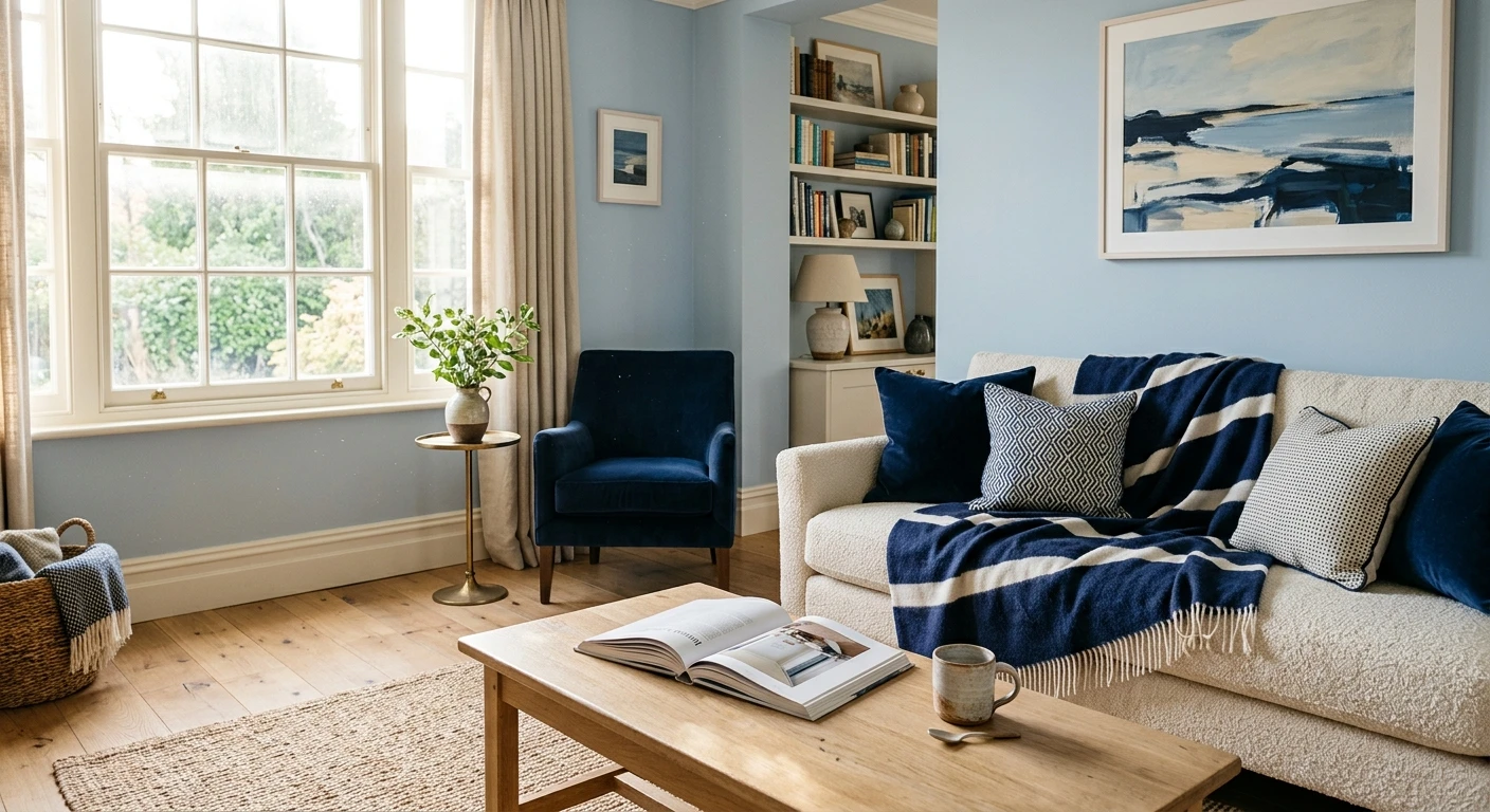
Living rooms and kitchens
In shared rooms, light blue works best as a backdrop with warmth layered in: wood floors, a greige or taupe sofa, navy as an accent on a cabinet or bookcase. On kitchen cabinets, a soft blue lower with warm-white uppers and brass hardware is one of the most enduring looks going. Just keep one big warm element in the sightline so the room does not read cold.
Where light blue struggles
A small, north-facing room with only cool LED light is the hardest place for pale blue. With no warm light source, even a good blue flattens. The fix is not a different blue, it is warmer light (2700K) plus a genuinely warm partner color. If it still feels cold, the room probably wants a warm neutral on the walls with blue moved to accents.
See walls, trim, and a navy accent together in one preview, free.
Colors to use carefully with light blue
A few pairings get recommended a lot but backfire more than people admit. None are banned, they just need a steady hand:
- Cool gray: the number-one mistake. Two cool colors with no warm relief is what makes a blue room feel like a waiting area. If you want gray, use a warm greige.
- Stark blue-white trim: a cool white like Extra White next to a gray-leaning blue exposes the gray and reads dingy. Use a warm white instead.
- Pink or coral with a violet-lean blue: they shove the violet forward and the wall can tip lavender. Fine with a clean sky blue, risky with periwinkle.
- Too much black: a little near-black hardware is sharp, but black plus cool blue plus white feels stark. Soften it with wood.
Search note: what goes with light blue, colors that go with pale blue, and light blue color combinations all land on the same answers above. The partner logic (one warm white, one grounding neutral, one anchor) holds across the whole blue band.
How to test a light blue scheme before you commit
A 3-inch chip is the number-one reason a pale blue disappoints: it reads cooler and grayer than a rolled wall. Two better methods:
- Paint a large swatch with the trim beside it: roll a 12-by-12-inch sample and brush a stripe of your chosen warm white right next to it. Cut in cleanly so you can read the contrast. Check it mid-morning, mid-afternoon, and at night under your normal bulbs, and watch for cool-light flatness in any dim corner. A second coat shows the true depth, so sample two coats.
- Preview it digitally first: upload a real photo of your room and apply the light blue with a warm-white trim and a navy or taupe accent before buying samples, narrowing the scheme to one worth painting. Pricing context for the full repaint is in our interior house painting cost guide for 2026.
Preview light blue against warm white, taupe, and navy, side by side, free.
Frequently asked questions
What colors go best with light blue?
Warm white is the essential partner for light blue, on trim and ceiling, because it keeps the blue crisp without going icy. The other strong pairings are a warm taupe or greige to ground it, navy as a tonal anchor, soft gold or brass as a complementary metal, and natural wood with greenery for warmth. Most rooms use the blue plus two or three of these, not all at once.
What trim color goes with light blue walls?
A soft warm white is the most reliable trim for light blue, such as Benjamin Moore White Dove (OC-17) or SW Alabaster (SW 7008). Their cream bias warms the blue back up and keeps the room from reading clinical. Avoid a stark blue-white like SW Extra White next to a gray-leaning blue, since it exposes the gray and makes the walls look cold and dingy.
Does gray go with light blue?
A warm greige goes well with light blue, but a cool steel gray usually does not. Two cool colors with no warm relief is the most common reason a blue room feels like a waiting area. If you want a gray-toned partner, choose a warm greige or taupe instead.
What goes with pale blue in a bedroom?
In a bedroom, pair pale blue with warm-white trim, taupe or oatmeal bedding, a wood or upholstered headboard, and warm 2700K bulbs at the bedside. A touch of soft gold finishes it. Skip cool gray bedding, the most common reason a blue bedroom ends up feeling cold rather than calm.
Do blue and gold go together?
Yes. Blue and gold are complementary on the color wheel, so a soft brushed brass or muted gold lifts a pale blue room instantly. Use it on cabinet hardware, a mirror frame, or a lamp base. Choose brushed or aged brass rather than a shiny polished gold, which feels loud against a soft blue wall.
Preview a pale blue with warm white, taupe, and a navy accent on your actual walls under your own light before buying a single sample.
Disclaimer: Benjamin Moore, White Dove (OC-17), and Hale Navy (HC-154) are trademarks of Benjamin Moore & Co. Sherwin-Williams, Alabaster (SW 7008), and Extra White are trademarks of The Sherwin-Williams Company. FacadeColorizer is an independent paint visualization service and is not affiliated with, endorsed by, or sponsored by Benjamin Moore or Sherwin-Williams. Color reproduction on screens approximates the manufacturer's chip; always confirm with a manufacturer sample under your own light before purchase. Sources: Benjamin Moore and Sherwin-Williams color data 2026, color-wheel complementary theory, The Spruce and Better Homes & Gardens blue-pairing coverage, designer field reports compiled by FacadeColorizer.
Trademarks mentioned (Sherwin-Williams, Benjamin Moore, Behr, Caparol, Brillux, Sto, Alpina, Valspar, PPG, Glidden, Dulux, Crown Trade, Sandtex, Farrow & Ball, Johnstone's, Leyland) are property of their respective owners. FacadeColorizer is independent and not affiliated with any of them. Nominative fair use under Lanham Act §1125.


