
The first time I rolled teal across a dining room wall, the homeowner went quiet for a full minute. Then she said, "I have no idea what to put next to it." That reaction is the whole problem with teal in a sentence. It is a gorgeous color, halfway between blue and green, deep enough to feel grown-up and saturated enough to carry a room on its own. But it is bossy. Pair it badly and the room reads like a dentist's office circa 1994. Pair it well and it looks like money. So the real question is not whether to use teal, it is what colors go with teal once it is on the wall. Below are 12 teal color combinations I actually trust, sorted from safe to bold.
One thing to settle first. Teal is not a single chip, it is a range. A bright peacock teal at LRV 18 behaves very differently from a deep, grayed-out teal at LRV 9, and the lighter "mermaid" teals lean almost turquoise. The pairings below hold across that range, but I will flag where a deep teal wants different company than a brighter one. This guide lives inside our wider interior color schemes guide, which maps how full palettes hang together room by room. If you are still choosing the exact teal shade, start with our teal paint colors for interiors roundup, then come back here for the partners.
Upload a photo of your actual room and preview a teal wall with white trim, brass, and wood in about 30 seconds, free.
The four safe partners for any teal
If you remember nothing else, remember these four. They flatter every teal from peacock to deep slate, and they are the reason a teal room reads designed instead of accidental. Start here, add the bolder pairings only once the base is set.
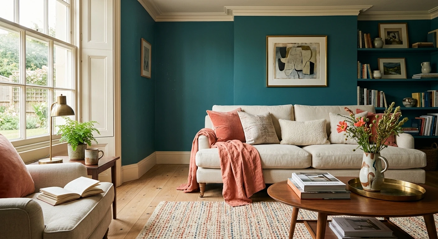
- 1. Warm white. A creamy off-white (think soft, slightly yellow) is teal's best trim and ceiling partner. It keeps the contrast crisp without the icy snap a stark blue-white brings. This is the pairing that stops teal from feeling cold. For the full lineup, see our warm white paint colors guide.
- 2. Warm gold and brass. Unlacquered brass, aged gold, antique hardware. Gold is a warm near-complement to teal on the color wheel, and the warmth balances teal's coolness instantly. A brass sconce against a teal wall is the single highest-impact, lowest-effort move in this whole list.
- 3. Natural wood. Walnut, white oak, rattan, cane. Wood reads warm and organic next to teal's cool depth, which is why teal kitchens and built-ins lean on it so heavily. Avoid orange-toned honey oak, though, it fights teal and pulls everything toward 1980s.
- 4. Soft gray. A greige or warm mid-gray on adjoining walls lets a teal accent wall breathe instead of shouting. This is the move for people who love teal but do not want to live inside it.
12 teal color combinations, decoded
Here is the full list, organized by the mood you are after. Each pairing tells you what it does and which teal it suits best, because a deep slate teal and a bright peacock want different friends.
| Pairing | Mood it creates | Best with which teal |
|---|---|---|
| Teal + warm white | Crisp, fresh, calm | Any teal, especially brighter peacock |
| Teal + brass gold | Rich, glamorous, warm | Deep and mid teal |
| Teal + walnut wood | Organic, grounded, timeless | Any teal |
| Teal + greige | Quiet, modern, balanced | Teal as an accent wall |
| Teal + navy | Moody, deep, tonal | Deep slate teal |
| Teal + coral | Playful, bold, retro | Bright peacock teal |
| Teal + blush pink | Soft, unexpected, warm | Mid teal, bedrooms |
| Teal + mustard yellow | Mid-century, confident | Deep and mid teal |
| Teal + black | Sharp, dramatic, modern | Any teal, on trim and hardware |
| Teal + terracotta | Earthy, warm, lived-in | Grayed deep teal |
| Teal + soft sage | Tonal, restful, green-leaning | Green-leaning teal |
| Teal + cream beige | Coastal, airy, relaxed | Lighter turquoise-teal |
Sources: color-wheel complementary theory; Benjamin Moore and Sherwin-Williams color data 2026; designer field reports compiled by FacadeColorizer.
The warm pairings: gold, coral, mustard, terracotta
Teal is a cool color, so its most reliable companions are warm. This is not decorator superstition, it is the color wheel: teal sits roughly opposite the warm reds and oranges, with coral landing closest to its true complement, so warm tones make each other look more vivid. Gold and mustard sit just beside that complement rather than directly across, which is why they read as a softer, harmonious warmth instead of a hard contrast. When a teal room feels flat, nine times out of ten it is starved of warmth.
Gold and brass are the easy win. Hardware, light fixtures, picture frames, even a thin brass mirror surround will make a teal wall glow. Mustard yellow is the bolder cousin, a velvet mustard chair against deep teal is peak mid-century and it never reads timid. Coral is the most fun and the most divisive: a coral cushion or art piece against bright peacock teal is joyful and a little retro, but it overwhelms a grayed-down teal, so save it for the saturated shades. Terracotta is the grown-up version, an earthy clay tone that grounds a deep, slightly gray teal and makes the whole room feel sun-warmed rather than cold.
My honest opinion: skip coral if your teal leans toward slate or navy. The two cancel each other and you end up with mud. Coral needs a teal that still has some turquoise life in it.
Free AI visualizer. Test the warm partners on your real walls before buying a single sample pot.
The tonal pairings: navy, sage, blush, gray
If high contrast is not your style, teal also plays in quieter, tonal schemes where colors sit close on the wheel. These feel layered and calm rather than punchy.
- Teal + navy: two deep blues in the same room sounds risky, but a deep slate teal next to a true navy like Hale Navy reads as a rich, moody gradient. Keep the trim warm white so it does not turn into a cave. If navy is your starting point, our colors that go with blue guide covers the wider blue family.
- Teal + sage green: a green-leaning teal beside a soft sage is barely a contrast at all, which is the point. This is a spa-quiet pairing for bedrooms and baths.
- Teal + blush pink: the unexpected one. A dusty blush softens teal's intensity and adds warmth without the punch of coral. Beautiful in a bedroom, especially with a mid teal rather than a dark one.
- Teal + warm gray: the do-no-harm partner. A greige on the other walls lets a teal accent be the star, which is the easiest way to enjoy teal without committing the whole room to it.
Whites, blacks, and the trim question
Trim is where teal rooms go right or wrong, so a few rules from painting plenty of them. Cut in the trim last and keep your line sharp, because the contrast against teal is unforgiving and a wobbly edge shows from across the room.
- Warm white trim (best): a creamy off-white keeps the contrast clean and the room friendly. This is the default and it rarely misses.
- Crisp white trim: a brighter, cleaner white gives teal a modern, almost coastal snap. Good with lighter turquoise-teals; it can feel a touch clinical with very dark teal.
- Black trim and hardware: a true black like SW Tricorn Black on window frames, a door, or a sconce sharpens teal and reads contemporary. Use it in moderation; a whole room of black-on-teal gets heavy fast. More on near-blacks in our Tricorn Black guide.
- Avoid: a stark blue-white ceiling over a deep teal. It pulls the cool even cooler and the room loses its warmth entirely.
For a ceiling, a warm white or a soft white pulled from the trim keeps a teal room bright. If you are committing teal to a whole feature wall, the accent wall color strategy guide walks through which wall to choose so the color lands with the most impact.
Preview teal against warm white, crisp white, and black trim, side by side, free.
Teal pairings by room
Where the teal goes changes which partner works hardest:
- Living room: teal accent wall, warm gray on the rest, brass lighting, walnut furniture. A coral or mustard throw adds the spark. See more whole-room schemes in our top living room paint colors for 2026.
- Bedroom: mid teal with blush and warm white. Restful, warm, and a little unexpected. Skip the high-contrast coral here, it is too energetic for sleep.
- Kitchen: teal lower cabinets, white oak open shelving, brass pulls, warm white walls. This is one of the most-requested combinations of the year and it ages well.
- Bathroom: deep teal with crisp white and brass fixtures reads like a boutique hotel. A green-leaning teal with sage tile is the calmer route.
- Dining room: deep teal walls (this is where dark teal earns its keep), warm white trim, gold and a single black accent. Cozy and dramatic after dark.
Before you commit to a gallon, price the full job. Our interior house painting cost guide for 2026 covers what a teal feature wall versus a whole room actually runs, including the second coat teal almost always needs over a lighter base.
How to test teal pairings before you commit
Saturated colors like teal are the riskiest to judge from a 3-inch chip, because the depth and the undertone (blue-leaning versus green-leaning) shift hard with light and with whatever sits beside them. Two better methods:
- Paint a large swatch: roll a 12-by-12-inch sample on two walls and hold your real partner materials against it, the brass knob, the white trim card, a wood sample. Check it morning, afternoon, and at night. Teal almost always needs a second coat to reach its true depth, so test over two coats.
- Preview it digitally first: upload a real photo of your room and apply teal with white, gold, navy, and wood before you buy any samples. It narrows a dozen pairing ideas to the two worth painting, which saves a counter full of sample pots.
Preview teal against its best partner colors, side by side, free.
Frequently asked questions
What colors go with teal best?
Teal's most reliable partners are warm: a creamy warm white for trim, brass or gold for hardware, and natural walnut or white oak wood. Soft warm gray works on adjoining walls to let a teal accent breathe. Because teal is cool, warm companions make it look richer; coral sits closest to teal's true complement on the color wheel, while gold and brass sit just beside it as a harmonious near-complement, which is why all three pop.
Do teal and gold go together?
Yes, teal and gold are one of the strongest pairings in interiors. Gold is a warm near-complement to teal (it sits just beside coral, teal's true complement, on the color wheel), so the warm metal makes the cool color look more vivid and luxurious. Brass hardware, gold light fixtures, and antique frames against a teal wall are the single highest-impact, lowest-effort way to finish a teal room.
What goes with teal in a bedroom?
In a bedroom, pair a mid teal with dusty blush pink and a warm white for a soft, restful, slightly unexpected scheme. Blush adds warmth without the high-energy contrast of coral, which is too stimulating for sleep. Add brass lamp bases and natural wood nightstands to keep the room feeling layered rather than cold.
What white trim works with teal?
A warm, creamy off-white is the safest trim with teal because it keeps the contrast crisp without an icy snap. A brighter crisp white gives lighter turquoise-teals a modern coastal edge but can feel clinical against very dark teal. Avoid a stark blue-white ceiling over deep teal, since it pulls the room colder and strips out the warmth.
Do teal and coral go together?
Teal and coral go together beautifully, but only with the right teal. A bright, turquoise-leaning peacock teal loves a coral accent for a playful, retro look. A grayed-down or slate teal cancels coral out and the pair can read muddy, so reserve coral for the more saturated teal shades and use it as an accent, not a wall color.
Preview teal on your actual walls with white, gold, navy, and wood before buying a single sample.
Disclaimer: Benjamin Moore and Hale Navy (HC-154) are trademarks of Benjamin Moore & Co. Sherwin-Williams and Tricorn Black (SW 6258) are trademarks of The Sherwin-Williams Company. FacadeColorizer is an independent paint visualization service and is not affiliated with, endorsed by, or sponsored by Benjamin Moore or Sherwin-Williams. Teal is a color family rather than a single product; specific shades vary by brand. Color reproduction on screens approximates the manufacturer's chip; always confirm with a manufacturer sample under your own light before purchase. Sources: color-wheel complementary theory, Benjamin Moore and Sherwin-Williams color data 2026, designer field reports compiled by FacadeColorizer.
Trademarks mentioned (Sherwin-Williams, Benjamin Moore, Behr, Caparol, Brillux, Sto, Alpina, Valspar, PPG, Glidden, Dulux, Crown Trade, Sandtex, Farrow & Ball, Johnstone's, Leyland) are property of their respective owners. FacadeColorizer is independent and not affiliated with any of them. Nominative fair use under Lanham Act §1125.


