
The first house I painted on my own, I picked five colors I loved one at a time, taped the chips to a window, and stepped back. Two of them fought. A warm beige hallway ran straight into a cool gray living room, and the seam where they met looked like a mistake nobody meant to make. That is the thing about interior color combinations: a color is rarely good or bad on its own, it is good or bad next to the colors around it. Get the pairing right and a plain room looks composed. Get it wrong and even an expensive sofa cannot save it. Below are 20 combinations that hold up in real homes, grouped by how bold you want to go, with the undertone and LRV notes that decide whether each one lands.
This guide is the hands-on companion to our broader interior color schemes guide: that one explains the theory (60-30-10, complementary versus analogous, how to build a palette from scratch), while this page is the shortlist of pairings I actually reach for. If you want the deeper logic, start there; if you want pairings you can copy tonight, stay here.
Upload a photo of your room and preview any wall and trim pairing under your own light in about 30 seconds, free.
How to read a color combination before you commit
Two rules save most rooms. First, match temperature or commit to contrast on purpose: warm walls want warm whites and warm wood, cool walls want cooler whites. The hallway clash I opened with was exactly this, a warm beige meeting a cool gray with no transition. Second, keep LRV (Light Reflectance Value) in mind. A combination with a big LRV gap (dark wall, bright white trim) reads crisp and graphic; a combination with colors close in LRV reads soft and quiet. Neither is better, but you should pick which one you want.
A practical way to build any interior design color combination follows the 60-30-10 split: one dominant color (usually the walls), one secondary, and one small accent. The pairings below give you the dominant-plus-secondary backbone; you bring the 10 percent accent.
Safe neutral combinations (start here)
These are the wall and trim color combinations that almost never miss. If you are repainting a whole floor and want cohesion over drama, this is your set.
- 1. Warm greige + soft warm white. Agreeable Gray walls with Alabaster trim. The default for transitional homes because the cream bias in both keeps them friendly. This is the safest home interior color combination there is.
- 2. Cool gray + crisp white. A true gray like Repose with Pure White trim. Cleaner and more modern; best in rooms with good light so the gray does not go flat.
- 3. Greige walls + white oak floors. Not a paint pair exactly, but the floor reads as your secondary. Warm wood pulls cream out of greige and grounds the whole room.
- 4. Creamy white + black accents. White Dove walls, matte black hardware and a black door. Quiet base, sharp punctuation. Looks expensive for very little money.
- 5. Two-tone neutral (light beige + deeper greige). Pale beige main walls, one deeper greige accent wall. Tone-on-tone warmth, no risk of clashing because it is the same family.
If neutrals are where you want to live, our colors that go with gray interior guide breaks down exactly which accents flatter a cool gray base versus a warm one, which is the single most common neutral mistake I see.
High-contrast combinations (classic and bold)
When you want a room to have a point of view, lean into LRV contrast. These read confident without reading trendy.
- 6. Navy + crisp white. Hale Navy with White Dove trim. The blazer of color combinations: timeless, slightly preppy, works in a study, a powder room, or kitchen cabinets.
- 7. Charcoal + warm white. A near-black like Tricorn Black on a feature wall, everything else warm white. Graphic and architectural. Reserve the dark for one plane or a small room so it does not swallow light.
- 8. Black + brass + white. White walls, black trim, brass lighting. The brass is the warm bridge that keeps black-and-white from feeling sterile.
- 9. Deep green + cream. A forest or hunter green with a cream ceiling and trim. Library energy. Cream (not stark white) keeps the green from looking harsh.
- 10. Terracotta + off-white. A warm clay wall against a soft white. Earthy, sunlit, great in a dining room or entry that gets afternoon light.
For a full breakdown of blue-based rooms and the whites, woods, and brass that sit best beside them, see colors that go with blue interior. Navy is forgiving, but the wrong cool-white trim can make it look like a corporate hallway.
Free AI visualizer. Test a high-contrast pairing on your real room before buying a single sample pot.
Soft color combinations (color, but calm)
Most people want color without the commitment of a saturated wall. These pairings add a hue while keeping the room restful, which makes them the workhorses for bedrooms and bathrooms.
- 11. Sage green + cream. A muted sage with a creamy off-white. The easiest entry into color: sage behaves like a neutral and pairs with almost any wood. My most-recommended pairing for nervous painters.
- 12. Soft blue + warm white. A grayed-down sky blue with warm white trim. Coastal without the seashells. Reads fresh in a north-facing bathroom where warmer colors go dull.
- 13. Blush + greige. A muted pink wall against a warm greige. Grown-up, not nursery, as long as the pink stays dusty and the greige stays warm.
- 14. Olive + ivory. A drab olive green with ivory trim and natural linen. Earthy and current; the warm green plays beautifully with brass and leather.
- 15. Greige + soft sage accent. Greige main walls, one sage accent wall. Two quiet colors, low LRV gap, a calm result that still has a little life.
Green is the color I push hardest right now because it is genuinely flexible. Our colors that go with green interior guide shows which whites, browns, and metals flatter sage, olive, and forest, since a green wall lives or dies on its trim and wood.
Warm and earthy combinations (cozy rooms)
- 16. Warm white + natural wood + black. The Scandinavian-meets-farmhouse formula. White walls let the wood and the black hardware carry the room.
- 17. Mushroom taupe + cream + caramel leather. Taupe walls, cream trim, tan leather. Layered neutrals that feel collected, not beige-boring.
- 18. Rust + deep teal. A bolder move: rusty terracotta with a deep teal accent. High energy, best as accents in a mostly neutral room.
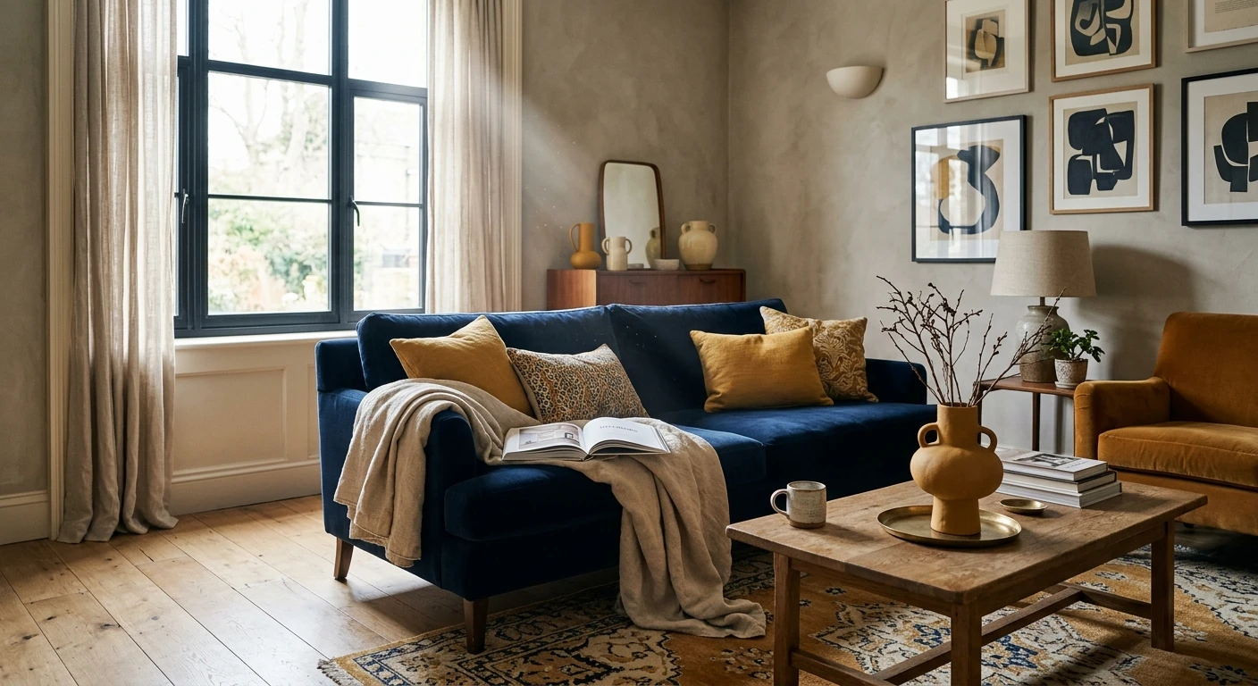
- 19. Mustard + charcoal + white. Mustard against charcoal and white. Mid-century leaning; keep mustard to 10 percent or it tips dated.
- 20. Cream + camel + black. A creamy base, camel textiles, black accents. The most timeless warm combination here, and the hardest to get wrong.
The 20 combinations at a glance
Here is the full set in one table, with the mood each one sets and the contrast level so you can match a pairing to the room you have:
| Combination | Contrast (LRV gap) | Best room |
|---|---|---|
| Warm greige + warm white | Low, soft | Whole-home base, living room |
| Cool gray + crisp white | Medium | Modern living room, hallway |
| Creamy white + black accents | High | Kitchen, entry, anywhere |
| Navy + crisp white | High | Study, powder room, cabinets |
| Charcoal + warm white | High | Feature wall, small den |
| Deep green + cream | Medium-high | Library, dining room |
| Sage green + cream | Low | Bedroom, bathroom, kitchen |
| Soft blue + warm white | Low-medium | Bathroom, nursery, bedroom |
| Blush + greige | Low | Bedroom, dressing room |
| Terracotta + off-white | Medium | Dining room, entry |
| Cream + camel + black | Medium | Living room, bedroom |
Sources: Sherwin-Williams and Benjamin Moore color data 2026; Better Homes & Gardens and The Spruce interior color pairing coverage; designer field reports compiled by FacadeColorizer.
See walls, trim, and an accent together in one preview, free.
Combinations I would skip
Not every popular pairing earns its hype, and I would rather you hear it now than after the second coat. A few that look great on a mood board and fall apart on a wall:
- Warm beige walls next to a cool blue-gray. The exact clash I opened with. The undertones pull opposite ways and the seam between rooms always looks off. If you love both, separate them with a doorway and a neutral transition wall.
- Gray walls + gray-washed floors + gray sofa. All-gray reads cold and lifeless fast, especially in north light. Gray needs a warm anchor (wood, brass, cream) somewhere in the room.
- Two strong saturated colors at 50-50. Navy and forest green in equal amounts, for example, gives the eye nowhere to rest. Pick one to lead and let the other accent.
- Stark white trim against a warm cream wall. The white makes the cream look dirty. Match your white to your wall's temperature instead.
The fix for almost all of these is the same: cut in a sample of both colors where they will actually meet, then look at that seam in morning and evening light before you buy gallons. For budgeting the full repaint once you have settled on a combination, our interior house painting cost guide sets realistic expectations.
How to test a combination before you commit
A pairing that sings in a magazine can disappoint in your room, because their light and window direction are not yours. Two reliable ways to check:
- Paint both colors together. Roll a large swatch of the wall color and brush the trim color right beside it on the same board, then view it across the day under your normal bulbs. Judge the pair, never each color alone.
- Preview the combination digitally first. Upload a real photo of your room and apply the wall and trim pairing together before you buy any samples, narrowing several contenders to the one worth painting. To see how these pairings fit into a complete room palette, our interior paint color families guide maps how each color family behaves.
Preview a wall, trim, and accent combination side by side on your real room, free.
Frequently asked questions
What is the easiest interior color combination to get right?
A warm greige wall with a soft warm white trim, such as Agreeable Gray with Alabaster. Both share a cream undertone, so they flatter each other instead of clashing, and the low LRV gap reads soft and forgiving. Add white oak floors and the room looks composed with almost no risk. It is the combination I recommend first to anyone repainting a whole floor.
How many colors should a room have?
Three is the reliable number: one dominant color for about 60 percent of the room (usually the walls), one secondary for 30 percent (large furniture or an adjacent wall), and one accent for the final 10 percent (pillows, art, a door). More than three saturated colors and the eye has nowhere to rest. You can use several shades within one family and still count it as one color.
What wall and trim color combination looks the most expensive?
Creamy white walls with matte black accents, or navy with crisp white trim, both look high-end for little money. The trick is matching undertone temperature: keep your white warm if the wall is warm, and add one warm metal like brass to keep black-and-white from feeling sterile. The contrast does the work, so the materials do not have to be costly.
Which color combinations should I avoid?
Avoid warm beige next to a cool blue-gray (the undertones fight), an all-gray room with no warm anchor (it reads cold and flat), two strong saturated colors at equal amounts (no place to rest), and stark white trim against a warm cream wall (it makes the cream look dirty). Most of these are fixed by matching temperature or letting one color clearly lead.
Do interior color combinations need to match between rooms?
They need to relate, not match. In open-plan spaces keep one consistent trim and a shared undertone temperature so adjacent rooms feel connected. For closed rooms off a hallway you have more freedom, but a common neutral or a repeated accent color threading through the home keeps it cohesive. The clash to avoid is two opposite undertones meeting at an open doorway.
Preview any wall, trim, and accent pairing on your own walls before buying a single sample.
Disclaimer: Agreeable Gray (SW 7029), Alabaster (SW 7008), Repose Gray, Pure White, and Tricorn Black (SW 6258) are trademarks of The Sherwin-Williams Company. Hale Navy (HC-154) and White Dove (OC-17) are trademarks of Benjamin Moore & Co. FacadeColorizer is an independent paint visualization service, not affiliated with or endorsed by either company. Color on screens only approximates the manufacturer's chip; always confirm with a physical sample under your own light before purchase.
Trademarks mentioned (Sherwin-Williams, Benjamin Moore, Behr, Caparol, Brillux, Sto, Alpina, Valspar, PPG, Glidden, Dulux, Crown Trade, Sandtex, Farrow & Ball, Johnstone's, Leyland) are property of their respective owners. FacadeColorizer is independent and not affiliated with any of them. Nominative fair use under Lanham Act §1125.


