
The first olive room I ever loved was a friend's home office in a deep, dusty olive off a clearance shelf. It looked incredible against her cognac leather chair and a brass desk lamp. Then she hung cool blue curtains, and the room went swampy overnight. The paint had not changed; the company it kept had. That is the lesson olive teaches every time: this is a chameleon color, half green and half yellow with a gray heart, and it lives or dies on its neighbors. Pair it warm and it reads like aged brass and forest floor. Pair it cool and it reads like army surplus.
Here is the practical answer to the question I field most from clients mid-renovation: what are the colors that go with olive green indoors, and why do some combinations feel rich while others feel like a mistake? I have organized it by the job each partner does, the whites and creams that frame olive, the earthy warms that energize it, the deep accents that ground it, and the metals that finish it. For building a whole room around any anchor, our interior color schemes guide is the parent map. This page zooms all the way in on olive.
Upload a room photo and preview an olive wall with different trim and accents in about 30 seconds, free.
First, understand what olive green actually is
Before you pick a single partner, read your olive. The word covers a wide band, from a pale sage drab to a deep, almost brown khaki, all sharing a muted, grayed yellow-green undertone. That gray is why olive feels sophisticated instead of loud, and also why it can turn dull in the wrong light. In a warm, south-facing room olive glows and the yellow side wakes up. In a cool, north-facing room the gray takes over and the olive flattens toward a sad gray-green. Which way your olive leans tells you whether to push the partners warmer, or let it stand on its own.
One quick note on terminology, since this trips people up. Color matching olive green is not about finding more greens. It is about choosing the few non-green colors that flatter that yellow-gray undertone. Throughout this guide, olive green combinations means the full room: walls, trim, sofa, rug, and metal. Olive is a team player, not a soloist.
The whites and creams that frame olive (start here)
If you do nothing else right, get the white right. Olive next to the wrong white is the most common olive mistake I see. A stark, blue-white trim (think a bright builder white) sucks the warmth out of olive and leaves it gray and tired. A creamy, warm white does the opposite: it makes olive read like aged stone and warm linen.
- Warm white trim (the default): a creamy off-white such as Benjamin Moore White Dove or Sherwin-Williams Alabaster is the safe, harmonious frame. The soft cream bias flatters olive's yellow undertone instead of fighting it. For the full lineup, our guide to warm white paint colors and their undertones shows which whites stay friendly to green.
- Soft cream and beige walls: running olive on a feature wall with cream or warm beige elsewhere is a gentle, livable scheme, the cream reading like candlelight next to the olive. Our colors that go with beige guide covers the beige side in depth.
- Avoid: a cool, blue-leaning white or a high-contrast pure white next to a muted olive. The contrast exposes olive's gray and can make a good color look dingy. For crisp, choose a warm white that is still bright, not a cold one.
Free AI visualizer. Test the wall and trim together on your real room before buying a single sample.
Earthy warms: where olive really comes alive
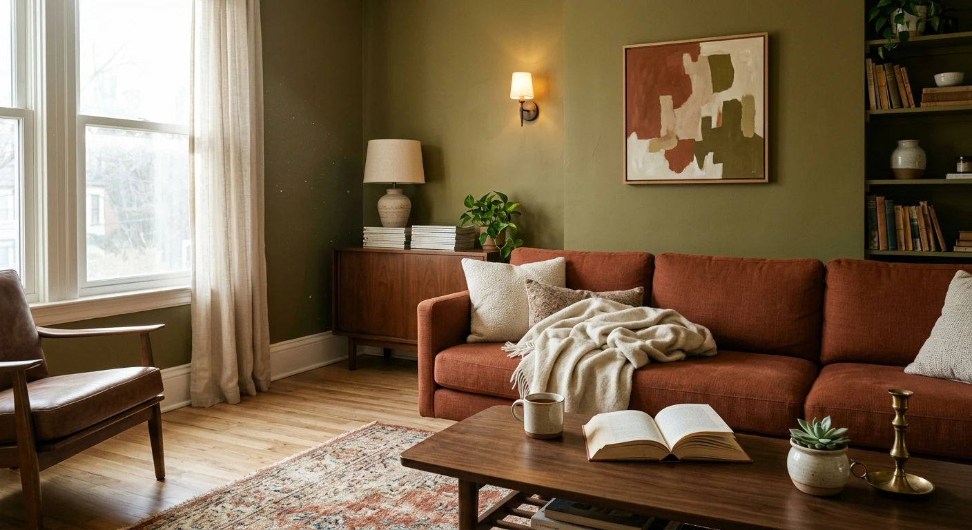
This is the fun part, and the most reliable. Olive's complement, the color roughly opposite on the wheel, sits in the red and orange range, which is why terracotta, rust, and clay feel so right next to it. They are not matchy; they create the tension that makes a room feel designed rather than decorated.
- Terracotta and rust: the headline pairing. A terracotta rug, clay pottery, or a rust velvet pillow against olive walls reads instantly warm and grounded. This is the combination that makes people ask what your color is. Our earthy warm interior paint colors guide maps a full earth-tone room around it.
- Warm taupe and greige: when you want olive to be the only bold note, a warm taupe is the perfect quiet partner, a neutral with enough warmth to stay in olive's family without competing. See our taupe paint colors and undertones guide to pick one that does not skew pink or purple.
- Mustard and ochre: these analogous yellows sit right next to olive on the wheel, so the combination is harmonious and a little retro (1970s, in the good way). Use them in small doses.
- Soft blush and dusty rose: an unexpected winner. A muted, brownish pink calms olive's intensity and adds a romantic edge. Keep both colors dusty; clean bubblegum pink will look wrong.
If you are building a living space around this energy, our living room color schemes guide lays out several olive-adjacent earth palettes.
Deep accents that ground olive
Olive is a mid-tone, so a room of all olive and cream can float a little. A deep anchor gives the eye somewhere to land. These are the partners I reach for when an olive room needs weight.
- Navy blue: the most foolproof deep accent. Navy and olive are both muted and slightly grayed, so they sit together like old friends. A navy sofa or built-ins under olive walls reads tailored and timeless. It is the one cool color that works, because it is too deep to pull olive toward swamp.
- Chocolate brown and cognac: brown leather, walnut wood, and a chocolate accent are olive's natural habitat. Wood tones especially are essential; olive looks happiest in a room with real wood in it.
- Charcoal and warm black: for trim, doors, or a fireplace surround, a soft warm black (not a cold blue-black) gives olive a modern, gallery-like edge. Use it sparingly to sharpen the room without darkening it.
- Cream as the relief: always balance the deep accents with enough cream or warm white so the room breathes. Olive plus navy plus brown with no light relief gets heavy.
| Partner color | Relationship to olive | Best use indoors | Mood it creates |
|---|---|---|---|
| Warm white / cream | Neutral frame | Trim, ceiling, relief walls | Calm, airy, classic |
| Terracotta / rust | Complement (opposite) | Rug, pottery, textiles | Warm, earthy, lively |
| Warm taupe / greige | Quiet neutral partner | Adjoining walls, sofa | Soft, organic, restful |
| Navy blue | Deep cool anchor | Sofa, built-ins, accent | Tailored, grounded |
| Brass / aged gold | Warm metal accent | Lighting, hardware, frames | Rich, finished, luxe |
| Cool gray-blue | Clashes (avoid) | Skip near olive | Flat, swampy, dull |
Sources: color-wheel theory (complementary and analogous relationships); The Spruce and Better Homes & Gardens olive-decor coverage; FacadeColorizer designer field reports.
Free AI visualizer. Test the full palette on your real walls before buying a single can.
Metals: the detail that makes olive look expensive
People skip this step and wonder why their olive room looks unfinished. Metal finish is part of the palette, not an afterthought, and olive wants warm metals.
- Brass and aged gold (best): unlacquered or antique brass against olive is a designer staple. The warm gold picks up olive's yellow undertone and the room instantly reads richer. Lighting, drawer pulls, and picture frames are the easy places to add it.
- Bronze and copper: warmer still and slightly rustic, great in a more organic olive room.
- Black hardware: a warm matte black is a clean alternative if brass feels too much.
- Be careful with chrome and polished nickel: cool, shiny silver metals can feel cold next to a warm olive. They are not banned, but keep them minimal and let a warm metal lead.
What does NOT work with olive (the honest part)
A pairing guide that only lists winners is not much help. Here is where olive consistently goes wrong in real rooms:
- Cool gray-blue and slate: the classic trap. Put a cool blue-gray next to a muted olive and the olive flattens into a tired, swampy green. For blue with olive, go deep navy, not mid gray-blue.
- Stark, cold white: as covered above, a blue-white trim drains olive. This mistake ruins more olive rooms than any other.
- Bright, clean pastels: a clean mint, clear sky blue, or bubblegum pink fights olive's muddy sophistication and makes the room read juvenile. Keep partners dusty.
- Too much olive: olive on walls, sofa, rug, and curtains with no contrast is monotonous and heavy. Olive is best as the star with a supporting cast, not the entire production.
Still deciding between olive and a softer green? Our broader guide to pairing greens indoors compares sage, forest, and olive side by side, and our sage green shades and pairings guide covers a lighter, easier green.
How to test olive pairings before you commit
Olive is exactly the kind of color a tiny fan-deck chip lies about. A chip cannot show how the gray takes over in a north room, or how a terracotta rug warms the whole thing. Two better methods, in order:
- Preview the whole palette digitally first: upload a real photo of your room and apply the olive plus the trim, plus a terracotta or navy accent, so you judge the combination, not a lonely chip. This narrows three palettes to the one worth sampling.
- Then paint a large swatch: roll a foot-square sample (or a peel-and-stick one) on two walls and check it morning, afternoon, and at night under your normal bulbs. Watch for olive flattening in any dim corner, and add a warm bulb if it does.
Preview olive against warm white, terracotta, and navy, side by side, free.
Frequently asked questions
What colors go best with olive green?
Olive green pairs best with warm, earthy partners: creamy warm white and beige for the frame, terracotta and rust as its complement, warm taupe as a quiet neutral, navy blue as a deep anchor, and brass or aged gold as the finishing metal. The common thread is warmth and a slightly muted, dusty quality. Olive flatters anything in its own warm, grayed family and pushes away clean, cool colors.
What colors should you avoid with olive green?
Avoid cool gray-blue and slate, which flatten olive into a swampy, tired green, and avoid stark blue-white trim, which drains olive's warmth and makes it look dingy. Clean bright pastels (clear mint, sky blue, bubblegum pink) also clash with olive's muddy sophistication. If you want blue with olive, use a deep navy rather than a mid gray-blue, and keep any pink dusty and brownish.
Does navy blue go with olive green?
Yes, navy is one of the most reliable partners for olive green. Both colors are deep and slightly grayed, so they read as a tailored, grounded combination rather than a clash. Navy works as a sofa, built-ins, or an accent under olive walls. The key is to keep the blue genuinely deep: it is mid-tone cool gray-blue, not navy, that turns olive swampy.
What metal finish looks best with olive green?
Warm metals look best with olive green. Brass and aged gold are the designer favorite because the warm gold echoes olive's yellow undertone and makes the room read richer. Bronze and copper work in more rustic spaces, and a warm matte black is a clean modern alternative. Cool, shiny chrome and polished nickel can feel a little cold next to olive, so use them minimally.
What white trim goes with olive green walls?
Use a creamy, warm white such as Benjamin Moore White Dove or Sherwin-Williams Alabaster. The soft cream bias flatters olive's yellow-green undertone and keeps the room cohesive. Avoid a stark, blue-leaning builder white, which exposes olive's gray and can make a good color look muddy. If you want a bright trim, choose a warm white that is still light rather than a cold one.
Preview an olive wall with your chosen trim and accents on your actual walls before you buy.
Disclaimer: Color names referenced here, including Benjamin Moore White Dove, are trademarks of Benjamin Moore & Co., and Sherwin-Williams Alabaster is a trademark of The Sherwin-Williams Company. FacadeColorizer is an independent paint visualization service, not affiliated with, endorsed by, or sponsored by any paint manufacturer. "Olive green" describes a color family rather than one product, and shades vary by brand. Screen color approximates real paint; always confirm with a manufacturer sample under your own light before purchase. Sources: color-wheel theory for complementary and analogous pairings, The Spruce and Better Homes & Gardens olive-decor coverage, designer field reports compiled by FacadeColorizer.
Trademarks mentioned (Sherwin-Williams, Benjamin Moore, Behr, Caparol, Brillux, Sto, Alpina, Valspar, PPG, Glidden, Dulux, Crown Trade, Sandtex, Farrow & Ball, Johnstone's, Leyland) are property of their respective owners. FacadeColorizer is independent and not affiliated with any of them. Nominative fair use under Lanham Act §1125.


