Walk through any furniture showroom in 2026 and the cool gray decade is clearly over. Walls have warmed up: clay, terracotta, mushroom, ochre, and soft caramel are the colors designers reach for now. Earthy tones read grounded and calm because they borrow their pigments from the natural world rather than a stark mineral white or a flat builder gray. This guide breaks down the 15 warm earthy interior colors worth painting in 2026, with real manufacturer codes, published Light Reflectance Values, the undertone traps to watch, and the rooms each one suits best.
In earthy tones interior design the word "earthy" describes a whole family, not a single chip, so the real question is which slice of it fits your room. A south-facing sunroom can carry a saturated terracotta that would feel like a cave in a north bedroom, so the sections below sort the palette from pale to deep. If a sunroom is the space you are painting, see our picks for bright, relaxing sunroom paint colors. This profile sits under our room paint color ideas by room guide.
Upload a photo of your space and preview terracotta, clay, ochre, and warm greige on your actual walls in about 30 seconds, free.
What makes a paint color read "earthy"
Three things separate an earthy color from a generic neutral. The undertone leans warm: think red, orange, yellow, or warm brown rather than blue, violet, or green-gray. The chroma is muted too, a tangerine knocked down with gray and brown the way clay or rust is. And the value sits mid range. Most earthy tones land between an LRV of 8 and 58, which is a big part of why they feel cozy.
Light Reflectance Value matters more here than with any other palette: a clay at LRV 12 will swallow a small windowless room, while the same hue family at LRV 50 keeps it open. Our interior paint color families guide explains how LRV and undertone work across every group.
The 15 best earthy interior colors for 2026
The full lineup, sorted light to deep, with brand, code, published LRV, and dominant undertone. Read the LRV column as your first filter for the room you have in mind.
| Color | Code | LRV (approx.) | Undertone / feel |
|---|---|---|---|
| Pale Oak | BM OC-20 | 70 | Greige with a warm-cool flip |
| Manchester Tan | BM HC-81 | 64 | Pale warm tan, slight green-yellow |
| Accessible Beige | SW 7036 | 58 | Warm greige, the safe entry point |
| Smokey Taupe | BM 983 | 55 | Light warm taupe, almost gray |
| Shiitake | SW 9173 | 51 | Mushroom taupe, soft and modern |
| Quietude (warm sage edge) | SW 6212 | 48 | Earthy gray-green, nature-leaning |
| Golden Ochre / Honey | BM Hathaway Gold 194 | 44 | Mustard ochre, sunny and bold |
| Tony Taupe | SW 7038 | 39 | Mid Tuscan taupe, grounding |
| Baked Clay | SW 6340 | 26 | Redder terracotta, a touch lighter |
| Cavern Clay | SW 7701 | 20 | Terracotta clay, the 2026 hero |
| Audubon Russet | BM HC-51 | 19 | Rust red-brown, rich and warm |
| Bear Creek | BM 1470 | 16 | Woodsy medium-dark brown |
| Sienna / Rookwood Terra Cotta | SW 2803 | 14 | Historic burnt sienna |
| Branchport Brown | BM HC-72 | 9 | Chocolate brown, enveloping |
| Urbane Bronze | SW 7048 | 8 | Deep warm earth, near-black |
Try it on your house
No photo? Try a sample
LRV figures are the published approximate values from the Sherwin-Williams and Benjamin Moore fan decks and may vary by batch and screen. Always confirm against a physical chip.
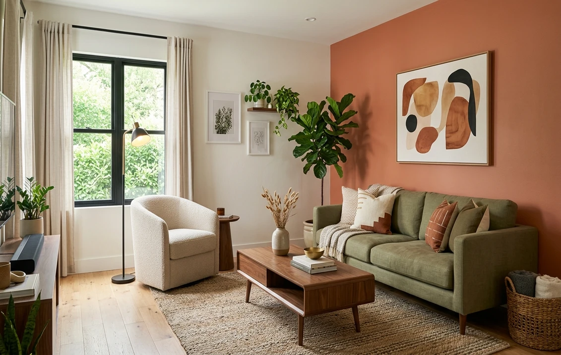
The terracotta and clay group (the 2026 headliner)
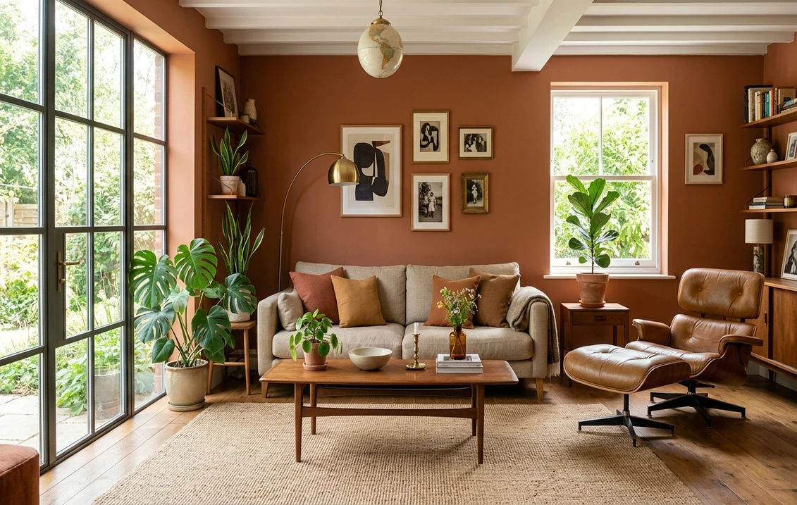
If one color defines the earthy trend it is terracotta. Sherwin-Williams Cavern Clay (SW 7701) was a Color of the Year pick and remains the reference point: LRV near 20, a burnt-orange base softened with brown and just enough gray to keep it from going neon. In a sun-filled room it glows; in low light it deepens toward dusty rust. It is also the rare saturated color that flatters skin tones, which is why designers favor it in living and dining rooms.
Baked Clay (SW 6340) is a redder relative at a slightly lighter LRV near 26, while the historic Rookwood Terra Cotta (SW 2803, LRV 14) is the genuinely deeper, burnt-sienna end of the group. Rookwood especially reads as a statement color, best on a single feature wall or a small jewel-box space rather than wrapped around a large open plan. If you want the hue pulled toward true red, compare them against our red walls best paint color ideas, where the line between deep terracotta and brick red gets a closer look.
Ochre, honey, and golden tones
Ochre is terracotta's sunnier cousin. Where clay leans red-orange, ochre leans yellow-gold, and it brings instant warmth to a room that gets little direct sun. Benjamin Moore Hathaway Gold (194, LRV 44) is a confident mustard that reads vintage and editorial, grounded enough by its amber base to behave almost like a warm neutral. Ochres shine in entryways, libraries, and home offices, where a hit of gold makes the space feel collected and lamp-lit even at midday. The one trap is going too acidic: a mustard with too much green in the base can look like a 1970s kitchen, so keep the undertone on the orange side of yellow.
Warm browns and bronzes for depth
At the dark end sit the browns and bronzes designers use to wrap a room in coziness. Sherwin-Williams Urbane Bronze (SW 7048), a former Color of the Year, is the standout: LRV near 8, a deep warm earth tone that reads near-black in shade and reveals bronze-brown warmth in direct light. It is a favorite for moody bedrooms, accent walls, built-ins, and powder rooms. Benjamin Moore Branchport Brown (HC-72, LRV 9) and the woodsy Bear Creek (1470, LRV 16) give a similar enveloping effect with a more chocolate, less gray cast, Bear Creek reading as a medium-dark brown rather than a true near-black. Because these colors absorb most of the light that hits them, add one light element (a cream sofa, an oak floor) so the depth feels chosen, not cavernous.
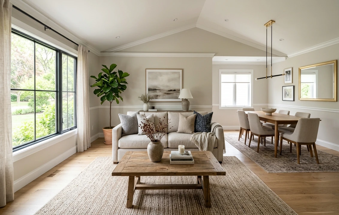
Mushroom, taupe, and warm greige (the easy entry point)
Not everyone wants a saturated clay wall, and the earthy family has a gentle on-ramp in the mushroom, taupe, and warm greige tones. Accessible Beige (SW 7036) at LRV 58 is the most-painted warm greige in the country: enough brown to feel earthy, enough gray to stay flexible, reading soft against almost any wood tone or trim. Shiitake (SW 9173) and Tony Taupe (SW 7038) step the same idea progressively darker, into true mushroom and Tuscan taupe, ideal as a whole-house body color that still feels grounded.
The watch-out with greige is the warm-cool flip: colors like Benjamin Moore Pale Oak (OC-20) can read warm beige in a sunny room and cool gray in a north-facing one, which is why testing on your own wall matters so much for this group. If you want the cooler, crisper end of the spectrum instead, our white rooms best paint color ideas covers warm whites that pair beautifully as trim above an earthy wall.
How earthy colors behave under different light
These tones are unusually sensitive to light. Their pigments are warm to begin with, so warm light intensifies them while cool light can turn them muddy. Here is a quick orientation guide for the Northern Hemisphere:
- South-facing rooms: warm, abundant light makes clay and ochre sing, so you can go a shade deeper than you think.
- West-facing rooms: late-afternoon sun turns terracotta almost molten, so check it at midday too in case it reads overly orange.
- East-facing rooms: bright warm mornings, cooler afternoons. Mid-tone taupes and honeyed ochres hold up well.
- North-facing rooms: cool indirect light mutes warmth and can pull a greige toward gray. Choose the warmer, more saturated members here (clay over greige) and warm bulbs.
Artificial light matters just as much. A 2700K to 3000K warm white bulb flatters every color in this guide. Switch to a 4000K or 5000K "daylight" bulb and it fights an earthy palette, making terracotta look like dried mud.
Free AI paint visualizer. Upload your real room photo and see how each earthy tone reads under your actual lighting before buying samples.
Trim, ceiling, and decor pairings
Earthy walls look their best when the supporting colors stay warm. Put a stark blue-white trim next to terracotta and the wall reads orange while the trim looks cold. A creamy warm white lets both read as intended.
- Trim and ceiling: a warm white such as Sherwin-Williams Alabaster (SW 7008, LRV 82) or Benjamin Moore White Dove (OC-17, LRV 85), both with a soft yellow base that harmonizes with clay, ochre, and brown.
- Flooring: warm woods (white oak, walnut, honey-toned maple) reflect warm light onto the walls and amplify the earthy effect. Terracotta or sandstone tile is a natural partner.
- Metals: aged brass, unlacquered bronze, and antique gold rather than chrome or polished nickel.
- Textiles: linen, jute, rattan, leather, and cream boucle. Layer one cool accent (a sage plant, a muted blue ceramic) so the room is not monochrome.
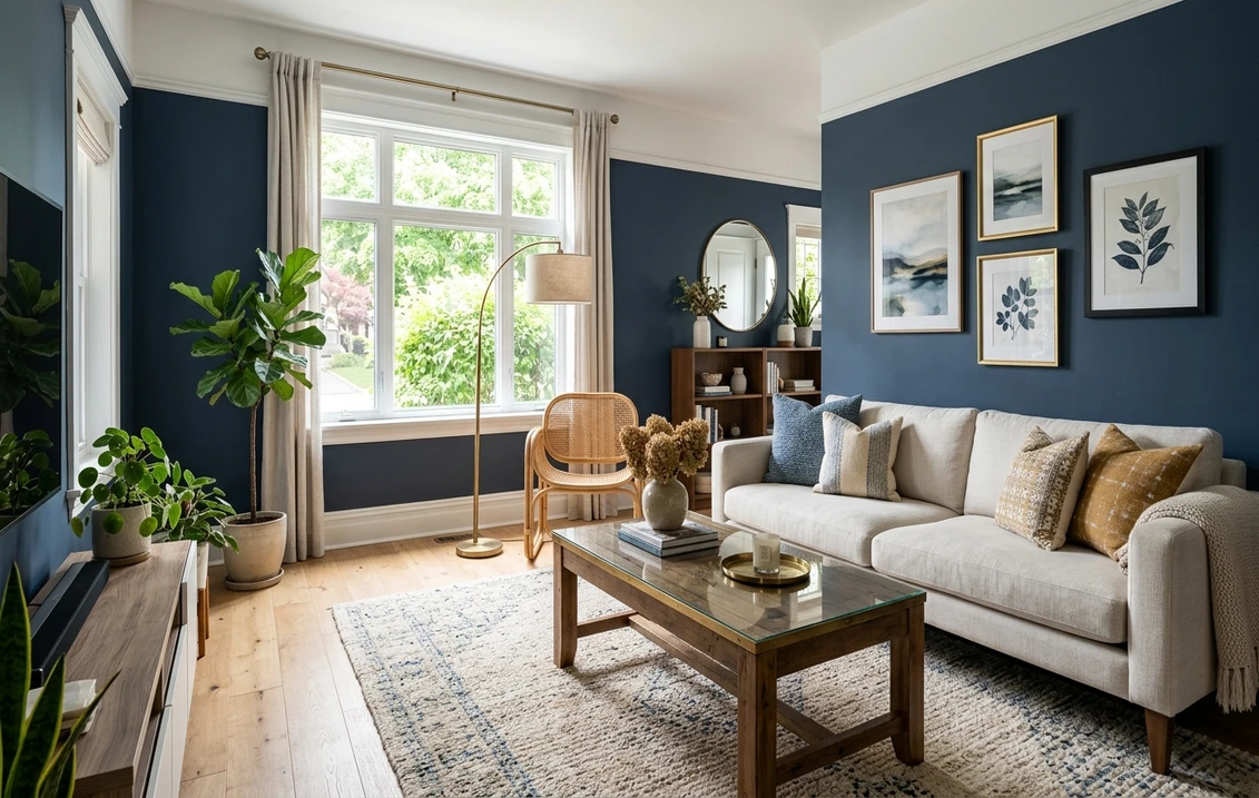
- Complementary color: a dusty blue or muted teal is terracotta's classic opposite and makes a striking accent in cushions or art. For more, see our blue rooms best paint color ideas.
How to test an earthy color before you commit
Earthy colors punish guesswork more than most. A fan-deck chip reads lighter and less saturated than a full wall, so a clay that looks like a soft blush on the card can land as a bold burnt orange once rolled out. Here is a reliable process:
- Sample large: paint at least a 12 by 12 inch peel-and-stick swatch and tape it to two different walls.
- Watch it across the day: check around 9 a.m., 2 p.m., and after dark under your normal bulbs. Earthy tones move most between daylight and lamplight.
- Judge it against your floor and trim: hold the swatch next to the wood and trim it will live with, not against a white wall.
- Budget realistically: deep earthy colors sometimes need an extra coat or tinted primer for even coverage. Our interior house painting cost guide covers what that adds.
Want the fastest no-mess option? Upload a photo of your room and apply terracotta, ochre, taupe, or bronze virtually before you buy a sample pot. Earthy tones especially benefit from this, since the warm-cool flip and the chip-to-wall saturation jump are so hard to predict on paper. To place these picks beside the year's other palettes, browse the best interior paint colors 2026 roundup, or compare them across brands in our Sherwin-Williams vs Benjamin Moore comparison.
Upload your room and preview Cavern Clay, Hathaway Gold, Accessible Beige, and Urbane Bronze side by side, free.
Frequently asked questions
What is the most popular earthy paint color for 2026?
Terracotta leads the earthy trend, and Sherwin-Williams Cavern Clay (SW 7701, LRV around 20) is the reference shade: a burnt-orange clay softened with brown and gray. For a warmer-but-neutral entry point, Accessible Beige (SW 7036, LRV 58) is the most-painted warm greige in the US. At the deep end, Urbane Bronze (SW 7048, LRV 8) is the go-to enveloping earth tone.
Are earthy tones too dark for a small room?
Not necessarily. The earthy family spans a wide LRV range, so for a small or low-light room you can choose a lighter member (Accessible Beige at LRV 58, or the mushroom taupe Shiitake at LRV 51) and keep the space open. Save the deep clays, browns, and bronzes (LRV 8 to 20) for rooms with strong natural light, or lean in deliberately as a cozy jewel-box space such as a powder room.
What trim color goes with terracotta or clay walls?
A warm white, not a cool blue-white. Sherwin-Williams Alabaster (SW 7008, LRV 82) and Benjamin Moore White Dove (OC-17, LRV 85) both carry a soft yellow base that harmonizes with clay, ochre, and brown. A stark cool white makes terracotta look orange and the trim look cold. For ceilings, match the trim or use the same warm white so the room reads cohesive.
Will earthy paint colors look dated in a few years?
Less than most trends. Warm earth tones are the colors that have anchored interiors for centuries (Provence ochre, adobe clay, library umber), so they read as timeless rather than of-the-moment. A warm greige is as broadly liveable as any gray, and the deeper clays and bronzes photograph as intentional design. They are a low-regret choice compared with a highly saturated trend color of the season.
See clay, terracotta, ochre, taupe, and bronze on your actual walls before buying a single sample pot.
Disclaimer: Sherwin-Williams, Cavern Clay, Urbane Bronze, Accessible Beige, and the SW color codes referenced are trademarks of The Sherwin-Williams Company. Benjamin Moore, White Dove, and the BM color codes are trademarks of Benjamin Moore and Co. FacadeColorizer is an independent paint visualization service and is not affiliated with, endorsed by, or sponsored by Sherwin-Williams, Benjamin Moore, or Behr. LRV and undertone descriptions reflect the manufacturers' published fan-deck data; color reproduction on screens approximates the physical chip, so always confirm with a manufacturer sample before purchase. Sources: Sherwin-Williams and Benjamin Moore technical fan-deck data 2026, The Spruce interior color references, and designer color guidance.
Trademarks mentioned (Sherwin-Williams, Benjamin Moore, Behr, Caparol, Brillux, Sto, Alpina, Valspar, PPG, Glidden, Dulux, Crown Trade, Sandtex, Farrow & Ball, Johnstone's, Leyland) are property of their respective owners. FacadeColorizer is independent and not affiliated with any of them. Nominative fair use under Lanham Act §1125.