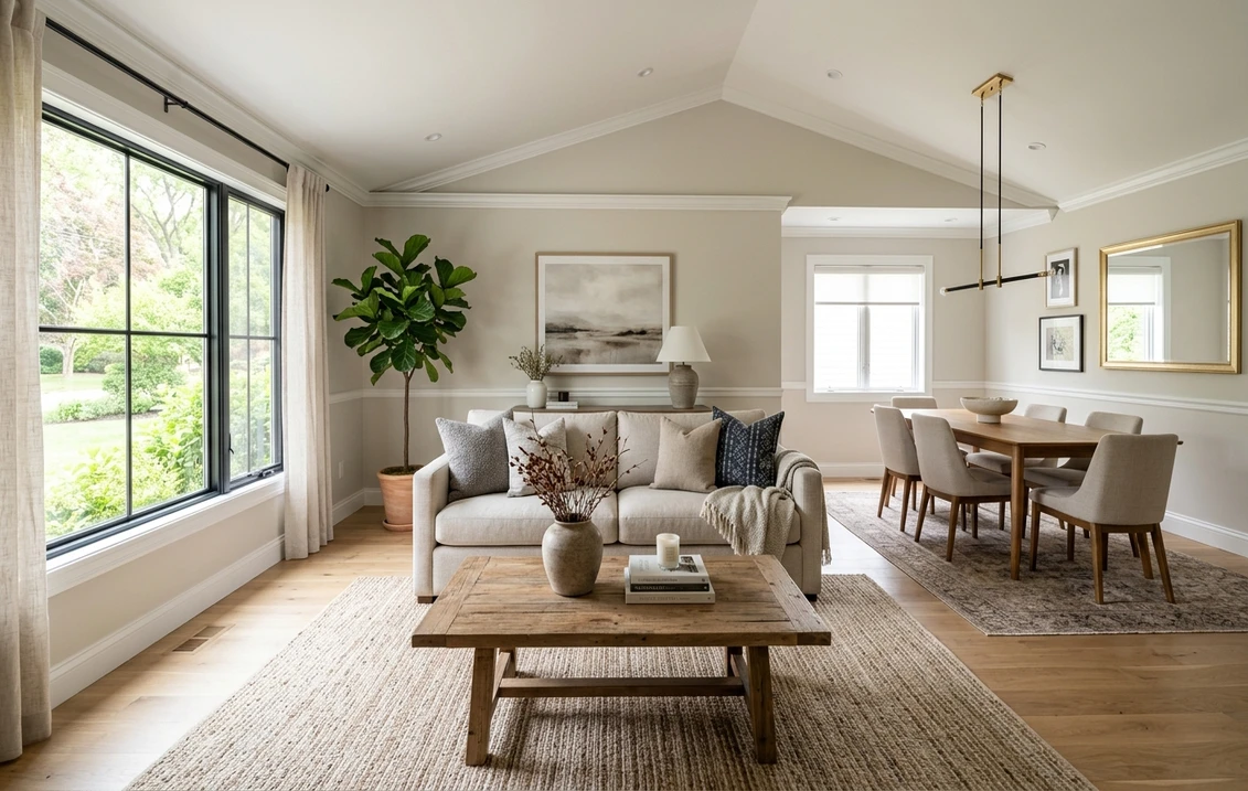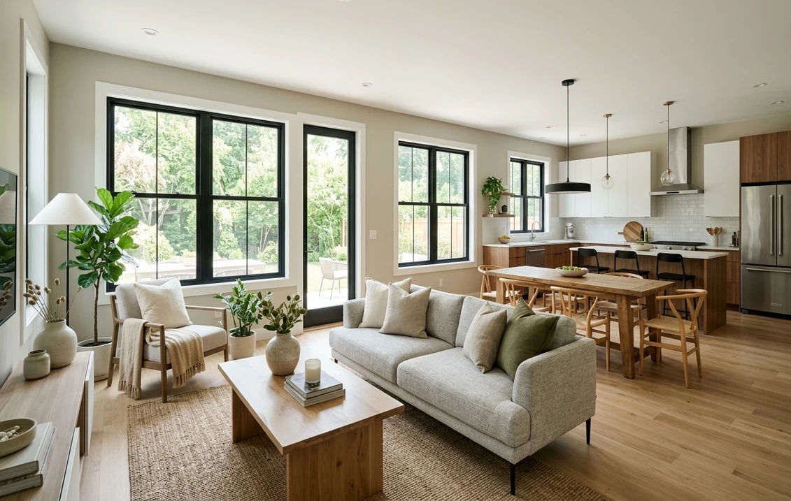

Open concept floor plans still make up roughly 70% of new single-family builds in the U.S. according to the 2026 NAHB Home Buyer Preferences report, but they are the single hardest room to paint well. With no walls to break sightlines between kitchen, dining, and living, one wrong color choice travels across 40 or 50 feet of sightline and flattens the entire first floor.
The 2026 fix is not to paint every zone a different color. It is the unified palette strategy: one base color on 80% of the walls, two coordinated accents reserved for specific architectural moments, and finish changes (matte vs eggshell) used to delineate kitchen from living without ever changing the hue. This guide covers the exact method, ten proven Sherwin-Williams and Benjamin Moore combinations, and a 2,000-sqft case study that tested the approach end to end. For full pricing context, see our complete interior painting cost guide.
Upload your open-concept photo and preview all 10 palettes in 30 seconds
The Unified Palette Rule: 1 Base + 2 Accents
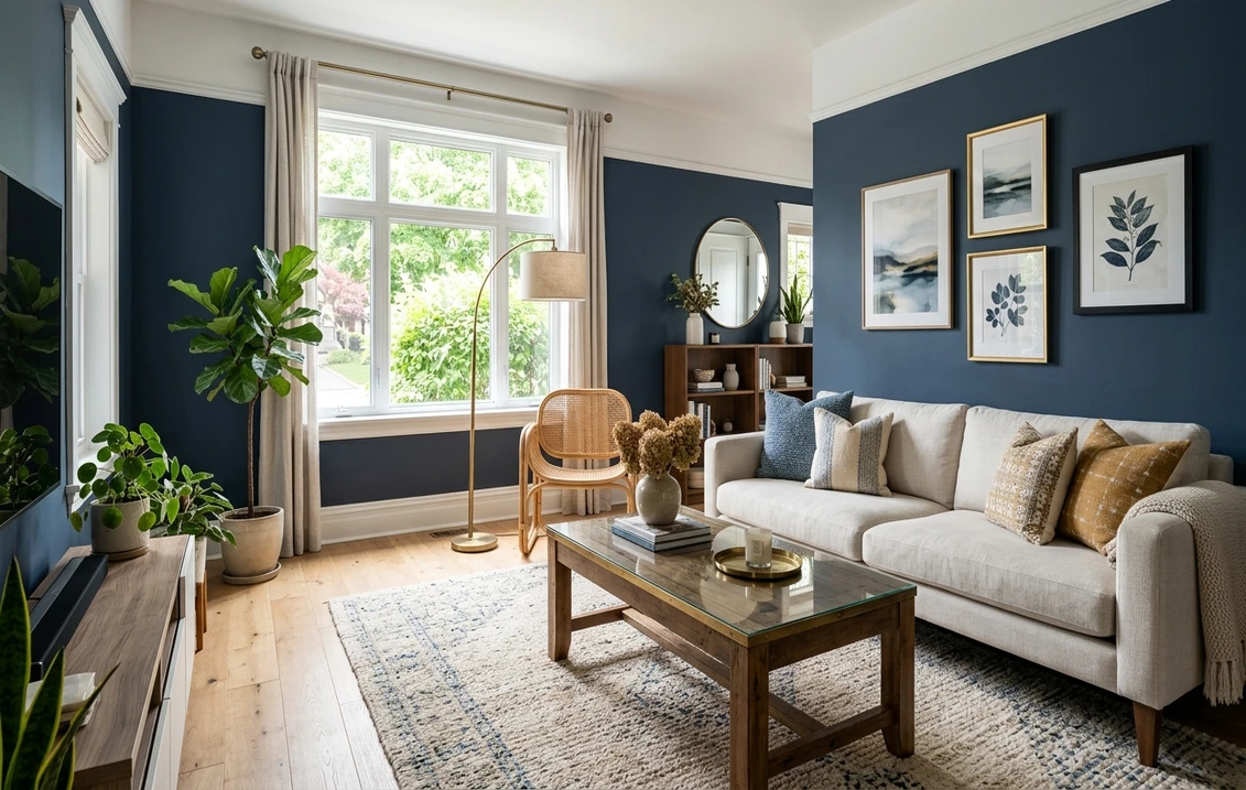
Designers call it the 60-30-10 rule, borrowed from fashion. In an open plan, 60% of the visible wall surface carries the base color, 30% carries a secondary tone (a shade darker or a deeper version of the same undertone), and 10% carries a true accent used on a single feature wall, a banquette niche, or a built-in. The math sounds arbitrary but it is what keeps the eye from stumbling as it sweeps across a 40-foot sightline.
The cardinal mistake is picking three colors that "go together" on a swatch board. On a swatch, they sit side by side at equal weight. On a real wall, they compete. Always choose the base first, then derive the accents from the same undertone family. If the base is Accessible Beige (SW 7036, warm neutral), the darker zone color should lean warm (Amazing Gray SW 7044, not Repose Gray which reads cool). The feature accent can break the rule, but only once per floor.
How to Delineate Kitchen, Dining, and Living Without Walls
Since you cannot add walls, you delineate with four non-color tools: finish, ceiling height, trim weight, and a single architectural pause. Used together, they signal "this is the kitchen" without requiring a different hue.
1. Same color, different finish. The highest-impact trick for 2026. Paint the walls throughout in one color, but switch finishes by zone. Matte or flat on the living-room walls absorbs glare and hides drywall imperfections. Eggshell or satin in the kitchen zone reflects light slightly and, critically, wipes clean when grease splatters. To the eye, the kitchen reads brighter and cleaner even though the hex value is identical. This is the single most-specified technique in Houzz 2026 open-plan projects.
2. Accent wall at the kitchen back wall. The wall behind the range hood or the pantry is the natural candidate. Painted in the 30% secondary color (one step darker than the base), it anchors the kitchen zone and gives upper cabinets something to float against. Keep the accent to a single plane; wrapping it onto a perpendicular wall kills the delineation.
3. Ceiling color continuity. In open plans, always paint the ceiling one continuous color across all three zones, typically Chantilly Lace (BM OC-65) or Pure White (SW 7005) in flat finish. Changing ceiling color between zones shrinks the whole floor visually, the opposite of what you want. A single ceiling tone acts as the "sky" that unifies what is happening below it.
4. Trim as the connective tissue. Run the same trim color (baseboards, window casings, door frames) across every zone in semi-gloss. Trim is the visual thread that stitches the palette together. If trim changes color or sheen from kitchen to living, the eye sees the break before it sees the room.
Top 10 Proven Open Concept Combinations (2026)
These ten palettes have all been spec'd across multiple builder and designer projects in the past 18 months. Each row lists the 60% base, the 30% secondary (accent wall and kitchen delineator), and the 10% accent used on an island or built-in. All finishes assume matte on living walls, eggshell in kitchen zone, semi-gloss on trim.
| # | Base (60%) | Secondary (30%) | Accent (10%) | Style |
|---|---|---|---|---|
| 1 | SW Alabaster 7008 | SW Accessible Beige 7036 | SW Urbane Bronze 7048 | Modern Farmhouse |
| 2 | BM White Dove OC-17 | BM Revere Pewter HC-172 | BM Hale Navy HC-154 | Transitional |
| 3 | SW Agreeable Gray 7029 | SW Mindful Gray 7016 | SW Iron Ore 7069 | Contemporary |
| 4 | BM Simply White OC-117 | BM Edgecomb Gray HC-173 | BM Knoxville Gray HC-160 | Coastal |
| 5 | SW Shoji White 7042 | SW Evergreen Fog 9130 | SW Cavern Clay 7701 | Boho / Organic Modern |
| 6 | BM Classic Gray OC-23 | BM Gray Owl OC-52 | BM Black Beauty 2128-10 | Minimalist |
| 7 | SW Pure White 7005 | SW Naval 6244 | SW Tricorn Black 6258 | Classic Colonial |
| 8 | BM Swiss Coffee OC-45 | BM October Mist 1495 | BM Kendall Charcoal HC-166 | Scandi |
| 9 | SW Natural Linen 9109 | SW Rookwood Sash Green 2810 | SW Rookwood Red 2802 | Craftsman |
| 10 | BM Pale Oak OC-20 | BM Salamander 2050-10 | BM Raccoon Fur 2126-20 | Moody Modern |
Try it on your house
No photo? Try a sample
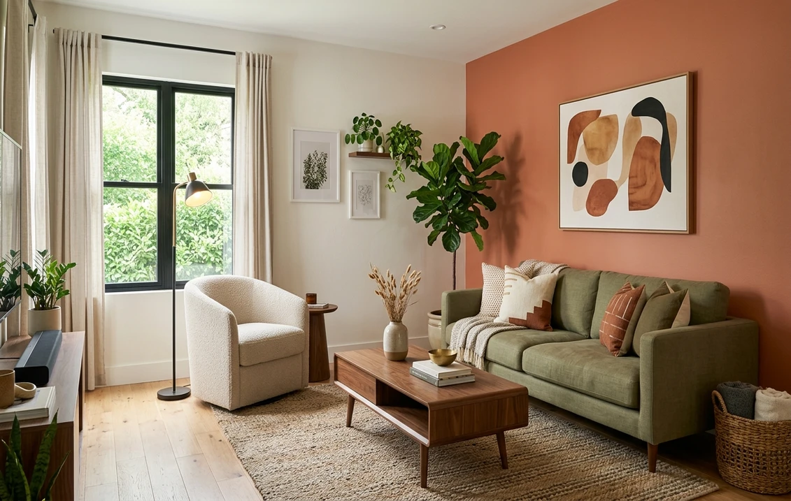
Accent Wall Technique: Where, How Big, What Finish
In an open plan the accent wall has to earn its place. The rule we follow: one accent wall per sightline, and it must back a piece of architecture. Good candidates are the fireplace surround, the wall behind a banquette, the pantry door elevation, or the wall behind the range hood. Bad candidates are any wall with a door opening, any wall visible from only one zone, or any wall under 8 feet wide.
Use the 30% secondary color on the accent wall, not the 10% deep accent. The deep accent (Urbane Bronze, Hale Navy, Iron Ore) belongs on cabinets, a kitchen island, or a single built-in bookcase, where it covers less than 10% of the total wall surface. Painting an entire accent wall in the deep accent pulls the eye so hard it breaks the open-plan illusion and fragments the space into visual boxes.
Finish on the accent wall should match the zone it belongs to. An accent wall in the kitchen zone gets eggshell for wipe-down. In the living zone it stays matte. Changing from matte to eggshell along an accent wall is fine if the wall spans both zones; the finish break reinforces the zone break.
Light Reflectance Value (LRV) and Why It Matters in Open Plans
LRV measures how much light a color bounces back, on a 0 (pure black) to 100 (pure white) scale. In a closed room LRV is a nice-to-know. In an open plan it is structural: every color in the palette is visible at the same time, and if the LRV spread between the base and the secondary is too tight, the zones blur; if it is too wide, the space fragments. The target is a 15 to 25 point LRV gap between base and secondary, and a 40 to 60 point gap between base and the deep 10% accent.
Example from our top 10: Alabaster (SW 7008, LRV 82) as the base, Accessible Beige (SW 7036, LRV 58) as the secondary, Urbane Bronze (SW 7048, LRV 8) as the accent. Gaps: 24 and 74. The secondary is visibly distinct without jumping; the accent anchors hard. Compare this to a common mistake: pairing Alabaster (LRV 82) with Classic Gray (BM OC-23, LRV 73.75) as the secondary. The 8-point gap means the two colors read as one slightly-uneven wash, and the zone delineation disappears.
Check LRV on the manufacturer's website before committing. Sherwin-Williams lists it under every color page, Benjamin Moore lists it as "Light Reflectance" in the color details panel. If the gap math does not work, swap one color rather than hoping the lighting saves it.
Case Study: 2,000-sqft Open Plan in Raleigh, NC
A 2,023-sqft first floor in a 2021 Raleigh new-build, open kitchen-dining-living with 9-foot ceilings and west-facing windows across the rear wall. The owners had lived with builder-grade Agreeable Gray (SW 7029) everywhere, flat finish, and complained the kitchen felt "dirty" by year two and the living area felt "cavernous" at night.
We kept Agreeable Gray as the 60% base on the living and dining walls (now in matte, which hides the settling drywall cracks), repainted the kitchen perimeter in the same Agreeable Gray but in eggshell finish, added a single accent wall behind the range in Mindful Gray (SW 7016) at 30%, and painted the kitchen island in Iron Ore (SW 7069) semi-gloss as the 10%. Ceiling stayed Pure White (SW 7005) flat across all three zones. Trim: Alabaster (SW 7008) semi-gloss, unchanged.
Total paint cost: 14 gallons at an average $62/gal = $868 in product. Labor for a two-person crew over 3 days: $2,400. Total project: $3,268, or roughly $1.62/sqft of floor area. The owner's feedback after 90 days: the kitchen reads as a distinct zone even though the hue is identical to the living area, the accent wall anchors the range like a piece of furniture, and guests consistently ask if the floor plan was reconfigured. No drywall was moved.
Preview your open-plan palette in 30 seconds, no signup
Frequently Asked Questions
Should I paint my open concept one color or multiple colors?
Paint one base color on 60% of the walls, then add one secondary accent (30%) on a single accent wall and one deep accent (10%) on an architectural feature like a kitchen island. Three or more wall colors across an open plan almost always reads chopped up. The unified palette with a finish change between kitchen and living (matte vs eggshell) delivers the zone delineation without breaking sightlines.
Can I use a different finish in the kitchen and still have continuity?
Yes, and it is the preferred 2026 technique. Paint the entire open plan in the same hue but switch from matte or flat in the living zone to eggshell or satin in the kitchen zone. The color is identical so sightlines stay unified, but the kitchen reads slightly brighter and wipes clean of grease splatter. The transition line should fall at a natural architectural break: an island edge, a ceiling beam, or the end of a cabinet run.
What color should the ceiling be in an open concept?
Paint the ceiling one continuous color across the entire open plan, typically Chantilly Lace (BM OC-65) or Pure White (SW 7005) in flat finish. A single ceiling tone unifies the floor below and visually expands the space. Changing ceiling color between zones shrinks the whole first floor and contradicts the purpose of an open plan. If the ceiling has beams, paint beams the same color as the trim for continuity.
Where should the accent wall go in an open kitchen-living plan?
Place the accent wall on a surface that already hosts architecture: the wall behind the range hood, the fireplace surround, a banquette niche, or a pantry door elevation. Use the 30% secondary color, not the deep 10% accent. One accent wall per sightline is the ceiling; two or more fragment the space. The wall should be at least 8 feet wide and free of door openings so the painted plane reads as a deliberate focal point.
The fastest way to validate an open-concept palette is to preview it on your actual photo before committing three days of labor. Upload a shot of your first floor and test all 10 combinations above with our free AI interior paint visualizer. Sources: NAHB 2026 Home Buyer Preferences, Sherwin-Williams 2026 Color Forecast, Benjamin Moore Color Trends 2026, Houzz 2026 U.S. Houzz & Home Report.
Trademarks mentioned (Sherwin-Williams, Benjamin Moore, Behr, Caparol, Brillux, Sto, Alpina, Valspar, PPG, Glidden, Dulux, Crown Trade, Sandtex, Farrow & Ball, Johnstone's, Leyland) are property of their respective owners. FacadeColorizer is independent and not affiliated with any of them. Nominative fair use under Lanham Act §1125.