In a north-facing living room, Benjamin Moore Revere Pewter (HC-172, LRV 55.5) is a refined greige, yet brush the same gallon onto the walls of a windowless bathroom and you will swear the store sent you two different colors. One glows. The other goes flat. That gap is the part most "best paint colors" lists skip: a room's light, size, and function quietly rewrite how the same paint reads on the wall. So this guide is organized the way you actually paint, one room at a time, with curated 2026 picks, the undertones to watch, and the trim pairings that keep each space looking deliberate rather than accidental.
Use it as a map. These are paint color ideas by room, not a single trend list: each section below gives you the shortlist of colors that perform in that specific space, then points you to a deeper guide when you want exact LRV values, lighting tests, and side-by-side comparisons. If you already know the room you are starting with, jump straight to it. If you are repainting the whole house, read top to bottom: the goal is a palette that flows from room to room instead of a patchwork of unrelated trends.
Upload a photo of the room you are painting and test 2026 colors on your actual walls in about 30 seconds, free.
How to read this guide (the 3 rules behind every pick)
Before the room-by-room list, three principles explain why a color belongs in one space and not another. They will save you from the most common repaint regret.
- Light direction drives undertone. North-facing rooms get cool, blue-leaning daylight that drains warmth from a color; south and west rooms get warm light that amplifies it. A greige that looks balanced facing south can read flat gray facing north. This is the single most important variable, and it is covered in depth in our north-facing undertone guide.
- LRV controls how big and bright the room feels. Light Reflectance Value runs 0 (black) to 100 (pure white). High-LRV colors (70+) open up small or dark rooms; low-LRV colors (under 40) add drama and intimacy but can shrink a space. Match the LRV to the room's size and how much light it gets.
- Function sets the sheen. Kitchens and bathrooms need scrubbable satin or semi-gloss; bedrooms and living rooms look richer in eggshell or matte. Pick the shade and the finish together, because the same color shifts in front of your eyes depending on how much it shines back.
With those in mind, here is the room-by-room breakdown. Every color named below is a real, currently sold shade with a published code, so you can sample it or test it virtually before committing.
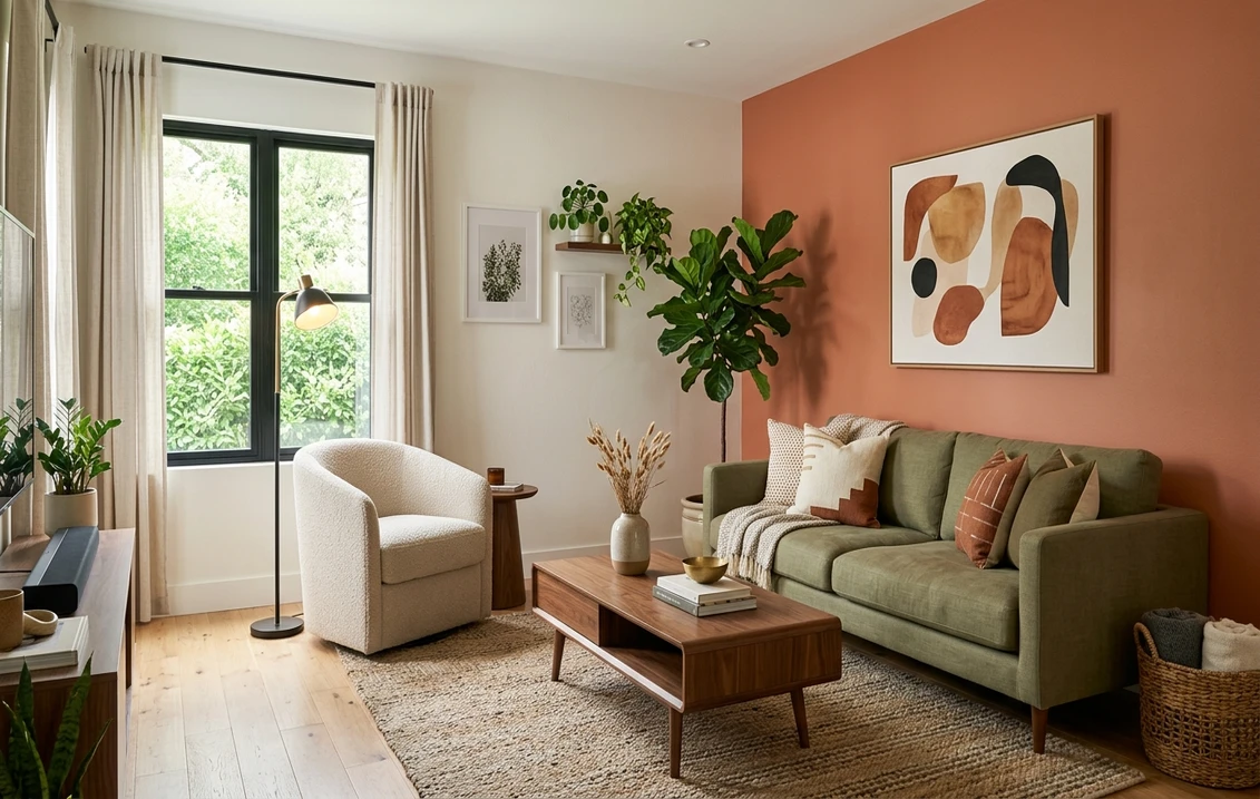
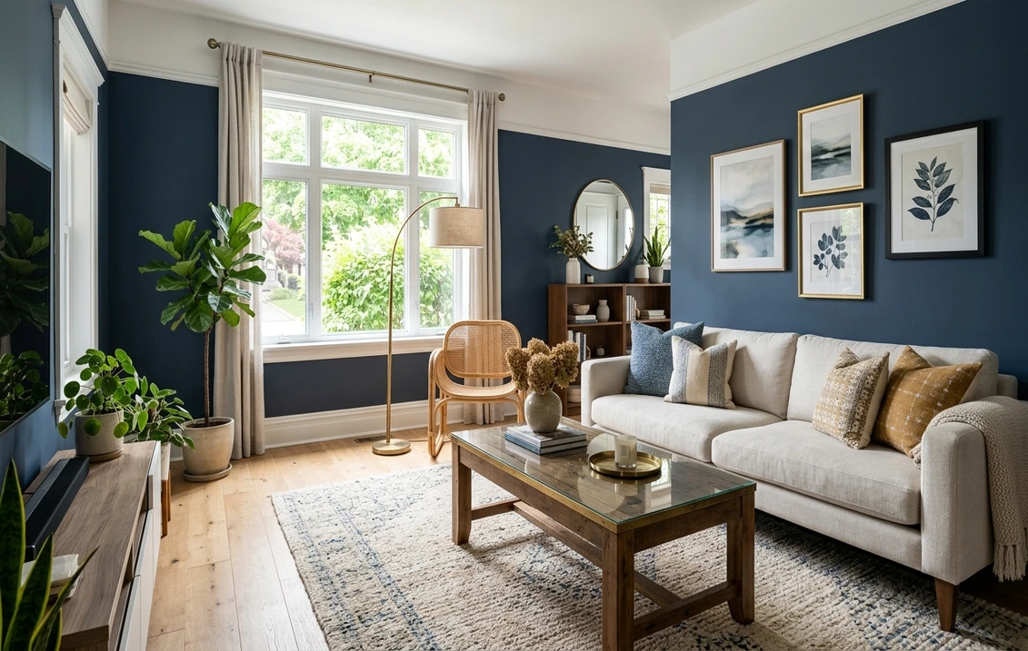
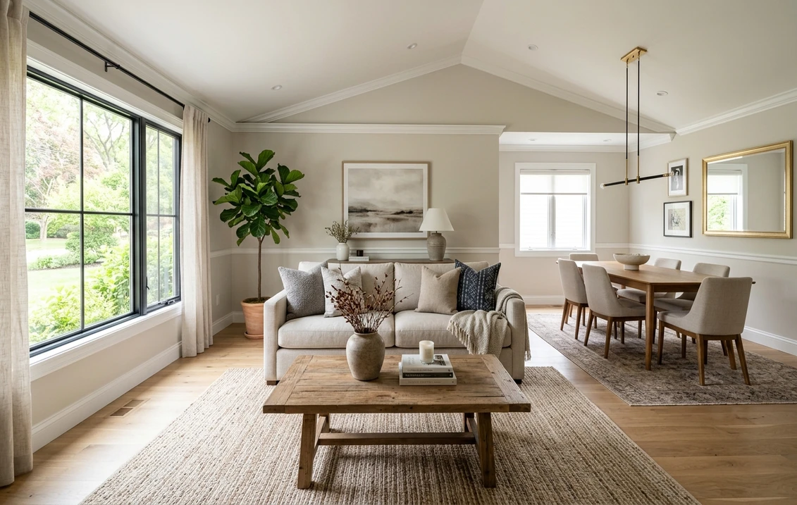
Living room paint colors
The living room is usually the largest wall area in the house and sets the tone for everything connected to it. For 2026 the dominant direction is warm and grounded: earthy neutrals, soft greige, and muted greens that feel calm without going cold. Sherwin-Williams named Universal Khaki (SW 6150), an earthy mid-tone tan with a warm yellow undertone, its 2026 Color of the Year, and it lives most naturally in exactly this room.
- Warm greige all-rounder: Sherwin-Williams Agreeable Gray (SW 7029), LRV 60, the most-painted neutral in the country because it flexes warm or cool depending on the room.
- Earthy statement: Universal Khaki (SW 6150) for a richer, enveloping feel in rooms with good natural light.
- Soft and airy: Benjamin Moore Revere Pewter (HC-172), LRV 55.5, a greige with a quiet green-gray base that reads sophisticated in north and east light.
For the full ranked list with trim pairings and accent ideas, see our dedicated living room paint colors 2026 top 15. Revere Pewter in particular deserves its own read before you commit, because its undertone shifts noticeably by orientation: our Revere Pewter HC-172 review walks through where it shines and where it sulks.
Bedroom and master bedroom
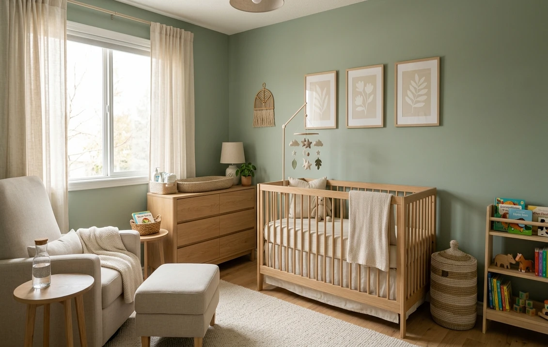
Bedrooms are about rest, so the brief flips: instead of bright and energizing, you want enveloping and low-contrast. Slightly deeper, softer colors work here because you spend most of your bedroom time in low light, and a color that feels "too dark" at noon often feels just right at night. The 2026 palette leans into muted blues, sage and olive greens, soft taupes, and warm off-whites.
| Mood | Color | LRV | Best light |
|---|---|---|---|
| Calm coastal | SW Sea Salt (SW 6204), soft green-blue | 63 | East, south |
| Quiet greige | SW Repose Gray (SW 7015) | 58 | South, west |
| Warm cocoon | BM Hale Navy (HC-154), deep accent wall | 6.3 | Any (accent) |
| Soft neutral | SW Accessible Beige (SW 7036) | 58 | North, east |
Try it on your house
No photo? Try a sample
Repose Gray and Accessible Beige are two of the most reliable bedroom neutrals in the US, but each has a specific light where it sings and another where it disappoints. Get the detail in our Repose Gray undertones and best rooms guide and the matching Accessible Beige guide. For a complete calming-color shortlist built specifically around sleep and low light, our calming master bedroom colors for 2026 is the place to go next.
Kitchen walls and cabinets
The kitchen is two color decisions in one: the walls and the cabinets, and they have to agree. Walls do their best work in warm, appetizing tones, think cream, warm white, mushroom, or a soft buttery yellow, and they earn their keep in a satin or semi-gloss that shrugs off grease and a daily wipe-down. Cabinets are the bigger commitment, and the bigger trend story for 2026.
The headline shift is away from all-white kitchens toward warmth and contrast: greige and mushroom cabinets, deep greens, soft black islands, and two-tone layouts that pair a warm white perimeter with a richer island. Because cabinet color is a longer, costlier decision than walls, it has two dedicated guides:
- Full strategy: our complete kitchen cabinet colors guide covers finishes, two-tone rules, hardware pairing, and how cabinet color interacts with countertops.
- What is trending now: our trending kitchen cabinet paint colors for 2026 is the shortlist of the specific shades buyers and designers are choosing this year.
A quick tip that prevents the most expensive kitchen mistake: never finalize cabinet color from a fan-deck chip held up to the cabinet door. Cabinet color reads dramatically different across a large door face under undercabinet lighting than it does on a tiny chip. Preview it at scale first, virtually or with a sample door.
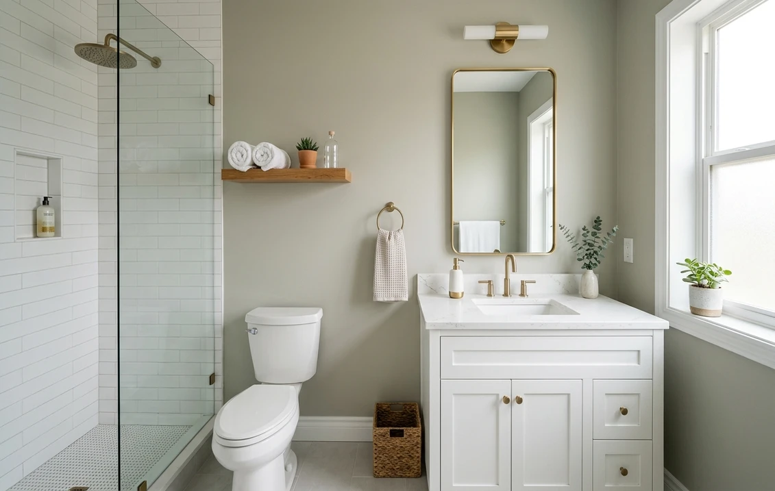
Bathroom paint colors
Bathrooms split into two very different problems. A bright bathroom with a window can take almost any color, including the deep, saturated shades that would be too much elsewhere. A small, windowless powder room or interior bath is the hardest room in the house to get right, because it has no natural light to correct undertones and the artificial light source dominates everything.
- Spa-calm: soft green-blues like SW Sea Salt (SW 6204) or quiet greiges keep a bathroom feeling clean and restful.
- Small and windowless: lean high-LRV. A warm off-white such as Benjamin Moore White Dove (OC-17), LRV 85, bounces the most light and avoids the cave effect, while still feeling softer than a stark builder white.
- Moody powder room: a small bath with no resale pressure is the one place to go bold (deep navy, forest green, even near-black) because the limited square footage keeps it from overwhelming.
Whatever you choose, use a satin or semi-gloss for moisture resistance, and confirm the white or neutral does not turn pink, green, or yellow under your specific bathroom bulbs. White Dove is a particularly safe high-LRV neutral, and our White Dove OC-17 review explains exactly how it behaves across lighting before you brush it on a windowless wall.
Free AI paint visualizer. See how a white or neutral reads in your actual bathroom before you commit to a gallon.
Home office, hallway, and other working rooms
The rooms people forget to plan are often where a thoughtful color pays off most. A home office benefits from colors that support focus rather than fatigue: muted sage, soft olive, and warm beige reduce visual noise and eye strain, which is why green tones keep topping designer office lists. For a ranked workspace shortlist, see the 12 best home office colors for productivity. Hallways, usually short on natural light, do best with warm neutrals one step lighter than the adjoining rooms so they read bright as you pass through rather than dim and tunnel-like.
Three neutral families do the heavy lifting in all of these rooms: warm gray (greige), warm white, and the soft greens. Not sure which one even suits your light and your furniture? Start with our interior paint color families guide, which sorts the entire interior palette into families and explains how each one behaves before you ever pick a single shade. To understand the most popular workhorse gray of all, our Agreeable Gray undertones and best rooms guide shows where SW 7029 lands warm versus cool.
Whole-house whites and trim that tie it together
Walk through a home that feels effortless and you will usually find the same two or three whites doing quiet work everywhere: one wall white or warm off-white carried across several rooms, plus a single trim white repeated start to finish. That repeated trim is the simplest trick there is for making a house feel designed rather than assembled one room at a time.
- Soft warm white walls: Sherwin-Williams Alabaster (SW 7008), LRV 82, a creamy off-white that flatters most rooms with warm or neutral light.
- Most popular trim and door white: Benjamin Moore White Dove (OC-17), LRV 85, neutral enough to pair with nearly any wall color.
- The classic that crosses brands: Swiss Coffee, a warm white sold by both Behr and Benjamin Moore (BM OC-45) and a favorite for trim and full-room warmth. The two versions differ subtly, which our Swiss Coffee Behr vs Benjamin Moore comparison breaks down side by side.
Here is the catch, and it is worth saying twice: every off-white hides an undertone. White is the single easiest color to get wrong, precisely because that shift stays invisible right up until it is on the wall. Alabaster, for instance, can drift greige in cool north light. Read our Alabaster north-facing guide before you roll it in a low-light room, and use our broad best interior paint colors 2026 overview to see how these whites sit alongside the year's color-of-the-year picks.
Choosing by brand instead of by room
Some homeowners start from a brand, either because of a store nearby, a contractor's preference, or loyalty to a particular formula. If that is you, each major brand has a full interior color hub:
- Sherwin-Williams interior paint colors 2026, home of Agreeable Gray, Repose Gray, Alabaster, and Universal Khaki.
- Benjamin Moore interior paint colors 2026, home of White Dove, Revere Pewter, and Hale Navy.
- Behr interior paint colors 2026, the budget-friendly hardware-store option many DIYers reach for.
Cross-shopping two brands? The two comparisons people search most are Sherwin-Williams vs Benjamin Moore interior and Behr vs Sherwin-Williams interior, which weigh coverage, durability, color range, and price so you can match brand to budget. And before you size the whole project, our interior house painting cost guide gives realistic per-room and whole-house numbers.
The fastest way to lock in a color: test it on your own room
The single biggest cause of repaint regret is committing to a color from a chip, a Pinterest photo, or someone else's room. A 3-inch fan-deck chip reflects roughly 25 to 35% lighter than the same paint rolled across a full wall, and a stranger's living room has different windows, bulbs, and flooring than yours. The only reliable preview is the color in your space, under your light.
There are two ways to do that. The traditional method is a peel-and-stick or sample-pot swatch painted at least 12 inches across two walls and observed at three moments: morning, midday, and after dark under your normal lights. The faster method is a digital visualizer: upload a real photo of the room and apply the colors above virtually before you buy a single sample. Both beat guessing from a chip, and you can combine them by shortlisting digitally, then sampling only your top one or two.
Frequently asked questions
What is the most popular interior paint color in 2026?
Warm neutrals lead 2026. Sherwin-Williams Agreeable Gray (SW 7029, LRV 60) remains the most-painted versatile greige nationwide, while the year's headline trend color is Sherwin-Williams Universal Khaki (SW 6150), an earthy mid-tone tan named the 2026 Color of the Year. Across brands, the direction is warm and grounded: greige, earthy tan, soft green, and warm white, replacing the cool grays that dominated the previous decade.
How do I pick a paint color for a room with no windows?
In a windowless room there is no natural light to balance undertones, so the artificial light source dominates. Lean toward high-LRV warm whites or soft neutrals (for example Benjamin Moore White Dove, OC-17, LRV 85) to bounce the most light and avoid a cave-like feel. Then confirm the color does not turn pink, green, or yellow under your specific bulbs, ideally by previewing it on a photo of the room or painting a sample swatch and viewing it under the lights you will actually use.
Should every room in my house be a different color?
No. The most cohesive homes repeat one or two wall colors across connected spaces and use a single trim white throughout, then vary the mood room by room with accent walls or slightly deeper shades in bedrooms. When an accent wall involves pattern, our guide to wallpaper and paint color pairings helps you match the wall paint to it. A patchwork of unrelated colors makes a house feel smaller and less intentional. Pick a small flowing palette first, then assign within it, rather than choosing each room in isolation.
What sheen should I use in each room?
Match sheen to function. Kitchens and bathrooms need scrubbable, moisture-resistant satin or semi-gloss. Living rooms and bedrooms look richer and hide wall imperfections better in eggshell or matte. Trim and doors are typically semi-gloss for durability and a crisp edge. Ceilings are usually flat. The color and the finish are one decision: the same shade in matte versus semi-gloss reads noticeably different because reflective sheen exaggerates undertones.
Can I trust a paint chip to choose a color?
Not on its own. A small fan-deck chip reflects roughly 25 to 35% lighter than the same paint rolled across a full wall, and it cannot show how the color shifts in your room's light. The reliable approach is to preview the color at scale in your actual space, either with a 12-inch sample swatch viewed morning, midday, and at night, or with a digital visualizer that applies the color to a real photo of the room before you buy.
Upload your room and preview bedroom, living room, kitchen, and bathroom colors side by side before buying a single sample.
Disclaimer: Sherwin-Williams, Benjamin Moore, and Behr, along with the color names and codes referenced above, are trademarks of their respective owners. FacadeColorizer is an independent paint visualization service and is not affiliated with, endorsed by, or sponsored by Sherwin-Williams, Benjamin Moore, or Behr. Light Reflectance Values and color descriptions are drawn from each manufacturer's published technical data; color reproduction on screens approximates the manufacturer's chip, so always confirm with a physical sample before purchase. Sources: Sherwin-Williams, Benjamin Moore, and Behr 2026 technical color data and Color of the Year announcements; The Spruce interior color guidance; designer room-by-room references.
Trademarks mentioned (Sherwin-Williams, Benjamin Moore, Behr, Caparol, Brillux, Sto, Alpina, Valspar, PPG, Glidden, Dulux, Crown Trade, Sandtex, Farrow & Ball, Johnstone's, Leyland) are property of their respective owners. FacadeColorizer is independent and not affiliated with any of them. Nominative fair use under Lanham Act §1125.