A roll of wallpaper rarely fails on its own. It fails because the three other walls, the trim, and the ceiling were painted a white that fights it. The most common regret email US homeowners send to paint forums in 2026 is not "I hate the wallpaper," it is "the wallpaper looks great but the room feels off, and I think it is the paint." This pillar fixes that. It is a browse-and-decide map of how to pair wallpaper with the right paint color: the one rule that does 80% of the work, the exact Sherwin-Williams and Benjamin Moore matches for the most-searched wallpaper families (blue, green, floral, and grasscloth), and a simple ratio so the room reads designed instead of busy.
Wallpaper is having its biggest US moment since the early 2000s, and blue wallpaper in particular (chinoiserie, botanical, and small geometric prints) is the single most-saved category on home-design boards going into 2026. The catch is that a patterned paper introduces three, four, sometimes six colors at once, and the paint has to answer all of them. Get the pairing right and a $6-per-square-foot accent wall reads like a $60,000 renovation. Get it wrong and the same paper looks like a sample left up too long.
Upload a photo of your room, drop in a wallpaper accent wall and the paint color around it, and preview the whole pairing in 30 seconds, free.
The one rule: pull the secondary color, not the loudest one
Stand back from any patterned wallpaper and you will see a hierarchy: a background field (usually the largest area), a dominant motif color, and one or two quiet secondary colors woven through. The instinct is to match the paint to the boldest motif. That is the mistake. Matching paint to the loudest color doubles down on intensity and the room starts to vibrate. The reliable move is to pull the quietest secondary color from the paper, or the background field itself, and put that on the surrounding walls.
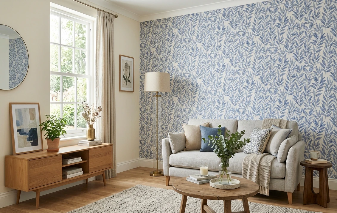
A blue-and-white botanical paper, for example, almost always carries a faint warm cream or pale stone in the background and a thread of soft green in the leaves. Painting the other walls a warm off-white (the background) or a whisper of sage (the secondary) lets the blue stay the star. Painting them a saturated navy to "match the blue" makes the paper disappear into the wall and kills the contrast that made it worth hanging. To understand how a color reads warm or cool before you commit, our interior paint color families guide walks through undertones family by family, which is exactly the lens you need when reading a wallpaper swatch.
Three working approaches, from safest to boldest:
- Match the field (safest). Paint the adjacent walls the same value as the wallpaper's background. Seamless, calm, lets the pattern float. Best for small rooms and powder baths.
- Pull a secondary (designer default). Take a minor color in the print (the green in the leaves, the blush in a peony) and use a muted version on the walls. Layered and intentional.
- Contrast the motif (boldest). Echo the dominant motif color on trim, a built-in, or the ceiling only, never all four walls. High drama, easy to overdo.
The 60-30-10 ratio that keeps a papered room from going busy
Interior designers lean on a simple proportion to stop a room from feeling chaotic, and it is doubly useful once a pattern is in play. The 60-30-10 rule splits a room's color into roughly 60% dominant, 30% secondary, and 10% accent. When wallpaper enters the room, slot it deliberately:
| Share of room | What it should be | Why |
|---|---|---|
| 60% (dominant) | Wall paint pulled from the wallpaper field or secondary | The quiet majority that lets the pattern breathe |
| 30% (secondary) | The wallpaper itself, on one accent wall, plus larger furniture | The pattern is a feature, not the entire envelope |
| 10% (accent) | Trim, a pillow, or art echoing the boldest motif color | Ties the scheme together without competing |
Try it on your house
No photo? Try a sample
Framework: 60-30-10 interior color proportion (widely documented by The Spruce and interior design references); paint values cross-checked against manufacturer technical data sheets.
So read it both ways. Wallpaper all four walls and the paper becomes the 60% dominant, which pushes your paint out to the trim and ceiling as the 30% and 10%. Wallpaper a single accent wall and that flips: the paint is the 60% and the paper is the 30% feature. Decide which job the paint is doing before you pick the can, because the same color behaves differently as a 60% envelope than as a 10% trim accent.
Preview an accent wall of wallpaper against three painted walls before you buy a single roll, free.
Blue wallpaper: the best paint matches
Blue is the most-searched wallpaper color going into 2026, and it is forgiving as long as the paint respects its undertone. The two big families are warm-blue papers (the inky, slightly purple navies and chinoiserie blues) and cool-blue papers (the clean, crisp sky and Wedgwood blues). They want different whites.
Blue-and-white botanical or chinoiserie
These papers carry a soft warm background, so a crisp builder white next to them reads cold and the cream in the paper looks dirty. Reach for a warm-leaning white:
- Benjamin Moore White Dove (OC-17), LRV 85. The most popular US off-white, warm enough to flatter the paper's cream field without yellowing. The safe default for blue-and-white prints.
- Sherwin-Williams Alabaster (SW 7008), LRV 82. A creamier warm white that nestles into chinoiserie backgrounds. Test it in your light first, because in cool north rooms it can shift gray, as covered in our deep dive linked below.
- Benjamin Moore Simply White (OC-117), LRV 91. A brighter option when the paper's background is closer to true white and you want crisp, not creamy.
Navy or deep indigo geometric
With a dark, saturated blue paper the move is contrast or near-match on trim only. For a tonal, enveloping look, echo the navy on the trim or a built-in with Benjamin Moore Hale Navy (HC-154) or Sherwin-Williams Naval (SW 6244). For a crisp library feel, keep the surrounding walls a clean greige like Benjamin Moore Revere Pewter (HC-172, LRV 55) so the navy reads as the jewel.
Soft sky or Wedgwood blue
Cool, clean blues pair beautifully with cool-leaning whites and pale grays. Sherwin-Williams Pure White (SW 7005, LRV 84) or a soft gray like Benjamin Moore Gray Owl (OC-52, LRV 65) keeps the scheme airy. A pulled-secondary move here is to paint the lower walls or a wainscot in a barely-there blue from the same family, which is where a side-by-side preview tool earns its keep.
If your blue paper lives in a north-facing room, read our Sherwin-Williams vs Benjamin Moore comparison for how each brand's whites behave under cool light, since that decision matters more next to blue than next to any other color.
Green wallpaper: pairings that feel current
Green wallpaper, from mossy botanicals to emerald palm prints, is the second-fastest-growing pattern category. Greens read warm (olive, sage, moss) or cool (emerald, forest, teal-leaning), and the paint should follow.
- Sage or olive botanical: pair with a warm white like Sherwin-Williams Greek Villa (SW 7551, LRV 84) or Benjamin Moore White Dove. For a tonal pull-the-secondary look, Benjamin Moore October Mist (1495, LRV 49), the 2022 Color of the Year, sits in the same gentle green family and layers seamlessly.
- Emerald or forest: contrast with a crisp white (Benjamin Moore Chantilly Lace, OC-65, LRV 90) for a fresh, high-contrast scheme, or go enveloping by painting the trim in a deep green like Benjamin Moore Hunter Green (2041-10).
- Grasscloth in natural greens: treat it as a warm neutral and surround it with a soft greige such as Sherwin-Williams Accessible Beige (SW 7036, LRV 58) so the texture, not a competing color, becomes the story.
No color shifts under lighting quite like green does. A swatch that looks sage at the store can turn mint or olive once it is home. Our color families guide breaks down that undertone behavior in detail, and it is the reason you test the paint against the actual paper, in the actual room, rather than trust two chips on a counter.
Floral, neutral, and textured papers
Beyond single-color papers, three categories dominate US searches: large-scale florals, neutral and beige tone-on-tone prints, and textured grasscloth or linen-weave papers. Each one rewards a different paint strategy, so here is the go-to move for all three.
Large-scale floral
Florals are the trickiest because they pack the most colors. Resist matching any single bloom. Instead, pull the leaf or stem green (almost every floral has one) or the background, and keep it soft. A blush peony print over walls in a barely-pink-tinted white, or a multicolor English garden print over a quiet warm gray like Benjamin Moore Pale Oak (OC-20, LRV 70), reads grown-up rather than loud. Save the bloom color for a single pillow or a lampshade as your 10% accent.
Neutral and tone-on-tone
Beige damask, taupe trellis, and cream-on-cream patterns are the easiest pairings of all. Match the paint to the paper's deeper tone for a wrapped, cozy effect, or to its lighter tone for a subtle, expansive one. Benjamin Moore Edgecomb Gray (HC-173, LRV 63) and Sherwin-Williams Agreeable Gray (SW 7029, LRV 60) both sit comfortably beside warm neutral papers.
Grasscloth and woven textures
Grasscloth is texture first, color second. Treat it like a neutral and let the weave do the work. Surround natural-fiber grasscloth with warm whites or soft greiges, and avoid a high-contrast bright white that flattens the texture into a flat tan. For tonal richness, paint adjacent walls within a few LRV points of the grasscloth so the eye reads one continuous warm envelope with a textured accent.
A quick cheat sheet for the pull-the-secondary picks above:
| Wallpaper family | Safe warm white | Pull-the-secondary option |
|---|---|---|
| Blue-and-white botanical | BM White Dove (OC-17) | A soft sage or pale blue from the print |
| Navy geometric | BM Revere Pewter (HC-172) walls | BM Hale Navy (HC-154) on trim |
| Sage / olive | SW Greek Villa (SW 7551) | BM October Mist (1495) |
| Emerald / forest | BM Chantilly Lace (OC-65) | BM Hunter Green (2041-10) trim |
| Large floral | BM Pale Oak (OC-20) | The leaf green from the print |
| Grasscloth / texture | SW Accessible Beige (SW 7036) | SW Agreeable Gray (SW 7029) |
LRV and color codes per Sherwin-Williams and Benjamin Moore technical data sheets 2026. Always confirm against a physical chip in your own light.
Where to put the wallpaper, and budget the pairing
The pairing only works if the wallpaper lands on the right surface. The highest-impact, lowest-risk placements in 2026 are one accent wall (typically behind a bed or sofa), a powder-room envelope (all four walls of a small space), a ceiling treatment as the "fifth wall," and the back of a bookcase or built-in. In each case the surrounding paint is doing real work, so do not treat it as an afterthought.
Budget matters too. Wallpapering one accent wall plus painting the other three is almost always cheaper and faster than papering an entire room, and it gives the 60-30-10 ratio a natural home. To estimate the painted portion of the job (the three walls, trim, and ceiling around your accent), our interior house painting cost guide breaks down real US per-square-foot and per-room numbers so the paint side of the pairing does not surprise you.
And if you are still choosing the overall direction for the room, our roundup of the best interior paint colors for 2026 is the right starting point, because the surrounding paint color should be a deliberate pick from a shortlist, not whatever was left in the garage.
How to test a wallpaper-and-paint pairing before you commit
The single biggest reason pairings disappoint is that people judge a paint chip and a wallpaper sample on a kitchen counter, under one light, flat on a horizontal surface. Paint reads up to 25 to 35% lighter on a chip than on a rolled wall, and a wallpaper sample held flat loses the way pattern repeats across a vertical plane. A reliable test sequence:
- Order a real wallpaper sample (most US brands sell A4 or larger swatches for a few dollars) and tape it to the intended wall, vertically.
- Paint a 12-inch swatch of each candidate paint directly beside it, not on poster board, and let it cure a day so the true color settles.
- View at three moments: mid-morning, mid-afternoon, and under your evening artificial light. The pairing has to hold at all three.
- Or preview it digitally first to narrow a long list to two or three before you spend on samples at all.
An AI visualizer earns its keep on that last step. Upload a real photo of your room, place a wallpaper accent wall, and try several surrounding paint colors against it in minutes. Then you only ever order samples for the pairing that already looks right on screen.
Free AI paint visualizer. Test the surrounding paint against your accent wall before buying samples.
Frequently asked questions
What paint color goes with blue wallpaper?
It depends on the blue's undertone. Warm blue-and-white botanical and chinoiserie papers pair best with a warm white such as Benjamin Moore White Dove (OC-17, LRV 85) or Sherwin-Williams Alabaster (SW 7008, LRV 82), which flatter the paper's cream background. Cool sky or Wedgwood blues want a cleaner white like Sherwin-Williams Pure White (SW 7005, LRV 84) or a soft gray. For a navy paper, keep the surrounding walls a neutral greige and echo the navy on trim only.
Should I match the paint to the boldest color in the wallpaper?
No. Matching paint to the loudest motif color doubles the intensity and makes the room feel busy and the paper disappear. The designer move is to pull a quiet secondary color from the print (a leaf green, a faint blush) or the background field, and use a muted version of it on the surrounding walls. Do that and the wallpaper stays the feature while the paint plays quiet support.
What is the 60-30-10 rule for wallpaper and paint?
It is a color proportion: about 60% of the room is the dominant color, 30% is a secondary, and 10% is an accent. When you wallpaper one accent wall, the paint is the 60% dominant and the paper is the 30% feature. When you paper all four walls, the paper becomes the 60% and the paint moves to trim and ceiling as the 30% and 10%. Decide which role the paint plays before you pick the can.
Can I put wallpaper on all four walls instead of one accent wall?
Yes, and small spaces like powder rooms and entryways often look best fully papered. The trade-off is budget and commitment: a full-room install costs more and the pattern carries the entire envelope, so choose a print you genuinely love and let the trim and ceiling paint do the balancing. One accent wall plus three painted walls is the lower-risk, lower-cost option and fits the 60-30-10 ratio naturally.
How do I test a wallpaper and paint pairing before buying?
Tape a real wallpaper sample to the wall vertically, paint a 12-inch swatch of each candidate paint directly beside it, and view both at mid-morning, mid-afternoon, and under evening light. Paint reads lighter on a chip than on a rolled wall, so judge it large and in place. The fastest way to shortlist before spending on samples is a digital visualizer: upload a photo of your room, add an accent wall, and preview the surrounding paint against it on screen.
See your wallpaper accent wall and the paint around it together before you buy a roll or a sample pot.
Disclaimer: Sherwin-Williams, Benjamin Moore, and their color names and codes are trademarks of their respective owners. FacadeColorizer is an independent paint visualization service and is not affiliated with, endorsed by, or sponsored by Sherwin-Williams, Benjamin Moore, or Behr. Wallpaper brands and patterns referenced are illustrative of common categories, not specific products. Color reproduction on screens approximates the manufacturer's chip and any wallpaper sample; always confirm with physical samples in your own room light before purchase. Sources: Sherwin-Williams and Benjamin Moore technical data sheets 2026 (LRV and color codes), The Spruce interior color guidance, and published interior-design references on the 60-30-10 proportion.
Trademarks mentioned (Sherwin-Williams, Benjamin Moore, Behr, Caparol, Brillux, Sto, Alpina, Valspar, PPG, Glidden, Dulux, Crown Trade, Sandtex, Farrow & Ball, Johnstone's, Leyland) are property of their respective owners. FacadeColorizer is independent and not affiliated with any of them. Nominative fair use under Lanham Act §1125.
