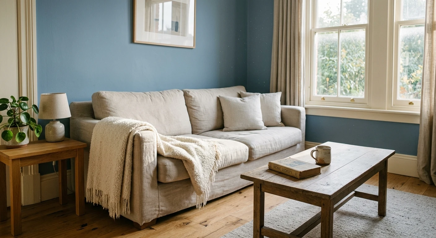

The first time a client asked me to put a deep navy on every wall of a north-facing front room, I cut in one corner, stepped back, and watched her shoulders drop. Not in a bad way. The space went from beige-builder anonymous to the kind of room you want to read in with a lamp on. That is the trick with blue in a living room: done right it feels grounded and timeless, done wrong it goes cold and flat. This gallery walks through 18 blue living room looks, the exact shades, how each one reads on a real wall, and what to pair it with. Blue earns its long reign here for one reason: it is the only bold color most people actually relax in.
A quick map before the looks. Blue covers an enormous range, from a near-black navy at LRV 6 to an airy powder blue near LRV 70, and the room it lands in changes everything. This page sits inside our wider room-by-room paint color ideas hub and pairs with our broader top living room paint colors for 2026 roundup. If you want the full spectrum of blue first (every undertone, brand by brand), our interior blue shades guide is the place to start. Here we stay in one room and get specific.
Upload a photo of your actual living room and preview any of these blues under your own light in about 30 seconds, free.
How blue reads on a living room wall
Before the 18 ideas, three rules that decide whether a blue living room works. I have watched all three sink a project, so this is worth two minutes.
- Light direction sets the temperature. A north-facing living room strips out warm wavelengths and pushes any blue cooler and grayer. South light warms it back up. A navy that looks rich and inky in a south room can read flat and cold on a north wall, so judge the swatch in the actual room, not the store.
- LRV controls how big the room feels. Light Reflectance Value runs 0 (black) to 100 (white). A pale blue near LRV 65 keeps a small living room open; a navy near LRV 6 wraps it in and can shrink it, which is great for a cozy den and risky for a tight space with one window.
- The undertone decides the pairings. A green-leaning blue (think blue-green-gray) wants warm wood and brass. A clean true-blue wants crisp white and black. A violet-leaning blue can fight orange-toned oak. Name the undertone first, then choose trim and floor.
Keep those three in mind as you scan the looks below. The shade names are real and current; the LRV figures come from each manufacturer's published color data.
18 blue living room paint ideas
Deep navy, the classic anchor (looks 1 to 5)
Navy is the safest bold move in a living room because it behaves almost like a warm neutral once the lamps come on. 1. Benjamin Moore Hale Navy (HC-154, LRV 6) is my go-to: deep, slightly grayed, never garish. 2. Sherwin-Williams Naval (SW 6244, LRV 4) runs a touch more saturated and dramatic, ideal for a full feature room. 3. Benjamin Moore Gentleman's Gray (2062-20) leans inky teal-navy for a richer, library feel. 4. Farrow & Ball Hague Blue (No.30) is a moody blue-green navy with real depth. 5. Sherwin-Williams In the Navy (SW 9178) is a clean traditional navy for paneling and built-ins. Pair any of these navy living room walls with warm-white trim, brass lamps, and oak or walnut, and add a single brass or rust accent so the room does not go too serious.
Slate and steel blue, the easy mid-tones (looks 6 to 10)
Mid-tone blues are the most livable for a whole-room blue living room because they have presence without the weight of navy. 6. Benjamin Moore Van Deusen Blue (HC-156) is a classic muted slate, traditional and forgiving. 7. Sherwin-Williams Distance (SW 6243) is a smoky blue-gray that flatters north light instead of fighting it. 8. Benjamin Moore Gray Wing (OC-52 sits cooler; here use Wolf Gray 2127-40) reads as a confident steel blue. 9. Sherwin-Williams Mineral Deposit (SW 7745) brings a soft green-blue calm. 10. Farrow & Ball Stiffkey Blue (No.281) is a deep denim-slate for a richer mid-tone. These slate blue living walls pair beautifully with greige sofas, natural linen, and a warm brass or aged-bronze finish. For more full-room recipes built on these tones, our living room color schemes for 2026 guide lays out the supporting palette.
Soft sky and powder blue, light and airy (looks 11 to 14)
When the living room is small or short on windows, a pale blue keeps it open while still adding character. 11. Benjamin Moore Constellation (AF-540) is a barely-there gray-blue that acts almost like a soft neutral. 12. Sherwin-Williams Rainwashed (SW 6211, LRV 60) is a gentle blue-green that reads spa-calm. 13. Benjamin Moore Yarmouth Blue (HC-150) is a soft heritage powder blue. 14. Sherwin-Williams Sleepy Blue (SW 6225) is a muted dusty blue that stays grown-up rather than babyish. These light blue living walls love crisp white trim, pale oak floors, and warm metal accents to stop them tipping cold. In a bright south room they sparkle; in a dim north room, warm the bulbs to 2700K so they do not read gray.
Blue-green and coastal, the in-between (looks 15 to 18)
This is the most-requested blue family right now, the blue that carries a green-gray undertone and reads coastal without being literal. 15. Sherwin-Williams Sea Salt (SW 6204, LRV 63) is the famous one: blue, green, and gray at once depending on the light. 16. Benjamin Moore Wythe Blue (HC-143) is a soft sage-blue with real warmth. 17. Sherwin-Williams Watery (SW 6478) leans more clearly aqua for a brighter beach read. 18. Benjamin Moore Palladian Blue (HC-144) is the timeless pale blue-green that has flattered living rooms for two decades. Pair these with warm whites, rattan, jute, and unfinished wood. They are the gentlest way to bring blue into a living room without committing to a strong color.
Free AI visualizer. Compare three blues on your real living room before buying a single sample pot.
Blue living room shades compared
The quickest way to narrow 18 looks down to a shortlist is to compare them by depth and undertone. Here are eight benchmarks across the range, with the LRV that tells you how light or heavy each will feel on the wall:
| Shade | Code | LRV | Reads as |
|---|---|---|---|
| Naval | SW 6244 | 4 | Deepest navy; bold full-room or feature wall |
| Hale Navy | BM HC-154 | 6 | Slightly grayed classic navy; warm and safe |
| Stiffkey Blue | F&B 281 | 8 | Deep denim-slate; rich mid-dark |
| Van Deusen Blue | BM HC-156 | 12 | Muted traditional slate blue |
| Distance | SW 6243 | 25 | Smoky blue-gray; flatters north light |
| Palladian Blue | BM HC-144 | 61 | Pale blue-green; light and timeless |
| Sea Salt | SW 6204 | 63 | Soft blue-green-gray; coastal, shifts with light |
| Yarmouth Blue | BM HC-150 | 66 | Soft heritage powder blue; airy |
Sources: Benjamin Moore, Sherwin-Williams, and Farrow & Ball published color data 2026; designer field reports compiled by FacadeColorizer. LRV values approximate manufacturer figures.
Pairings: trim, ceiling, and what goes with blue
A blue living room lives or dies on its supporting cast. The wall is the easy part; the trim, floor, and one or two accents are what make it look designed instead of accidental.
- Trim: a warm white such as BM White Dove (OC-17) or SW Alabaster (SW 7008) keeps deep blues from going cold. For a crisper, more modern edge against navy, a cleaner white like SW Pure White works. Match the white to the blue's temperature: warm blue, warm white.
- Ceiling: a soft white ceiling keeps a navy room from feeling like a cave. In a light blue room you can carry the wall color faintly up onto the ceiling for a wraparound calm, but keep it lighter than the walls.
- Floors and wood: warm oak and walnut bring out the warmth in navy and slate; cool gray-washed floors can leave a blue room feeling flat and chilly. Rattan and jute soften the blue-green coastal shades.
- Metals and accents: brass and aged bronze are the classic warm counterpoint to blue. A single rust, mustard, or terracotta accent (a pillow, a throw) stops a navy room going corporate. For a full breakdown of accent colors, see our guide to colors that go with blue interiors.
One painter's note on application. Saturated navies and deep slates eat coverage, so plan on a tinted gray primer and at least a second coat, sometimes a third on a previously light wall. Cut in your edges carefully, because crisp lines between a deep blue and a white ceiling are unforgiving when the light hits them.
See walls, trim, and floor together in one preview, free.
Whole wall, accent wall, or two-thirds?
You do not have to drench the whole room. How much blue you commit to changes the feel completely:
- Full room in a mid-tone: the most cohesive look for slate and blue-green shades. Best when the room has decent natural light and you want enveloping calm.
- One accent wall in navy: the lowest-risk way to add a deep blue, usually behind the sofa, the TV, or a fireplace. It anchors the room without darkening it everywhere.
- Two-thirds with paneling: navy on the lower wall and board-and-batten, with a lighter blue or warm white above, gives a heritage, grounded look that suits older homes.
If you are leaning toward a single bold wall rather than the whole room, our accent wall color strategy covers where the wall should go and how dark to take it.
How to test a blue living room before you commit
Blue is the color most often returned to the store, because a 3-inch chip cannot show how a navy deepens at night or how a soft blue-green slides toward gray on a north wall. Two reliable methods beat the chip:
- Paint a large swatch: roll a 12-by-12-inch sample (or a peel-and-stick sample) on two walls, one near the window and one in a darker corner, and check it mid-morning, late afternoon, and at night under your normal bulbs. Blues shift more than any other family across a day.
- Preview it digitally first: upload a real photo of your living room and apply a navy, a slate, and a soft blue side by side before you buy any samples. That narrows three contenders to the one worth painting. For what the full repaint costs, our interior house painting cost guide for 2026 has the per-room numbers.
Preview a navy, a slate, and a soft blue on your real living room, side by side, free.
Frequently asked questions
What is the best blue for a living room?
For most living rooms the safest bold pick is a slightly grayed navy like Benjamin Moore Hale Navy (HC-154) or a muted slate like Van Deusen Blue (HC-156), because they read warm under lamp light and pair easily with wood and white. If the room is small or dim, drop to a soft blue-green such as Sherwin-Williams Sea Salt (SW 6204) so the space stays light. Match the blue to your light first, then the look.
Does a blue living room make the room feel smaller?
A deep navy near LRV 6 absorbs light and can make a small living room feel cozier and more enclosed, which is great for a den and risky for a tight room with one window. A pale blue near LRV 65 reflects more light and keeps the space open. To add blue without shrinking a small room, use a light blue-green on all walls or put a single navy accent wall behind the sofa.
What colors go with a blue living room?
Warm white trim, oak or walnut wood, and brass or aged-bronze metals are the classic partners for a blue living room. Greige and natural linen soften slate blues, while rattan and jute suit coastal blue-greens. A single warm accent (rust, mustard, or terracotta) keeps a navy room from looking corporate. Avoid cool gray-washed floors with deep blue, which can leave the room flat and chilly.
Should I paint the whole living room blue or just an accent wall?
A full room works best in a mid-tone slate or soft blue-green when the room has decent natural light, giving an enveloping, calm feel. A single navy accent wall, usually behind the sofa, TV, or fireplace, is the lowest-risk way to add a deep blue without darkening the whole space. Two-thirds navy with paneling and a lighter top suits older, traditional homes.
How many coats does a dark blue living room need?
Saturated navies and deep slates have low hide, so plan on a tinted gray primer plus at least two finish coats, and sometimes a third when you are covering a previously light wall. The primer cuts down how much expensive color you need and helps the blue reach its true depth. Cut in edges carefully, because crisp lines between a deep blue and a white ceiling show every wobble.
Preview any of these blues on your actual living room under your own light before buying a single sample.
Disclaimer: Benjamin Moore, Hale Navy (HC-154), Van Deusen Blue (HC-156), Gentleman's Gray (2062-20), Wolf Gray (2127-40), Constellation (AF-540), Yarmouth Blue (HC-150), Wythe Blue (HC-143), Palladian Blue (HC-144), and White Dove (OC-17) are trademarks of Benjamin Moore & Co. Sherwin-Williams, Naval (SW 6244), In the Navy (SW 9178), Distance (SW 6243), Mineral Deposit (SW 7745), Rainwashed (SW 6211), Sleepy Blue (SW 6225), Sea Salt (SW 6204), Watery (SW 6478), Alabaster (SW 7008), and Pure White are trademarks of The Sherwin-Williams Company. Hague Blue (No.30) and Stiffkey Blue (No.281) are trademarks of Farrow & Ball. FacadeColorizer is an independent paint visualization service and is not affiliated with, endorsed by, or sponsored by these manufacturers. Color reproduction on screens approximates the manufacturer's chip; always confirm with a manufacturer sample under your own light before purchase. Sources: Benjamin Moore, Sherwin-Williams, and Farrow & Ball published color data 2026, designer field reports compiled by FacadeColorizer.
Trademarks mentioned (Sherwin-Williams, Benjamin Moore, Behr, Caparol, Brillux, Sto, Alpina, Valspar, PPG, Glidden, Dulux, Crown Trade, Sandtex, Farrow & Ball, Johnstone's, Leyland) are property of their respective owners. FacadeColorizer is independent and not affiliated with any of them. Nominative fair use under Lanham Act §1125.