
Benjamin Moore Yarmouth Blue (HC-150) is one of those quiet historic blues that does not shout in the fan deck but turns into the favorite color in the house once it is on the wall. It is a soft, pale, powdery blue with just enough green in it to feel old and settled rather than nursery-sweet. People reach for it when they want a bedroom or bath to feel calm and a little coastal without committing to a saturated blue, and the search that follows is almost always the same: is it actually blue, or is it secretly green, and will it go cold in my room? The honest answer is that Yarmouth Blue is a true light blue that leans gently green, and how green it reads depends entirely on your light and your trim. Here is exactly how it behaves indoors.
Quick orientation before the deep dive. Yarmouth Blue HC-150 has a published LRV of about 56 and a hex approximation of #C8D2CC (RGB 200, 210, 204). That places it in light, mid-bright territory: pale enough to keep a small room open and airy, but deep enough to read as a clear soft color rather than a barely-there tint that washes to white. The undertone is a soft blue with a gentle green-gray lean, the combination that gives it a faded, seaglass, almost antique quality. This profile is one stop in our wider Benjamin Moore interior paint colors guide, and it sits right next to its much-discussed sibling in our Benjamin Moore Stonington Gray HC-170 review: that one is a cool gray that flirts with blue, while Yarmouth is an actual soft blue. They are complementary references, not duplicates.
Upload a photo of your actual room and preview BM Yarmouth Blue under your own light in about 30 seconds. Free tier includes 1 HD render plus 3 variations.
Yarmouth Blue at a glance: the numbers that matter
Before opinions, here are the verifiable specs from the Benjamin Moore color library. These are the values you can take to a paint counter:
| Spec | Yarmouth Blue HC-150 |
|---|---|
| Color number | HC-150 (Historical Color collection) |
| LRV (Light Reflectance Value) | Approximately 56: light soft blue, keeps a room bright and airy |
| Hex / RGB (approx.) | #C8D2CC / 200, 210, 204 |
| Color family | Light blue with a soft green lean |
| Primary undertone | Soft powder blue, with a quiet green-gray that surfaces in shade |
| Best base / finish | Light tint base; eggshell or matte on walls, satin on trim and cabinets |
The takeaway from those numbers: Yarmouth Blue is a genuine soft blue, not a blue-gray pretending to be neutral and not a green wearing a blue name. At LRV 56 it sits in the same bright band as many designer light blues, pale enough to make a small bathroom feel like it doubled in size, deep enough that a finished wall still reads as a real, restful color rather than fading to off-white. The gentle green in the undertone is the whole personality: it is what makes Yarmouth read historic and seaglass instead of crayon-blue or sky-blue. Lean into that softness with warm whites and natural materials, and it looks timeless; surround it with stark cool whites and harsh LED light and the green can drift toward a faded sage. That is the entire decision in one sentence.
Is Yarmouth Blue blue or green? The undertone, decoded
Yarmouth Blue is a blue, full stop, but it is a blue with a green-gray softener mixed in, and that softener is exactly what trips people up. Understanding the balance is what separates a room that reads as a calm coastal blue from one that surprises you by looking like a muted sage. Here is what is happening underneath.
The blue is the lead pigment, and it is loudest in clean, bright daylight and against warm-white trim. Riding beneath it is a soft green-gray, the muting agent that pulls Yarmouth away from a saturated periwinkle and gives it that faded, historic, almost weathered-shutter feel. In warm or south light the blue stays forward and the green simply rounds the edges, so the wall reads as a clear, gentle powder blue. In cool, indirect, or north light the warm wavelengths drain out of the room, the blue calms, and the green-gray steps up: that is the moment the wall can look noticeably greener and more muted than the chip promised, occasionally tipping toward a pale sage. It rarely goes cold or steel the way a pure blue-gray can, which is why it feels so cozy, but the green absolutely advances in cool light.
Watch out for one quirk specific to this color. Yarmouth Blue reads bluer on a fan-deck chip and on a phone screen than it does as a finished, rolled wall under your own bulbs. The expanse of a full wall lets the green-gray breathe, so the real wall often lands softer, hazier, and a half-step greener than the little chip suggested. If you are choosing from Pinterest alone, assume your finished room will be quieter and more seaglass than the image, especially once warm lamps come on at night.
| Indoor light | How Yarmouth Blue reads |
|---|---|
| South-facing (bright, warm) | Clearest, happiest powder blue; the green stays in the background |
| West-facing (warm afternoon) | Warm light deepens it slightly and keeps it firmly blue late in the day |
| East-facing (cool after noon) | Fresh blue in morning light, drifts softer and greener by afternoon |
| North-facing (cool, indirect) | At its greenest and most muted; reads as a serene seaglass tone, lean into it |
| Artificial light at night | Warm 2700K bulbs keep it soft and blue-green; cool 4000K bulbs push it crisper and a touch grayer |
Sources: Benjamin Moore HC-150 color data 2026; designer undertone field reports compiled by FacadeColorizer.
Free AI visualizer. Test Yarmouth Blue on your real walls before buying a single sample pot.
Best rooms for Yarmouth Blue
Pale, soft, and quietly historic, Yarmouth Blue is happiest in rooms where calm and a little nostalgia are the goal. It is not a bold statement blue and it is not a do-anything greige; it is the color you choose when you want a space to feel restful, airy, and a touch coastal-cottage. Here is where it consistently earns its keep:
Bedrooms and nurseries aiming for calm
This is Yarmouth Blue's sweet spot. The soft powder tone reads serene and restful, the same psychology that makes blue the most-recommended bedroom hue, but the green-gray softener keeps it grown-up rather than baby-blue, so it ages well in a primary bedroom or a child's room alike. It pairs beautifully with white bedding, natural linen, rattan, and pale oak. If a restful bedroom is your project, our guide to calming master bedroom paint colors and our roundup of the best blue bedroom paint ideas both show how it sits next to other quiet picks.
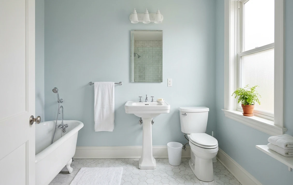
Bathrooms and powder rooms
The soft blue-green reads spa-clean against white subway tile, marble, and polished nickel, and at LRV 56 it keeps even a windowless bath feeling open. It is gentler and warmer than a stark cool gray, which is why people who find pure grays clinical often land on Yarmouth instead. Paired with crisp white trim it looks like a coastal inn rather than a builder special.
Coastal kitchens, cabinets, and sunrooms
Yarmouth Blue is a favorite for painted island cabinets, built-ins, and sunroom walls where you want the seaglass feel without a saturated blue taking over. In a bright sunroom the light keeps it cheerful and clearly blue; on lower cabinets under warm whites it reads soft and timeless. For the wider beachy palette it lives in, our coastal color palette guide maps the companion tones.
Where to think twice
A small, dim, north-facing room lit only by cool LEDs is where Yarmouth Blue can drift from soft blue to muted sage and lose its identity. If you specifically want a clear blue in a dark room, this may disappoint; pick a more saturated blue or at minimum switch to 2700K bulbs so the warmth keeps the blue forward. Yarmouth rewards light, so do not bury it in a cave and expect it to read blue.
Trim, ceiling, and coordinating colors
A soft historic blue lives or dies on what sits next to it. Get the whites and woods right and Yarmouth Blue looks intentional and serene; get them wrong and it can read cold or, worse, muddy and dingy. These are the Benjamin Moore companions designers actually reach for:
- Soft warm trim (most balanced): BM White Dove (OC-17, LRV 85) is the default. Its gentle cream bias warms the room just enough to keep Yarmouth's blue forward and its green from going gray, while still reading clean. This is the safe, cohesive pick for most homes.
- Crisp coastal trim (cleaner, brighter): BM Simply White (OC-117) or Chantilly Lace (OC-65) give a brighter, fresher edge and lean into Yarmouth's coastal-cottage side. Best for bathrooms, sunrooms, and homes with lots of natural light.
- Warm neutral walls to coordinate: BM Manchester Tan (HC-81) or a soft greige make a warm, grounding companion in an adjoining room, letting Yarmouth stay the cool accent.
- Avoid: a bright, blue-based stark white trim in a north room. The cool-on-cool pairing can drain the warmth out of Yarmouth and push it toward a sad, hospital-pale tone.
- Ceilings: a clean warm white (often the trim color) keeps the room bright. A flat builder white can read slightly dingy above a soft blue, so favor a crisp warm white overhead.
- Floors and decor: pale oak, white oak, jute, rattan, brass, and natural linen flatter the soft blue and reinforce the historic-coastal read. Cool, gray-toned floors can fight it; warm woods are the safer partner.
For contrast, a deep navy on a door, vanity, or lower cabinet reads crisp and tailored against the pale Yarmouth walls. If you want that deeper blue to anchor the scheme, see how a true navy behaves indoors in our Benjamin Moore Hale Navy HC-154 review. For lighter companions and accents, our guide to colors that go with light blue is a useful map.
See walls, trim, and floor together in one preview, free.
Yarmouth Blue vs the blues people confuse it with
Almost every Yarmouth Blue search ends in a side-by-side, and the three below are the near-twins that genuinely matter indoors. They are close enough that a tiny chip will not settle it, so this is where most people get stuck:
- vs BM Woodlawn Blue (HC-147): the classic dilemma, and the two sit in the same Historical row at almost the same depth (Woodlawn LRV near 62, Yarmouth 56). Woodlawn is noticeably greener and more muted, reading more like a soft seafoam or muted teal-blue, while Yarmouth stays more clearly blue with the green only whispering. Choose Woodlawn when you want the green to lead and the room to feel more aqua; choose Yarmouth when you want it to read as a soft, true powder blue.
- vs BM Hamilton Blue (848): Hamilton is a brighter, cleaner, more saturated sky-leaning blue with far less green muting it. Next to it Yarmouth looks dustier, paler, and more historic. Pick Hamilton for a cheerful, fresh, distinctly blue room; pick Yarmouth when you want the faded, weathered, calmer feel.
- vs BM Wythe Blue (HC-143): Wythe is the famous green-blue and it is significantly greener and a step deeper, often reading as a true blue-green or muted celadon. Yarmouth is lighter and stays on the blue side of the fence, while Wythe lands closer to the middle of blue and green. If people keep telling you a color looks green, you probably want Yarmouth, not Wythe.
Spelling note: yarmouth blue benjamin moore, BM Yarmouth Blue, and Yarmouth Blue HC150 all point to this same HC-150. For where it sits among the year's other soft blues, our blue living room paint ideas roundup lines several of these up side by side.
How to test Yarmouth Blue before you commit
A 2-inch fan-deck chip is the number-one reason people pick a soft blue that disappoints: it exaggerates the blue and cannot show how the green-gray steps forward across a real day on a real wall. Two better methods:
- Paint a large swatch: roll a 12-by-12-inch sample (or a peel-and-stick sample) on two different walls and check it mid-morning, mid-afternoon, and at night under your normal bulbs. Watch specifically for how green it goes in your coolest, dimmest corner; that corner tells you the truth about whether it will read blue or sage for you.
- Preview it digitally first: upload a real photo of your room and apply Yarmouth Blue alongside a greener option like Woodlawn and a brighter one like Hamilton before you buy any samples, narrowing three near-twins to the one worth painting. Pricing context for the full repaint is in our interior house painting cost guide for 2026.
Preview Yarmouth Blue against Woodlawn and Hamilton Blue, side by side, free.
Frequently asked questions
Is Yarmouth Blue blue or green?
Yarmouth Blue (HC-150) is a soft blue that leans gently green. The blue is the lead pigment, but a quiet green-gray softener gives it a faded, seaglass quality. In bright or south light it reads as a clear powder blue; in cool, indirect, or north light the green-gray steps forward and it can drift toward a muted sage. So it is genuinely blue, but expect more green in cool or dim rooms.
What is the LRV of Yarmouth Blue?
Yarmouth Blue has a Light Reflectance Value of about 56 on the Benjamin Moore color data, with a hex approximation of #C8D2CC (RGB 200, 210, 204). That makes it a light, soft blue: bright enough to keep a small room open and airy, but with enough depth to read as a real restful color rather than fading to off-white like a very high-LRV tint.
What are the best rooms for Yarmouth Blue?
Bedrooms and nurseries, bathrooms and powder rooms, and coastal kitchens, cabinets, or sunrooms are where Yarmouth Blue shines, because its soft blue-green reads calm, restful, and spa-clean against white tile, marble, and natural wood. It is least reliable in small, dim, north-facing rooms with only cool LED light, where it can drift from soft blue to muted sage; 2700K bulbs or a more saturated blue help there.
What trim color goes with Yarmouth Blue?
BM White Dove (OC-17) is the most balanced trim because its gentle cream bias warms the room just enough to keep Yarmouth's blue forward and its green from going gray, while still looking clean. BM Simply White (OC-117) or Chantilly Lace (OC-65) are brighter, more coastal options for sunrooms and well-lit baths. Avoid a stark blue-based white in a north room, which can drain the warmth and push Yarmouth toward a sad, washed-out tone.
What is the difference between Yarmouth Blue and Woodlawn Blue?
Woodlawn Blue (HC-147, LRV near 62) and Yarmouth Blue (HC-150, LRV 56) sit at almost the same depth, so the difference is undertone. Woodlawn is noticeably greener and more muted, reading more like a soft seafoam or aqua, while Yarmouth stays more clearly blue with the green only whispering. Choose Woodlawn when you want the green to lead and the room to feel more aqua, and Yarmouth when you want a soft, true powder blue.
Preview BM Yarmouth Blue on your actual walls under your own light before buying a single sample. Free tier includes 1 HD render plus 3 variations.
Disclaimer: Benjamin Moore, Yarmouth Blue (HC-150), Woodlawn Blue (HC-147), Hamilton Blue (848), Wythe Blue (HC-143), White Dove (OC-17), Simply White (OC-117), Chantilly Lace (OC-65), Manchester Tan (HC-81), and Hale Navy (HC-154) are trademarks of Benjamin Moore & Co. FacadeColorizer is an independent paint visualization service and is not affiliated with, endorsed by, or sponsored by Benjamin Moore. Color reproduction on screens approximates the manufacturer's chip; always confirm with a manufacturer sample under your own light before purchase. Sources: Benjamin Moore HC-150 Yarmouth Blue color data 2026, Benjamin Moore HC-147 Woodlawn Blue, 848 Hamilton Blue, and HC-143 Wythe Blue color data 2026, designer undertone field reports compiled by FacadeColorizer.
Trademarks mentioned (Sherwin-Williams, Benjamin Moore, Behr, Caparol, Brillux, Sto, Alpina, Valspar, PPG, Glidden, Dulux, Crown Trade, Sandtex, Farrow & Ball, Johnstone's, Leyland) are property of their respective owners. FacadeColorizer is independent and not affiliated with any of them. Nominative fair use under Lanham Act §1125.


