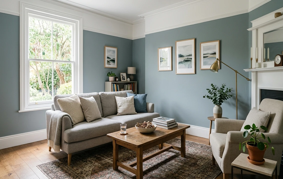

Benjamin Moore Philipsburg Blue (HC-159) is one of those Historical Colors that quietly does the work people wish a louder blue would do: it gives a room the calm, settled feeling of a real blue without ever shouting "I painted the room blue." I have brushed it onto dining rooms, studies, and a couple of period staircases, and the comment I hear most is some version of "is that gray or blue?" That hesitation is the whole charm. Philipsburg Blue is a mid-tone, slightly grayed, slightly green-leaning historic blue: deep enough to read as a genuine color on the wall, soft enough to behave like a sophisticated neutral. The question buyers actually want answered is whether it will read too gray and flat, or whether the blue will come through. The truth, as always, lives in your light and your trim. Here is how this color behaves in real rooms.
Quick orientation before the deep dive. Philipsburg Blue HC-159 carries a published LRV of about 46 and a hex approximation of #9DAAA9 (RGB 157, 170, 169). That puts it squarely in mid-tone territory: not a pastel and not a deep nautical blue, but the kind of color that anchors a room while still bouncing back a reasonable amount of light. The undertone is a soft, slightly muted blue that leans the tiniest bit green-gray, which is what gives it that aged, historic, almost weathered-slate quality rather than a crisp coastal pop. This profile is one stop in our wider Benjamin Moore interior paint colors guide, and it pairs naturally with our broader look at blue-gray paint undertones and best shades, where Philipsburg sits among its cousins.
Upload a photo of your actual room and preview BM Philipsburg Blue under your own light in about 30 seconds, free.
Philipsburg Blue at a glance: the numbers that matter
Before opinions, here are the verifiable specs from the Benjamin Moore color library. These are the values you can carry to the paint counter:
| Spec | Philipsburg Blue HC-159 |
|---|---|
| Color number | HC-159 (Historical Color collection) |
| LRV (Light Reflectance Value) | Approximately 46: mid-tone, holds light but reads as a real color |
| Hex / RGB (approx.) | #9DAAA9 / 157, 170, 169 |
| Color family | Mid-tone historic blue-gray |
| Primary undertone | Soft muted blue with a faint green-gray lean |
| Best base / finish | Medium tint base; eggshell or matte on walls, satin on trim and cabinetry |
The takeaway from those numbers: at LRV 46, Philipsburg Blue is noticeably deeper than the light blue-grays people reach for in bright bathrooms (which often sit in the high 50s to low 70s). It is a mid-tone, so it will darken a small or dim room more than a pale blue would, and it rewards rooms with decent natural light. The slight green-gray in the undertone is what keeps it from feeling like a flat denim or a saturated cobalt: it gives the color age and depth, which is exactly why it lives in the Historical Color line and why it works so well in traditional and transitional homes. That muted, settled quality is the entire identity of the color.
Is Philipsburg Blue gray or blue? The undertone, decoded
Philipsburg Blue is a blue, but a heavily grayed one, and the proportion of blue to gray you perceive shifts more with light than almost any color in its family. That is why one homeowner swears it is "a sophisticated slate gray" and another in the same paint store insists it is "a soft historic blue." Both are seeing the truth under their own conditions. Here is what is happening underneath.
The dominant note is muted blue, and it shows its truest, most colorful blue in clean, bright, direct light. Underneath it runs a soft green-gray that mutes and ages the blue, keeping it from ever reading as a cheerful, saturated, or coastal hue. In strong daylight the blue steps forward and the room reads clearly blue, calm and a little maritime. In dim, indirect, or shaded conditions the gray takes over, the green hint surfaces a touch more, and the wall settles into what most people would call a deep grayed teal-blue or slate. It rarely goes purple, which is one reason designers trust it for whole rooms, but in very warm incandescent light it can look slightly more muted and grayed than expected.
Watch out for one quirk specific to mid-tone historic blues. Because the LRV is around 46, Philipsburg Blue absorbs more light than the pale blue-grays people are used to, so it can look dramatically deeper and grayer in a north room or after dusk than a chip suggests. The chip is also viewed against the bright white of a fan deck, which makes the blue look more vivid than it will on a full wall surrounded by furniture and shadow. Assume the finished wall will land a half-step deeper and a touch grayer than the swatch promised.
| Indoor light | How Philipsburg Blue reads |
|---|---|
| South-facing (bright, warm) | Its most clearly blue and most colorful read; warm sun keeps it lively rather than gloomy |
| West-facing (warm afternoon) | Richer and a touch warmer late in the day; the green-gray softens and it feels enveloping |
| East-facing (cool after noon) | Fresh and blue in morning light, settles grayer and deeper by afternoon |
| North-facing (cool, indirect) | At its grayest, deepest, and most slate-like; moody and handsome but can feel dim in a small room |
| Artificial light at night | Warm 2700K bulbs mute it toward grayed teal; cool 4000K bulbs revive the blue and sharpen it |
Sources: Benjamin Moore HC-159 color data 2026; The Spruce blue-paint undertone coverage; designer field reports compiled by FacadeColorizer.
Free AI visualizer. Test Philipsburg Blue on your real walls before buying a single sample pot.
Best rooms for Philipsburg Blue
Mid-tone, muted, and quietly historic, Philipsburg Blue is happiest where you want a room to feel grounded and a little tailored rather than bright and breezy. It is not the high-LRV blue-gray you reach for to make a small bathroom feel airy; it is the color you use when you want depth, mood, and a sense of permanence. Here is where it consistently earns its keep:
Dining rooms and studies
This is Philipsburg Blue's strongest suit. In a dining room, the grayed historic blue reads dressy and intimate under both daylight and candlelight, flattering wood furniture and white linen without going somber. In a study or home office, the mid-tone depth wraps the room and reduces glare, which is exactly the calm, focused backdrop people want for a desk. Both rooms tolerate, and even benefit from, a color that absorbs a little light.
Bedrooms wanting depth, not pastel
For a bedroom that aims for cocooning calm rather than airy lightness, Philipsburg Blue is a beautiful pick. The grayed blue is restful and a touch moody, the kind of color that reads sophisticated against white bedding and natural wood. If you are weighing it against lighter or brighter options, our roundup of the best blue bedroom paint ideas shows how a mid-tone like this sits next to softer blues.
Cabinetry, built-ins, and accent walls
Some of the best uses of Philipsburg Blue are not full rooms at all. On kitchen island cabinetry, a bank of built-in bookshelves, or a single accent wall behind a bed or fireplace, the mid-tone historic blue adds a hit of grounded color without committing every wall. In a bright living room with white or off-white walls, it reads as a confident, traditional accent. For pricing context if you are planning a fuller repaint, our interior house painting cost guide for 2026 is a useful reference.
Where to think twice
A small, dim, north-facing room with little natural light is where Philipsburg Blue can tip from moody to gloomy. At LRV 46 it absorbs a meaningful amount of light, so in a windowless powder room or a dark hallway it can feel heavy and read more gray-slate than blue. If you love the color but the room is dark, use it on cabinetry or a single accent wall rather than all four, or borrow it for a brighter space and choose a higher-LRV blue-gray for the dim room.
Trim, ceiling, and decor pairings
A grayed historic blue lives or dies on contrast. Get the trim right and Philipsburg Blue looks tailored and intentional; get it wrong and the mid-tone can read flat or muddy.
- Soft warm trim (most classic): BM White Dove (OC-17, LRV 85) is the designer default and the safe historic pairing. Its gentle cream bias warms the room and gives the deep blue a crisp, high-contrast frame without going stark. See it in detail in our Benjamin Moore White Dove OC-17 review.
- Crisp trim (cleaner, cooler): BM Chantilly Lace (OC-65) gives a brighter, more modern white that sharpens the blue and pushes the look toward transitional. Best when you want the wall color to pop against the trim.
- Avoid: a heavy yellow-cream antique white next to Philipsburg Blue. The warm-cool clash dulls the blue and can make the grayed undertone look dingy rather than rich.
- Ceilings: a clean white (often the trim color) keeps a mid-tone room from feeling closed in. In a study or dining room going for full drama, painting the ceiling the same Philipsburg Blue at 50 percent strength can create a cohesive, enveloping effect.
- Floors and decor: warm oak, walnut, brass, aged bronze, and natural linen all flatter the historic blue and play up its warmth. Crisp whites and creamy textiles keep it from feeling somber; cool chrome and stark grays can make it read colder.
For a richer, more dramatic scheme, Philipsburg Blue sits beautifully next to a deeper navy on a door or cabinet. If you want to see how it relates to its darker cousin, our Benjamin Moore Hale Navy HC-154 review covers the deep-navy end of the same historic-blue family, and the contrast between the two makes a handsome study or library.
See walls, trim, and floor together in one preview, free.
Philipsburg Blue vs the BM blues people confuse it with
Philipsburg Blue lives in a crowded Benjamin Moore neighborhood of grayed historic blues, and shoppers constantly hold three chips next to it. Here is how they differ in plain terms:
- vs BM Yarmouth Blue (HC-150): this is the most common mix-up by name, but they are not close in person. Yarmouth Blue is a light, airy pastel blue (LRV around 56) that reads soft and cottage-fresh, ideal for bright bathrooms and breezy bedrooms. Philipsburg Blue (LRV 46) is deeper and grayer, a mid-tone meant to add weight and mood. Choose Yarmouth when you want light and a whisper of blue; choose Philipsburg when you want the room to feel anchored and genuinely colored.
- vs BM Wythe Blue (HC-143): Wythe Blue is the famous green-leaning historic color, a soft blue-green that reads clearly more aqua and sage. Philipsburg Blue keeps far more blue in the mix and only hints at green, so it reads cooler and more decidedly blue rather than teal. Pick Wythe if you want a sage-aqua mood; pick Philipsburg if you want the color to land as a grayed blue.
- vs BM Brittany Blue (1633): the closest in character, though Brittany Blue (LRV around 30) is a step deeper and moodier than Philipsburg (LRV 46). It also leans a touch more saturated and slightly warmer-blue, reading a hair more like a soft denim. Philipsburg Blue is lighter, more muted, and carries that faint green-gray, so it reads more historic and weathered. If you want a deeper, cleaner, slightly more colorful blue, Brittany edges ahead; if you want a lighter, aged, settled slate-blue, Philipsburg is the one.
Spelling note: philipsburg blue, BM Philipsburg Blue HC-159, and Philipsburg Blue Benjamin Moore all point to this same Historical Color.
How to test Philipsburg Blue before you commit
A 2-inch fan-deck chip is the single biggest reason people get a mid-tone blue wrong: it makes the blue look brighter and more cheerful than it will across a full, shadowed wall, and it cannot show how much the color deepens after dusk. Two better methods:
- Paint a large swatch: roll a 12-by-12-inch sample (or a peel-and-stick sample) on two different walls and check it in the morning, mid-afternoon, and at night under your normal bulbs. Pay special attention to your dimmest corner: that corner is where the mid-tone gray takes over and tells you whether the room will feel cozy or gloomy.
- Preview it digitally first: upload a real photo of your room and apply Philipsburg Blue (alongside a lighter alternative such as Yarmouth Blue and a greener one such as Wythe Blue) before you buy any samples, narrowing three contenders to the one worth painting. It is faster than a hardware run and shows the color at full-wall scale instead of chip scale.
Preview Philipsburg Blue against a lighter and a greener blue, side by side, free.
Frequently asked questions
Is Philipsburg Blue gray or blue?
Philipsburg Blue (HC-159) is a blue, but a heavily grayed one with a faint green-gray lean, which is why people genuinely disagree about it. In bright, direct light the blue steps forward and the room reads clearly blue and a little maritime. In dim, indirect, or north light the gray takes over and it settles into a deep slate or grayed teal-blue. It rarely turns purple, which is why designers trust it for whole rooms, but it is firmly a muted historic blue rather than a true neutral.
What is the LRV of Philipsburg Blue?
Philipsburg Blue has a Light Reflectance Value of about 46 on the Benjamin Moore color data, with a hex approximation of #9DAAA9 (RGB 157, 170, 169). That makes it a true mid-tone: deep enough to read as a real color and add mood, but not so dark that it becomes a deep navy. Because it absorbs more light than the pale blue-grays people often use, it can look noticeably deeper and grayer in a dim or north-facing room than the chip suggests.
What are the best rooms for Philipsburg Blue?
Dining rooms, studies and home offices, cocooning bedrooms, and cabinetry or accent walls are where Philipsburg Blue shines, because the grayed historic blue adds depth, mood, and a tailored, period feeling. It is least reliable in small, windowless, or north-facing rooms with little natural light, where at LRV 46 it can tip from moody to gloomy and read more gray-slate than blue. In those spaces, use it on built-ins or a single accent wall instead of all four.
What trim color goes with Philipsburg Blue?
BM White Dove (OC-17) is the most classic trim because its gentle cream bias warms the room and frames the deep blue crisply without going stark. BM Chantilly Lace (OC-65) is the brighter, cooler option that sharpens the blue for a more modern, transitional look. Avoid a heavy yellow-cream antique white, which clashes with the cool blue and can make the grayed undertone look dingy rather than rich.
What is the difference between Philipsburg Blue and Yarmouth Blue?
Yarmouth Blue (HC-150, LRV around 56) is a light, airy pastel blue that reads soft and cottage-fresh, ideal for bright bathrooms and breezy bedrooms. Philipsburg Blue (HC-159, LRV around 46) is deeper and grayer, a mid-tone meant to add weight and mood to a room. Choose Yarmouth when you want lightness with only a whisper of blue, and Philipsburg when you want the space to feel anchored and genuinely colored.
Preview BM Philipsburg Blue on your actual walls under your own light before buying a single sample. One HD render plus three variations, free.
Disclaimer: Benjamin Moore, Philipsburg Blue (HC-159), Yarmouth Blue (HC-150), Wythe Blue (HC-143), Brittany Blue (1633), Hale Navy (HC-154), White Dove (OC-17), and Chantilly Lace (OC-65) are trademarks of Benjamin Moore & Co. FacadeColorizer is an independent paint visualization service and is not affiliated with, endorsed by, or sponsored by Benjamin Moore. Color reproduction on screens approximates the manufacturer's chip; always confirm with a manufacturer sample under your own light before purchase. Sources: Benjamin Moore HC-159 Philipsburg Blue color data 2026, Benjamin Moore HC-150 Yarmouth Blue, HC-143 Wythe Blue, and 1633 Brittany Blue color data 2026, The Spruce blue-paint undertone coverage, designer field reports compiled by FacadeColorizer.
Trademarks mentioned (Sherwin-Williams, Benjamin Moore, Behr, Caparol, Brillux, Sto, Alpina, Valspar, PPG, Glidden, Dulux, Crown Trade, Sandtex, Farrow & Ball, Johnstone's, Leyland) are property of their respective owners. FacadeColorizer is independent and not affiliated with any of them. Nominative fair use under Lanham Act §1125.


