
Benjamin Moore Blue Heather (1620) is one of those colors that fools people on the chip. From the fan deck it looks like a soft, dusty blue, almost a denim. But brush it onto a real wall and a second personality steps forward: a faint lavender warmth that keeps it from ever going cold or steely. That dual nature is exactly why it gets searched, sampled, and second-guessed so often. Homeowners want to know if it is going to read blue, gray, or purple once it is on four walls in their light. The short answer: Blue Heather is a medium blue-gray with a deliberate violet softening, and which side wins comes down entirely to your light and your trim. Here is how it actually behaves indoors.
Quick orientation before the deep dive. Blue Heather 1620 carries an LRV of about 38 and a hex approximation of #9FA6B0 (RGB 159, 166, 176). That places it squarely in the medium-depth range: deep enough to read as a real saturated color and hold a room with presence, light enough that it never tips into a true navy or a dark moody blue. The undertone is blue first, with a soft gray-violet riding underneath, which is what gives it that heathered, dusty, slightly romantic quality the name promises. This profile is one stop in our wider Benjamin Moore interior paint colors guide, and it sits alongside the lighter cool grays many shoppers cross-shop, such as our Benjamin Moore Gray Owl OC-52 review.
One important name clarification right up front: Blue Heather 1620 is not the same color as Heather Gray 2138-40. The two share the word heather and get confused in search constantly, but they are nothing alike. Heather Gray 2138-40 is a deep gray-green stone color with no blue and no violet. Blue Heather 1620 is a medium blue-gray with a lavender lean. If you are shopping for the moody, dusty blue, you want 1620; if a counter clerk hands you a chip for 2138-40, it is the wrong one.
Upload a photo of your actual room and preview BM Blue Heather 1620 under your own light in about 30 seconds. Free: 1 HD preview plus 3 variations.
Blue Heather at a glance: the numbers that matter
Before opinions, here are the verifiable specs from the Benjamin Moore color library. These are the values you can take to a paint counter:
| Spec | Blue Heather 1620 |
|---|---|
| Color number | 1620 (Color Preview / Off-the-deck collection) |
| LRV (Light Reflectance Value) | Approximately 38: medium depth, holds a room with presence |
| Hex / RGB (approx.) | #9FA6B0 / 159, 166, 176 |
| Color family | Medium blue-gray |
| Primary undertone | Blue, with a soft gray-violet lavender underneath |
| Best base / finish | Medium tint base; eggshell or matte on walls, satin on trim and doors |
The takeaway from those numbers: at LRV 38, Blue Heather is meaningfully deeper than the popular light blue-grays (which usually live in the 50s and 60s). It is a commitment color, not a barely-there whisper. That depth is its strength: it wraps a room in soft, enveloping color without the heaviness of a navy. The lavender undertone is the personality. Lean into it with the right pairings and the color reads romantic and serene; ignore it and pair it with the wrong trim and the violet can surface in a way that surprises people who expected a flat denim blue.
Is Blue Heather lavender or blue? The undertone, decoded
This is the single biggest question about 1620, and it deserves a straight answer. Blue Heather is a blue-gray with a real, intentional violet undertone. It is not a periwinkle and it is not a flat slate. The blue is the headline; the lavender is the soft backing vocal you hear most clearly in cool light and in shade. Understanding when that violet shows up is the whole game.
In warm, bright, south-facing light, the violet calms right down and Blue Heather reads as a clean, dusty blue with a gray softness, the most reassuring version of the color. In cool, indirect, or north light, the warm wavelengths drain out of the room and the lavender steps forward: the wall reads softer, hazier, and noticeably more purple-leaning. This is not a defect, it is the heather in the name doing its job, the same way a heathered wool sweater shows flecks of violet inside the gray-blue. But if you were expecting a pure denim and you put it in a north room, the purple cast can catch you off guard.
Watch out for one quirk specific to this color. Blue Heather pulls more violet next to anything warm or yellow, and more clean-blue next to anything cool or white. So the same gallon can look like two different colors in the same house depending on the room's furnishings. A bedroom with cream bedding and oak floors will coax out the lavender; a bathroom with white tile and chrome will hold it to a crisp blue-gray. Decide which read you want, then build the room around it.
| Indoor light | How Blue Heather reads |
|---|---|
| South-facing (bright, warm) | Clean dusty blue, its most reliable and flattering read; lavender stays quiet |
| West-facing (warm afternoon) | Softens and warms in late-day sun; the violet glows gently, romantic and moody |
| East-facing (cool after noon) | Fresh blue-gray in the morning, drifts hazier and more lavender by afternoon |
| North-facing (cool, indirect) | At its most lavender and hazy; embrace the heathered, dusky look or it can read cool |
| Artificial light at night | Warm 2700K bulbs push it toward soft violet-blue; cool 4000K bulbs hold it crisper and bluer |
Sources: Benjamin Moore 1620 Blue Heather color data 2026; The Spruce blue-paint undertone coverage; designer field reports compiled by FacadeColorizer.
Free AI visualizer. See whether Blue Heather goes blue or lavender on your real walls before buying a single sample pot.
Best rooms for Blue Heather
Medium-depth, dusty, and quietly romantic, Blue Heather is at its best in rooms where you want enveloping calm rather than bright airiness. At LRV 38 it is a color that wraps a space, so it rewards rooms you want to feel cocooning. Here is where it consistently earns its keep:
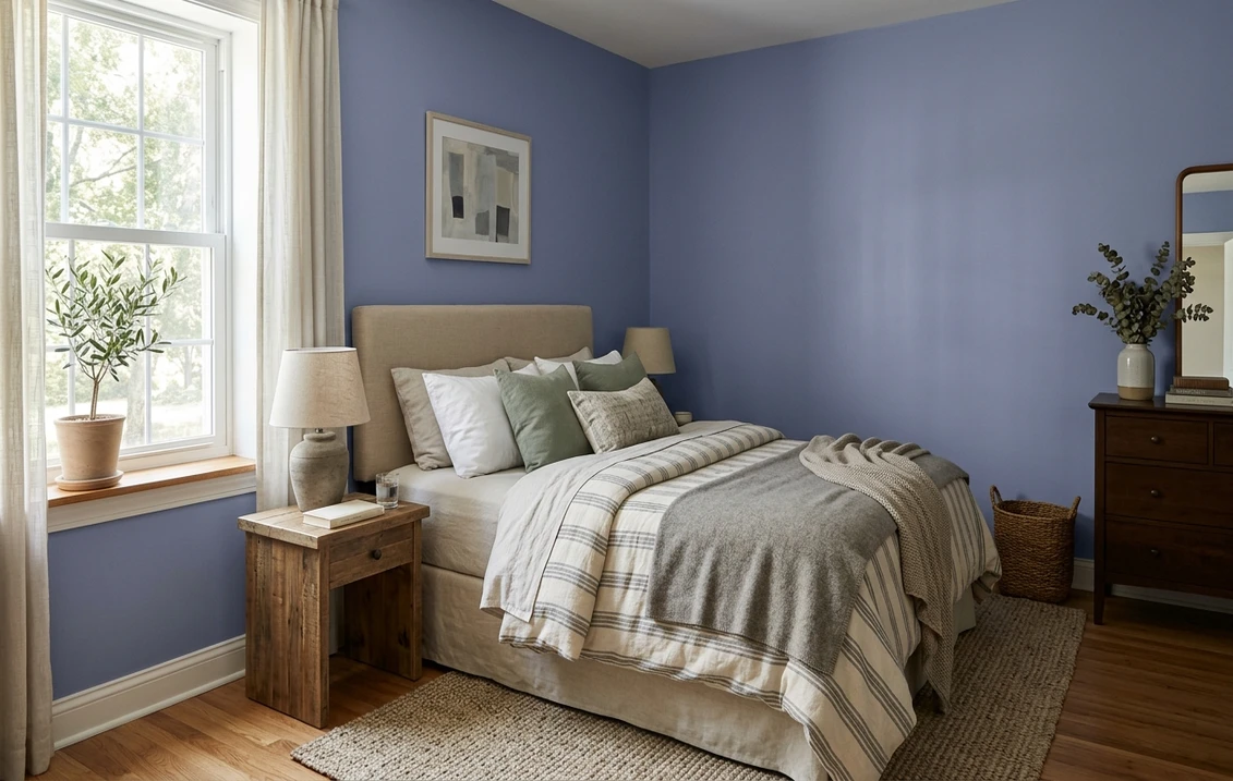
Bedrooms (its strongest room)
This is where Blue Heather shines brightest. The soft blue-violet reads serene and restful, exactly the psychology that makes dusty blues such enduring bedroom favorites, but with enough warmth in the lavender to feel intimate rather than cold. It pairs beautifully with white or cream bedding, natural linen, brass lamps, and pale wood. For more on how moody blues sit in a sleeping space, our roundup of the best blue bedroom paint ideas for 2026 shows it next to other restful picks.
Powder rooms and small bathrooms
A windowless powder room is the rare place where depth is a feature, not a risk. Blue Heather turns a tiny bath into a jewel box: dramatic, intimate, and far more interesting than another white box. Against white tile and chrome the lavender stays in check and the blue-gray reads crisp and tailored. With brass fixtures and a warm vanity, the violet glows and the room turns soft and romantic.
Studies, libraries, and moody accent walls
For a home office or reading nook, Blue Heather brings focus and quiet without the severity of a charcoal or the cliche of a deep navy. It also makes a superb single accent wall behind a bed or built-ins, where its medium depth contrasts a lighter wall color cleanly. For where this dusty blue lands among other blue-gray options, our guide to blue gray paint undertones and best shades is a useful map.
Where to think twice
A large, bright, open-concept main living space is where Blue Heather can be a tougher call. At LRV 38 it will darken a big room noticeably, and across that much wall area the lavender undertone becomes more committal. It can absolutely work as a deliberate moody choice, but if you want light and airy across an open floor plan, this is not the color; reach for a lighter blue-gray in the 50s. Likewise, a dim north room with no warm light and cream furniture is where the purple cast is most likely to surprise you.
Trim, ceiling, and decor pairings
A blue-violet at this depth lives or dies on what sits next to it. Get the trim right and Blue Heather looks intentional and elegant; get it wrong and the lavender can read either chalky or unexpectedly purple.
- Crisp white trim (most balanced): BM Chantilly Lace (OC-65) or Simply White (OC-117) gives a clean, bright frame that keeps Blue Heather reading as a confident blue-gray rather than letting the violet take over. This is the safest, most cohesive pick for bedrooms and baths.
- Soft warm white (cozier): BM White Dove (OC-17, LRV 85) warms the room and leans into the romantic, heathered side. Lovely in a west-facing bedroom, but be aware its warmth will coax out more lavender.
- Monochrome envelope (dramatic): painting trim and walls the same Blue Heather, or pairing it with a deeper blue-gray on built-ins, creates a moody, enveloping study or powder room that feels custom.
- Avoid: a heavy yellow-cream or honey-oak builder trim directly against Blue Heather. The strong warm-cool clash maximizes the violet and can make the walls look chalky or dingy by comparison.
- Ceilings: a clean white ceiling keeps the room from feeling closed in given the medium LRV. In a deliberately moody bedroom, a ceiling tinted to 25 percent of Blue Heather softens the line between wall and ceiling beautifully.
- Floors and decor: white oak, pale wood, natural linen, brass, and aged gold all flatter the dusty blue. Brass especially is the secret weapon, it picks up the violet warmth and makes the whole scheme feel intentional. Very orange-toned wood will fight the blue, so temper it with cooler textiles.
For accent colors, soft blush, warm cream, sage green, and aged brass all live happily with Blue Heather. If you want a fuller palette of companions, our guide to colors that go with blue interiors walks through the best pairings.
See walls, trim, and floor together in one preview, free.
Blue Heather vs the colors people confuse it with
Almost every Blue Heather search ends in a side-by-side, because several Benjamin Moore blue-grays sit nearby and the name itself gets crossed with the unrelated Heather Gray. Here are the comparisons that matter most indoors:
- vs BM Wickham Gray (HC-171): Wickham Gray is much lighter (LRV around 64) and reads as a pale, airy green-blue-gray with no real violet. Blue Heather is far deeper (LRV 38) and clearly more purple. Choose Wickham Gray for a soft, bright, barely-there blue-gray on a whole room; choose Blue Heather when you want depth, drama, and a dusty lavender character.
- vs BM Beacon Gray (2128-60): Beacon Gray is a light, clean cool gray with a subtle blue lean (LRV in the high 60s) and stays neutral. Blue Heather is two-plus shades deeper and carries an obvious violet warmth Beacon Gray simply does not have. Beacon Gray is the safe light neutral; Blue Heather is the saturated mood color.
- vs BM Woodlawn Blue (HC-147): Woodlawn Blue is a lighter, fresher coastal blue-green (LRV around 62) that leans toward aqua and teal, with no violet at all. Blue Heather leans the opposite direction, toward gray and lavender, and is noticeably deeper. Choose Woodlawn Blue for a light, breezy, slightly green coastal blue; choose Blue Heather for a moodier, dustier, more grounded blue-violet.
- vs BM Heather Gray (2138-40): the name trap. Heather Gray 2138-40 is a deep gray-green stone color with no blue and no purple, an entirely different animal despite the shared word. If you wanted the dusty blue, do not let a clerk substitute 2138-40.
Spelling note: blue heather benjamin moore, BM 1620, and Blue Heather 1620 paint all point to this same medium blue-violet gray. For the broader landscape of cool neutrals it gets cross-shopped against, our interior gray paint shade guide is a helpful reference.
How to test Blue Heather before you commit
A 2-inch fan-deck chip is the number-one reason people pick a blue-violet that surprises them: it cannot show how the lavender behaves across a real day on a real wall, and at LRV 38 the chip badly understates how the depth will fill a room. Two better methods:
- Paint a large swatch: roll a generous sample (a foot or two square, or a peel-and-stick sample) on two different walls and check it mid-morning, mid-afternoon, and at night under your normal bulbs. Watch specifically for how purple it goes in your coolest corner and next to your warmest furniture; those two spots tell you the truth about the violet.
- Preview it digitally first: upload a real photo of your room and apply Blue Heather (plus a lighter blue-gray and a warmer alternative) before you buy any samples, so you can narrow three contenders to the one worth painting.
Preview Blue Heather against a lighter and a warmer blue-gray, side by side, free.
Frequently asked questions
Is Blue Heather 1620 blue or purple?
Blue Heather is a medium blue-gray with a real, intentional violet undertone. The blue is the headline, but a soft gray-lavender rides underneath and shows most clearly in cool, indirect, or north light, and next to warm furniture. In bright south light it reads as a clean dusty blue with the violet quiet. It is genuinely both, which is the heathered character the name promises, so plan your light and pairings around the read you want.
What is the LRV of Blue Heather 1620?
Blue Heather has a Light Reflectance Value of about 38 on the Benjamin Moore color data, with a hex approximation of #9FA6B0 (RGB 159, 166, 176). That makes it a medium-depth color: saturated enough to wrap a room with real presence and hold a moody bedroom or powder room, but lighter than a navy. At LRV 38 it will visibly darken a large open space, so it is best used where enveloping color is the goal.
What are the best rooms for Blue Heather?
Bedrooms are Blue Heather's strongest room, where the soft blue-violet reads serene and intimate. Powder rooms and small bathrooms turn into jewel boxes with its depth, and studies or accent walls benefit from its quiet focus. It is least reliable in large, bright, open living spaces, where its medium LRV darkens the room and the lavender becomes more committal across a lot of wall area; a lighter blue-gray suits those better.
What trim color goes with Blue Heather?
A crisp white like BM Chantilly Lace (OC-65) or Simply White (OC-117) is the most balanced trim, because it frames Blue Heather as a confident blue-gray and keeps the violet from taking over. BM White Dove (OC-17) is a cozier, warmer option that leans into the romantic, heathered side. Avoid a heavy yellow-cream or honey-oak trim, which maximizes the lavender and can make the walls look chalky.
Is Blue Heather 1620 the same as Heather Gray 2138-40?
No. Despite the shared word in the name, they are completely different colors. Blue Heather 1620 is a medium blue-gray with a lavender lean. Heather Gray 2138-40 is a deep gray-green stone color with no blue and no violet at all. They get confused in search constantly, so if you want the dusty blue you must specify 1620, not 2138-40.
Preview BM Blue Heather 1620 on your actual walls under your own light before buying a single sample. Free: 1 HD preview plus 3 variations.
Disclaimer: Benjamin Moore, Blue Heather (1620), Heather Gray (2138-40), Wickham Gray (HC-171), Beacon Gray (2128-60), Woodlawn Blue (HC-147), Gray Owl (OC-52), White Dove (OC-17), Chantilly Lace (OC-65), and Simply White (OC-117) are trademarks of Benjamin Moore & Co. FacadeColorizer is an independent paint visualization service and is not affiliated with, endorsed by, or sponsored by Benjamin Moore. Color reproduction on screens approximates the manufacturer's chip; always confirm with a manufacturer sample under your own light before purchase. Sources: Benjamin Moore 1620 Blue Heather color data 2026, Benjamin Moore HC-171 Wickham Gray, 2128-60 Beacon Gray, and HC-147 Woodlawn Blue color data 2026, The Spruce blue-paint undertone coverage, designer field reports compiled by FacadeColorizer.
Trademarks mentioned (Sherwin-Williams, Benjamin Moore, Behr, Caparol, Brillux, Sto, Alpina, Valspar, PPG, Glidden, Dulux, Crown Trade, Sandtex, Farrow & Ball, Johnstone's, Leyland) are property of their respective owners. FacadeColorizer is independent and not affiliated with any of them. Nominative fair use under Lanham Act §1125.


