
There is a particular kind of pink that homeowners want and almost never find on the first try: a rose that reads soft and grown-up instead of nursery-sweet or salon-bubblegum. Benjamin Moore Pink Damask (2078-60) is one of the few that lands there reliably. It is a clean, mid-light pink with just enough presence to register as a real color on the wall, but with a cool, slightly dusty lean that keeps it from tipping into candy territory. The question I hear most, from clients standing in a freshly primed bedroom, is the same every time: will it actually look pink, or will it wash out to white once the wall goes up? The honest answer depends almost entirely on your light and your trim. Here is how Pink Damask really behaves indoors.
Quick orientation before the deep dive. Pink Damask 2078-60 sits at a published LRV of about 70 with a hex approximation of #F0D9D8 (RGB 240, 217, 216). That puts it in light, mid-range pink territory: bright enough to keep a room feeling open and fresh, deep enough that it reads as a genuine rose rather than vanishing to off-white in strong sun. The undertone is a soft, slightly cool rose, with a faint mauve-gray ghost underneath that keeps it sophisticated. This profile is one stop in our wider Benjamin Moore interior paint colors guide, and it sits next to the broader picks in our roundup of soft blush pink paint colors for interiors: that page surveys a dozen pinks across brands, while this one stays entirely on Pink Damask: its numbers, its light behavior, its rooms, and its trim. They are complementary, not duplicates.
Upload a photo of your actual room and preview BM Pink Damask under your own light in about 30 seconds, free.
Pink Damask at a glance: the numbers that matter
Before opinions, here are the verifiable specs straight from the Benjamin Moore color library. These are the values you can take to a paint counter:
| Spec | Pink Damask 2078-60 |
|---|---|
| Color number | 2078-60 (Color Preview / fan-deck collection) |
| LRV (Light Reflectance Value) | Approximately 70: light, keeps a room bright and open |
| Hex / RGB (approx.) | #F0D9D8 / 240, 217, 216 |
| Color family | Light cool rose pink |
| Primary undertone | Soft rose, with a faint mauve-gray that surfaces in shade |
| Best base / finish | Light tint base; eggshell or matte on walls, satin on trim accents |
The takeaway from those numbers: Pink Damask is a real pink, not a pink-tinted white pretending to be neutral. At LRV 70 it sits in that sweet spot where it stays light and breathable but still commits to color. The cool rose undertone with its mauve-gray softening is the whole identity. In the right room it reads romantic, calm, and surprisingly sophisticated; in the wrong light it can either wash toward beige-pink or, under cool LEDs, lean a touch chalky. That is the entire decision in one sentence.
Is Pink Damask too pink? The undertone, decoded
Pink Damask is unmistakably pink, but it is a controlled, slightly desaturated pink rather than a saturated one. That distinction is what separates a bedroom that feels like a serene boutique hotel from one that feels like a costume. Here is what is happening underneath.
The rose note is dominant and shows up clearly on a full wall, which is its biggest advantage over the barely-there pinks: you will not squint and wonder if you actually painted the room. Riding under that rose is a quiet mauve-gray that pulls the saturation down a notch and keeps Pink Damask from going hot or candy. In warm or south light, the rose blooms and the wall reads its most flattering, warm-romantic best. In cool, indirect light (a north room, an overcast day, deep shade) the warm wavelengths drain out and the mauve-gray steps forward, so the wall can read slightly dustier and cooler, edging toward a soft greyed-rose. It rarely goes salmon or peach the way warmer pinks do, which is exactly why designers reach for it when they want pink without the kitsch.
Watch out for one quirk specific to light pinks at this LRV. Pink Damask reads more obviously pink on a small chip and in bright midday sun than it does at night under warm bulbs, where it can soften almost to a warm off-white in the corners of the room. So if you want the pink to stay legible after dark, lean into the trim contrast and lamp choices below rather than expecting the wall to carry it alone.
| Indoor light | How Pink Damask reads |
|---|---|
| South-facing (bright, warm) | Its most romantic read: the rose blooms warm and clear |
| West-facing (warm afternoon) | Glows warmer and slightly deeper in late-day sun, very flattering |
| East-facing (cool after noon) | Fresh pink in morning, settles to a softer dusty rose by afternoon |
| North-facing (cool, indirect) | Cooler and dustier; the mauve-gray shows, a sophisticated greyed-rose |
| Artificial light at night | Warm 2700K bulbs keep the rose alive; cool 4000K bulbs flatten it toward pale gray-pink |
Sources: Benjamin Moore 2078-60 color data 2026; pink-paint undertone coverage; designer field reports compiled by FacadeColorizer.
Free AI visualizer. Test Pink Damask on your real walls before buying a single sample pot.
Best rooms for Pink Damask
Soft, romantic, and quietly grown-up, Pink Damask is happiest in rooms where you want warmth and calm rather than crispness. It is not a whole-home neutral; it is the color you choose when you want a space to feel gentle and a little special. Here is where it consistently earns its keep:
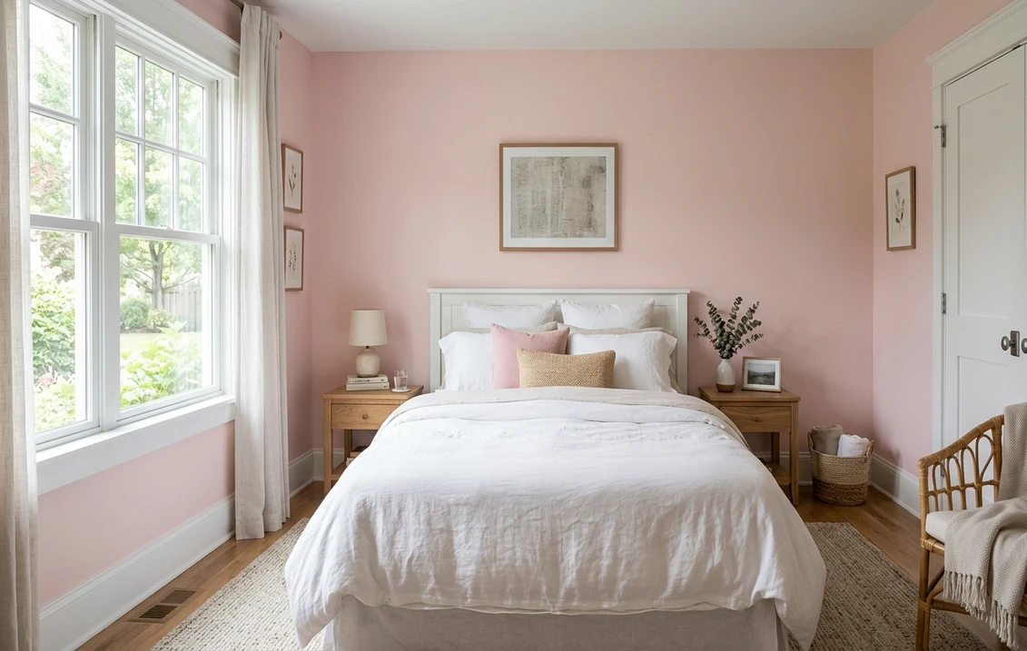
Bedrooms, primary and guest
This is Pink Damask's home turf. The cool-rose undertone reads restful and romantic without skewing juvenile, which makes it a rare pink that works in a primary bedroom as easily as a guest room. It pairs beautifully with white bedding, natural linen, brass, and pale wood, and the LRV near 70 keeps the room feeling airy. If a calm, enveloping bedroom is your goal, our guide to calming master bedroom paint colors shows how a soft rose sits among the other quiet picks.
Girls' rooms, teen rooms, and nurseries
Because it is desaturated and slightly sophisticated, Pink Damask grows with a child far better than a bright primary pink. It reads sweet enough for a young child's room but holds up into the tween and teen years without feeling babyish, so you are not repainting in three years. If you are weighing softer, less gendered options for a baby's room, our roundup of gender-neutral nursery paint colors is a useful counterpoint to a committed pink.
Powder rooms, dressing rooms, and accent walls
A small powder room or dressing area is a low-risk place to commit to pink, and Pink Damask flatters skin tones in the mirror, a real consideration for a vanity. It also works beautifully as a single accent wall behind a bed or in a reading nook when you want a hint of rose without wrapping the whole room. For more bathroom-specific pink direction, our guide to pink bathroom paint ideas covers tile and fixture pairings in detail.
Where to think twice
A bright, hot, south-facing kitchen or a high-traffic family room is where Pink Damask can read sweeter or more dated than you intend, especially under strong sun that pushes the rose forward. And a small north-facing room lit only by cool LEDs can flatten it toward a chalky gray-pink that loses its charm. If either describes your space, either switch to 2700K bulbs or save the rose for a more forgiving room.
Trim, ceiling, and decor pairings
A soft pink lives or dies on what sits next to it. Get the trim right and Pink Damask looks intentional and elegant; get it wrong and it can read either too sweet or slightly washed out.
- Soft warm trim (most balanced): BM White Dove (OC-17, LRV 85) is the designer default. Its gentle cream bias keeps the room warm and cohesive, framing Pink Damask so the rose reads romantic rather than candy. This is the safe, elegant pick for most bedrooms and is detailed in our Benjamin Moore White Dove OC-17 review.
- Crisp trim (cleaner, more modern): BM Chantilly Lace (OC-65) gives a bright white edge that makes the pink pop and reads more contemporary. Best when you want the rose to feel deliberate and graphic rather than soft.
- Avoid: a heavy yellow-cream antique white, which can fight the cool rose and make the walls look slightly muddy or peachy by comparison.
- Ceilings: a clean white (often the trim color) keeps the room bright. Tinting the ceiling a hair of the wall pink can feel enveloping in a small bedroom but skips the airy effect, so choose deliberately.
- Floors and decor: pale oak, white oak, brass, warm brushed gold, and natural linen flatter the rose and reinforce the grown-up read. Cool chrome and stark black-and-white can leave it feeling cold, so warm the metals where you can.
For contrast, a soft sage green, a muted navy, or a warm caramel leather reads sophisticated against Pink Damask walls and pulls it firmly out of nursery territory. If you want to see where the wider pink family sits, our soft blush pink paint colors guide maps a dozen pinks side by side.
See walls, trim, and floor together in one preview, free.
Pink Damask vs the pinks people confuse it with
Almost every Pink Damask search ends in a side-by-side, usually against its lighter near-twin. The three comparisons that matter most indoors:
- vs BM Tissue Pink (2087-70): the most important comparison and the one people get wrong. Tissue Pink (LRV near 77) is markedly lighter and airier, a barely-there blush that often reads as a warm white on a full wall, especially in dim corners. Pink Damask (LRV near 70) is a clear step deeper and unmistakably reads as pink. Choose Tissue Pink when you want only a whisper of color and a near-white room; choose Pink Damask when you actually want the wall to look pink and committed.
- vs BM First Light (2102-70): First Light (the 2020 Color of the Year, LRV near 80) is noticeably lighter and leans warmer and more peach-pink, reading softer and sweeter. Pink Damask is deeper, cooler, and dustier with that mauve-gray edge, so it reads more grown-up and less candy. Pick First Light for a lighter, warm, glowing pink; pick Pink Damask for a more sophisticated, slightly muted rose.
- vs BM Proposal (2080-60): Proposal is a deeper, more saturated rose at a similar value family but with more punch. Pink Damask is the softer, more livable of the two and far easier to commit to across all four walls without overwhelming the room.
Spelling note: pink damask paint, BM Pink Damask, and Pink Damask Benjamin Moore all point to this same 2078-60.
How to test Pink Damask before you commit
A 2-inch fan-deck chip is the number-one reason people pick a soft pink that disappoints: it exaggerates the rose against the white card and cannot show how the color softens across a real day on a real wall. Two better methods:
- Paint a large swatch: roll a 12-by-12-inch sample (or a peel-and-stick sample) on two different walls and check it mid-morning, mid-afternoon, and at night under your normal bulbs. Watch specifically for how dusty it goes in your coolest corner and how legible the pink stays after dark; those two moments tell you the truth.
- Preview it digitally first: upload a real photo of your room and apply Pink Damask (plus a lighter alternative like Tissue Pink and a warmer one like First Light) before you buy any samples, narrowing three contenders to the one worth painting. Pricing context for the full repaint is in our interior house painting cost guide for 2026.
Preview Pink Damask against a lighter and a warmer pink, side by side, free.
Frequently asked questions
Is Pink Damask warm or cool?
Pink Damask (2078-60) is a soft, slightly cool rose with a faint mauve-gray ghost that surfaces in shade. In warm or south light the rose blooms and reads warm and romantic, but in cool, indirect, or north light the mauve-gray steps forward and it reads dustier and cooler. It rarely turns peach or salmon, which is why designers use it when they want pink without the candy, but it is more on the cool, controlled side of pink than the warm, glowing side.
What is the LRV of Pink Damask?
Pink Damask has a Light Reflectance Value of about 70 on the Benjamin Moore color data, with a hex approximation of #F0D9D8 (RGB 240, 217, 216). That makes it a light, mid-range pink: bright enough to keep a room open and airy, but with enough depth that it reads as a genuine rose on the wall rather than washing out to a near-white like much higher-LRV blush colors.
What are the best rooms for Pink Damask?
Bedrooms (primary and guest), girls' and teen rooms, nurseries, powder rooms, dressing rooms, and accent walls are where Pink Damask shines, because its soft, slightly cool rose reads romantic and grown-up rather than juvenile. It is least reliable in hot, bright south-facing kitchens, where it can read sweeter, and in small north-facing rooms lit only by cool LEDs, where it can flatten to a chalky gray-pink; 2700K bulbs help there.
What trim color goes with Pink Damask?
BM White Dove (OC-17) is the most balanced trim because its gentle cream bias keeps the room warm and cohesive while framing the rose so it reads elegant rather than candy. BM Chantilly Lace (OC-65) is the crisper, more modern option that makes the pink pop. Avoid a heavy yellow-cream antique white, which can fight the cool rose and leave the walls looking muddy or peachy by comparison.
What is the difference between Pink Damask and Tissue Pink?
Tissue Pink (2087-70, LRV near 77) is markedly lighter and airier, a barely-there blush that often reads as a warm white on a full wall, especially in dim corners. Pink Damask (2078-60, LRV near 70) is a clear step deeper and unmistakably reads as pink. Choose Tissue Pink when you want only a whisper of color and a near-white room, and Pink Damask when you actually want the wall to look pink and committed.
Preview BM Pink Damask on your actual walls under your own light before buying a single sample.
Disclaimer: Benjamin Moore, Pink Damask (2078-60), Tissue Pink (2087-70), First Light (2102-70), Proposal (2080-60), White Dove (OC-17), and Chantilly Lace (OC-65) are trademarks of Benjamin Moore & Co. FacadeColorizer is an independent paint visualization service and is not affiliated with, endorsed by, or sponsored by Benjamin Moore. Color reproduction on screens approximates the manufacturer's chip; always confirm with a manufacturer sample under your own light before purchase. Sources: Benjamin Moore 2078-60 Pink Damask color data 2026, Benjamin Moore 2087-70 Tissue Pink and OC-17 White Dove color data 2026, pink-paint undertone coverage, designer field reports compiled by FacadeColorizer.
Trademarks mentioned (Sherwin-Williams, Benjamin Moore, Behr, Caparol, Brillux, Sto, Alpina, Valspar, PPG, Glidden, Dulux, Crown Trade, Sandtex, Farrow & Ball, Johnstone's, Leyland) are property of their respective owners. FacadeColorizer is independent and not affiliated with any of them. Nominative fair use under Lanham Act §1125.


