
Some blues shout and some blues whisper. Benjamin Moore Solitude (2123-50) is firmly in the whisper category. It is the kind of pale, serene blue that looks like a held breath: clean and airy in the morning, soft and almost spa-like by evening, never loud enough to be called a bold blue and never washed out enough to pass for white. People reach for it when they want a room to feel calm without committing to a colored statement wall. The recurring question I hear is the same one that follows every quiet blue: does it actually read blue on the wall, or does it disappear into a pale gray haze? The answer depends entirely on your light, and the details below will tell you exactly what to expect.
Quick orientation before the deep dive. Solitude 2123-50 has a published LRV of about 62 and a hex approximation of #C7D2D5 (RGB 199, 210, 213). That places it in the light, airy range: bright enough to keep a small bedroom or bath feeling open, but with just enough saturation to hold its blue identity in good light. The undertone is a clean, slightly cool blue with the faintest whisper of gray to keep it from going icy or babyish. This profile is one stop in our wider Benjamin Moore interior paint colors guide, and it sits among the pale blues we map in our best interior blue paint shades guide. Those pages give you the family context; this page stays on Solitude specifically: its undertone, its rooms, its trim, and the two historical blues people constantly confuse it with.
Upload a photo of your actual room and preview BM Solitude under your own light in about 30 seconds, free.
Solitude at a glance: the numbers that matter
Before any opinion, here are the verifiable specs from the Benjamin Moore color library. These are the values you can carry to a paint counter:
| Spec | Solitude 2123-50 |
|---|---|
| Color number | 2123-50 (Color Preview collection) |
| LRV (Light Reflectance Value) | Approximately 62: light and airy, keeps rooms bright |
| Hex / RGB (approx.) | #C7D2D5 / 199, 210, 213 |
| Color family | Pale, serene blue (light cool blue) |
| Primary undertone | Clean blue with a faint gray softener; a barely-there green ghost in shade |
| Best base / finish | Light tint base; eggshell or matte on walls, satin or semi-gloss on trim |
The takeaway from those numbers: Solitude is a real, recognizable blue, not a blue-tinted gray pretending to be neutral. At LRV 62 it is light enough to brighten a north bathroom and bounce daylight around a small bedroom, but it carries more blue saturation than near-neutrals like a blue-leaning gray. That faint gray softener is what keeps it from reading like a nursery pastel, and it is the whole reason adults choose Solitude for primary bedrooms and baths rather than just kids' rooms. Read it as a grown-up pale blue, calm rather than cute.
Is Solitude too blue? The undertone, decoded
Solitude is unambiguously a blue, but it is a quiet, dusty blue rather than a saturated sky blue. The faint gray riding underneath is what tones it down and keeps it sophisticated. Here is what is actually happening under different conditions.
In bright, direct light the blue comes forward cleanly and the wall reads as a soft, fresh, clearly blue surface, the kind of read that makes a bathroom feel like a calm coastal retreat. In cool, indirect, or north light the gray softener gains the upper hand and Solitude relaxes into a hazy, almost periwinkle-gray, more muted and a half-step grayer than the chip promised. In deep shade you may catch a faint green ghost, which is the pigment that stops the color from ever going purple or steely. It does not muddy and it does not turn cold and clinical; it just shifts between fresh-blue and soft-gray-blue depending on how much warm light is in the room.
Watch out for one quirk specific to pale blues like this. On a tiny fan-deck chip Solitude can look almost gray, because a 2-inch sample cannot gather enough light to show the blue. The finished, rolled wall will read noticeably bluer than the chip, especially across a large surface in daylight. So if you fell in love with the chip thinking it was a quiet near-gray, be prepared for the full wall to commit more clearly to blue than you expected.
| Indoor light | How Solitude reads |
|---|---|
| South-facing (bright, warm) | Soft, clean, clearly blue; its freshest and most flattering read |
| West-facing (warm afternoon) | Warmer and slightly grayer in late sun; the blue calms and softens |
| East-facing (cool after noon) | Crisp and bright in the morning, drifting hazier and grayer by afternoon |
| North-facing (cool, indirect) | At its softest and grayest, a muted periwinkle-blue; lean into the calm |
| Artificial light at night | Warm 2700K bulbs soften the blue toward gray-lavender; cool 4000K bulbs push it crisper and more clearly blue |
Sources: Benjamin Moore 2123-50 color data 2026; The Spruce blue-paint undertone coverage; designer field reports compiled by FacadeColorizer.
Free AI visualizer. Test Solitude on your real walls before buying a single sample pot.
Best rooms for Solitude
Light, calm, and quietly blue, Solitude is happiest in rooms built for rest and freshness. It is not a whole-home workhorse neutral; it is the color you choose when you want a specific space to feel like an exhale. Here is where it consistently earns its keep:
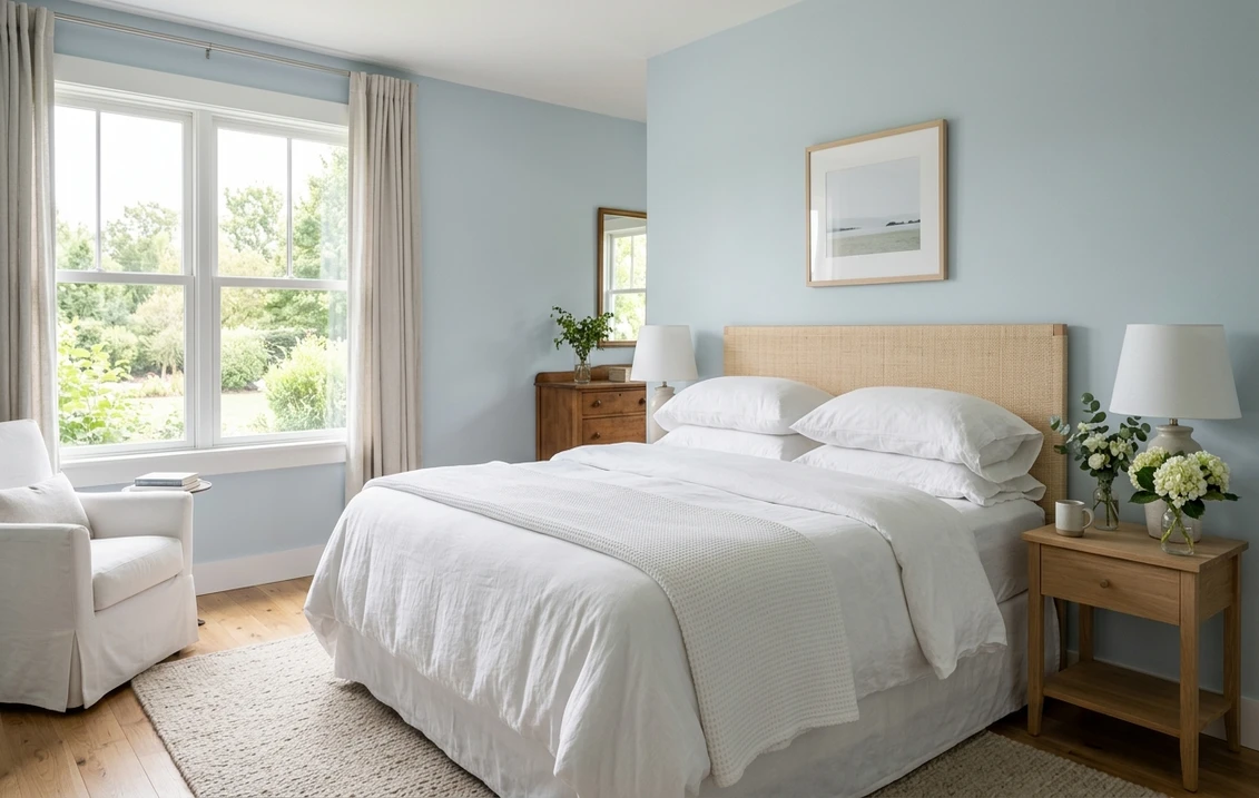
Primary and guest bedrooms
This is Solitude's strongest room. The name is not an accident: pale blue is the classic restful bedroom hue, and the gray softener keeps it adult and serene rather than juvenile. It pairs beautifully with white bedding, natural linen, and pale wood, creating a calm, hotel-quiet feel. If a restful bedroom is your project, our guide to calming master bedroom paint colors shows how Solitude sits next to other quiet picks.
Bathrooms and powder rooms
Solitude's clean blue reads spa-fresh against white subway tile, marble, and chrome, and at LRV 62 it keeps even a windowless bath from feeling boxed in. It gives a bath that calm, just-renovated coastal feel without the commitment of a deep color. It is a natural fit among our roundup of the best bathroom paint colors for 2026 for exactly this reason.
Nurseries, home offices, and reading nooks
The same restful quality makes Solitude excellent for a nursery that will grow with the child, a focused home office, or a quiet reading corner. It is soothing without being sleepy, and it photographs softly in video calls. For how pale blue partners with other colors in these calmer spaces, see our guide to colors that go with light blue.
Where to think twice
A high-energy room that you want to feel cozy and warm, a dark den or a north-facing family room with only cool LED light, is where Solitude can read chilly and a little flat. There the blue can feel cool rather than calming. If warmth is the goal in that space, reach for a soft greige or a warm white instead. Solitude rewards daylight, so do not bury it in a windowless cave and expect it to glow.
Trim, ceiling, and decor pairings
A pale blue lives or dies on what sits beside it. Get the trim right and Solitude looks intentional and crisp; get it wrong and it can read either chalky or oddly cold.
- Crisp white trim (most balanced): BM Chantilly Lace (OC-65, LRV 90) is the cleanest pairing. Its bright, near-pure white makes Solitude's blue read fresh and modern, the classic coastal-bath and serene-bedroom look. This is the safe default for most rooms.
- Soft warm white trim (cozier): BM White Dove (OC-17, LRV 85) adds a gentle cream note that warms the room a touch and keeps Solitude from feeling cool. Best when you want calm-cozy rather than crisp-coastal.
- Avoid: a heavy yellow-cream antique white next to Solitude. The strong warm-cool clash can make the pale blue look gray and slightly dingy by comparison.
- Ceilings: a clean white (often the trim color) keeps the room airy. For a soft enveloping effect in a bedroom, a ceiling washed in a lighter tint of the same blue feels serene.
- Floors and decor: pale oak, white oak, rattan, brushed nickel, and natural linen flatter the cool blue and reinforce the coastal-calm read. A deep navy or warm brass accent on a vanity, headboard, or built-in adds welcome contrast and keeps the room from feeling washed out.
If you want to see how a quiet blue-gray relates to the cool grays nearby, its neutral cousin is covered in our Benjamin Moore Gray Owl OC-52 review, which is a useful contrast: Gray Owl is a gray that flirts with blue, while Solitude is a blue that flirts with gray.
See walls, trim, and floor together in one preview, free.
Solitude vs Woodlawn Blue vs Yarmouth Blue
Almost every Solitude search ends in a comparison with Benjamin Moore's two famous historical pale blues. They look like cousins on a chip, but they behave differently on a wall, and choosing wrong is the single most common Solitude regret.
| Color | LRV (approx.) | Lean | Reads as |
|---|---|---|---|
| Solitude 2123-50 | ~62 | Clean blue, faint gray | Fresh, crisp, modern pale blue |
| Woodlawn Blue HC-147 | ~62 | Blue with green-gray | Softer, dustier, more historical |
| Yarmouth Blue HC-150 | ~56 | Green-leaning blue, warmer | Cozier, slightly deeper, almost spa-green in some light |
- vs Woodlawn Blue (HC-147): Woodlawn is the dustier, more muted historical blue with a clearer green-gray cast, so it reads softer and more vintage. Solitude is cleaner and crisper, with the blue more obviously present. Choose Woodlawn for a period or cottage feel; choose Solitude for a fresh, modern coastal look.
- vs Yarmouth Blue (HC-150): Solitude (LRV near 62) and Yarmouth (LRV near 56) sit very close in value, with Solitude just slightly lighter, so the real difference is undertone, not lightness. Yarmouth leans noticeably greener and warmer, a warm green-blue that can read almost soft spa-green in some light and feels cozier. Solitude stays truer to blue and reads cooler and crisper, more of a fresh blue-gray. Choose Yarmouth when you want warmth and a hint of green; choose Solitude when you want the room to stay distinctly, coolly blue.
- The one-line rule: Solitude is the crisp, true pale blue. Woodlawn is the dusty historical blue. Yarmouth is the warm, slightly green pale blue. Same family, three different moods.
Spelling note: BM Solitude, Solitude Benjamin Moore, and Benjamin Moore Solitude blue all point to this same 2123-50.
How to test Solitude before you commit
A 2-inch fan-deck chip is the number-one reason people misjudge a pale blue: it makes Solitude look almost gray and hides how clearly the blue shows up across a full wall in daylight. Two better methods:
- Paint a large swatch: roll a 12-by-12-inch sample (or a peel-and-stick sample) on two different walls and check it mid-morning, mid-afternoon, and at night under your normal bulbs. Watch how blue it goes in your brightest spot versus how gray it relaxes in your dimmest corner; both reads are the real Solitude.
- Preview it digitally first: upload a real photo of your room and apply Solitude (plus Woodlawn Blue and Yarmouth Blue) before you buy any samples, so you can settle the three-way pale-blue debate in minutes instead of three sample pots. Pricing context for the full repaint is in our interior house painting cost guide for 2026.
Preview Solitude against Woodlawn Blue and Yarmouth Blue, side by side, free.
Frequently asked questions
Is Benjamin Moore Solitude warm or cool?
Solitude (2123-50) is a cool color: a clean pale blue with a faint gray softener and a barely-there green ghost that shows only in deep shade. In bright or south light the blue reads fresh and crisp, while in cool, indirect, or north light the gray takes over and it softens into a muted periwinkle-blue. It never turns purple or muddy, but it is firmly a cool pale blue rather than a warm neutral.
What is the LRV of Solitude 2123-50?
Solitude has a Light Reflectance Value of about 62 on the Benjamin Moore color data, with a hex approximation of #C7D2D5 (RGB 199, 210, 213). That makes it a light, airy pale blue: bright enough to keep a small bedroom or bathroom feeling open and to bounce daylight around a north room, but with enough blue saturation to hold a clear blue identity rather than washing out to a near-white.
What are the best rooms for Solitude?
Bedrooms (primary and guest), bathrooms and powder rooms, nurseries, home offices, and reading nooks are where Solitude shines, because its serene pale blue reads restful and spa-fresh against white trim, tile, and natural materials. It is least reliable in dark dens or north-facing family rooms with only cool LED light, where the blue can feel chilly and flat; a soft greige or warm white suits those spaces better.
What trim color goes with Solitude?
BM Chantilly Lace (OC-65) is the crispest pairing and gives Solitude a fresh, modern coastal look, while BM White Dove (OC-17) adds a gentle cream warmth for a calm-cozy feel. Avoid a heavy yellow-cream antique white, which can make the pale blue look gray and slightly dingy by contrast. A deep navy or brass accent adds welcome depth so the room never reads washed out.
What is the difference between Solitude, Woodlawn Blue, and Yarmouth Blue?
Solitude (2123-50, LRV near 62) is the crisp, true pale blue. Woodlawn Blue (HC-147) is a dustier, more muted historical blue with a green-gray cast that reads softer and more vintage. Yarmouth Blue (HC-150, LRV near 56) sits very close to Solitude in value but leans noticeably greener and warmer, reading cozier and almost soft spa-green in some light. Choose Solitude for a fresh, cool modern blue, Woodlawn for a period cottage feel, and Yarmouth for warmth with a hint of green.
Preview BM Solitude on your actual walls under your own light before buying a single sample.
Disclaimer: Benjamin Moore, Solitude (2123-50), Woodlawn Blue (HC-147), Yarmouth Blue (HC-150), Gray Owl (OC-52), White Dove (OC-17), and Chantilly Lace (OC-65) are trademarks of Benjamin Moore & Co. FacadeColorizer is an independent paint visualization service and is not affiliated with, endorsed by, or sponsored by Benjamin Moore. Color reproduction on screens approximates the manufacturer's chip; always confirm with a manufacturer sample under your own light before purchase. Sources: Benjamin Moore 2123-50 Solitude color data 2026, Benjamin Moore HC-147 Woodlawn Blue and HC-150 Yarmouth Blue color data 2026, The Spruce blue-paint undertone coverage, designer field reports compiled by FacadeColorizer.
Trademarks mentioned (Sherwin-Williams, Benjamin Moore, Behr, Caparol, Brillux, Sto, Alpina, Valspar, PPG, Glidden, Dulux, Crown Trade, Sandtex, Farrow & Ball, Johnstone's, Leyland) are property of their respective owners. FacadeColorizer is independent and not affiliated with any of them. Nominative fair use under Lanham Act §1125.


