
There is a particular color homeowners describe before they can name it: the pale green of sea glass, of a hospital-clean spa towel, of the inside of a vintage Mason jar held to the light. More often than not the color they are reaching for is Benjamin Moore Seafoam Green (2039-60). It is a light, airy water-green with a soft blue breath behind it, and it sits in that narrow band where green and blue refuse to fully separate. The fear that drives every search for it is the same one: will it look like a 1950s bathroom, minty and dated, or like a fresh, calm, modern wash of color? The answer depends almost entirely on the light it lives in and the white you put beside it. Here is exactly how Seafoam Green behaves on real interior walls.
Quick orientation before the deep dive. Seafoam Green 2039-60 has a published LRV of about 66 and a hex approximation of #BFD8C7 (RGB 191, 216, 199). That puts it firmly in the light pastel range: bright enough to keep a small bathroom feeling open, with just enough saturation to read as a real color rather than a tinted off-white. The undertone is green-dominant with a clear cool, slightly blue lean, which is what gives it that watery, sea-glass quality instead of a leafy or yellow-green look. This profile is one stop in our wider Benjamin Moore interior paint colors guide, and it sits naturally alongside our broader interior green paint shades guide, which maps where pale water-greens land among sages, olives, and deeper greens.
Upload a photo of your actual room and preview BM Seafoam Green under your own light in about 30 seconds, free.
Seafoam Green at a glance: the numbers that matter
Before opinions, here are the verifiable specs from the Benjamin Moore color library. These are the values you can take to a paint counter:
| Spec | Seafoam Green 2039-60 |
|---|---|
| Color number | 2039-60 (Color Preview collection). Note: distinct from Solitude 2123-50, a blue often confused with it. |
| LRV (Light Reflectance Value) | Approximately 66: light pastel, keeps a room bright and open |
| Hex / RGB (approx.) | #BFD8C7 / 191, 216, 199 |
| Color family | Light green (cool, water-green) |
| Primary undertone | Cool green with a soft blue lean; a faint gray keeps it from going neon |
| Best base / finish | Light tint base; eggshell or matte on walls, satin or semi-gloss on trim and cabinets |
The takeaway from those numbers: Seafoam Green is a genuine pastel, not a near-white with a hint of color. At LRV 66 it reflects a lot of light, so it brightens small and windowless rooms, yet the saturation is high enough that it commits to being green-blue rather than fading to a tinted white the way a 75-plus LRV color would. The green-with-blue undertone is the whole identity. Pair it with the right crisp white and it reads fresh and spa-clean; pair it with a warm yellow-cream and it can tip toward dated mint. That contrast is the entire decision in one sentence.
Is Seafoam Green too minty? The undertone, decoded
Seafoam Green walks a tightrope between fresh and dated, and where it lands is almost entirely about saturation control and context. Anyone who tells you it is a safe, undertone-free pastel is overselling it. Here is what is actually happening underneath the chip.
The green is dominant, but it is a cool green, cut with a soft blue that pulls it toward the water-glass end of the spectrum rather than the herb-garden end. There is also a faint gray-softening pigment riding underneath, the quiet ingredient that keeps Seafoam from going chalky mint or candy-green. In bright, warm south light the blue calms down and the green warms a touch, so the wall reads as a soft, sunlit sea-glass green at its most flattering. In cool, indirect north light the warm wavelengths drain out of the room and the blue steps forward: that is the moment the wall looks cooler, cleaner, and a half-step more blue-green than the chip promised. It does not turn muddy or olive, which is why designers trust it for spa-style rooms, but it absolutely shifts cooler when the light is cool.
Watch out for one quirk that drives the dated-mint fear. Seafoam Green reads more saturated and minty on a small 2-inch chip and in flash photographs than it does as a finished, rolled wall under real lamps. So if you are judging it from a paint-store fan deck or a Pinterest pin alone, assume the actual wall will land softer, paler, and more sophisticated than the sample suggests, especially once warm bulbs come on at night.
| Indoor light | How Seafoam Green reads |
|---|---|
| South-facing (bright, warm) | Soft sunlit sea-glass green, its warmest and most flattering read |
| West-facing (warm afternoon) | Greener and softer in late-day sun; the blue recedes, mint risk is lowest |
| East-facing (cool after noon) | Fresh and balanced in morning, leans cooler and more blue-green by afternoon |
| North-facing (cool, indirect) | At its coolest and most blue-green; reads clean and spa-like, never warm |
| Artificial light at night | Warm 2700K bulbs deepen the green and warm it; cool 4000K bulbs push it crisper, cooler, and more clearly blue-green |
Sources: Benjamin Moore 2039-60 color data 2026; designer field reports on pastel green undertones compiled by FacadeColorizer.
Free AI visualizer. Test Seafoam Green on your real walls before buying a single sample pot.
Best rooms for Seafoam Green
Light, watery, and quietly cool, Seafoam Green is happiest in rooms where calm and freshness are the goal and a wash of soothing color is welcome. It is not a whole-home neutral; it is the color you reach for when you want a space to feel restful and a little coastal. Here is where it consistently earns its keep:
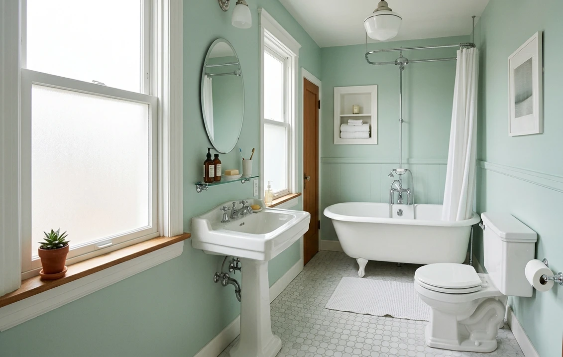
Bathrooms and powder rooms
This is Seafoam Green's home turf, and its association with spa towels and sea glass is no accident. The cool green-blue undertone reads clean and watery against white subway tile, marble, and polished nickel, and at LRV 66 it keeps even a windowless bath from feeling boxed in. Pair it with crisp white trim and it looks like a boutique spa rather than a 1980s rental. It is one of the freshest non-neutrals in our roundup of the best bathroom paint colors for 2026 for exactly this reason.
Bedrooms aiming for calm and coastal
In a bedroom the soft green-blue reads serene and restful, drawing on the same restorative psychology that makes both green and blue popular sleep colors, but kept pale enough to live with for years. It pairs beautifully with white bedding, natural linen, rattan, and pale wood for a relaxed coastal feel. If a restful bedroom is your project, our guide to calming master bedroom paint colors shows how a water-green sits next to other quiet picks.
Kitchens, laundry rooms, and cabinet accents
Seafoam Green is a charming choice for a laundry room, mudroom, or a freestanding piece of furniture, where its cheer brightens a utilitarian space without shouting. On lower kitchen cabinets in semi-gloss it reads soft and current rather than trendy, especially against white uppers and warm brass. For inspiration on pairing pale greens with other hues, our guide to colors that go with sage green translates well to the seafoam family, since both live in the cool-green neighborhood.
Where to think twice
A large, formal living or dining room can feel underwhelmed by Seafoam Green; its pastel saturation reads more convincing in smaller, more intimate spaces than across a wide great room, where it can wash out toward a tinted white. It is also the wrong call if you want cozy and enveloping: this is a cool, fresh, awake color, not a warm cocoon. And next to warm yellow-cream trim it risks reading dated mint, so the trim choice below matters more here than with almost any other color.
Trim, ceiling, and decor pairings
A pastel green lives or dies on what sits next to it. Get the trim right and Seafoam Green looks intentional and spa-fresh; get it wrong and it can read either institutional or dated.
- Soft warm trim (most balanced): BM White Dove (OC-17, LRV 85) is the designer default. Its gentle cream bias frames Seafoam without competing, warming the room just enough to keep the green from reading cold or clinical, while still looking clean. This is the safe, cohesive pick for most homes.
- Crisp trim (cleaner, cooler): BM Chantilly Lace (OC-65) gives a bright, modern, slightly cooler edge and leans into Seafoam's coastal, spa-clean side. Best for bathrooms, modern spaces, and homes with black hardware or windows.
- Avoid: a heavy yellow-cream antique white next to Seafoam Green. The warm-cool clash is the single biggest cause of the dreaded dated-mint read; the trim throws yellow back into the green and the whole room tips 1980s.
- Ceilings: a clean white (often the trim color) keeps the room bright and airy. A flat builder white can go faintly gray-green over a cool pastel, so favor a crisp white above.
- Floors and decor: pale oak, white oak, marble, rattan, brushed brass, and natural linen all flatter the water-green and reinforce the coastal read. Warm honey-toned wood and brass are the friendliest metals; cool chrome and nickel lean the room more strictly spa.
For a deeper, grounding contrast, a navy or warm charcoal on a vanity, door, or lower cabinet reads tailored and current against the soft green walls. If you want to see how Seafoam relates to the wider family of interior greens, from sage to olive to deep forest, our interior green paint shades guide places it in context.
See walls, trim, and floor together in one preview, free.
Seafoam Green vs the colors people confuse it with
Almost every Seafoam Green search ends in a side-by-side with another Benjamin Moore blue-green. These are the three comparisons that matter most indoors, and the differences are real even though the chips look like cousins on the rack:
- vs BM Palladian Blue (HC-144): the most common mix-up. Palladian Blue (LRV around 61) is the famous spa color that tips the balance toward blue, reading as a soft blue-green that most people call blue first. Seafoam Green (2039-60, LRV 66) is lighter and tips the balance toward green, reading as a green that most people call green first. Choose Palladian when you want a calming blue with a green whisper; choose Seafoam when you want a fresh green with a blue whisper. Side by side, Palladian looks deeper and more blue, Seafoam looks airier and more green.
- vs BM Wythe Blue (HC-143): Wythe Blue (LRV around 57) is the most saturated and the grayest-warmest of the three, a heritage blue-green with a clear gray base that reads almost teal-meets-sage in dim light. It is noticeably deeper and more complex than Seafoam, which stays pale, clean, and pastel. Pick Wythe Blue for a richer, more grounded blue-green on a feature wall or a study; pick Seafoam when you want light, fresh, and unmistakably soft.
- vs BM Solitude (2123-50): the code confusion to clear up. Solitude is a light blue, not a green: it lives a step toward true sky-blue and lacks Seafoam's green core. If you have seen Seafoam Green listed as 2123-50 anywhere, that is the wrong code; Seafoam Green is 2039-60, and Solitude 2123-50 is a separate blue. Confirm the number at the counter.
Spelling note: sea foam green, BM Seafoam Green, and Seafoam Green Benjamin Moore all point to this same 2039-60.
How to test Seafoam Green before you commit
A 2-inch fan-deck chip is the number-one reason people pick a pastel green that disappoints: it exaggerates the mint and cannot show how the undertone shifts between green and blue across a real day on a real wall. Two better methods:
- Paint a large swatch: roll a 12-by-12-inch sample (or a peel-and-stick sample) on two different walls and check it mid-morning, mid-afternoon, and at night under your normal bulbs. Watch specifically for how green-versus-blue it reads in your coolest corner and how minty it looks beside your existing trim; those two checks tell you the truth.
- Preview it digitally first: upload a real photo of your room and apply Seafoam Green (plus a bluer alternative such as Palladian Blue and a deeper one such as Wythe Blue) before you buy any samples, narrowing three contenders to the one worth painting. Pricing context for the full repaint is in our interior house painting cost guide for 2026.
Preview Seafoam Green against Palladian Blue and Wythe Blue, side by side, free.
Frequently asked questions
What is the LRV and color code of Benjamin Moore Seafoam Green?
Benjamin Moore Seafoam Green is color 2039-60 in the Color Preview collection, with a Light Reflectance Value of about 66 and a hex approximation of #BFD8C7 (RGB 191, 216, 199). That makes it a light pastel water-green: bright enough to keep a small or windowless room open, but saturated enough to read as a genuine green-blue rather than a tinted off-white. Note that 2039-60 is distinct from Solitude 2123-50, a light blue it is sometimes confused with.
Is Seafoam Green warm or cool?
Seafoam Green is a cool color. Its undertone is green-dominant with a soft blue lean and a faint gray that keeps it from going neon. In bright south or warm west light the green warms slightly and reads as a sunlit sea-glass green, but in cool north or indirect light the blue steps forward and it reads cooler and more clearly blue-green. It never turns muddy or olive, which is why it works so well for spa-style rooms.
Does Seafoam Green look dated or minty?
It can, but only with the wrong context. The dated-mint read comes mostly from warm yellow-cream trim and from judging the color off a small chip, which exaggerates the mint. Paired with a clean white like White Dove or Chantilly Lace, under good light, and kept to smaller spaces like bathrooms and bedrooms, Seafoam Green reads fresh, coastal, and spa-clean rather than 1980s. Avoid heavy antique-white trim and you avoid most of the risk.
What is the difference between Seafoam Green and Palladian Blue?
Both are soft blue-greens, but they sit on opposite sides of the line. Palladian Blue (HC-144, LRV around 61) tips toward blue, so most people call it blue with a green whisper, and it reads slightly deeper. Seafoam Green (2039-60, LRV 66) tips toward green and is lighter, so most people call it green with a blue whisper. Choose Palladian for a calming blue, Seafoam for a fresh green; side by side, Seafoam is the airier, greener of the two.
What trim color goes with Seafoam Green?
BM White Dove (OC-17) is the most balanced trim because its gentle cream bias frames Seafoam and warms the room just enough to keep the green from reading clinical, while still looking clean. BM Chantilly Lace (OC-65) is the crisper, cooler option for bathrooms and modern spaces. Avoid a heavy yellow-cream antique white, which is the main cause of a dated-mint look because it throws warmth back into the green.
Preview BM Seafoam Green on your actual walls under your own light before buying a single sample. One HD simulation plus three variations, free.
Disclaimer: Benjamin Moore, Seafoam Green (2039-60), Palladian Blue (HC-144), Wythe Blue (HC-143), Solitude (2123-50), White Dove (OC-17), and Chantilly Lace (OC-65) are trademarks of Benjamin Moore & Co. FacadeColorizer is an independent paint visualization service and is not affiliated with, endorsed by, or sponsored by Benjamin Moore. Color reproduction on screens approximates the manufacturer's chip; always confirm with a manufacturer sample under your own light before purchase. Sources: Benjamin Moore 2039-60 Seafoam Green color data 2026, Benjamin Moore HC-144 Palladian Blue, HC-143 Wythe Blue, and OC-17 White Dove color data 2026, designer field reports on pastel green undertones compiled by FacadeColorizer.
Trademarks mentioned (Sherwin-Williams, Benjamin Moore, Behr, Caparol, Brillux, Sto, Alpina, Valspar, PPG, Glidden, Dulux, Crown Trade, Sandtex, Farrow & Ball, Johnstone's, Leyland) are property of their respective owners. FacadeColorizer is independent and not affiliated with any of them. Nominative fair use under Lanham Act §1125.


