
Benjamin Moore Nantucket Fog (AC-22) is the greige people reach for when the popular light greiges feel too pale and washed out. I get called in for it most often after a homeowner has tried a sample of Edgecomb Gray, decided it disappeared on the wall, and asked for something with the same easygoing neutrality but more backbone. Nantucket Fog is that color: a medium greige that blends gray, soft green, and warm taupe into a single calm, earthy tone. The search that brings most people here is some version of "is Nantucket Fog gray or green or beige?" The honest answer is that it is genuinely all three at once, and which one you notice depends almost entirely on your light. Here is how it actually behaves on interior walls.
Quick orientation first. Nantucket Fog AC-22 has a published LRV of about 50 and a hex approximation of #B7B2A8 (RGB 183, 178, 168). That puts it squarely in medium greige territory: noticeably deeper than the featherweight greiges everyone defaults to, but still light enough to keep a room open in decent daylight. The undertone is a balanced gray-green-taupe, more complex and a touch cooler than a straight warm greige. This profile is one stop in our wider Benjamin Moore interior paint colors guide, and it sits right next to the two greiges shoppers always weigh it against: our Revere Pewter HC-172 review and our Edgecomb Gray HC-173 review. Read those two side by side with this one and you will have the whole greige decision mapped.
Upload a photo of your actual room and preview BM Nantucket Fog under your own light in about 30 seconds. Free.
Nantucket Fog at a glance: the numbers that matter
Before opinions, here are the verifiable specs from the Benjamin Moore color library. These are the values you can take to a paint counter:
| Spec | Nantucket Fog AC-22 |
|---|---|
| Color number | AC-22 (Affinity / classic color line) |
| LRV (Light Reflectance Value) | Approximately 50: medium greige, holds depth without going dark |
| Hex / RGB (approx.) | #B7B2A8 / 183, 178, 168 |
| Color family | Medium greige (gray-beige) |
| Primary undertone | Balanced gray-green-taupe, slightly cooler than a true warm greige |
| Best base / finish | Medium tint base; eggshell or matte on walls, satin or semi-gloss on trim |
The takeaway from those numbers: Nantucket Fog is a real, substantial greige, not a near-white that pretends to be neutral. At LRV 50 it sits a clear step below the light greige crowd (Edgecomb Gray lives near LRV 63, Revere Pewter near 55), which is exactly why it reads as a color on the wall rather than evaporating. That extra depth is the entire reason to choose it. The trade is simple: it needs more light to stay bright, and in a dim room it will pull cooler and grayer. Plan around the light and it rewards you with a grounded, sophisticated neutral that very few "safe" greiges can match.
Is Nantucket Fog gray, green, or beige? The undertone, decoded
Nantucket Fog is the rare greige where no single undertone runs the show. It is built from three quiet voices: a base of warm taupe, a gray that keeps it from reading beige, and a soft green-gray that gives it that misty, slightly outdoorsy character its name promises. Because the mix is so balanced, the room decides which voice you hear.
In bright, warm light the taupe steps forward and Nantucket Fog reads as a soft, grounded greige with a faintly mushroom warmth. Pull the light back, or face it north, and the gray-green takes over: the wall cools off and starts to look like the foggy coastal gray it was named after. This green-gray drift is the single most important thing to test. It is subtle and flattering in a well-lit room, but in a dim or cool space it can edge toward a slightly sage, slightly mineral gray that surprises people who expected a warm beige. It does not go muddy or purple, which is why designers trust it on whole floors, but you should know the green is in there before you commit.
One field note worth more than any chip: Nantucket Fog photographs grayer and greener than it lives. On Pinterest and in listing photos it often looks like a cool gray; on a finished wall under real lamps it warms up and the taupe shows. So if you are judging it from images alone, assume the real wall will land a half-step warmer and more taupe than the picture, especially once 2700K bulbs come on at night.
| Indoor light | How Nantucket Fog reads |
|---|---|
| South-facing (bright, warm) | Its warmest and most flattering read: a soft, grounded taupe-greige with the green held in check |
| West-facing (warm afternoon) | Warm and earthy in late-day sun, the taupe glows, green nearly vanishes |
| East-facing (cool after noon) | Balanced greige in the morning, then drifts grayer and slightly greener by afternoon |
| North-facing (cool, indirect) | At its coolest: the gray-green leads and it reads as a misty foggy gray rather than a warm greige |
| Artificial light at night | Warm 2700K bulbs pull out the taupe; cool 4000K bulbs push it grayer and greener |
Sources: Benjamin Moore AC-22 color data 2026; greige-undertone coverage from The Spruce and designer field reports compiled by FacadeColorizer.
Free AI visualizer. See whether Nantucket Fog stays warm or turns green on your real walls before buying a sample pot.
Best rooms for Nantucket Fog
Medium-depth, earthy, and quietly complex, Nantucket Fog is happiest in rooms with enough natural light to keep its taupe alive, where you want a neutral that actually reads as a color rather than disappearing. It is the greige to pick when "light and safe" left the room feeling flat. Here is where it consistently delivers:
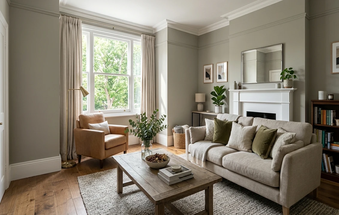
Living rooms and open main floors
This is Nantucket Fog's strongest setting. At LRV 50 it gives a great room genuine envelope and warmth without going dark, and the gray-green-taupe blend flatters both cool and warm furnishings, which makes it forgiving on an open plan. It looks especially good with natural wood, woven textures, and brass. For where it fits among the year's other neutrals, our gray living room paint ideas and our guide to the best greige paint colors both place it in context.
Bedrooms wanting cozy depth, not pale
In a bedroom the deeper greige reads enveloping and restful, the cocoon a high-LRV off-white can never quite create. The soft green-gray keeps it calm and a little organic rather than sweet. It pairs beautifully with linen, oatmeal, and pale-to-mid wood. If a serene, grounded bedroom is the goal, our guide to calming master bedroom paint colors shows how a medium greige sits next to other quiet picks.
Hallways, studies, and transitional spaces
Windowless hallways and studies often look thin in a light greige; Nantucket Fog gives them substance and a tailored, settled feel without reading dark. Its complexity stops a corridor from feeling like an afterthought. For more on how the greige family ranges from pale to mid-deep, our interior gray paint shades guide is a useful map.
Where to think twice
A small, north-facing room with little daylight and only cool LED light is where Nantucket Fog can disappoint. There the green-gray dominates, the warmth drains away, and a space meant to feel cozy can read flat and slightly cold. If that describes your room and you want it warm, drop down to a lighter, warmer greige or switch firmly to 2700K bulbs. Nantucket Fog rewards light; do not starve it.
Trim, ceiling, and decor pairings
A medium greige looks intentional and rich next to the right trim, and slightly dirty next to the wrong one. Because Nantucket Fog carries warmth and a green-gray edge, the trim choice tilts how the whole room reads.
- Soft warm white (most balanced): BM White Dove (OC-17, LRV 85) is the designer default and the safest call. Its gentle cream bias echoes Nantucket Fog's warmth, gives clean contrast at LRV 50, and keeps the whole room cohesive. Our White Dove OC-17 review covers it in full.
- Crisp white (cleaner, cooler): BM Chantilly Lace (OC-65) gives a bright, modern, slightly cooler edge that plays up Nantucket Fog's gray-green side. Best for spaces where you want the wall to read more contemporary and a touch cooler.
- Avoid: a stark blue-white trim, which can make Nantucket Fog's green-gray look slightly murky, and a heavy yellow antique white, which fights the taupe and can read dingy.
- Ceilings: the trim white carried overhead keeps a room with medium walls feeling bright and intentional. A flat builder white can go slightly gray above a greige this deep, so favor a clean white above.
- Floors and decor: natural oak, walnut, jute, linen, aged brass, and matte black all flatter Nantucket Fog and reinforce its earthy character. Very orange-toned wood can clash with the green-gray; temper it with neutral textiles.
For depth and contrast, a charcoal or deep olive on a door, built-in, or kitchen island reads tailored and modern against Nantucket Fog walls. To see how the greige family relates from light to mid-depth, the two natural neighbors are covered in our Revere Pewter HC-172 review and Edgecomb Gray HC-173 review.
See walls, trim, and floor together in one preview. Free.
Nantucket Fog vs Revere Pewter vs Edgecomb Gray
Almost every Nantucket Fog search ends in a head-to-head with Benjamin Moore's two most famous greiges. They are close relatives, but the differences are real and easy to feel once you know what to look for. The quick version: Nantucket Fog is the deepest and coolest of the three, Revere Pewter is the warmest, and Edgecomb Gray is the lightest.
| Color | LRV | Undertone | Reads as |
|---|---|---|---|
| Nantucket Fog AC-22 | ~50 | Gray-green-taupe (balanced, cooler) | Medium, earthy, misty greige with depth |
| Revere Pewter HC-172 | ~55 | Warm taupe with a green wink | Soft, golden, classic warm greige |
| Edgecomb Gray HC-173 | ~63 | Light warm gray-beige | Airy, pale, easy light greige |
- vs Revere Pewter (HC-172): the most common comparison. Revere Pewter is lighter (LRV ~55) and clearly warmer, with a golden-taupe glow that makes it feel cozy and traditional. Nantucket Fog is deeper, cooler, and greener, reading more contemporary and a little more mineral. Choose Revere Pewter for a warm, classic whole-home greige; choose Nantucket Fog when you want the same easygoing neutrality but with more depth and a cooler, foggier character.
- vs Edgecomb Gray (HC-173): the upgrade path. Edgecomb Gray (LRV ~63) is the light, airy greige that can vanish in bright rooms or feel thin in dim ones. Nantucket Fog is a full step deeper and cooler, so it holds presence where Edgecomb fades. Pick Edgecomb to keep a room maximally light and soft; pick Nantucket Fog when Edgecomb looked washed out and you want real substance on the wall.
- vs Revere Pewter and Edgecomb together: think of them as a staircase. Edgecomb is the top step (lightest, warm-light), Revere is the middle (warm, mid), and Nantucket Fog is the bottom step (deepest, coolest). Same family, three different jobs.
Spelling note: nantucket fog bm, BM Nantucket Fog, and Nantucket Fog Benjamin Moore all point to this same AC-22.
How to test Nantucket Fog before you commit
A 2-inch fan-deck chip is the number-one reason people misjudge a medium greige: it cannot show how the taupe and the green-gray trade places across a real day, and it always reads cooler than the finished wall. Two better methods:
- Paint a large swatch: roll a 12-by-12-inch sample (or a peel-and-stick sample) on two different walls and check it mid-morning, mid-afternoon, and at night under your normal bulbs. Watch specifically for how green it goes in your coolest corner and how warm it gets in your sunniest one; the gap between those two tells you the truth.
- Preview it digitally first: upload a real photo of your room and apply Nantucket Fog, plus a warmer option like Revere Pewter and a lighter one like Edgecomb Gray, before you buy any samples, so you narrow three contenders to the one worth painting. Pricing context for the full repaint is in our interior house painting cost guide for 2026.
Preview Nantucket Fog against Revere Pewter and Edgecomb Gray, side by side. Free.
Frequently asked questions
Is Nantucket Fog warm or cool?
Nantucket Fog (AC-22) is a balanced greige that leans slightly cool for its family. It blends warm taupe, gray, and a soft green-gray, so in bright or south light the taupe leads and it reads warm and earthy, while in cool, indirect, or north light the green-gray takes over and it reads as a misty cool greige. It is cooler than Revere Pewter and warmer than a true gray, which is why it photographs grayer than it lives.
What is the LRV of Nantucket Fog?
Nantucket Fog has a Light Reflectance Value of about 50 on the Benjamin Moore color data, with a hex approximation of #B7B2A8 (RGB 183, 178, 168). That makes it a medium greige: deep enough to read as a real color on the wall with genuine presence, but light enough to keep a well-lit room open. It sits clearly below light greiges like Edgecomb Gray (around LRV 63) and Revere Pewter (around 55).
What are the best rooms for Nantucket Fog?
Living rooms, open main floors, cozy bedrooms, hallways, and studies are where Nantucket Fog shines, because its medium depth gives a space substance and warmth that a light greige cannot, while its gray-green-taupe blend flatters both cool and warm furnishings. It is least reliable in small, dim, north-facing rooms with only cool LED light, where the green-gray dominates and it can read flat; more daylight or 2700K bulbs fix that.
What trim color goes with Nantucket Fog?
BM White Dove (OC-17) is the most balanced trim because its gentle cream bias echoes Nantucket Fog's warmth and gives clean contrast at LRV 50 while keeping the room cohesive. BM Chantilly Lace (OC-65) is the crisper, cooler option for a more modern look. Avoid a stark blue-white, which can make the green-gray look murky, and a heavy yellow antique white, which fights the taupe and can read dingy.
What is the difference between Nantucket Fog and Revere Pewter?
Revere Pewter (HC-172, LRV ~55) is lighter and clearly warmer, with a golden-taupe glow that feels cozy and traditional. Nantucket Fog (AC-22, LRV ~50) is deeper, cooler, and greener, reading more contemporary and a little more mineral. Choose Revere Pewter for a warm classic whole-home greige; choose Nantucket Fog when you want similar easygoing neutrality but with more depth and a cooler, foggier character.
Is Nantucket Fog the same as Edgecomb Gray?
No. Edgecomb Gray (HC-173) is a light, airy greige near LRV 63 that can wash out in bright rooms or feel thin in dim ones. Nantucket Fog (AC-22) is a full step deeper, near LRV 50, and slightly cooler, so it holds presence where Edgecomb fades. Many people choose Nantucket Fog specifically because their Edgecomb sample looked washed out and they wanted more substance on the wall.
Preview BM Nantucket Fog on your actual walls under your own light before buying a single sample.
Disclaimer: Benjamin Moore, Nantucket Fog (AC-22), Revere Pewter (HC-172), Edgecomb Gray (HC-173), White Dove (OC-17), and Chantilly Lace (OC-65) are trademarks of Benjamin Moore & Co. FacadeColorizer is an independent paint visualization service and is not affiliated with, endorsed by, or sponsored by Benjamin Moore. Color reproduction on screens approximates the manufacturer's chip; always confirm with a manufacturer sample under your own light before purchase. Sources: Benjamin Moore AC-22 Nantucket Fog color data 2026, Benjamin Moore HC-172 Revere Pewter and HC-173 Edgecomb Gray color data 2026, The Spruce greige-paint undertone coverage, designer field reports compiled by FacadeColorizer.
Trademarks mentioned (Sherwin-Williams, Benjamin Moore, Behr, Caparol, Brillux, Sto, Alpina, Valspar, PPG, Glidden, Dulux, Crown Trade, Sandtex, Farrow & Ball, Johnstone's, Leyland) are property of their respective owners. FacadeColorizer is independent and not affiliated with any of them. Nominative fair use under Lanham Act §1125.


