
The first thing people ask me about Benjamin Moore Wythe Blue (HC-143) is the question that is right there in the name: is it actually blue? Stand in front of a freshly rolled wall and the honest answer is, not really, or at least not only. Wythe Blue is one of those quietly clever Benjamin Moore colors that sits in the in-between: a soft, dusty blue-green with a gray base, the kind of muted historic teal that reads serene and slightly faded, like a color that has lived in a room for a hundred years rather than one chosen yesterday. It was named for the Wythe House in Colonial Williamsburg, and that heritage is the whole personality. It is calm, it is sophisticated, and it changes its mind about being blue or green depending on the hour. Here is exactly how it behaves on real interior walls.
Quick orientation before the deep dive. Wythe Blue HC-143 has a published LRV of about 52 and a hex approximation of #B7C2BA (RGB 183, 194, 186). That puts it in the middle of the light range: deep enough to read as a real color with presence, light enough that it never goes dim or heavy on a wall. The undertone is the heart of it, a balanced blue-green (teal) muted by gray, with the green slightly ahead of the blue in most light. This profile is one stop in our wider Benjamin Moore interior paint colors guide, and it sits right next to its deeper cousin in our Benjamin Moore Aegean Teal review: Aegean Teal is the bold, saturated teal of that pair, while Wythe Blue is the soft, dusty, livable one.
Upload a photo of your actual room and preview BM Wythe Blue under your own light in about 30 seconds.
Wythe Blue at a glance: the numbers that matter
Before opinions, here are the verifiable specs straight from the Benjamin Moore color library. These are the values you can take to a paint counter:
| Spec | Wythe Blue HC-143 |
|---|---|
| Color number | HC-143 (Historical Color collection) |
| LRV (Light Reflectance Value) | Approximately 52: mid-range, real color presence without going heavy |
| Hex / RGB (approx.) | #B7C2BA / 183, 194, 186 |
| Color family | Soft blue-green (dusty historic teal) |
| Primary undertone | Balanced blue-green muted by gray; green usually a half-step ahead |
| Best base / finish | Light to medium tint base; eggshell on walls, satin or semi-gloss on trim and cabinets |
The takeaway from those numbers: Wythe Blue is a true color, not a colored neutral and not a pastel. At LRV 52 it carries enough depth to feel intentional and grounding on every wall of a room, yet it stays light enough to keep that room open. The gray in the mix is what tames the teal: it pulls the saturation down so the color reads soft, antique, and a little weathered rather than bright or beachy. That muting is the entire reason it works as a whole-room color instead of just an accent. Get the undertone read right and it is one of the most flattering historic colors Benjamin Moore makes.
Is Wythe Blue blue or green? The undertone, decoded
This is the question that drives every Wythe Blue search, and the truthful answer is that it is both, with the green slightly winning most of the time. Wythe Blue is a teal at heart, which by definition is a marriage of blue and green, but the gray base keeps it from committing fully to either side. That non-committal quality is exactly why it shifts so noticeably with light. Here is what is happening underneath.
In bright, warm light the green steps forward and Wythe Blue reads as a soft, sage-leaning seafoam, almost a muted spa-green. In cool or low light the blue rises and the same wall looks more clearly like a dusty, grayed coastal blue. There is no purple or muddy turn lurking in it, which is what makes it forgiving, but you should expect the blue-to-green balance to slide across the day rather than hold still. The gray base is the constant: it keeps the color from ever going acid or candy bright, so even at its greenest it stays soft and historic instead of minty.
Watch out for one quirk specific to this color. Wythe Blue almost always looks greener on a small fan-deck chip and bluer on a finished wall, the reverse of what people expect. So if you fell for it as a green online, do not be surprised when the rolled wall leans more blue-gray than the chip promised, especially in a north room or under cool bulbs.
| Indoor light | How Wythe Blue reads |
|---|---|
| South-facing (bright, warm) | At its greenest and softest: a sage-leaning seafoam, calm and sunlit |
| West-facing (warm afternoon) | Warmer and greener in late sun, deepening toward a muted spa-green |
| East-facing (cool after noon) | Fresh blue-green in the morning, slides toward dusty blue-gray by afternoon |
| North-facing (cool, indirect) | At its bluest and grayest: a soft coastal blue; the green nearly disappears |
| Artificial light at night | Warm 2700K bulbs revive the green; cool 4000K bulbs push it crisper and bluer |
Sources: Benjamin Moore HC-143 color data 2026; The Spruce blue-green paint undertone coverage; designer field reports compiled by FacadeColorizer.
Free AI visualizer. See whether Wythe Blue reads blue or green on your real walls before buying a sample pot.
Best rooms for Wythe Blue
Soft, historic, and just colorful enough to feel like a decision, Wythe Blue is happiest in rooms where you want calm with character rather than a plain neutral. Its dusty teal works as a full-room wall color, on cabinetry, and on built-ins. Here is where it consistently earns its keep:
Dining rooms and formal living spaces
This is where Wythe Blue feels most at home. The grayed teal reads refined and a little traditional, the kind of color that makes a dining room feel composed and intentional without going dark. It is gorgeous against white wainscoting, antique brass, and warm wood furniture, and it photographs beautifully by candle or warm lamplight when the green comes forward.
Bedrooms and home offices that want calm
In a bedroom the soft blue-green is restful without being cold, the rare color that soothes like a blue but feels a touch warmer thanks to the green. It pairs naturally with linen, pale wood, and creamy whites. In a home office it provides quiet focus without the sterile feel of gray. If a serene room is the goal, our roundup of the best interior teal paint colors for 2026 shows where Wythe Blue lands among its softer and bolder siblings.
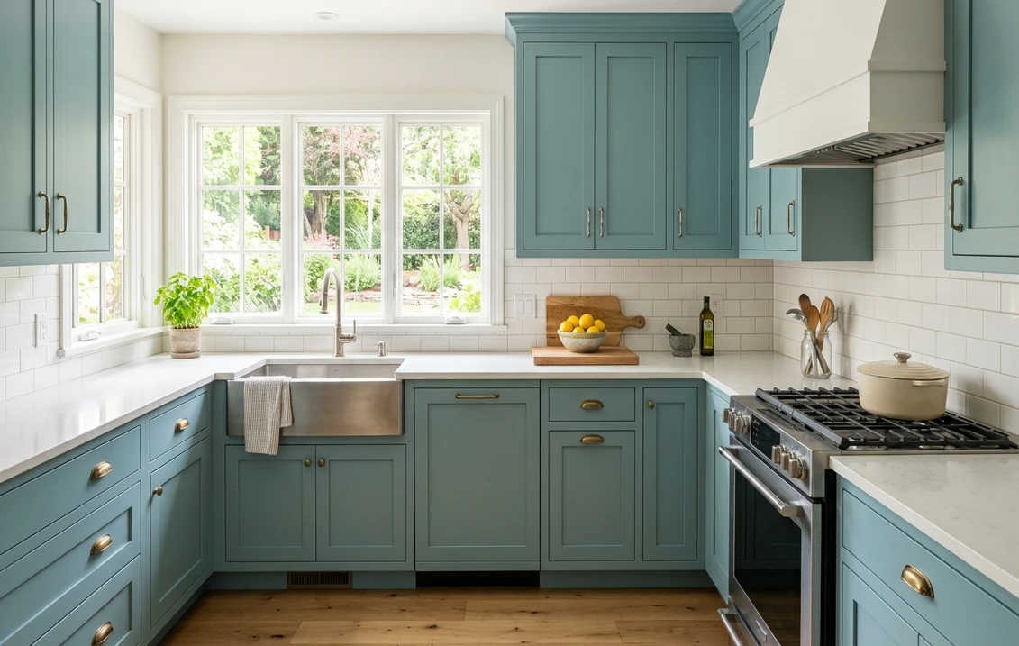
Kitchen islands, cabinetry, and bathrooms
Wythe Blue is a favorite for painted kitchen islands and lower cabinets because the gray base keeps it from looking trendy or loud; it reads timeless next to white uppers, brass hardware, and butcher block. In a bathroom it is spa-soft against white tile and marble. For more on living with blue-greens at this scale, our guide to blue living room paint ideas covers how these tones behave across larger surfaces.
Where to think twice
A small, dim, north-facing room with only cool LED light is where Wythe Blue can drain to a flat, slightly cold gray-blue, losing the warm green that makes it special. If you love the seafoam side of this color, do not put it in a cave with cool bulbs; give it some natural light or switch to 2700K. And because it is a real color, it is not the pick if you want a whole house to read as a soft neutral, that is a job for greige, not teal.
Trim, ceiling, and decor pairings
A muted teal lives or dies on the white you set next to it. Choose a warm, soft white and Wythe Blue glows; choose a stark blue-white and you risk amplifying the cool side and flattening the charm.
- Soft warm trim (most balanced): BM White Dove (OC-17, LRV 85) is the designer default here. Its gentle cream bias warms the room and lets Wythe Blue's green come forward, which is exactly the historic look the color was made for. Our full Benjamin Moore White Dove OC-17 review covers why it is the safe partner for almost any muted color.
- Creamy historic trim: BM Simply White or a soft antique-leaning white plays up Wythe Blue's Colonial Williamsburg heritage and reads warm and traditional. Best for dining rooms and older homes.
- Crisp trim (cooler, cleaner): BM Chantilly Lace (OC-65) leans into the blue and modern side; use it when you want Wythe Blue to read more coastal and contemporary than antique.
- Ceilings: a clean warm white (often the trim color) keeps the room from feeling closed; avoid a stark cool ceiling white, which can make Wythe Blue look gray.
- Floors and decor: warm wood tones, brass and antique gold, cane, rattan, and creamy linens flatter the green side beautifully. Cool chrome and stark grays will push it bluer and colder, so use them only if that is the look you want.
For contrast, a warm walnut or natural-wood element, or a soft black on a window or light fixture, reads tailored against the dusty teal. If you want the deeper, more saturated version of this same family, the bolder partner is covered in our Benjamin Moore Aegean Teal review.
See walls, trim, and floor together in one preview, free.
Wythe Blue vs the three colors people confuse it with
Almost every Wythe Blue search ends in a side-by-side, because Benjamin Moore stacks several soft blues and blue-greens on neighboring HC chips. These three are the ones that trip people up most:
- vs BM Palladian Blue (HC-144): the most common mix-up because they sit right next to each other. Palladian Blue (LRV near 61) is noticeably lighter, airier, and more clearly green-aqua, a pale, breezy spa color. Wythe Blue (LRV 52) is deeper, grayer, and more balanced between blue and green. Choose Palladian for a light, fresh, almost pastel room; choose Wythe Blue when you want more depth, more gray, and a more grounded, historic feel.
- vs BM Woodlawn Blue (HC-147): Woodlawn (LRV near 62) is lighter and leans more purely blue with less green, reading as a soft, gentle sky-blue rather than a teal. Wythe Blue is darker and distinctly greener and grayer. Pick Woodlawn for a sweet, restful pastel blue nursery or bedroom; pick Wythe Blue when you want a more sophisticated, weathered teal with presence.
- vs BM Van Courtland Blue (HC-145): Van Courtland is the deeper, moodier blue-green of the group, a darker, more saturated colonial teal that makes a room feel enveloping. Wythe Blue is the lighter, softer, more everyday version, far easier to live with on all four walls. Reach for Van Courtland when you want drama; reach for Wythe Blue when you want calm.
In short, on the same color strip Woodlawn and Palladian are the lighter, softer neighbors, Van Courtland is the deeper, moodier one, and Wythe Blue sits in the sweet spot: enough color and gray to feel intentional, never so much that it overwhelms.
Spelling note: wythe blue benjamin moore, BM Wythe Blue, and Wythe Blue HC-143 all point to this same color (occasionally misspelled wythe blu or white blue).
How to test Wythe Blue before you commit
A 2-inch fan-deck chip is the number-one reason people choose a blue-green that disappoints: it exaggerates the green and cannot show how dramatically the blue-to-green balance swings across a real day on a real wall. Two better methods:
- Paint a large swatch: roll a 12-by-12-inch sample (or a peel-and-stick sample) on two different walls and check it mid-morning, mid-afternoon, and at night under your normal bulbs. Watch specifically for how green it goes in your sunniest spot and how blue-gray it goes in your dimmest corner; those two extremes tell you the truth about your room.
- Preview it digitally first: upload a real photo of your room and apply Wythe Blue, plus a lighter alternative like Palladian Blue and a moodier one like Van Courtland, before you buy any samples, narrowing three contenders to the one worth painting. Pricing context for the full repaint is in our interior house painting cost guide for 2026.
Preview Wythe Blue against Palladian and Van Courtland, side by side, free.
Frequently asked questions
Is Wythe Blue blue or green?
Wythe Blue (HC-143) is a teal, meaning it is genuinely both, with the green usually a half-step ahead. A gray base mutes the saturation so it reads soft and historic rather than bright. In warm or south light the green comes forward as a sage-leaning seafoam; in cool or north light the blue rises and it reads as a dusty coastal blue-gray. Expect the balance to shift across the day rather than hold still.
What is the LRV of Wythe Blue?
Wythe Blue has a Light Reflectance Value of about 52 on the Benjamin Moore color data, with a hex approximation of #B7C2BA (RGB 183, 194, 186). That puts it in the middle of the light range: deep enough to read as a real color with presence on all four walls, but light enough that it never goes dim or heavy. It works as a full-room wall color, not just an accent.
What are the best rooms for Wythe Blue?
Dining rooms, formal living rooms, calm bedrooms, home offices, painted kitchen islands and cabinets, and spa-style bathrooms all suit Wythe Blue, because its grayed teal reads refined and historic next to white trim, brass, and warm wood. It is least reliable in small, dim, north-facing rooms with only cool LED light, where it can drain to a flat cold blue-gray and lose the warm green that makes it special.
What trim color goes with Wythe Blue?
BM White Dove (OC-17) is the most balanced trim because its gentle cream bias warms the room and lets Wythe Blue's green come forward, the historic look the color was made for. A creamy white like Simply White plays up its Colonial heritage, while Chantilly Lace (OC-65) leans it cooler and more coastal. Avoid a stark blue-white, which can flatten the charm and push Wythe Blue toward a cold gray.
What is the difference between Wythe Blue and Palladian Blue?
They sit on neighboring HC chips, which is why people confuse them. Palladian Blue (HC-144, LRV near 61) is noticeably lighter, airier, and more clearly green-aqua, almost a pastel spa color. Wythe Blue (HC-143, LRV 52) is deeper, grayer, and more balanced between blue and green. Choose Palladian for a light, fresh room and Wythe Blue when you want more depth and a more grounded, historic feel.
Preview BM Wythe Blue on your actual walls under your own light before buying a single sample.
Disclaimer: Benjamin Moore, Wythe Blue (HC-143), Palladian Blue (HC-144), Van Courtland Blue (HC-145), Woodlawn Blue (HC-147), White Dove (OC-17), Simply White (OC-117), Chantilly Lace (OC-65), and Aegean Teal (2136-40) are trademarks of Benjamin Moore & Co. FacadeColorizer is an independent paint visualization service and is not affiliated with, endorsed by, or sponsored by Benjamin Moore. Color reproduction on screens approximates the manufacturer's chip; always confirm with a manufacturer sample under your own light before purchase. Sources: Benjamin Moore HC-143 Wythe Blue color data 2026, Benjamin Moore HC-144 Palladian Blue, HC-145 Van Courtland Blue, and HC-147 Woodlawn Blue color data 2026, The Spruce blue-green paint undertone coverage, designer field reports compiled by FacadeColorizer.
Trademarks mentioned (Sherwin-Williams, Benjamin Moore, Behr, Caparol, Brillux, Sto, Alpina, Valspar, PPG, Glidden, Dulux, Crown Trade, Sandtex, Farrow & Ball, Johnstone's, Leyland) are property of their respective owners. FacadeColorizer is independent and not affiliated with any of them. Nominative fair use under Lanham Act §1125.


