
Benjamin Moore Hamilton Blue (848) is the kind of blue that makes people exhale. It is light, powdery, and quiet: not the punchy cornflower of a child's bedroom, not the chalky steel of a coastal gray, but a soft sky blue with just enough gray-green underneath to keep it grown-up. Homeowners reach for it when they want a wall that feels like a clear morning, calm and airy, without committing to a saturated color. The most common worry I hear is the opposite of the worry people have about deep blues: not "is it too bold," but "will it look washed out or like a nursery." The honest answer depends almost entirely on your light and the white you set beside it. Here is exactly how Hamilton Blue behaves on a real interior wall.
Quick orientation first. Hamilton Blue 848 has a published LRV of about 57 and a hex approximation of #A9BFC9 (RGB 169, 191, 201). That places it in light-to-mid territory: bright enough to keep a small room open, soft enough to read clearly as a color rather than a tinted white. The undertone is a gentle sky blue with a soft gray-green softener that keeps it from going icy or saccharine. This profile sits inside our wider Benjamin Moore interior paint colors guide; this page stays on Hamilton Blue specifically, its rooms, undertones, trim and the soft blues people mix it up with.
Upload a photo of your actual room and preview BM Hamilton Blue under your own light in about 30 seconds. Free: 1 HD render plus 3 variations.
Hamilton Blue at a glance: the numbers that matter
Before opinions, here are the specs you can take to a paint counter. These are the values that govern how the color actually behaves on a wall:
| Spec | Hamilton Blue 848 |
|---|---|
| Color number | 848 (Benjamin Moore Color Preview / classic range) |
| LRV (Light Reflectance Value) | Approximately 57: light, keeps a room bright and open |
| Hex / RGB (approx.) | #A9BFC9 / 169, 191, 201 |
| Color family | Soft, light sky blue |
| Primary undertone | Powdery blue with a quiet gray-green softener |
| Best base / finish | Light tint base; eggshell or matte on walls, satin or semi-gloss on trim |
The takeaway from those numbers: Hamilton Blue is a genuine soft blue, not a blue-gray pretending to be a neutral. At LRV 57 it lands light enough to feel airy in a small bedroom or bath, yet has enough pigment that two coats build a real, recognizable blue on the wall. The gray-green softener is the difference between a sophisticated powder blue and a flat baby blue. Lean into that softener with the right whites and the color reads refined; surround it with stark, cold whites and it can tip a half-step chalky or cool.
Hamilton Blue undertones: powder blue, gently grayed
Hamilton Blue is clearly a blue, but it is a quieted blue. The hue is a soft, clean sky blue, and underneath it runs a low murmur of gray-green that takes the candy edge off. That softener is what keeps it out of nursery territory and gives it a faintly historic, slightly faded-denim character that adults can live with for years rather than months.
The trap is the green ghost. In strong, warm light Hamilton Blue can occasionally flash the faintest green, reading like a soft seafoam in the brightest corner of a sunny room. It is subtle, and most people never name it, but it is why the color sometimes looks a touch more gray-green in person than the pure-blue chip suggests. In cooler, indirect light the green recedes and the blue steps forward cleaner and a touch brighter. So unlike a cool gray that goes bluer in shade, Hamilton Blue does the opposite of what you might fear: it is at its most blue and crisp in cooler light, and at its softest and most gray-green in warm sun.
One quirk worth knowing. Because it is light and low-saturation, Hamilton Blue reads more clearly as a color on a large wall than it does on a 2-inch chip, where it can look almost like a tinted white. Do not dismiss it from the fan deck alone; on a full wall the blue has noticeably more presence than the swatch implies.
LRV and how Hamilton Blue reads room by room
At LRV 57 Hamilton Blue reflects a healthy amount of light, so it rarely darkens a space, but its hue swings with orientation. Here is how the same gallon reads on four different walls:
| Indoor light | How Hamilton Blue reads |
|---|---|
| North-facing (cool, indirect) | At its cleanest and most clearly blue; bright and fresh, never muddy |
| South-facing (bright, warm) | Softest read; the gray-green softener surfaces, leaning gently seafoam |
| East-facing (cool after noon) | Crisp powder blue in the morning, settling softer by afternoon |
| West-facing (warm afternoon) | Warms and quiets in late sun, the blue relaxing toward gray-blue |
| Artificial light at night | 2700K warm bulbs soften and slightly gray it; 4000K cool bulbs sharpen the blue and brighten it |
Sources: Benjamin Moore 848 Hamilton Blue color data 2026; The Spruce blue-paint undertone coverage; designer field reports compiled by FacadeColorizer.
Free AI visualizer. Test Hamilton Blue on your real walls before buying a single sample pot.
Best rooms for Hamilton Blue 848
Soft, light and calming, Hamilton Blue is happiest in rooms where you want serenity and air rather than drama. It is not a moody library color; it is the blue you choose when the goal is rest. Here is where it consistently earns its place:
Bedrooms and nurseries that want to grow up slowly
This is Hamilton Blue's strongest room. The soft sky blue is restful and sleep-friendly, the same psychology that makes blue the most-requested bedroom hue, but the gray-green softener keeps it from reading babyish, so it works in a primary bedroom as easily as a child's room. It pairs beautifully with white bedding, natural linen, and pale wood. If a calm bedroom is the project, see how it sits among other quiet picks in our blue bedroom paint ideas and our guide to calming master bedroom paint colors.
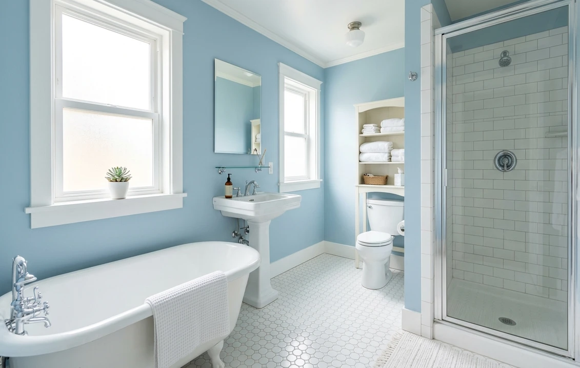
Bathrooms and powder rooms
The powdery blue reads clean and spa-like against white subway tile, marble, and chrome, and at LRV 57 it keeps even a windowless bath feeling open. It is fresher and a touch more colorful than the usual cool gray, which is exactly why people who find gray baths a little clinical land on Hamilton Blue instead. For the broader palette, our interior blue paint shades guide maps where it falls among the year's blues.
Sunrooms, breakfast nooks, and coastal living spaces
In a bright, airy room with a coastal or cottage lean, Hamilton Blue evokes sky and water without shouting. It is a natural fit for a sunroom, a beadboard breakfast nook, or a relaxed living room where you want softness rather than a statement. Its gentle gray-green side also makes it a friendly partner to greens and creams, which is why it slots so easily into a soft, layered scheme.
Where to think twice
A dim, low-light room with no natural daylight is where Hamilton Blue can lose its charm: starved of light, a low-saturation blue can flatten and read slightly gray and cold, the very "washed out" effect people fear. It also fights heavily warm, orange-toned wood floors and golden-yellow trim, where the cool blue can look out of place. In a dark room or against a lot of warm wood, a warmer or deeper color serves you better.
Trim, ceiling, and coordinating colors for Hamilton Blue
A soft blue lives or dies by the white beside it. Choose a warm white and Hamilton Blue looks gentle and inviting; choose a stark, blue-based white and the room can tip cold and clinical.
- Soft warm white trim (most balanced): BM Simply White (OC-117) or White Dove (OC-17) is the designer default. Their gentle warmth keeps Hamilton Blue from drifting cold while staying clean and bright. This is the safe, cohesive pick for most rooms. See the white itself in our Benjamin Moore Simply White OC-117 review.
- Crisp white trim (cleaner, cooler): BM Chantilly Lace (OC-65) sharpens the blue and gives a fresh, modern, coastal edge. Best in bright bathrooms and rooms with plenty of natural light.
- Coordinating wall colors: Hamilton Blue layers beautifully with soft sages, warm greiges, and pale creams. A muted sage green in an adjoining room makes a soothing flow; a warm greige grounds it so the scheme does not float.
- Ceilings: a clean white (often the trim color) keeps the room airy. Painting the ceiling a whisper of the same Hamilton Blue at 25 to 50 percent strength is a classic move for a serene, sky-like bedroom.
- Floors and decor: white oak, pale ash, woven naturals, rattan, and brushed nickel flatter the soft blue. Very orange-toned wood and brass can fight it; temper with cooler textiles or a softer metal.
For a deeper, anchoring partner on a door, built-in, or accent wall, a true navy reads crisp and tailored against the soft blue walls. See how the deeper end of the family behaves in our Benjamin Moore Hale Navy HC-154 review.
See walls, trim, and floor together in one preview, free.
Hamilton Blue vs the soft blues people confuse it with
Almost every Hamilton Blue search ends with a stack of similar chips fanned out on a counter. The three that come up most often:
- vs BM Yarmouth Blue (HC-150): the closest call. Yarmouth Blue is a soft blue with a noticeably stronger green-gray pull, so it reads more muted, more historic, and a touch grayer overall. Hamilton Blue (848) is cleaner and reads more clearly as a true sky blue, a half-step brighter and less grayed. Choose Yarmouth when you want a faded, almost antique blue that behaves like a near-neutral; choose Hamilton when you want the blue to actually read blue and feel fresher.
- vs BM Woodlawn Blue (HC-147): Woodlawn is the soft aqua of the group, with a clear green-aqua lean that can flash mint or seafoam in bright light. Hamilton Blue stays truer to blue and shows far less green. Pick Woodlawn if you want a spa-aqua bath; pick Hamilton if you want sky blue without the aqua tipping point.
- vs BM Wickham Gray (HC-171): Wickham Gray is the impostor here. It is a very light gray with a soft blue undertone, so it can pass as a pale blue in some light but reads mostly as a cool gray. Hamilton Blue is committed: it is a real, light blue, not a blue-leaning gray. Choose Wickham if you want a gray that whispers blue; choose Hamilton if you want a blue that whispers gray.
The one-line rule: Wickham Gray is a gray, Woodlawn Blue is an aqua, Yarmouth Blue is a grayed historic blue, and Hamilton Blue is the cleanest true soft sky blue of the four. Spelling note: hamilton blue benjamin moore, BM Hamilton Blue, and Hamilton Blue 848 all point to this same color.
How to test Hamilton Blue before you commit
A 2-inch fan-deck chip is the number-one reason people misjudge a soft blue: it shrinks the color toward a tinted white and hides the gray-green flash that appears at full scale in warm light. Two better methods:
- Paint a large swatch: roll a 12-by-12-inch sample (or use a peel-and-stick sample) on two different walls and check it mid-morning, mid-afternoon, and at night under your normal bulbs. Watch your sunniest corner specifically; that is where the green softener shows, and it tells you whether the room will read sky blue or soft seafoam.
- Preview it digitally first: upload a real photo of your room and apply Hamilton Blue, then compare it against a grayer option like Yarmouth Blue and an aqua like Woodlawn Blue, before you buy any samples. That narrows three contenders to the one worth painting. Budget context for the full job is in our interior house painting cost guide for 2026.
Preview Hamilton Blue against a grayer and an aqua blue, side by side, free.
Frequently asked questions
What undertone does Benjamin Moore Hamilton Blue have?
Hamilton Blue (848) is a soft, light sky blue with a quiet gray-green softener underneath. That softener keeps it from reading like a candy baby blue and gives it a faintly faded, grown-up quality. In strong warm light the green can surface and the color leans gently seafoam, while in cooler, indirect light the blue steps forward cleaner and a touch brighter.
What is the LRV of Hamilton Blue 848?
Hamilton Blue has a Light Reflectance Value of about 57, with a hex approximation of #A9BFC9 (RGB 169, 191, 201). That makes it a light-to-mid soft blue: bright enough to keep a small bedroom or bathroom feeling open and airy, but with enough pigment that two coats read clearly as a real blue rather than a tinted white.
What are the best rooms for Hamilton Blue?
Bedrooms, nurseries, bathrooms, powder rooms, sunrooms, and relaxed coastal living spaces suit Hamilton Blue best, because its soft, restful blue reads calm and clean against white tile, linen, and pale wood. It is least reliable in dim, low-daylight rooms, where a low-saturation blue can flatten and read slightly gray and cold, and against very warm orange-toned wood, where the cool blue can clash.
What trim color goes with Hamilton Blue?
A soft warm white like BM Simply White (OC-117) or White Dove (OC-17) is the most balanced trim, because the gentle warmth keeps Hamilton Blue from drifting cold while staying clean. BM Chantilly Lace (OC-65) is the crisper, cooler option for bright bathrooms and coastal rooms. Avoid a heavy golden-yellow trim, which can make the cool blue look out of place.
What is the difference between Hamilton Blue and Yarmouth Blue?
Yarmouth Blue (HC-150) has a stronger green-gray pull, so it reads more muted, historic, and grayer, behaving almost like a soft neutral. Hamilton Blue (848) is cleaner and reads more clearly as a true sky blue, a half-step brighter and less grayed. Choose Yarmouth for a faded antique blue, and Hamilton when you want the blue to actually read blue and feel fresher.
Preview BM Hamilton Blue on your actual walls under your own light before buying a single sample. Free: 1 HD render plus 3 variations.
Disclaimer: Benjamin Moore, Hamilton Blue (848), Yarmouth Blue (HC-150), Woodlawn Blue (HC-147), Wickham Gray (HC-171), Simply White (OC-117), White Dove (OC-17), Chantilly Lace (OC-65), and Hale Navy (HC-154) are trademarks of Benjamin Moore & Co. FacadeColorizer is an independent paint visualization service and is not affiliated with, endorsed by, or sponsored by Benjamin Moore. Color reproduction on screens approximates the manufacturer's chip; always confirm with a manufacturer sample under your own light before purchase. Sources: Benjamin Moore 848 Hamilton Blue color data 2026, Benjamin Moore HC-150 Yarmouth Blue, HC-147 Woodlawn Blue and HC-171 Wickham Gray color data 2026, The Spruce blue-paint undertone coverage, designer field reports compiled by FacadeColorizer.
Trademarks mentioned (Sherwin-Williams, Benjamin Moore, Behr, Caparol, Brillux, Sto, Alpina, Valspar, PPG, Glidden, Dulux, Crown Trade, Sandtex, Farrow & Ball, Johnstone's, Leyland) are property of their respective owners. FacadeColorizer is independent and not affiliated with any of them. Nominative fair use under Lanham Act §1125.


