
The first time I brushed Benjamin Moore Caldwell Green (HC-124) onto a dining-room wall, the homeowner went quiet for a long beat and then said, "It looks like the inside of an old library." That is exactly the reaction this color is built for. Caldwell Green is a mid-depth historic green that leans olive, with a backbone of gray and a thread of muted gold running through it. It is not the soft, breezy sage that dominates Pinterest, and it is not a true forest green either. It sits in that grounded, slightly antique middle, the green you choose when you want a room to feel established, calm, and a little serious. The question that drives every search is whether it reads too dark, too drab, or just right. The answer lives in your light, your trim, and how much depth your room can carry. Here is how it actually behaves indoors.
Quick orientation before the deep dive. Caldwell Green HC-124 has a published LRV of about 27 and a hex approximation of #6F705C (RGB 111, 112, 92). That puts it firmly in mid-to-deep territory: dark enough to wrap a room in atmosphere, light enough that it never goes black or cavernous the way a true charcoal-green would. The undertone is olive with a strong gray component and a quiet gold warmth, which is what gives it that aged, drapery-and-leather feel. This profile is one stop in our wider Benjamin Moore interior paint colors guide. If you are weighing it against the year's other indoor greens, our interior green paint shades guide is the wider map this one lives inside.
Upload a photo of your actual room and preview BM Caldwell Green under your own light in about 30 seconds. Free: one HD render plus three variations.
Caldwell Green at a glance: the numbers that matter
Before opinions, here are the verifiable specs straight from the Benjamin Moore Historical Color collection. These are the values you can take to a paint counter:
| Spec | Caldwell Green HC-124 |
|---|---|
| Color number | HC-124 (Historical Color collection) |
| LRV (Light Reflectance Value) | Approximately 27: mid-to-deep, atmospheric without going black |
| Hex / RGB (approx.) | #6F705C / 111, 112, 92 |
| Color family | Mid-depth historic olive-green |
| Primary undertone | Olive, with a strong gray base and a thread of muted gold |
| Best base / finish | Medium or deep base; matte or eggshell on walls, satin on cabinets and trim |
The takeaway from those numbers: Caldwell Green is a confident, saturated mid-tone, not a whisper. At LRV 27 it absorbs far more light than the LRV-50-plus sages, so it will visibly darken a room and reward good natural light. The olive-plus-gray combination is the whole identity. Lean into it with the right warm trim and the color reads rich and timeless; pair it with the wrong cool white and it can slump toward drab military-green. That balance is the entire decision in one sentence, and it is why so many people second-guess this color before committing.
Is Caldwell Green too dark or too drab? The undertone, decoded
Caldwell Green is a complex color, and complexity is exactly why people hesitate. Anyone who tells you it is a "simple sage" has not lived with it. Here is what is happening underneath.
The olive is dominant, but it is muddied on purpose by a heavy gray load and warmed by a faint gold. In strong, warm sunlight the gold wakes up, the olive turns lush and almost mossy, and the wall reads as a rich, lived-in green that flatters wood and brass. In flat or cool light the gray takes over, the gold goes to sleep, and the same wall can drift toward a grayed-down khaki, the read some people describe as "swampy" or "army." It does not turn blue or purple the way a cooler green might; its risk runs in the opposite direction, toward dullness rather than coolness. That is the trade-off you are managing: this is a green that wants warmth and depth around it, and punishes a cold, sterile setting.
Watch out for one quirk specific to deeper colors like this. Caldwell Green looks meaningfully darker as a finished, four-wall room than it does on a 2-inch chip held up to a window. A chip is backlit and surrounded by white; a real wall reflects light off itself and onto its neighbors, deepening the whole space. So if the chip already feels borderline-dark to you, assume the finished room will land a half-step deeper and moodier still. That is wonderful in a study and risky in a small, dim bedroom.
| Indoor light | How Caldwell Green reads |
|---|---|
| South-facing (bright, warm) | Its best self: lush, mossy olive with the gold awake and the gray held back |
| West-facing (warm afternoon) | Glows golden-green in late sun, deepens richly as evening sets in |
| East-facing (cool after noon) | Warm and green in morning, grays down and reads more khaki by afternoon |
| North-facing (cool, indirect) | Its riskiest light: the gray dominates and it can read flat and drab unless warmed by lamps and wood |
| Artificial light at night | Warm 2700K bulbs revive the olive and gold beautifully; cool 4000K bulbs flatten it toward gray-khaki |
Sources: Benjamin Moore HC-124 color data 2026; Historical Color collection documentation; designer field reports compiled by FacadeColorizer.
Free AI visualizer. Test Caldwell Green on your real walls before buying a single sample pot.
Best rooms for Caldwell Green
Deep, grounded, and a little antique, Caldwell Green is happiest where you want enclosure rather than airiness. It is not the whole-home neutral; it is the color you commit to in a room that should feel intimate and considered. Here is where it consistently earns its keep:
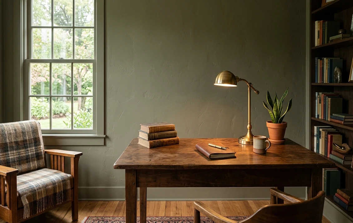
Studies, libraries, and home offices
This is Caldwell Green's home turf. The olive depth wraps a small workspace in focus and quiet, reads beautifully against walnut shelving and leather, and pairs naturally with brass lamps and old book spines. At LRV 27 it is dark enough to feel cocooning but light enough that a desk lamp and one window keep it from going gloomy. If you want a room that says "this is where serious thinking happens," few greens do it better.
Dining rooms and moody accent walls
A dining room is rarely used in flat midday light, which is exactly why Caldwell Green works there: under evening lamps and candles the gold wakes up and the room turns warm and enveloping. As a single accent wall behind a bed or sofa it adds depth without committing the whole room to darkness. For more on how a deep green sits next to lighter companions in a lounge, our green living room paint ideas guide shows the supporting palette.
Kitchen cabinets and built-ins
Caldwell Green is a superb cabinet color. On lower cabinets or a kitchen island, its olive depth grounds the room against white uppers, warm wood floors, and unlacquered brass hardware, giving an instant heritage-kitchen feel without the trendiness of a brighter sage. It holds up to satin and semi-gloss finishes that show off its richness. If green cabinetry is your project, our sage green kitchen cabinet color guide covers where a deeper olive like Caldwell fits among the lighter picks.
Where to think twice
A small, north-facing bedroom with one window and only cool LED light is where Caldwell Green can tip from moody to murky. There the gray dominates, the gold never wakes up, and the room can feel heavy and flat. If you love the color but the room is dim, either reserve it for a single accent wall, commit to warm 2700K bulbs and warm wood, or switch to a grayer, less saturated green like Hollingsworth instead. Caldwell rewards light and warmth, so do not strand it in a cold, sunless box.
Trim, ceiling, and decor pairings
A deep olive lives or dies on what frames it. Get the trim right and Caldwell Green looks rich and intentional; get it wrong and it can read either drab or oddly stark.
- Warm creamy trim (most balanced): BM White Dove (OC-17, LRV 85) is the designer default here. Its soft cream bias echoes Caldwell's gold thread and keeps the contrast warm rather than clinical, so the green reads as heritage rather than harsh. This is the safe, cohesive pick for most homes.
- Soft historic white (gentler contrast): BM Simply White (OC-117) or a warm antique white softens the line between wall and trim, letting the olive feel enveloping and old-world. Best for studies and dining rooms where you want low contrast and atmosphere.
- Avoid: a cold, blue-based white like a stark builder bright-white next to Caldwell Green. The warm-cool clash drains the gold out of the green and pushes it toward flat army-khaki.
- Ceilings: a warm white (often the trim color) keeps the room from feeling top-heavy. In a study you can also wrap the ceiling in Caldwell itself for full cocooning depth.
- Floors and decor: walnut and warm oak, leather, brass and aged bronze, terracotta, cream linen, and oxblood accents all flatter the olive and reinforce its heritage read. Cool chrome and stark gray-blue textiles fight it; keep metals and woods warm.
For a designer-approved color story, Caldwell Green sits naturally beside cream, terracotta, brass, and walnut, the same warm family that flatters most olives. Our breakdown of colors that go with sage and olive greens walks through those pairings in detail and applies cleanly to a deeper olive like this one.
See walls, trim, and floor together in one preview. Free.
Caldwell Green vs the historic greens people confuse it with
Almost every Caldwell Green search ends in a side-by-side with its Historical Color neighbors. The three comparisons that matter most indoors:
- vs BM Cushing Green (HC-125): the closest dilemma, since they are literally adjacent numbers and sit at virtually the same depth (both around LRV 27). The difference is not value but undertone: Caldwell is the warmer, more olive-and-gold of the pair, with a thread of muted gold, while Cushing reads as a cooler, fresher gray-sage with the gray pulling a hair more blue-green. Choose Caldwell when you want warmth and an antique, lamp-lit glow; choose Cushing when you want the green to read cooler and a touch more formal. Because the depth is so close, always sample both on the same wall.
- vs BM Hollingsworth Green (HC-141): Hollingsworth is the grayer, more muted relative. At LRV 24 it sits at almost the same depth as Caldwell, only a hair deeper, but it leans gray-sage rather than olive-and-gold, so it reads softer and less saturated than Caldwell's lush, golden olive. Pick Caldwell for warmth and a heritage, lamp-lit glow on an accent wall, study, or cabinet; pick Hollingsworth when you want a quieter, grayer green with less of the olive-gold richness.
- vs BM October Mist (1495): October Mist is a much lighter, softer, almost gray-sage that became a designer darling for airy whole-home use. Next to it, Caldwell Green is dramatically deeper and more saturated. They are not interchangeable: October Mist whispers across a bright room, while Caldwell anchors and encloses one. Our Benjamin Moore October Mist 1495 review covers that lighter end of the BM green family if Caldwell feels too heavy for your space.
Spelling note: caldwell green benjamin moore, BM Caldwell Green, and Caldwell Green HC 124 all point to this same HC-124.
How to test Caldwell Green before you commit
A 2-inch fan-deck chip is the single biggest reason people regret a deep green: it under-represents how dark and how olive the color goes once it covers four walls, and it cannot show how dramatically the gold wakes up under evening lamps. Two better methods:
- Paint a large swatch: roll a 2-by-2-foot sample (or a peel-and-stick sample) on two different walls and check it in morning sun, flat midday light, and at night under your normal bulbs. Watch specifically for the grayest corner of the room at midday; that is where Caldwell shows its drab risk, and it tells you the truth about whether the room has enough warmth.
- Preview it digitally first: upload a real photo of your room and apply Caldwell Green alongside a lighter alternative such as Hollingsworth Green and a softer one such as October Mist, narrowing three contenders to the one worth painting. Pricing context for the full repaint is in our interior house painting cost guide for 2026.
Preview Caldwell Green against a lighter and a softer green, side by side. Free.
Frequently asked questions
Is Caldwell Green warm or cool?
Caldwell Green (HC-124) is a warm-leaning historic green: an olive base carried on a strong gray with a thread of muted gold. In warm or south light the gold wakes up and it reads lush and mossy; in flat or cool north light the gray dominates and it can drift toward a grayed khaki. It does not go blue or purple, so its only real risk is dullness, which warm bulbs, wood, and brass easily solve.
What is the LRV of Caldwell Green?
Caldwell Green has a Light Reflectance Value of about 27, with a hex approximation of #6F705C (RGB 111, 112, 92). That makes it a mid-to-deep color: dark enough to wrap a study or dining room in atmosphere and absorb noticeable light, but light enough that it never reads black or cavernous like a true charcoal-green. Because it sits this low, it visibly deepens a room and rewards good natural light.
What are the best rooms for Caldwell Green?
Studies, libraries, home offices, dining rooms, moody accent walls, and kitchen cabinets are where Caldwell Green shines, because its olive depth feels grounded and heritage against wood, leather, and brass. It is least reliable in small, north-facing bedrooms with only cool LED light, where the gray takes over and the room can feel murky; an accent wall, warm 2700K bulbs, or a grayer, less saturated green like Hollingsworth are better there.
What trim color goes with Caldwell Green?
BM White Dove (OC-17) is the most balanced trim because its soft cream bias echoes Caldwell's gold thread and keeps the contrast warm rather than clinical. A warm historic white like Simply White softens the line further for a low-contrast, old-world look. Avoid a cold blue-based bright-white, which drains the gold from the green and pushes it toward flat army-khaki.
What is the difference between Caldwell Green and Cushing Green?
Caldwell Green (HC-124) and Cushing Green (HC-125) are adjacent Historical colors and sit at virtually the same depth, both around LRV 27, so the difference is undertone rather than value. Caldwell is the warmer, more olive-and-gold of the pair, while Cushing reads as a cooler, fresher gray-sage with its gray leaning slightly more blue-green. Choose Caldwell for a warm, lamp-lit, antique glow; choose Cushing when you want the green to read cooler and a touch more formal. Always sample both on the same wall, because the difference is subtle and light-dependent.
Preview BM Caldwell Green on your actual walls under your own light before buying a single sample. One HD render plus three variations, free.
Disclaimer: Benjamin Moore, Caldwell Green (HC-124), Cushing Green (HC-125), Hollingsworth Green (HC-141), October Mist (1495), White Dove (OC-17), and Simply White (OC-117) are trademarks of Benjamin Moore & Co. FacadeColorizer is an independent paint visualization service and is not affiliated with, endorsed by, or sponsored by Benjamin Moore. Color reproduction on screens approximates the manufacturer's chip; always confirm with a manufacturer sample under your own light before purchase. Sources: Benjamin Moore HC-124 Caldwell Green color data 2026, Benjamin Moore Historical Color collection documentation, designer field reports compiled by FacadeColorizer.
Trademarks mentioned (Sherwin-Williams, Benjamin Moore, Behr, Caparol, Brillux, Sto, Alpina, Valspar, PPG, Glidden, Dulux, Crown Trade, Sandtex, Farrow & Ball, Johnstone's, Leyland) are property of their respective owners. FacadeColorizer is independent and not affiliated with any of them. Nominative fair use under Lanham Act §1125.


