
Benjamin Moore Brittany Blue (1633) is one of those mid-blues that people fall for on a swatch card and then hesitate over for weeks, because a saturated blue feels like a bigger commitment than another gray. I get the hesitation. This is not a whisper of blue that disappears into the wall: Brittany Blue is a confident, medium denim-blue with just enough gray folded in to keep it grown up rather than playful. The whole question with this color is whether that depth will feel like a cozy, tailored statement or like a room that suddenly got smaller and darker. The answer comes down to your light, your trim, and the room you put it in. Here is exactly how Brittany Blue 1633 behaves on real interior walls.
Quick orientation first. Brittany Blue 1633 has an approximate LRV of 30 and a hex approximation of #6E84A0 (RGB 110, 132, 160). That places it squarely in medium-blue territory: deeper than a soft sky and far lighter than a navy. It is saturated enough to read as genuine, sophisticated color in daylight, yet softened by a gray haze that keeps it from going primary or nautical. This profile is one stop in our wider Benjamin Moore interior paint colors guide, and it sits in the same blue family covered in our broader best interior blue paint shades for 2026. This page stays focused on Brittany Blue specifically: its undertone, how it reads room by room, and how to keep it from going flat.
Upload a photo of your actual room and preview BM Brittany Blue 1633 under your own light in about 30 seconds, free.
Brittany Blue at a glance: the numbers that matter
Before opinions, here are the verifiable specs from the Benjamin Moore color library. These are the values you can take to a paint counter:
| Spec | Brittany Blue 1633 |
|---|---|
| Color number | 1633 (Color Preview collection) |
| LRV (Light Reflectance Value) | Approximately 30: medium depth, reads as real color, not a pastel |
| Hex / RGB (approx.) | #6E84A0 / 110, 132, 160 |
| Color family | Medium grayed blue (denim blue) |
| Primary undertone | Clean blue with a soft gray haze; a faint slate-violet shift in low light |
| Best base / finish | Medium tint base; eggshell or matte on walls, satin on trim and built-ins |
The takeaway from those numbers: at LRV 30, Brittany Blue is a true mid-tone. It absorbs noticeably more light than a soft blue but stays well clear of the near-black drama of a navy. The gray in the formula is what makes it wearable. It tempers the blue so the wall reads tailored and calm instead of crayon-bright. That gray haze is also the variable to watch, because it can push the color toward soft and powdery in flat light or let the blue come forward and look richer in strong sun. Whether you love or regret Brittany Blue almost always comes down to how much light the room gets.
Is Brittany Blue gray or blue? The undertone, decoded
Brittany Blue is, first and foremost, blue. The gray is a softening agent, not the main event, which is what separates it from a true blue-gray where the gray would dominate. Read it side by side with a saturated cobalt and Brittany looks dusty and refined; read it next to a gentle blue-gray and Brittany looks decisively blue. It lives right in the middle, and that balance is exactly why it is so versatile and also why it photographs differently than it looks on the wall.
There is a quiet secondary move worth naming. In strong, warm daylight the blue is clean and a touch brighter, almost periwinkle at the edges. As light drops, the gray takes over and a faint slate-violet shift can appear, especially in corners and under cool LED. Brittany Blue does not turn green the way some teal-leaning blues do, and it does not go muddy. It simply gets softer and grayer as the light leaves, which is a graceful way for a mid-blue to age across a day rather than a flaw.
Watch out for one thing. On a small fan-deck chip and in bright phone photos, Brittany Blue reads cleaner, brighter, and more vivid than the finished wall. Rolled over a full wall under real lamps it settles a half-step deeper and grayer than the chip promised. So if you are choosing from Pinterest alone, assume the actual room will be calmer and a little more muted than the image, never bolder.
| Indoor light | How Brittany Blue reads |
|---|---|
| South-facing (bright, warm) | Its richest, cleanest read; the blue comes forward and looks vivid and confident |
| West-facing (warm afternoon) | Warm late-day sun deepens it slightly and softens the edge toward a cozy denim |
| East-facing (cool after noon) | Crisp and clean in morning light, grayer and quieter by afternoon |
| North-facing (cool, indirect) | The gray dominates; can look dusty and a touch flat, so build in warm light and texture |
| Artificial light at night | Warm 2700K bulbs make it cozy and rich; cool 4000K bulbs sharpen the blue and surface the slate-violet edge |
Sources: Benjamin Moore 1633 color data 2026; The Spruce blue-paint undertone coverage; designer field reports compiled by FacadeColorizer.
Free AI visualizer. Test Brittany Blue on your real walls before buying a single sample pot.
Best rooms for Brittany Blue
Medium, grayed, and confident, Brittany Blue is happiest where you want color to do the talking but still want a room you can relax in for years. At LRV 30 it is not a whole-home neutral; it is a feature color. Used in the right rooms it reads tailored and timeless, never trendy. Here is where it consistently earns its keep:
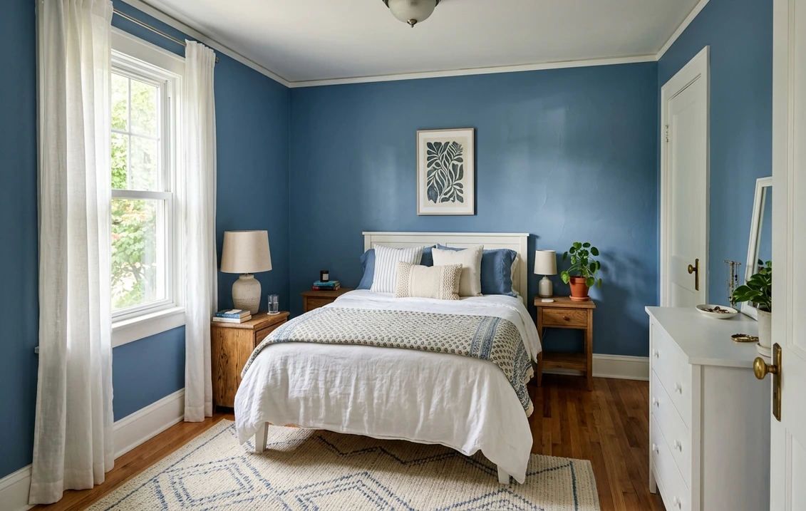
Bedrooms aiming for cozy and enveloping
This is Brittany Blue's strongest room. The grayed mid-blue reads restful and grown up, the kind of color that makes a bedroom feel like a quiet retreat rather than a child's room. It wraps a space without making it feel small the way a navy can, and it flatters white bedding, warm wood, and brass hardware beautifully. If a calm, color-forward bedroom is your project, see how it sits next to other picks in our roundup of the best blue bedroom paint ideas for 2026.
Studies, libraries, and home offices
A medium blue with gray in it is a classic study color for a reason: it reads focused and scholarly without the heaviness of a true dark. Brittany Blue on the walls of a home office, paired with bookshelves and warm task lighting, looks tailored on a video call and calm in person. It is a smart way to get color drama in a small room that you do not spend all day in.
Powder rooms, dining rooms, and accent walls
Because Brittany Blue is a feature color, it is perfect for the rooms where you want a moment. A small powder room drenched in Brittany Blue (walls, trim, and ceiling) feels like a jewel box. A dining room in it feels intimate at night under warm bulbs. And as an accent wall behind a bed or sofa it gives a focal point without committing the whole room. For pairing it with built-in cabinetry, it sits in the same conversation as our guide to soft blue-gray kitchen cabinet colors.
Where to think twice
A small, dim, north-facing room with only cool LED is where Brittany Blue can tip from cozy to flat and dusty. There the gray dominates, the blue loses its life, and the room can feel cold rather than enveloping. If that is your room, either lean into the depth with warm 2700K lighting and rich textiles, or step up to a lighter, friendlier blue instead. Brittany rewards a little warmth, so do not strand it in a sunless box.
Trim, ceiling, and decor pairings
A saturated mid-blue lives or dies on its contrast. Get the trim right and Brittany Blue looks crisp and intentional; get it wrong and it can read either heavy or oddly washed out.
- Crisp white trim (most balanced): BM Chantilly Lace (OC-65, LRV 90) gives the cleanest, brightest contrast and lets Brittany Blue read fresh and tailored. This is the safe, high-contrast pick for most homes and the classic blue-and-white look.
- Soft warm white trim (cozier): BM White Dove (OC-17, LRV 85) takes the edge off the contrast and makes the room feel warmer and more enveloping, ideal for a bedroom. Its gentle cream bias keeps the pairing from going stark. See the full profile in our Benjamin Moore White Dove OC-17 review.
- Tone-on-tone drama: for a powder room or study, take Brittany Blue onto the trim and ceiling too. The monochrome wrap reads luxe and intentional, and it sidesteps the contrast problem entirely.
- Avoid: a heavy antique-cream or builder beige trim, which clashes warm-against-cool and can make the blue look gray and dingy by comparison.
- Floors and decor: warm wood (white oak, walnut), brass, natural rattan, and cream linen all flatter the grayed blue and add the warmth it craves. Cool chrome and stark gray-on-gray schemes can leave it feeling flat.
For real punch, pair Brittany Blue walls with a deeper navy on a door or built-in. If you want to go all the way dark, our Benjamin Moore Hale Navy HC-154 review covers the navy most designers reach for, and it makes a handsome layered duo with Brittany as the lighter mid-tone.
See walls, trim, and floor together in one preview, free.
Brittany Blue vs the blues people confuse it with
Almost every Brittany Blue search ends in a side-by-side with one of Benjamin Moore's other mid-blues. These three are the ones that matter most indoors, and the differences are real even though the chips look similar at a glance:
- vs BM Philipsburg Blue (HC-159): Philipsburg is the lighter, softer historical cousin. It carries more green in the undertone and a higher LRV, so it reads gentler, airier, and more colonial than Brittany Blue. Choose Philipsburg when you want a relaxed wall color that still feels light; choose Brittany Blue when you want more saturation and depth, a wall that clearly commits to being blue rather than blue-ish.
- vs BM Providence Blue (1636): these two are the closest near-twins because they sit on the same color strip, with Providence the deeper, more intense step. Providence Blue pushes toward a richer, slightly more royal blue with less of the calming gray. Brittany Blue is the more muted, grayed, livable option of the pair. If you want jewel-box drama, go Providence; if you want a mid-blue you can relax with on every wall of a bedroom, Brittany is the safer call.
- vs BM Van Courtland Blue (HC-145): Van Courtland is deeper and noticeably dustier, with a blue-green slate cast that makes it read almost like a soft teal in some light. Brittany Blue stays cleaner and truer to blue, without that green pull. Pick Van Courtland for a moodier, more historic library feel; pick Brittany when you want the color to stay recognizably blue rather than drifting green-gray.
Spelling note: brittany blue, BM Brittany Blue, and Brittany Blue Benjamin Moore all point to this same 1633.
How to test Brittany Blue before you commit
A 2-inch fan-deck chip is the number-one reason people choose a saturated blue that disappoints: it makes the color look cleaner and brighter than a full wall ever will, and it cannot show how the gray takes over as the light drops. Two better methods:
- Paint a large swatch: roll a 12-by-12-inch sample (or a peel-and-stick sample) on two different walls and check it mid-morning, mid-afternoon, and at night under your normal bulbs. Watch specifically for how dusty and flat it goes in your dimmest corner; that corner tells you the truth about whether the room has enough light for a mid-blue.
- Preview it digitally first: upload a real photo of your room and apply Brittany Blue (plus a lighter alternative like Philipsburg and a deeper one like Providence) before you buy any samples, narrowing three contenders to the one worth painting. Pricing context for the full repaint is in our interior house painting cost guide for 2026.
Preview Brittany Blue against a lighter and a deeper blue, side by side, free.
Frequently asked questions
Is Brittany Blue 1633 gray or blue?
Brittany Blue 1633 is firmly blue, with a soft gray haze folded in to keep it tailored rather than primary. The blue is the main event and the gray is the softener, which is why it reads as a refined medium denim blue rather than a true blue-gray. In bright south light the blue comes forward and looks cleaner and richer; in dim or north light the gray takes over and it reads softer and dustier, with a faint slate-violet edge.
What is the LRV of Brittany Blue?
Brittany Blue 1633 has a Light Reflectance Value of about 30, with a hex approximation of #6E84A0 (RGB 110, 132, 160). That makes it a true medium-depth color: it absorbs noticeably more light than a soft pastel blue, so it reads as a real, saturated wall color, but it stays well clear of the near-black depth of a navy. Because of that mid-range LRV it works best in rooms with decent natural light.
What are the best rooms for Brittany Blue?
Bedrooms, home offices and studies, powder rooms, dining rooms, and accent walls are where Brittany Blue shines, because its grayed mid-blue reads cozy, tailored, and grown up without the heaviness of a navy. It is least reliable in small, dim, north-facing rooms with only cool LED light, where the gray dominates and it can look flat and dusty; warm 2700K bulbs and rich textiles fix that, or step up to a lighter blue.
What trim color goes with Brittany Blue?
Crisp BM Chantilly Lace (OC-65) gives the brightest, cleanest contrast and the classic blue-and-white look. BM White Dove (OC-17) is the cozier choice: its soft warm white takes the edge off and makes a bedroom feel more enveloping. For a powder room or study, taking Brittany Blue onto the trim and ceiling for a tone-on-tone wrap reads luxe. Avoid heavy antique-cream or builder beige trim, which can make the blue look gray and dingy.
What is the difference between Brittany Blue and Providence Blue?
Brittany Blue 1633 and Providence Blue 1636 sit on the same Benjamin Moore color strip, so they are close near-twins, but Providence is the deeper, more intense step with less of the calming gray, pushing toward a richer, more royal blue. Brittany Blue is the more muted and livable of the pair. Choose Providence for jewel-box drama in a small space, and Brittany when you want a mid-blue you can relax with on every wall of a bedroom.
Preview BM Brittany Blue 1633 on your actual walls under your own light before buying a single sample.
Disclaimer: Benjamin Moore, Brittany Blue (1633), Philipsburg Blue (HC-159), Providence Blue (1636), Van Courtland Blue (HC-145), White Dove (OC-17), Chantilly Lace (OC-65), and Hale Navy (HC-154) are trademarks of Benjamin Moore & Co. FacadeColorizer is an independent paint visualization service and is not affiliated with, endorsed by, or sponsored by Benjamin Moore. Color reproduction on screens approximates the manufacturer's chip; always confirm with a manufacturer sample under your own light before purchase. Sources: Benjamin Moore 1633 Brittany Blue color data 2026, Benjamin Moore HC-159 Philipsburg Blue, 1636 Providence Blue, and HC-145 Van Courtland Blue color data 2026, The Spruce blue-paint undertone coverage, designer field reports compiled by FacadeColorizer.
Trademarks mentioned (Sherwin-Williams, Benjamin Moore, Behr, Caparol, Brillux, Sto, Alpina, Valspar, PPG, Glidden, Dulux, Crown Trade, Sandtex, Farrow & Ball, Johnstone's, Leyland) are property of their respective owners. FacadeColorizer is independent and not affiliated with any of them. Nominative fair use under Lanham Act §1125.


