
Benjamin Moore Van Courtland Blue (HC-145) is one of those Historical Colors that almost nobody can describe in a single word, and that is exactly its charm. Ask three homeowners standing in the same room what they are looking at and you will hear "blue," "green," and "gray" in the same breath. Often spelled Van Cortland Blue after the historic Bronx estate it nods to, this is a deep, dusty, blue-green slate: a quiet, aged, almost colonial color that reads like fog rolling over a stone wall. It is not a bright coastal blue and it is not a clean gray. It is the moody, grown-up middle that designers reach for when they want a room to feel settled and a little bit old-world. The real question buyers wrestle with is whether it leans blue, green, or gray in their own light, and how it differs from the cluster of similar BM blues it is constantly mixed up with. Here is how it actually behaves on interior walls.
Quick orientation before the deep dive. Van Courtland Blue HC-145 carries a published LRV of about 27 and a hex approximation of #6E7C7C (RGB 110, 124, 124). That puts it squarely in mid-to-deep territory: dark enough to wrap a room and create drama, but not so dark that it swallows light like a true navy or charcoal. The undertone is a grayed blue-green, a slate-teal that shifts depending on what light hits it. This profile is one stop in our wider Benjamin Moore interior paint colors guide, and it sits in the family covered by our best interior blue paint shades for 2026 roundup. This page stays focused on Van Courtland Blue itself: its undertones, the rooms it suits, trim pairings, and how to tell it apart from its near twins.
Upload a photo of your actual room and preview BM Van Courtland Blue under your own light in about 30 seconds. Free: 1 HD render plus 3 variations.
Van Courtland Blue at a glance: the numbers that matter
Before opinions, here are the verifiable specs straight from the Benjamin Moore color library. These are the values you can take to a paint counter:
| Spec | Van Courtland Blue HC-145 |
|---|---|
| Color number | HC-145 (Historical Color collection) |
| LRV (Light Reflectance Value) | Approximately 27: mid-deep, dramatic but not black-hole dark |
| Hex / RGB (approx.) | #6E7C7C / 110, 124, 124 |
| Color family | Deep blue-green slate (smoky teal-gray) |
| Primary undertone | Grayed blue with a clear green pull; reads slate-teal in shade |
| Best base / finish | Medium or deep tint base; matte or eggshell on walls, satin on trim and cabinets |
The takeaway from those numbers: Van Courtland Blue is a colored gray that is far more pigmented than the light cool grays most people start with. At LRV 27 it is genuinely dark, roughly half the reflectance of a mid-gray like Stonington at 59, so it will eat light in a dim room and reward a room with windows. The blue-green slate undertone is the whole identity. In the right space it reads sophisticated, historic, and calming; in the wrong light it can slide unexpectedly green or feel heavy. That balance is the entire decision, and it is decided by your light.
Is Van Courtland Blue blue, green, or gray? The undertone, decoded
This is the question that drives every Van Courtland Blue search, and the honest answer is "all three, in shifting proportions." It is fundamentally a blue with a strong green lean, knocked back by gray so it never reads as a pure or cheerful color. Think aged copper, weathered slate, or sea glass left out in the sun. Here is what is happening underneath.
The blue is the backbone, but the green pull is what gives Van Courtland its character. In clean, bright daylight the blue holds, and the wall reads as a deep, slightly steely teal-blue. As the light cools or dims, the green wavelength surfaces and the color drifts toward a smoky sea-green slate, the moodier read that makes it feel like a historic library or a coastal cottage at dusk. The gray base keeps the whole thing muted and grown-up, so it never goes garish, but it also means in a low-light corner the color can flatten into a dark, ambiguous gray-green that loses its blue charm. This green-shifting behavior is the single most important thing to understand about HC-145, and it is the main reason people who loved the chip end up surprised by the finished wall.
Watch out for one quirk. Van Courtland Blue tends to photograph bluer and cleaner than it lives, because cameras struggle with grayed blue-greens. If you are choosing from Pinterest or an online swatch alone, assume the actual rolled wall will read a half-step greener, grayer, and moodier than the bright image promised, especially in anything other than full south sun.
| Indoor light | How Van Courtland Blue reads |
|---|---|
| South-facing (bright, warm) | At its most blue and most balanced; the slate reads rich and confident, green held in check |
| West-facing (warm afternoon) | Warm late sun softens it into a deep, glowing teal-blue, its most flattering hour |
| East-facing (cool after noon) | Fresh blue in the morning, then drifts noticeably greener and dustier by afternoon |
| North-facing (cool, indirect) | At its greenest and moodiest; reads as a smoky sea-green slate, dramatic but can feel heavy in a small room |
| Artificial light at night | Warm 2700K bulbs deepen it toward a cozy teal; cool 4000K bulbs push the green-gray forward and flatten it |
Sources: Benjamin Moore HC-145 color data 2026; The Spruce blue-paint undertone coverage; designer field reports compiled by FacadeColorizer.
Free AI visualizer. See whether Van Courtland Blue leans blue or green on your real walls before buying a sample pot.
Best rooms for Van Courtland Blue
Deep, dusty, and historic, Van Courtland Blue is a statement color, not a whole-home neutral. It is at its best in rooms where you want depth, intimacy, and a sense of age rather than bright openness. Here is where it consistently earns its keep:
Studies, libraries, and home offices
This is Van Courtland Blue's natural home. The smoky slate-teal wraps a study in exactly the focused, settled, slightly scholarly mood that built-in bookshelves and leather chairs were made for. Because it is a colored gray rather than a stark blue, it does not feel cold or corporate the way a clean navy office can. Painted onto bookcases or the full room, it reads timeless and a little bit British. If a workspace is your project, see how deep colors perform in our guide to home office paint colors for productivity.
Dining rooms and powder rooms for drama
Dark, enveloping colors shine in rooms you use in the evening, and Van Courtland Blue is tailor-made for a dramatic dining room or a jewel-box powder room. Under warm lamplight or candlelight the green-blue slate glows and turns moody and flattering, the kind of backdrop that makes brass, antique wood, and white linens pop. A small powder room is the lowest-risk way to try a deep color: the room is brief, the impact is high, and the green shift only adds to the character.
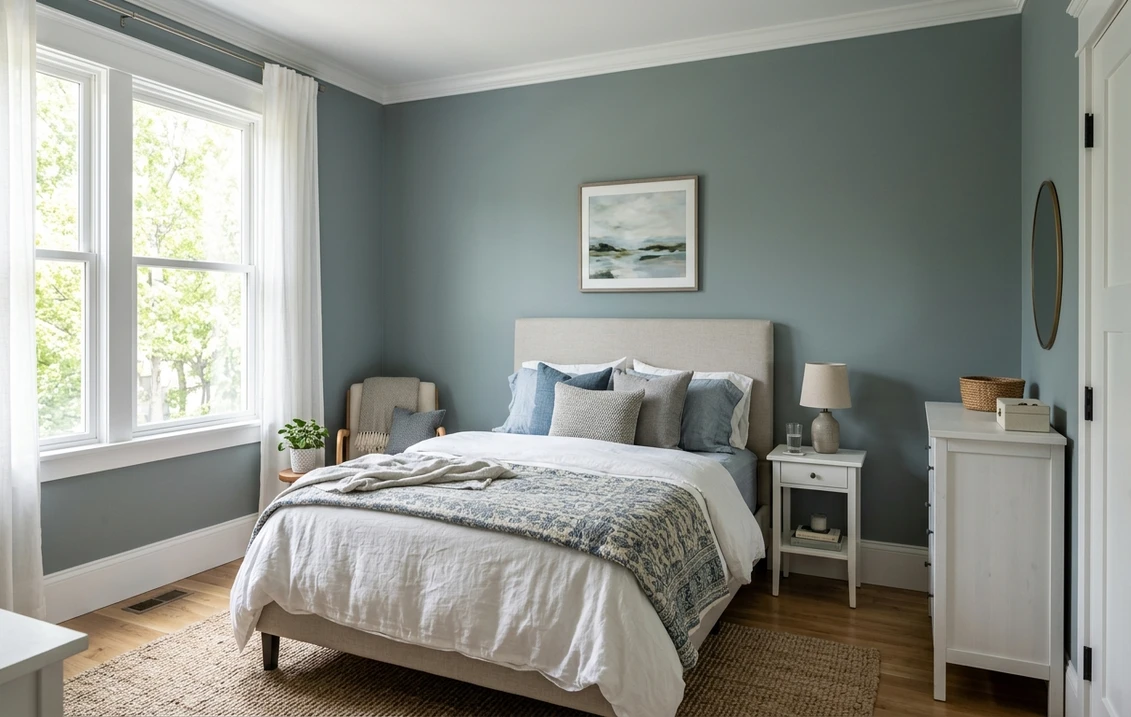
Bedrooms aiming for cocoon-like calm
In a bedroom with decent light, Van Courtland Blue reads serene and cocooning, the deeper, more enveloping cousin of the soft blues people usually choose for rest. It pairs beautifully with crisp white bedding, natural linen, and warm wood for a grounded, restful retreat. If a calm bedroom is your aim, our guide to calming master bedroom paint colors shows how a deep slate sits next to softer picks.
Where to think twice
A small, north-facing room with little natural light and only cool LED bulbs is where Van Courtland Blue can disappoint. There the green-gray takes over, the LRV 27 darkness closes the space in, and a room meant to feel cozy can feel murky and ambiguous instead. If you love the color but the room is dim, lean into the drama (dark room, warm bulbs, plenty of lamps) rather than fighting it, or save HC-145 for a brighter space and pick a lighter blue for the dim one.
Trim, ceiling, and decor pairings
A deep blue-green slate lives or dies on its contrast. Get the trim and ceiling right and Van Courtland Blue looks tailored and historic; get it wrong and it can read either flat or muddy.
- Soft warm white trim (most balanced): BM White Dove (OC-17, LRV 85) is the designer default. Its gentle cream bias warms the deep slate and gives a high-contrast, classic look that keeps the room from feeling cold. This is the safe, cohesive pick for most homes.
- Crisp white trim (cleaner, cooler): BM Chantilly Lace (OC-65) gives a bright, modern, gallery-clean edge and pushes Van Courtland toward its bluer side. Best for powder rooms and modern interiors.
- Tonal, low-contrast trim: for a moody, enveloping library feel, paint trim the same Van Courtland Blue in a satin finish. The wall-and-trim drench is one of the most striking ways to use HC-145.
- Avoid: a heavy yellow-cream antique white, which can make the slate read dirty and pull the green forward in an unflattering way.
- Ceilings: a clean white ceiling keeps a deep room from feeling like a box, while a tonal soft-blue or the same color overhead leans fully into the cozy cocoon effect.
- Floors and decor: warm oak, walnut, brass, aged bronze, rattan, and natural linen all flatter the dusty slate and reinforce the historic read. Crisp whites and a touch of warm metal keep it from feeling somber.
For a high-drama whole-home strategy, pair Van Courtland Blue with a deeper anchor elsewhere. If you want a true navy in the mix rather than this green-leaning slate, see our Benjamin Moore Hale Navy HC-154 review: it is the classic clean navy where Van Courtland is the dustier, greener, more historic alternative. And if you are building a deep-blue living room around it, our blue living room paint ideas show the color in context.
See walls, trim, and floor together in one preview. Free: 1 HD render plus 3 variations.
Van Courtland Blue vs its near twins
Van Courtland Blue lives in a crowded neighborhood of Benjamin Moore blue-greens, and it is constantly confused with three lighter relatives. The difference is almost entirely about depth and how much green shows. Here is how to tell them apart:
- vs BM Wythe Blue (HC-143): Wythe Blue is the lighter, greener, more cheerful cousin. At a much higher LRV it reads as a soft, dusty blue-green that brightens a room, almost a vintage robin's-egg. Van Courtland is far deeper and moodier, with the gray pulling it toward slate rather than sage. Pick Wythe Blue when you want a light, airy, retro blue-green; pick Van Courtland when you want depth and drama.
- vs BM Woodlawn Blue (HC-147): Woodlawn is a medium, soft spa blue with a gentle green whisper, much lighter and more conventionally "pretty blue" than Van Courtland. Woodlawn keeps a room open and calm; Van Courtland wraps and darkens it. They share a family resemblance, but Woodlawn is the easygoing everyday blue and Van Courtland is the statement.
- vs BM Philipsburg Blue (HC-159): the closest call. Philipsburg is a clearer, brighter, more saturated blue with less gray muddying it, so it stays more recognizably blue and feels a touch more lively. Van Courtland is dustier, grayer, and greener, reading more like aged slate than clean blue. Choose Philipsburg when you want the color to stay distinctly blue; choose Van Courtland when you want it knocked back into a quiet, historic teal-gray.
The simplest rule of thumb: if a Wythe, Woodlawn, or Philipsburg chip looks too light, too clean, or too obviously blue for the moody, aged room you are picturing, Van Courtland Blue HC-145 is almost certainly the deeper, dustier slate you actually want.
Spelling note: van cortland blue, BM van courtland blue, and van courtland blue benjamin moore all point to this same HC-145. The estate it is named for is spelled Van Cortlandt, which is why the alternate spelling keeps appearing in searches.
How to test Van Courtland Blue before you commit
A 2-inch fan-deck chip is the number-one reason people pick a deep blue-green that disappoints: it cannot show the green shift, and it makes the color look brighter and bluer than a finished wall in real light. Two better methods:
- Paint a large swatch: roll a 12-by-12-inch sample (or a peel-and-stick sample) on two different walls and check it mid-morning, mid-afternoon, and at night under your normal bulbs. Watch specifically for how green and how dark it goes in your dimmest corner; that corner tells you the truth about whether HC-145 will feel rich or murky in your room.
- Preview it digitally first: upload a real photo of your room and apply Van Courtland Blue, plus a lighter alternative like Wythe Blue and a cleaner one like Philipsburg, before you buy any samples. That narrows three contenders to the one worth painting. For the full repaint, pricing context is in our interior house painting cost guide for 2026.
Preview Van Courtland Blue against a lighter and a cleaner blue, side by side. Free.
Frequently asked questions
Is Van Courtland Blue blue or green?
Van Courtland Blue (HC-145) is fundamentally a blue with a strong green pull, all knocked back by gray, so it reads as a smoky blue-green slate rather than a pure color. In bright south or warm west light the blue holds and it looks like a deep steely teal-blue. In cool, dim, or north light the green surfaces and it drifts toward a sea-green slate. It is best described as a moody blue-green, never a clean blue and never a pure gray.
What is the LRV of Van Courtland Blue?
Van Courtland Blue has a Light Reflectance Value of about 27 on the Benjamin Moore color data, with a hex approximation of #6E7C7C (RGB 110, 124, 124). That makes it a genuinely deep, dramatic color: roughly half the reflectance of a light mid-gray, so it will wrap and darken a room. It rewards a space with good natural light and can feel murky in a small, dim, north-facing room.
What are the best rooms for Van Courtland Blue?
Studies, libraries, and home offices are its natural home, where the smoky slate-teal creates a focused, scholarly mood, especially on built-in bookcases. It also shines in dramatic dining rooms and jewel-box powder rooms used in the evening, and in bedrooms aiming for a cocoon-like calm. It is least reliable in small, dim, north-facing rooms with only cool LED light, where the green-gray dominates and the depth can feel heavy.
What trim color goes with Van Courtland Blue?
BM White Dove (OC-17) is the most balanced trim because its gentle cream bias warms the deep slate and gives a classic high-contrast look without feeling cold. BM Chantilly Lace (OC-65) is the crisper, cooler option for powder rooms and modern spaces. For a moody library effect, drench the trim in the same Van Courtland Blue. Avoid a heavy yellow-cream antique white, which can make the slate read dirty and pull the green forward.
What is the difference between Van Courtland Blue and Philipsburg Blue?
Philipsburg Blue (HC-159) is a clearer, brighter, more saturated blue with less gray, so it stays recognizably blue and feels livelier. Van Courtland Blue (HC-145) is dustier, grayer, and greener, reading more like aged slate than clean blue. Choose Philipsburg when you want the color to stay distinctly blue, and Van Courtland when you want a quiet, historic teal-gray with more depth and moodiness.
Preview BM Van Courtland Blue on your actual walls under your own light before buying a single sample. Free: 1 HD render plus 3 variations.
Disclaimer: Benjamin Moore, Van Courtland Blue (HC-145), Wythe Blue (HC-143), Woodlawn Blue (HC-147), Philipsburg Blue (HC-159), Hale Navy (HC-154), White Dove (OC-17), and Chantilly Lace (OC-65) are trademarks of Benjamin Moore & Co. FacadeColorizer is an independent paint visualization service and is not affiliated with, endorsed by, or sponsored by Benjamin Moore. Color reproduction on screens approximates the manufacturer's chip; always confirm with a manufacturer sample under your own light before purchase. Sources: Benjamin Moore HC-145 Van Courtland Blue color data 2026, Benjamin Moore HC-143 Wythe Blue, HC-147 Woodlawn Blue, and HC-159 Philipsburg Blue color data 2026, The Spruce blue-paint undertone coverage, designer field reports compiled by FacadeColorizer.
Trademarks mentioned (Sherwin-Williams, Benjamin Moore, Behr, Caparol, Brillux, Sto, Alpina, Valspar, PPG, Glidden, Dulux, Crown Trade, Sandtex, Farrow & Ball, Johnstone's, Leyland) are property of their respective owners. FacadeColorizer is independent and not affiliated with any of them. Nominative fair use under Lanham Act §1125.


