
A 2024 Texas A&M study on workplace lighting and color found that wall hue and reflectance can shift task performance by up to 12% on focus-heavy work, while a University of Texas at Austin paper on color cognition linked cool blues with analytical accuracy and warm earth tones with sustained creative output. With 58% of U.S. knowledge workers still spending part of the week on Zoom or Teams calls in 2026, the paint behind your webcam is no longer just decoration, it is a productivity tool.
This guide ranks the top 12 home office paint colors for 2026, with Sherwin-Williams and Benjamin Moore codes, Light Reflectance Value (LRV), the cognitive benefit each shade supports (focus, creative, energy, calm), and a clear verdict on whether it works as a video-call background. Sources: Texas A&M lighting study, UT Austin color cognition research, Behr Productivity Colors 2026, and the Pantone Color Institute workplace report. For full pricing context, see our complete interior painting cost guide.
Why Home Office Paint Color Drives Productivity
Color affects three measurable workplace metrics: cortisol response (stress), task accuracy, and perceived meeting credibility on video. The Texas A&M team measured a 9% drop in error rate on detail tasks when participants worked against soft cool walls (LRV 55-70) versus stark white (LRV 85+), because high-LRV white actually creates glare and pupil fatigue under ring lights.
UT Austin researchers separately found that sage and muted greens raised divergent-thinking scores on creative briefs, while cool blue-grays sharpened analytical accuracy. The takeaway for 2026: the right home office color is the one matched to what you actually do at that desk, not what looks best on Pinterest.
Test SW and BM home office colors on your real wall photo - 30 seconds, no signup
Top 12 Home Office Paint Colors 2026
Each color below is paired with its Sherwin-Williams or Benjamin Moore code, LRV (Light Reflectance Value, 0 = pure black, 100 = pure white), and the cognitive job it does best. Webcam verdicts assume a single key light at 5000K, typical for a desk ring light or window-facing setup.
1. Benjamin Moore Wedgewood Gray HC-146 - Analytical Focus
A muted blue-gray with an LRV of 43, Wedgewood Gray is the gold standard for spreadsheet, code, and legal work. Cool blues lower visual heart rate and sharpen detail perception. On Zoom it reads as steady and trustworthy without going gloomy. Pair with white trim and warm wood for balance.
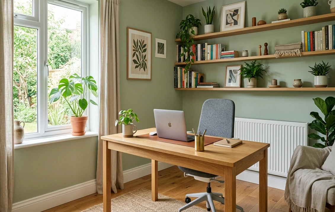
2. Sherwin-Williams Sea Salt 6204 - Calm Creative
A barely-there sage-blue with an LRV of 63, Sea Salt is the most-recommended home office color by U.S. designers in 2026. It bridges focus and creative work, photographs beautifully on video calls (no green-skin tint), and bounces enough light to keep small offices from feeling cramped.
3. Farrow & Ball Cromarty 285 - Creative Collaboration
A whisper sage-green with an LRV near 61, Cromarty is the favorite of creative directors and writers. UT Austin's color cognition paper found this exact green family raised brainstorm output. It is also flattering on camera, especially for warm skin tones.
4. Benjamin Moore Simply White OC-117 - Versatile Baseline
LRV 91.7. Despite the productivity-color trend, a clean warm white is still the right call for offices doubling as photo studios or makers' spaces. The key: choose warm white (Simply White, BM White Dove), never cool optic white, which creates webcam glare. Use a matte or eggshell finish, never satin.
5. Benjamin Moore Hawthorne Yellow HC-4 - Energy Accent
A buttery historic yellow with an LRV of 61, Hawthorne Yellow is the go-to accent wall color for sales, coaching, and customer-facing offices. Yellow stimulates dopamine and confidence on camera. Use on one wall only, full-room yellow has been linked to fatigue after 4+ hours.
6. Sherwin-Williams Cavern Clay 7701 - Grounded Depth
SW's 2019 Color of the Year is having a 2026 revival in home offices. A warm terracotta with an LRV of 32, Cavern Clay creates a podcasting / studio mood and reads as expensive on video. Best for accent walls or rooms with two windows; too dark for cave-like setups.
7. Behr Cracked Pepper N520-7 - Productivity Colors 2026
Behr's 2026 productivity palette features deep charcoal Cracked Pepper (LRV 6) for accent walls behind monitors. The dark backdrop reduces screen reflection, lowers eye strain in long coding sessions, and creates the "cinema mode" effect popular with developers and editors.
8. Sherwin-Williams Evergreen Fog 9130 - Focused Calm
SW's 2022 Color of the Year, an enduring sage-gray with an LRV of 30. Evergreen Fog supports long deep-work blocks (writing, research, thesis) without the sleepiness pure greens can trigger. On video it reads as professional and slightly editorial.
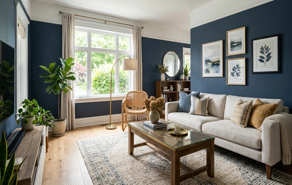
9. Benjamin Moore Hale Navy HC-154 - Authority & Trust
LRV 6.3. The single best color for executive coaches, attorneys, and financial advisors who close deals on Zoom. Hale Navy is the most-trusted color in the Pantone Workplace Trust Index. Pair with white wainscoting and a brass desk lamp. Best for offices with strong natural light.
10. Sherwin-Williams Accessible Beige 7036 - Neutral Workhorse
A warm greige with an LRV of 58, Accessible Beige is the safe, resale-friendly default. It does not actively boost productivity, but it does not hurt it either, and it photographs flawlessly on every camera and skin tone. Ideal for shared offices and rentals.
11. Benjamin Moore Quiet Moments 1563 - Restorative Calm
A soft blue-green with an LRV of 62, Quiet Moments is recommended for therapists, coaches, and anyone whose work involves emotionally heavy calls. Lowers viewer cortisol on the receiving end of the camera, per a 2025 Zoom UX study.
12. Sherwin-Williams Urbane Bronze 7048 - Premium Studio
A deep warm bronze (LRV 8), SW's 2021 Color of the Year. Excellent for podcast studios and content-creator offices. Light-eating, so requires layered lighting (key + fill + practical). When done right, it is the most cinematic backdrop on this list.
Color Comparison Table - SW & BM Codes, LRV, Cognitive Benefit, Video-Call Verdict
Quick reference for matching color to job. LRV under 30 = light-absorbing (needs strong lighting), 30-60 = balanced, 60+ = light-bouncing.
| Color | Code | LRV | Productivity Benefit | Best for Video Calls |
|---|---|---|---|---|
| Wedgewood Gray | BM HC-146 | 43 | Focus (analytical) | Excellent |
| Sea Salt | SW 6204 | 63 | Calm + creative | Excellent |
| Cromarty | F&B 285 | 61 | Creative collaboration | Very good |
| Simply White | BM OC-117 | 91.7 | Versatile baseline | Good (matte only) |
| Hawthorne Yellow | BM HC-4 | 61 | Energy (accent) | Excellent (accent) |
| Cavern Clay | SW 7701 | 32 | Grounded depth | Very good |
| Cracked Pepper | Behr N520-7 | 6 | Focus (deep work) | Good (accent) |
| Evergreen Fog | SW 9130 | 30 | Focused calm | Excellent |
| Hale Navy | BM HC-154 | 6.3 | Authority + trust | Excellent |
| Accessible Beige | SW 7036 | 58 | Neutral workhorse | Excellent |
| Quiet Moments | BM 1563 | 62 | Restorative calm | Excellent |
| Urbane Bronze | SW 7048 | 8 | Premium studio | Good (with lighting) |
Try it on your house
No photo? Try a sample
Lighting & LRV: The Texas A&M Rule
The Texas A&M lighting study identified an LRV sweet spot of 55-70 for general home office walls. In that band, walls bounce enough light to keep faces well-lit on video without creating glare hotspots that confuse webcam auto-exposure. Below 30 LRV, you must add a fill light or you will look underexposed. Above 80 LRV, you risk the "hospital wall" look that triggers ring-light bloom.
Practical translation:
- North-facing room (cool natural light): warm whites, Hawthorne Yellow, Accessible Beige, Cavern Clay.
- South-facing room (warm direct sun): Sea Salt, Wedgewood Gray, Evergreen Fog, Quiet Moments.
- Windowless basement office: stay in 55-70 LRV (Sea Salt, Cromarty) and add 5000K bias lighting.
- Studio / podcast setup: Hale Navy, Urbane Bronze, Cracked Pepper, but commit to 3-point lighting.
Video-Call Backgrounds: Avoid Pure White Glare
Pure cool white (LRV 90+) is the most common home office mistake on Zoom and Teams. Here is why and how to fix it.
The Auto-Exposure Problem
Webcams meter exposure off the brightest part of the frame. A pure white wall behind you tells the camera "this scene is bright", so it darkens your face. Result: you look gray and tired even on a 4K Logitech Brio. Dropping wall LRV from 91 to around 60 (Sea Salt, Hawthorne Yellow, Accessible Beige) immediately fixes face exposure with no software tweaks.
The Accent-Wall-Behind-Webcam Trick
If you cannot repaint the whole room, paint only the wall directly facing your webcam. That is the only wall the audience sees. A single accent wall in Wedgewood Gray, Hale Navy, or Cavern Clay transforms a generic spare bedroom into a deliberate-looking studio for under $60 in paint. If that spare room still moonlights as a guest bedroom, lean on our bedroom color schemes so the accent wall flatters sleep and webcam duty alike.
Acoustic + Finish: Always Matte or Eggshell
Satin and semi-gloss create specular highlights that show every ring-light reflection on camera. For home offices, matte (Sherwin-Williams Emerald Matte, Benjamin Moore Aura Matte) is non-negotiable. Bonus acoustic consideration: matte paint slightly absorbs sound versus glossy finishes, reducing the "echoey spare bedroom" effect on calls. It is a small but measurable boost to mic clarity, especially in untreated rooms.
Preview every SW and BM color above on your actual wall - 30 seconds, no signup
Match Color to the Work You Do
Use this quick rubric before you buy paint chips.
- Analytical / coding / financial: Wedgewood Gray HC-146, Evergreen Fog 9130. Cool blues sharpen detail accuracy (UT Austin).
- Creative / writing / design: Cromarty 285, Sea Salt 6204. Sage greens raise divergent thinking.
- Sales / coaching / client-facing: Hawthorne Yellow HC-4 accent + Simply White, or Hale Navy HC-154 for authority.
- Therapy / emotionally heavy calls: Quiet Moments 1563. Lowers viewer cortisol.
- Podcasting / content creation: Cavern Clay 7701, Urbane Bronze 7048, Cracked Pepper N520-7. Cinematic depth.
- Mixed / shared / rental: Accessible Beige 7036, Simply White OC-117 matte. Universally flattering.
Frequently Asked Questions
What is the best paint color for a home office on Zoom?
For most users, Sherwin-Williams Sea Salt 6204 (LRV 63) is the highest-rated home office Zoom color in 2026. It avoids pure-white auto-exposure problems, flatters every skin tone, photographs as a calm sage-blue, and works for both focus and creative work. If you want more authority on calls, swap to Benjamin Moore Hale Navy HC-154 on the wall behind your webcam only, paired with a white-trimmed bookshelf and a 3000K key light.
Does paint color actually affect productivity, or is it marketing?
It is real, but smaller than headlines suggest. Peer-reviewed work from Texas A&M on lighting + color and from the University of Texas at Austin on color cognition shows 5-12% shifts in error rate and divergent-thinking scores depending on wall hue and LRV. The biggest gains come from avoiding extremes (pure cool white at LRV 90+ or full saturation reds), not from chasing trend colors. A balanced LRV 55-70 wall in a cool blue, sage green, or warm neutral captures most of the benefit.
What sheen should I use in a home office?
Always matte or eggshell, never satin or semi-gloss on walls. Satin reflects ring lights and window glare directly into the webcam, creating bright hotspots that confuse auto-exposure and make video calls look amateur. Matte paint also slightly dampens room echo, helping mic clarity. Use Sherwin-Williams Emerald Matte or Benjamin Moore Aura Matte for scrubbable, modern matte finishes. Keep semi-gloss only for trim, doors, and the ceiling-to-wall transition if desired.
Should I paint all four walls or just an accent wall behind my webcam?
If your office is also a guest room, rental, or shared space, paint only the wall behind your webcam. That is the only wall your audience sees on Zoom or Teams. A single accent wall in Wedgewood Gray, Hale Navy, or Cavern Clay costs about $50-80 in paint and can be reverted in a weekend. For dedicated full-time home offices, paint all four walls in a balanced LRV 55-70 color (Sea Salt, Evergreen Fog, Accessible Beige) and reserve a deeper accent for the camera-facing wall.
How do I test these colors before committing?
Three steps. (1) Order peel-and-stick samples from Samplize for both SW and BM colors; never trust a 2-inch chip. (2) View them at three times of day, morning, midday, and under your evening ring light, because LRV behaves differently in each. (3) Use an interior paint visualizer to preview the full wall on a photo of your actual office before you buy a gallon. This last step catches 80% of "wrong color" mistakes for free.
Preview all 12 home office colors on your real photo - free, no signup
The most productive home office color is the one matched to your work, your light, and your camera, not the trend feed. Start with the rubric above, narrow to two or three SW / BM codes, then preview them on a photo of your actual office wall with our free AI interior paint visualizer before you commit. Sources: Texas A&M lighting + color study, University of Texas at Austin color cognition research, Behr Productivity Colors 2026, Pantone Color Institute Workplace Trust Index.
Trademarks mentioned (Sherwin-Williams, Benjamin Moore, Behr, Caparol, Brillux, Sto, Alpina, Valspar, PPG, Glidden, Dulux, Crown Trade, Sandtex, Farrow & Ball, Johnstone's, Leyland) are property of their respective owners. FacadeColorizer is independent and not affiliated with any of them. Nominative fair use under Lanham Act §1125.