
There is a particular kind of blue that does not announce itself, and Benjamin Moore Woodlawn Blue (HC-147) is the textbook example. I have brushed it onto bedroom and dining room walls for clients who asked for "a blue, but a soft, old-house blue, nothing loud," and it is almost always the chip they keep coming back to. Woodlawn Blue is a pale, serene powder blue from the Historical Color collection: a heritage hue with just enough gray and green folded in to keep it from ever turning sweet or babyish. The question buyers wrestle with is whether it reads more blue, more green, or more gray, and the honest answer is that it does all three depending on the light. Here is exactly how it behaves on a real interior wall.
A quick orientation first. Woodlawn Blue HC-147 carries a published LRV of about 62 and a hex approximation of #CAD3CC (RGB 202, 211, 204). That places it in the light, airy end of the color wheel: bright enough to keep a small room open, with enough body to read as a genuine soft color rather than a tinted white. The undertone is the whole story: a quiet powder blue softened by a green-gray cast that surfaces in dim light. This profile is one stop in our wider Benjamin Moore interior paint colors guide, and it sits naturally alongside the calmer blues in our roundup of the best blue paint color ideas for rooms. This page goes deep on the single color: undertone, light, rooms, trim, and the near-twins it gets confused with.
Upload a photo of your actual room and preview BM Woodlawn Blue under your own light in about 30 seconds. Free: 1 HD render plus 3 variations.
Woodlawn Blue at a glance: the numbers that matter
Before any opinions, here are the verifiable specs straight from the Benjamin Moore color library. These are the values you can take to a paint counter:
| Spec | Woodlawn Blue HC-147 |
|---|---|
| Color number | HC-147 (Historical Color collection) |
| LRV (Light Reflectance Value) | Approximately 62: light and airy, keeps a room open |
| Hex / RGB (approx.) | #CAD3CC / 202, 211, 204 |
| Color family | Soft powder blue with a green-gray cast |
| Primary undertone | Muted blue, softened by gray and a faint green |
| Best base / finish | Light tint base; matte or eggshell on walls, satin on trim and beadboard |
The takeaway: Woodlawn Blue is a muted, grayed blue, not a clean primary blue and not a true gray. At LRV 62 it is light enough to wrap a whole room without closing it in, yet it has enough pigment to read as a real color on the wall, especially in second coat. That green-gray softening is what gives it the calm, slightly dusty, period quality that makes it feel at home in a 1920s bungalow or a New England farmhouse. Lean into the softness and it is one of the most soothing blues Benjamin Moore makes; push it into a harsh cool room and the gray can flatten it.
Is Woodlawn Blue blue, green, or gray? The undertone, decoded
Woodlawn Blue is fundamentally a blue, but it is a blue wearing a sweater. The gray and the faint green are what mute it, and which of those three you notice depends almost entirely on light and on what hangs next to it. This shape-shifting is the number-one source of confusion in the reviews.
In bright, clean daylight the blue is clearly the lead note: the wall reads as a soft, serene sky blue with a hint of haze. As the light dims (an overcast afternoon, a north room, a hallway away from windows) the gray steps forward and Woodlawn Blue settles into a quiet, dusty blue-gray that looks distinctly more muted than the chip. In warm artificial light, especially at night, the faint green ghost can surface and the color drifts a half-step toward a soft seafoam or spa green. It rarely goes anywhere ugly, which is the heritage charm of the color, but you should expect it to read bluer by day and grayer or slightly greener by lamp light.
One practical warning. Because Woodlawn Blue is so muted, it can look almost like a pale gray on a tiny fan-deck chip held under store lighting, then bloom into a recognisable soft blue once it covers a whole wall. The reverse is also true: in a bright nursery or a south sunroom it can look more saturated and more sky-blue than the chip suggested. Never judge this one from the chip alone.
| Indoor light | How Woodlawn Blue reads |
|---|---|
| South-facing (bright, warm) | Its brightest, clearest read: a soft, sky-leaning powder blue, the most blue you will ever see it |
| West-facing (warm afternoon) | Warm late sun pulls out the green ghost slightly; reads soft and a touch seafoam after 4pm |
| East-facing (cool after noon) | Fresh and bluest in morning light, settles into a calmer blue-gray by afternoon |
| North-facing (cool, indirect) | Coolest and grayest read: the muted blue-gray dominates and the color can flatten if the room is dim |
| Warm 2700K bulbs | Softens and slightly greens the blue; cozy and historic, the most flattering evening look |
| Cool 4000K bulbs | Pushes it crisper and bluer, edging toward a clean coastal powder blue |
Sources: Benjamin Moore HC-147 color data 2026; designer field reports compiled by FacadeColorizer.
Free visualizer. See how blue, green, or gray it goes on your real walls before buying a sample pot.
Best rooms for Woodlawn Blue
Soft, restful, and a little nostalgic, Woodlawn Blue is at its best in rooms where the goal is calm rather than energy. It is not the bold accent blue you reach for to make a statement; it is the gentle, all-day color you live inside. Here is where it consistently earns its keep:
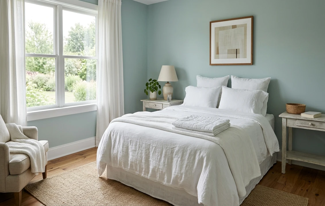
Bedrooms and nurseries
This is Woodlawn Blue's natural home. The muted powder blue reads serene and sleepy without being cold, the textbook palette for rest, and the green-gray softening keeps it from tipping into a sugary baby blue. It pairs beautifully with white linens, natural wood, and brass hardware. If a restful bedroom is your project, see how it sits beside other quiet picks in our guide to calming master bedroom paint colors.
Bathrooms and powder rooms
Against white subway tile, marble, and polished nickel, Woodlawn Blue reads spa-fresh and a little coastal, and at LRV 62 it keeps even a windowless bath feeling open. The faint green note actually flatters white and cream tile better than a cleaner blue would. It is a recurring favorite in our roundup of the best bathroom paint colors for 2026.
Dining rooms, hallways, and period homes
As a Historical Color, Woodlawn Blue belongs in older homes. It looks right at home in a colonial or Cape dining room with white wainscoting, in a hallway that needs a soft wash of color, or above board-and-batten in a mudroom. The muted heritage quality is exactly what makes it feel period-correct rather than trendy.
Where to think twice
A small, dim, north-facing room lit only by cool LEDs is where Woodlawn Blue can lose its charm: the gray takes over, the blue flattens, and the room can feel cold and washed out. If that is your space, switch to 2700K bulbs to revive the warmth, or choose a slightly warmer or more saturated blue. Woodlawn rewards light, so do not bury it in a cave.
Trim, ceiling, and decor pairings
A soft, muted blue lives or dies on what frames it. Get the trim right and Woodlawn Blue looks intentional and serene; get it wrong and it can read either flat or faintly dingy.
- Soft warm white (most balanced): BM White Dove (OC-17, LRV 85) is the designer default. Its gentle cream bias warms the room just enough to keep Woodlawn's gray from going cold, while staying clean. The safest, most cohesive pick for a period home.
- Crisp white (cleaner, cooler): BM Chantilly Lace (OC-65) gives a bright, modern edge and pushes Woodlawn toward its coastal, powder-blue side. Best for bathrooms and lighter, brighter rooms.
- Warm white with body: BM Simply White (OC-117) or Cloud White (OC-130) lean a little soft and creamy, reinforcing the heritage, lived-in feel in a dining room or bedroom.
- Avoid: a stark blue-white trim, which can make Woodlawn Blue look gray and tired by comparison, draining the warmth out of an already muted color.
- Ceilings: a clean soft white (often the trim color) keeps the room airy. Painting the ceiling a whisper of the wall color is a classic period move for a soft, enveloping bedroom.
- Floors and decor: warm oak, honey-toned wood, natural rattan, brass, and cream linen all flatter Woodlawn Blue and reinforce the cozy heritage read. Crisp navy, soft greens, and terracotta accents all play beautifully against it.
For contrast, a deep navy on a door or built-in reads tailored and classic against the soft walls. If you want to see how that deeper anchor behaves, our Benjamin Moore Hale Navy HC-154 review covers the navy most often paired with light heritage blues.
See walls, trim, and floor together in one preview, free.
Woodlawn Blue vs the BM blues people confuse it with
Almost every Woodlawn Blue search ends in a side-by-side, because Benjamin Moore makes a whole family of soft historic blues that look nearly identical on a tiny chip. Here is how to tell the three near-twins apart on a real wall.
- vs BM Yarmouth Blue (HC-150): the most common mix-up, and the two sit at almost the same depth (Yarmouth around LRV 56, Woodlawn 62). Yarmouth reads cleaner and more clearly blue, a more pastel, slightly cooler powder blue with less gray. Woodlawn is the more muted of the two, with that green-gray softening Yarmouth lacks, so it reads dustier and a touch greener. Choose Yarmouth for a crisper, more obviously blue nursery or bath; choose Woodlawn when you want a calmer, dustier, more heathered heritage feel.
- vs BM Wythe Blue (HC-143): not really a twin once you see them together, but constantly cross-shopped. Wythe Blue is much deeper and far greener, a saturated blue-green that reads moody and distinctly colonial on a full wall. Woodlawn is the pale, soft, barely-there version. Pick Wythe when you want a color that fills the room and makes a statement; pick Woodlawn when you want a quiet wash that disappears into calm.
- vs BM Van Courtland Blue (HC-145): the deeper, more dramatic cousin. Van Courtland is a richer, smokier slate-blue with real saturation, the kind of blue you use to make a library or dining room feel enveloping. Woodlawn is the light, airy member of the same historic blue family. Think of Van Courtland as the evening version and Woodlawn as the morning version of a similar blue idea.
If you want the broader map of where Woodlawn sits among grays and greige neutrals it often borders, our interior gray paint shades guide is a useful companion, since Woodlawn reads almost gray in its coolest, dimmest rooms.
Spelling note: woodlawn blue benjamin moore, BM Woodlawn Blue HC-147, and woodlawn blue paint all point to this same HC-147.
How to test Woodlawn Blue before you commit
Because Woodlawn Blue shifts between blue, green, and gray, it is one of the easiest colors to get wrong from a chip. Two reliable ways to be sure:
- Paint a large swatch: roll a 12-by-12-inch sample (or a peel-and-stick sample) on two different walls and check it mid-morning, mid-afternoon, and at night under your normal bulbs. Watch specifically for the green ghost in evening light and for how gray it goes in your dimmest corner; those two moments tell you the truth about this color in your home.
- Preview it digitally first: upload a real photo of your room and apply Woodlawn Blue alongside its near-twins (a lighter Yarmouth and a deeper Wythe), so you can narrow three look-alikes to the one worth a sample pot. For the full repaint budget, our interior house painting cost guide for 2026 has the per-room numbers.
Preview Woodlawn Blue against Yarmouth and Wythe, side by side, free.
Frequently asked questions
Is Woodlawn Blue blue, green, or gray?
Woodlawn Blue (HC-147) is fundamentally a soft, muted powder blue, but it is softened by gray and a faint green that surface in different light. In bright daylight the blue leads and it reads as a serene sky blue; in dim or north light the gray takes over and it reads as a dusty blue-gray; under warm evening bulbs the green ghost can appear and it drifts toward a soft seafoam. It rarely goes anywhere unflattering, which is the charm of this heritage color.
What is the LRV of Woodlawn Blue?
Woodlawn Blue has a Light Reflectance Value of about 62 on the Benjamin Moore color data, with a hex approximation of #CAD3CC (RGB 202, 211, 204). That makes it a light, airy soft blue: bright enough to keep a small room open and reflective, but with enough pigment to read as a genuine color on the wall rather than washing out like a tinted white.
What is the difference between Woodlawn Blue and Yarmouth Blue?
Yarmouth Blue (HC-150, around LRV 56) and Woodlawn Blue (HC-147, LRV 62) sit at almost the same depth, so the difference is undertone. Yarmouth reads cleaner and more clearly blue, a more pastel and slightly cooler powder blue with less gray. Woodlawn is more muted, with a green-gray softening that Yarmouth lacks, so it reads dustier and a touch greener. Choose Yarmouth for a crisper, more obviously blue nursery or bathroom, and Woodlawn when you want a calmer, dustier, more heathered heritage feel.
What are the best rooms for Woodlawn Blue?
Bedrooms, nurseries, bathrooms, powder rooms, and dining rooms in older homes are where Woodlawn Blue shines, because its muted, restful powder blue reads serene and a little nostalgic without going cold or babyish. It is least reliable in small, dim, north-facing rooms lit only by cool LEDs, where the gray dominates and the blue can flatten; warmer 2700K bulbs or a slightly more saturated blue help there.
What trim color goes with Woodlawn Blue?
BM White Dove (OC-17) is the most balanced trim because its gentle cream bias warms the room just enough to keep Woodlawn's gray from reading cold while staying clean. BM Chantilly Lace (OC-65) is the crisper, cooler option that pushes Woodlawn toward its coastal side, while Simply White and Cloud White lean soft and creamy for a heritage room. Avoid a stark blue-white trim, which can make Woodlawn look gray and tired by contrast.
Preview BM Woodlawn Blue on your actual walls under your own light before buying a single sample. Free: 1 HD render plus 3 variations.
Disclaimer: Benjamin Moore, Woodlawn Blue (HC-147), Yarmouth Blue (HC-150), Wythe Blue (HC-143), Van Courtland Blue (HC-145), White Dove (OC-17), Chantilly Lace (OC-65), Simply White (OC-117), Cloud White (OC-130), and Hale Navy (HC-154) are trademarks of Benjamin Moore & Co. FacadeColorizer is an independent paint visualization service and is not affiliated with, endorsed by, or sponsored by Benjamin Moore. Color reproduction on screens approximates the manufacturer's chip; always confirm with a manufacturer sample under your own light before purchase. Sources: Benjamin Moore HC-147 Woodlawn Blue color data 2026, Benjamin Moore HC-150 Yarmouth Blue, HC-143 Wythe Blue, and HC-145 Van Courtland Blue color data 2026, designer field reports compiled by FacadeColorizer.
Trademarks mentioned (Sherwin-Williams, Benjamin Moore, Behr, Caparol, Brillux, Sto, Alpina, Valspar, PPG, Glidden, Dulux, Crown Trade, Sandtex, Farrow & Ball, Johnstone's, Leyland) are property of their respective owners. FacadeColorizer is independent and not affiliated with any of them. Nominative fair use under Lanham Act §1125.


