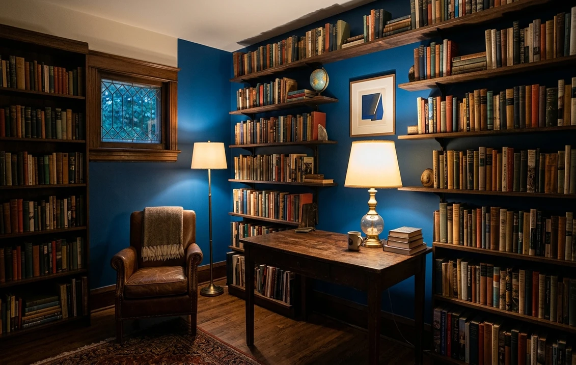

Benjamin Moore Providence Blue (1636) is the color homeowners reach for when a soft coastal blue feels too timid and a navy feels too safe. It is a vivid, saturated mid-to-deep blue with real backbone: bold enough to turn a dining room or a powder room into a moment, but stopping short of the inky near-black where navies live. I have brushed it onto cabinet fronts, accent walls, and whole studies, and the same thing happens every time the homeowner walks back in: they expect dark, and instead they get rich and almost jewel-like. The recurring search question is whether 1636 is simply too dark to live with. The honest answer depends entirely on your light, and on how much you commit. Here is how Providence Blue actually behaves on an interior wall.
Quick orientation before the deep dive. Providence Blue 1636 carries an LRV of about 13 and a hex approximation of #2E4A6B (RGB 46, 74, 107). That puts it firmly in the deep-color category: it absorbs a lot of light, so it reads as a true statement blue rather than a wall you forget. The undertone is a clean, slightly cool blue with the faintest cooler-violet edge in shade, and crucially less gray haze than its softer strip-mates. That relative clarity is what gives 1636 its almost-royal vibrancy. This profile is one stop in our wider Benjamin Moore interior paint colors guide, and it sits among the deeper end of our best interior blue paint shades for 2026.
Upload a photo of your actual room and preview BM Providence Blue 1636 under your own light in about 30 seconds, free.
Providence Blue at a glance: the numbers that matter
Before opinions, here are the verifiable specs straight from the Benjamin Moore color library. These are the values you can take to a paint counter:
| Spec | Providence Blue 1636 |
|---|---|
| Color number | 1636 (Color Preview collection) |
| LRV (Light Reflectance Value) | Approximately 13: a deep, light-absorbing statement blue |
| Hex / RGB (approx.) | #2E4A6B / 46, 74, 107 |
| Color family | Vivid mid-to-deep blue |
| Primary undertone | Clean cool blue, with a faint cooler-violet edge in shade |
| Best base / finish | Deep tint base; matte or eggshell on walls, satin or semi-gloss on cabinets and trim |
The takeaway from those numbers: Providence Blue is a deep color, not a mid-tone. At LRV 13 it absorbs far more light than a grayed denim blue and lands closer to the territory of a navy in sheer depth, yet it stays distinctly blue rather than tipping toward black. The relatively clean undertone (less of the dusty gray that muffles softer blues) is the whole identity. It is why 1636 can look genuinely vivid and almost royal in good light, and also why it demands a deep base and a generous two coats to read true. Skimp on the base or the coats and you get a patchy, slightly chalky version of a color that is supposed to be lush.
Is Providence Blue too dark? The undertone, decoded
Providence Blue is a deep, saturated color, full stop. Anyone calling it a soft or easygoing mid-blue is underselling how much presence it brings. But deep is not the same as gloomy, and the difference is exactly what separates a room that looks rich and tailored from one that feels like a cave. Here is what is happening underneath.
The blue is the loud, dominant note, and it is cleaner than most blues on the same strip because there is comparatively little gray pulling it toward dusty. In bright, direct light the blue lifts and turns vivid, almost cobalt-meets-royal, with the saturation really showing off. As light drops, in shade, at dusk, or in a north room, the color deepens and a faint cooler edge creeps in: not a true purple, but a slate-violet whisper that keeps 1636 from looking flatly primary. It never goes teal or green, which is what distinguishes it from blues with a green ghost, and it never goes warm. This is a committed cool blue from every angle.
Watch out for one quirk specific to deep colors like this. Providence Blue looks brighter and more royal on a tiny fan-deck chip than it does as a finished wall, because a small chip catches edge light that a full wall does not. On a real wall the same color reads deeper and a half-step moodier than the chip promised, especially on the wall farthest from the window. Plan for the room to come out darker and richer than the swatch suggested, not lighter.
| Indoor light | How Providence Blue reads |
|---|---|
| South-facing (bright, warm) | At its most vivid and royal; the saturation really sings and the depth feels luxe rather than heavy |
| West-facing (warm afternoon) | Glows richer and slightly warmer in late sun, then deepens fast once the sun drops |
| East-facing (cool after noon) | Clean and bright in the morning, settling into a deeper, moodier blue through the afternoon |
| North-facing (cool, indirect) | Coolest and deepest; the slate-violet edge shows most here, so lean into the drama or add warm light |
| Artificial light at night | Warm 2700K bulbs make it cozy and jewel-like; cool 4000K bulbs push it crisper, cooler, and a touch flatter |
Sources: Benjamin Moore 1636 color data 2026; The Spruce blue-paint undertone coverage; designer field reports compiled by FacadeColorizer.
Free AI visualizer. Test Providence Blue on your real walls before buying a single sample pot.
Best rooms for Providence Blue
Deep, clean, and confidently blue, Providence Blue is happiest in rooms where you want a wrap of color to set a mood, not a neutral backdrop. It rewards commitment: this is a color you wrap a whole room in, paint onto cabinets, or feature on a bold wall, rather than dab on one timid corner. Here is where it consistently earns its keep:
Dining rooms and studies
This is Providence Blue's strongest play. In a dining room the deep, vivid blue reads dramatic and intimate by candlelight or warm pendant light, flattering skin tones and making brass, gold, and warm wood pop. In a home office or study the same depth feels focused and grown up, the kind of saturated color that makes a small room feel like a deliberate jewel box rather than an undersized leftover. Wrap the trim and ceiling in the same blue for a tone-on-tone wrap and the room reads expensive.
Powder rooms and accent walls
A windowless powder room is the perfect place to go bold, because you are not fighting to keep it bright; you are leaning into the moody glamour. Providence Blue against a white pedestal sink, brass fixtures, and a gilt mirror is a five-minute showstopper. As an accent wall behind a bed or a bookcase, the saturation gives instant depth without the funereal weight of a true navy. For more ways to use deep blue in a wet space, our roundup of best blue bathroom paint ideas for 2026 shows how it sits among lighter options.
Cabinetry and built-ins
On kitchen islands, lower cabinets, a bar, or a built-in bookcase, Providence Blue is a stunner. The clean, vivid blue is more energetic than a safe navy and reads custom rather than catalog. In satin or semi-gloss it catches light beautifully on a cabinet face. Pair it with white uppers and warm brass hardware for a classic, slightly preppy contrast that does not feel dated.
Where to think twice
A large, low-light family room where you want softness and easy daily living is not 1636's natural home; at LRV 13 it will eat the available light and can feel heavy across big square footage. If you want a blue you can put on every wall of a sunny-but-not-bright bedroom and relax with, a grayed mid-blue is the smarter call. And in a strictly cool-LED, north-facing room with no warm light, Providence Blue can read cold and a touch flat. Add 2700K bulbs and warm textiles, or step toward a softer blue, if cozy is the goal.
Trim, ceiling, and decor pairings
A deep, clean blue lives or dies on what frames it. Get the trim right and Providence Blue looks rich and intentional; get it wrong and it can read either harsh or strangely muddy.
- Crispest contrast: BM Chantilly Lace (OC-65) is the bright, clean white that gives the sharpest blue-and-white edge. Best when you want a fresh, classic, slightly preppy look on cabinets and trim.
- Softer, cozier white: BM White Dove (OC-17, LRV 85) takes a little of the hard edge off and makes a study or dining room feel more enveloping while still reading clearly white.
- Tone-on-tone wrap (most luxe): take Providence Blue onto the trim and ceiling for a fully wrapped powder room or study; the absence of contrast makes a small room feel like a deliberate jewel box.
- Avoid: a heavy antique-cream or builder beige trim next to 1636. The yellow-warm cast fights the clean cool blue and can make the wall look duller and slightly dingy by comparison.
- Ceilings: a crisp white ceiling keeps a deep-blue room from feeling like a box; in a tone-on-tone wrap the matching blue ceiling reads cocooning. A dull builder white can look gray against this much saturation, so favor a clean white.
- Floors and decor: warm wood, brass and gold, cane, white marble, and natural linen all flatter the clean blue. Cool chrome and stark gray can make a north room feel clinical; warm metals are the better partner here.
If you decide 1636 is one step too vivid or too deep, its closest restrained relative in the navy family is covered in our Benjamin Moore Hale Navy HC-154 review, and the broader field of deep options sits in our best interior navy paint colors guide.
See walls, trim, and ceiling together in one preview, free.
Providence Blue vs the colors people confuse it with
Because 1636 sits between a mid-blue and a navy, nearly every search ends in a side-by-side. The three comparisons that matter most indoors:
- vs BM Brittany Blue (1633): the closest near-twin, since both live on the same color strip. Brittany Blue is the lighter, softer, more grayed step (LRV near 30), reading as a livable medium denim you can relax with on every wall. Providence Blue is the deeper, cleaner, more saturated step (LRV near 13) with less gray and more vivid backbone. Choose Brittany for an everyday mid-blue bedroom; choose Providence when you want jewel-box drama and depth.
- vs BM Van Courtland Blue (HC-145): Van Courtland is a muted, slightly grayed historic blue with a soft, calm, almost dusty character that reads gentle and traditional. Providence Blue is markedly cleaner, more vivid, and more energetic, with none of Van Courtland's restrained haze. Pick Van Courtland for quiet, period-correct calm; pick Providence when you want the blue to feel rich and alive.
- vs BM Hale Navy (HC-154): Hale Navy is the classic deep navy, darker still and noticeably grayer, the safe near-black blue that reads timeless and conservative. Providence Blue is lighter than Hale Navy and far more clearly, vividly blue rather than near-black. Choose Hale Navy for an understated, classic deep blue; choose Providence when you want the saturation and color to actually show.
Spelling note: providence blue 1636, BM Providence Blue, and Providence Blue Benjamin Moore all point to this same Color Preview 1636.
How to test Providence Blue before you commit
A 2-inch fan-deck chip is the number-one reason people misjudge a deep blue: it exaggerates the brightness and cannot show how much darker and moodier 1636 reads as a full wall away from the window. Two better methods:
- Paint a large swatch: roll a 12-by-12-inch sample (or a peel-and-stick sample) on two different walls, including the one farthest from your window, and check it mid-morning, mid-afternoon, and at night under your normal bulbs. Watch specifically how deep it goes in your darkest corner; that corner tells you whether the room will feel rich or heavy.
- Preview it digitally first: upload a real photo of your room and apply Providence Blue (plus a lighter alternative like Brittany Blue and a darker one like Hale Navy) before you buy any samples, narrowing three contenders to the one worth painting. Pricing context for the full repaint is in our interior house painting cost guide for 2026, and if a calmer bedroom is the goal, our calming master bedroom paint colors guide shows where a deep blue fits.
Preview Providence Blue against a lighter and a deeper blue, side by side, free.
Frequently asked questions
Is Providence Blue 1636 too dark?
Providence Blue 1636 is a deep, saturated blue with an LRV of about 13, so it does absorb a lot of light and will read dark in a low-light room. But it is not gloomy: it stays clearly, vividly blue rather than tipping toward black, which keeps it feeling rich rather than heavy. It shines in dining rooms, studies, powder rooms, and on cabinetry where you want drama. In a large, dim family room it can feel heavy, and a grayed mid-blue is the easier choice there.
What is the LRV of Providence Blue?
Providence Blue 1636 has a Light Reflectance Value of about 13, with a hex approximation of #2E4A6B (RGB 46, 74, 107). That makes it a genuinely deep statement color: it absorbs far more light than a soft or grayed mid-blue, so it reads as a rich, vivid wall, while still staying lighter and clearly more blue than a true navy. Because of that low LRV it does best in rooms with decent natural or warm artificial light.
What are the best rooms for Providence Blue?
Dining rooms, home offices and studies, powder rooms, accent walls, and cabinetry are where Providence Blue shines, because its deep, clean, vivid blue reads dramatic, intimate, and custom. It flatters brass, gold, and warm wood and feels jewel-like by warm light. It is least reliable across large, dim family rooms where its depth can feel heavy, and in strictly cool-LED north rooms where it can read cold and flat; warm 2700K bulbs and warm textiles fix that.
What trim color goes with Providence Blue?
BM Chantilly Lace (OC-65) gives the crispest, cleanest blue-and-white contrast, ideal on cabinets and trim. BM White Dove (OC-17) is the cozier choice, softening the edge for a study or dining room while still reading white. For the most luxe look, wrap the trim and ceiling in Providence Blue itself for a tone-on-tone powder room. Avoid heavy antique-cream or builder beige trim, which fights the clean cool blue and can make it look dull.
What is the difference between Providence Blue and Brittany Blue?
Brittany Blue 1633 and Providence Blue 1636 sit on the same Benjamin Moore color strip, so they are close near-twins. Brittany Blue is the lighter, softer, more grayed step (LRV near 30), a livable medium denim you can relax with on every wall. Providence Blue is the deeper, cleaner, more saturated step (LRV near 13) with less gray and more vivid backbone. Choose Brittany for an everyday mid-blue bedroom, and Providence for jewel-box drama in a dining room, study, or powder room.
Preview BM Providence Blue 1636 on your actual walls under your own light before buying a single sample.
Disclaimer: Benjamin Moore, Providence Blue (1636), Brittany Blue (1633), Van Courtland Blue (HC-145), Hale Navy (HC-154), White Dove (OC-17), and Chantilly Lace (OC-65) are trademarks of Benjamin Moore & Co. FacadeColorizer is an independent paint visualization service and is not affiliated with, endorsed by, or sponsored by Benjamin Moore. Color reproduction on screens approximates the manufacturer's chip; always confirm with a manufacturer sample under your own light before purchase. Sources: Benjamin Moore 1636 Providence Blue color data 2026, Benjamin Moore 1633 Brittany Blue, HC-145 Van Courtland Blue, and HC-154 Hale Navy color data 2026, The Spruce blue-paint undertone coverage, designer field reports compiled by FacadeColorizer.
Trademarks mentioned (Sherwin-Williams, Benjamin Moore, Behr, Caparol, Brillux, Sto, Alpina, Valspar, PPG, Glidden, Dulux, Crown Trade, Sandtex, Farrow & Ball, Johnstone's, Leyland) are property of their respective owners. FacadeColorizer is independent and not affiliated with any of them. Nominative fair use under Lanham Act §1125.


