
Benjamin Moore Cushing Green (HC-125) is one of those quiet Historical Colors that almost nobody picks off a fan deck and almost everybody loves once it is on the wall. It is a soft, grayed sage: green enough to read as a real color, gray enough that it never tips into mint, fern, or anything you would call bright. I think of it as the green you choose when you want a room to feel calm, grounded, and a little old-soul, without committing to a deep moody forest. The question most people type into a search bar is whether it reads more green or more gray, and whether that mid-tone depth will make a room feel dark. The honest answer depends on your light, and this page walks through exactly how Cushing Green behaves indoors.
Quick orientation before the deep dive. Cushing Green HC-125 has a published LRV of about 27 and a hex approximation of #84897A (RGB 132, 137, 122). That places it firmly in mid-tone territory: not a pastel and not a near-black, but a real, sittable depth of color that holds its own on a full wall. The undertone is a muted sage green softened by a strong gray base, with a faint warmth that keeps it from going cold. This profile is one stop in our wider Benjamin Moore interior paint colors guide, and it sits in the same calm-sage family as our Benjamin Moore October Mist 1495 review, which covers a much lighter, airier sage. Cushing is the deeper, more saturated cousin.
Upload a photo of your actual room and preview BM Cushing Green under your own light in about 30 seconds, free.
Cushing Green at a glance: the numbers that matter
Before opinions, here are the verifiable specs straight from the Benjamin Moore color library. These are the values you can take to a paint counter:
| Spec | Cushing Green HC-125 |
|---|---|
| Color number | HC-125 (Historical Color collection) |
| LRV (Light Reflectance Value) | Approximately 27: mid-tone, has real depth on a full wall |
| Hex / RGB (approx.) | #84897A / 132, 137, 122 |
| Color family | Muted gray-sage green |
| Primary undertone | Soft sage with a heavy gray base and a quiet warmth |
| Best base / finish | Medium tint base; matte or eggshell on walls, satin on trim and cabinets |
The takeaway from those numbers: at LRV 27, Cushing Green is meaningfully darker than the popular pale sages people often expect from the word "sage." That depth is the point. It gives a room a cocooning, grounded feeling and lets the color read as historic and intentional rather than washed out. It also means light matters more than usual here: in a dim room the depth can swallow the wall, while in a bright room the gray-sage stays soft and sophisticated. The undertone identity is "green held back by gray," and that restraint is exactly why designers reach for it when a brighter sage would feel too sweet.
Is Cushing Green more green or more gray? The undertone, decoded
Cushing Green is a green, but it is a green that has been deliberately muddied with gray, and that balance shifts dramatically with light. Understanding the seesaw between the green and the gray is the whole game with this color.
In bright, warm light the green wins. South and west exposures pull the sage forward, and the wall reads as a clear, soft, slightly olive-leaning green with a calm earthiness. In cool or weak light the gray takes over: north rooms and overcast days drain the warmth out and the wall can read almost like a green-gray or a "greige with attitude," where you have to look twice to be sure it is green at all. There is no purple or blue ghost to worry about, which makes Cushing easier to live with than many mid-tone greens, but the green-versus-gray read genuinely flips with your exposure.
Watch out for one quirk specific to this depth. Because LRV 27 absorbs a fair amount of light, Cushing Green photographs and chips lighter and grayer than it lands as a finished, rolled wall. The actual painted wall usually reads a touch deeper and a touch greener than the swatch suggests, especially in a room with good natural light. If you are choosing from a Pinterest image alone, assume the real wall will have more color and more presence than the photo promised.
| Indoor light | How Cushing Green reads |
|---|---|
| South-facing (bright, warm) | Clearest, softest sage; the green steps forward and looks rich but calm |
| West-facing (warm afternoon) | Warm and slightly olive in late sun, its coziest and most flattering read |
| East-facing (cool after noon) | Fresh sage in morning, drifts grayer and quieter by afternoon |
| North-facing (cool, indirect) | Grayest and moodiest; can read as a green-gray, lean into it as a cozy feature |
| Artificial light at night | Warm 2700K bulbs deepen the sage and add coziness; cool 4000K bulbs flatten it toward gray-green |
Sources: Benjamin Moore HC-125 color data 2026; designer field reports on Historical Color sages compiled by FacadeColorizer.
Free AI visualizer. Test Cushing Green on your real walls before buying a single sample pot.
Best rooms for Cushing Green
At LRV 27, Cushing Green is a depth-of-color play, not a barely-there neutral. It rewards rooms where you want atmosphere, grounding, and a sense of age. Here is where it consistently earns its keep:
Studies, libraries, and dens
This is Cushing Green's strongest room. The grayed sage wraps a study or home office in a quiet, focused, slightly traditional mood, especially when paired with wood shelving, leather, and brass. The mid-tone depth reads cozy rather than dark in a room you do not need to feel airy. It is the green for a space that should feel like a retreat.
Kitchen cabinets and islands
Sage cabinetry is everywhere right now, and Cushing Green is a smarter pick than the predictable bright sages because the gray base keeps it timeless instead of trend-bound. On lower cabinets or a kitchen island under warm-white quartz, it reads earthy and high-end. If a green kitchen is your project, our guide to a green kitchen paint ideas for 2026 shows how this depth of sage sits next to lighter and bolder options.
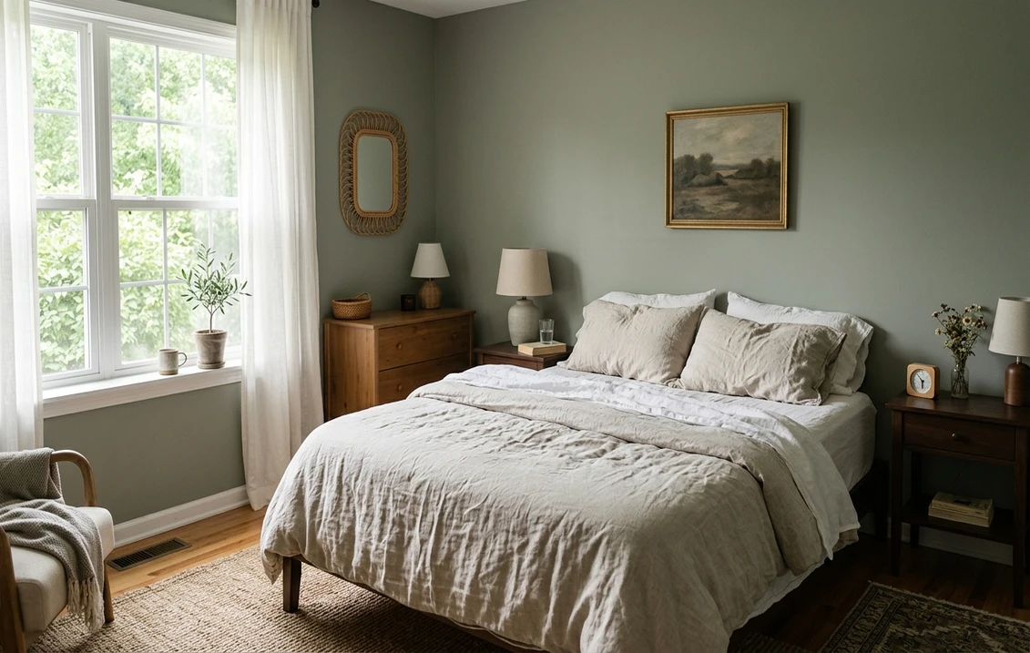
Bedrooms and dining rooms wanting cocoon and calm
In a bedroom the muted sage reads restful and enveloping, the kind of color that makes a room feel like it is hugging you at night. In a dining room the same depth feels intimate and a little formal under candlelight or a warm fixture. For more sage-toned bedroom directions, our roundup of green bedroom paint ideas puts Cushing in context with its lighter relatives.
Where to think twice
A small, dim, north-facing room with weak natural light is where Cushing Green can read flat and muddy, the sage collapsing into a heavy gray that feels closed-in. If that is your room and you still want sage, drop to a much lighter shade like October Mist instead, or commit to the depth and lean into a cozy, layered look with plenty of warm lamplight. Cushing is not the color to make a dark room feel bigger.
Trim, ceiling, and decor pairings
A mid-tone gray-sage lives or dies on what frames it. Get the trim right and Cushing Green looks historic and intentional; get it wrong and it can read either cold or dull.
- Soft warm trim (most balanced): BM White Dove (OC-17, LRV 85) is the designer default. Its gentle cream bias keeps Cushing's sage warm and friendly, and the high-contrast white pops the green crisply. This is the safe, cohesive pick for most homes. We break it down fully in our White Dove OC-17 review.
- Creamy historic trim (warmer, more period): BM Simply White (OC-117) or a soft ivory pushes the room further toward a warm, old-house feeling, which suits Cushing's Historical Color heritage.
- Avoid: a stark, blue-white trim like a contractor builder white next to Cushing Green. The cool white can drain the warmth out of the sage and leave the walls reading gray and slightly grim.
- Ceilings: a warm white (often the trim color) keeps the room from feeling top-heavy. In a study or den, a tone-on-tone ceiling in a lighter sage can make the whole space feel custom.
- Floors and decor: warm wood (white oak, walnut), brass and antique gold, cane, leather, and creamy linen all flatter Cushing Green and reinforce its earthy, lived-in read. Terracotta, rust, and warm clay accents are a natural complement; cool chrome and stark black can feel a touch hard against it.
For a fuller decorating map, our guide to the best interior sage green shades and pairings shows how Cushing relates to the wider sage family, and our interior green paint shades guide places it among the year's other greens.
See walls, trim, and floor together in one preview, free.
Cushing Green vs the two HC sages people confuse it with
Cushing Green sits between two near-identical-sounding Historical Color sages, and the side-by-side is where almost every search ends. Here is exactly how the three differ:
- vs BM Caldwell Green (HC-124): the closest call, one number down on the deck, and the two sit at virtually the same depth (both around LRV 27). The difference is undertone, not value: Caldwell is the warmer, more olive-and-gold one, with a thread of muted gold that makes it read mossier and more saturated, while Cushing is the cooler, fresher gray-sage with the gray pulling a hair more blue-green. Where Caldwell leans into "green room," Cushing stays in "gray-sage that happens to be green." Choose Caldwell when you want warmth and an olive-gold glow; choose Cushing when you want the same family but cooler, quieter, and easier to pair with existing decor. Because the depth is so close, sample both on the same wall.
- vs BM Hollingsworth Green (HC-141): Hollingsworth is the brighter, fresher, more openly green sibling, with a cleaner sage clarity and less of the dusty gray that defines Cushing. Hollingsworth reads younger and more obviously "green," while Cushing reads older, calmer, and more grayed. Pick Hollingsworth for a livelier, garden-leaning sage; pick Cushing when you want restraint and a historic, almost dusty depth.
- vs BM October Mist (1495): not an HC color, but the comparison people always raise. October Mist is far lighter and airier, a pale gray-sage that keeps a room bright. Cushing is its much deeper, moodier counterpart. Use October Mist when you want sage that recedes; use Cushing when you want sage that grounds and wraps the room.
Spelling note: cushing green benjamin moore, BM Cushing Green, and Cushing Green HC 125 all point to this same HC-125. The "HC" prefix simply marks it as part of Benjamin Moore's Historical Color collection, alongside Caldwell and Hollingsworth.
How to test Cushing Green before you commit
A 2-inch fan-deck chip is the single biggest reason people misjudge a mid-tone green: at LRV 27 the chip reads lighter and grayer than the finished wall, and it cannot show how the green and gray trade places across a real day. Two better methods:
- Paint a large swatch: roll a 12-by-12-inch sample (or a peel-and-stick sample) on two different walls and check it mid-morning, mid-afternoon, and at night under your normal bulbs. Watch specifically for how gray it goes in your dimmest corner; that corner tells you whether the room will read green or merely gray-green.
- Preview it digitally first: upload a real photo of your room and apply Cushing Green (plus a deeper option like Caldwell Green and a lighter one like October Mist) before you buy any samples, narrowing three contenders to the one worth painting. Pricing context for the full repaint is in our interior house painting cost guide for 2026.
Preview Cushing Green against Caldwell and Hollingsworth, side by side, free.
Frequently asked questions
Is Cushing Green more green or more gray?
Cushing Green (HC-125) is a real green that has been heavily muted with gray, so the read flips with your light. In bright, warm south or west light the sage steps forward and looks clearly green; in cool or weak north light the gray takes over and it can read almost as a green-gray. There is no blue or purple ghost to worry about, which makes it easy to live with, but expect a genuine green-versus-gray seesaw depending on exposure.
What is the LRV of Cushing Green?
Cushing Green has a Light Reflectance Value of about 27 on the Benjamin Moore color data, with a hex approximation of #84897A (RGB 132, 137, 122). That makes it a mid-tone color with real depth: noticeably darker than the pale sages people often expect, so it grounds and cocoons a room rather than keeping it bright and airy. Light matters more than usual at this depth, so test it in your actual room.
What are the best rooms for Cushing Green?
Studies, libraries, dens, kitchen cabinets and islands, and cocooning bedrooms or dining rooms are where Cushing Green shines, because its grayed-sage depth reads cozy, grounded, and historic against wood, brass, and warm whites. It is least reliable in small, dim, north-facing rooms with weak light, where the sage can collapse into a flat, muddy gray; a much lighter sage like October Mist is the better choice there.
What trim color goes with Cushing Green?
BM White Dove (OC-17) is the most balanced trim because its gentle cream bias keeps Cushing's sage warm while the high contrast pops the green crisply. For a more period look, a creamy white like Simply White (OC-117) suits its Historical Color heritage. Avoid a stark, blue-white builder white, which can drain the warmth and leave the walls reading gray and grim.
What is the difference between Cushing Green, Caldwell Green, and Hollingsworth Green?
Caldwell Green (HC-124) sits at almost exactly the same depth as Cushing, both around LRV 27, but it is warmer and more olive-and-gold, so it reads mossier and more saturated. Hollingsworth Green (HC-141) is also close in depth and leans slightly warmer than Cushing, with a touch more green presence on the wall. Cushing Green (HC-125) is the cooler, softer, more muted gray-sage of the group: choose Caldwell for a warm, olive-gold green, Hollingsworth for a slightly warmer green with a little more presence, and Cushing when you want restraint and a quiet, historic feel.
Preview BM Cushing Green on your actual walls under your own light before buying a single sample.
Disclaimer: Benjamin Moore, Cushing Green (HC-125), Caldwell Green (HC-124), Hollingsworth Green (HC-141), October Mist (1495), White Dove (OC-17), and Simply White (OC-117) are trademarks of Benjamin Moore & Co. FacadeColorizer is an independent paint visualization service and is not affiliated with, endorsed by, or sponsored by Benjamin Moore. Color reproduction on screens approximates the manufacturer's chip; always confirm with a manufacturer sample under your own light before purchase. Sources: Benjamin Moore HC-125 Cushing Green color data 2026, Benjamin Moore HC-124 Caldwell Green, HC-141 Hollingsworth Green, and OC-17 White Dove color data 2026, designer field reports on Historical Color sages compiled by FacadeColorizer.
Trademarks mentioned (Sherwin-Williams, Benjamin Moore, Behr, Caparol, Brillux, Sto, Alpina, Valspar, PPG, Glidden, Dulux, Crown Trade, Sandtex, Farrow & Ball, Johnstone's, Leyland) are property of their respective owners. FacadeColorizer is independent and not affiliated with any of them. Nominative fair use under Lanham Act §1125.


